

Our camera app, Halide, was just weeks old when the first leaks of the iPhone X surfaced. We didn’t know what the device was called, let alone exactly how it would impact our user interface — but we nevertheless decided to start working on what a camera app for it could look like.
Now, a month after the release of iPhone X, I want to show you how we designed and released an app redesigned for iPhone X, without ever even having held one.
What we knew
There were a few assumptions we made about the iPhone X (which still apply today!)
- it has a significantly taller screen than the regular iPhone
- the bottom area of the screen is occupied by a system navigation area
- it packs a dual camera into a smaller package than the Plus iPhones that came before
These assumptions would significantly affect our UI design. Fortunately, Ben built Halide with auto-layout, so it could theoretically automatically scale to fit a larger screen. We could be ready for the new iPhone with as little as a few tweaks!
But these kind of form factor changes don’t come around often. We thought there was a better way to approach it.
Design like it’s Version One
With some information known about the new device, I decided to basically go back to the drawing board. Forcing yourself to start the design process from scratch helps you design for all the particularities of the hardware and helps you verify if your current approaches are valid.
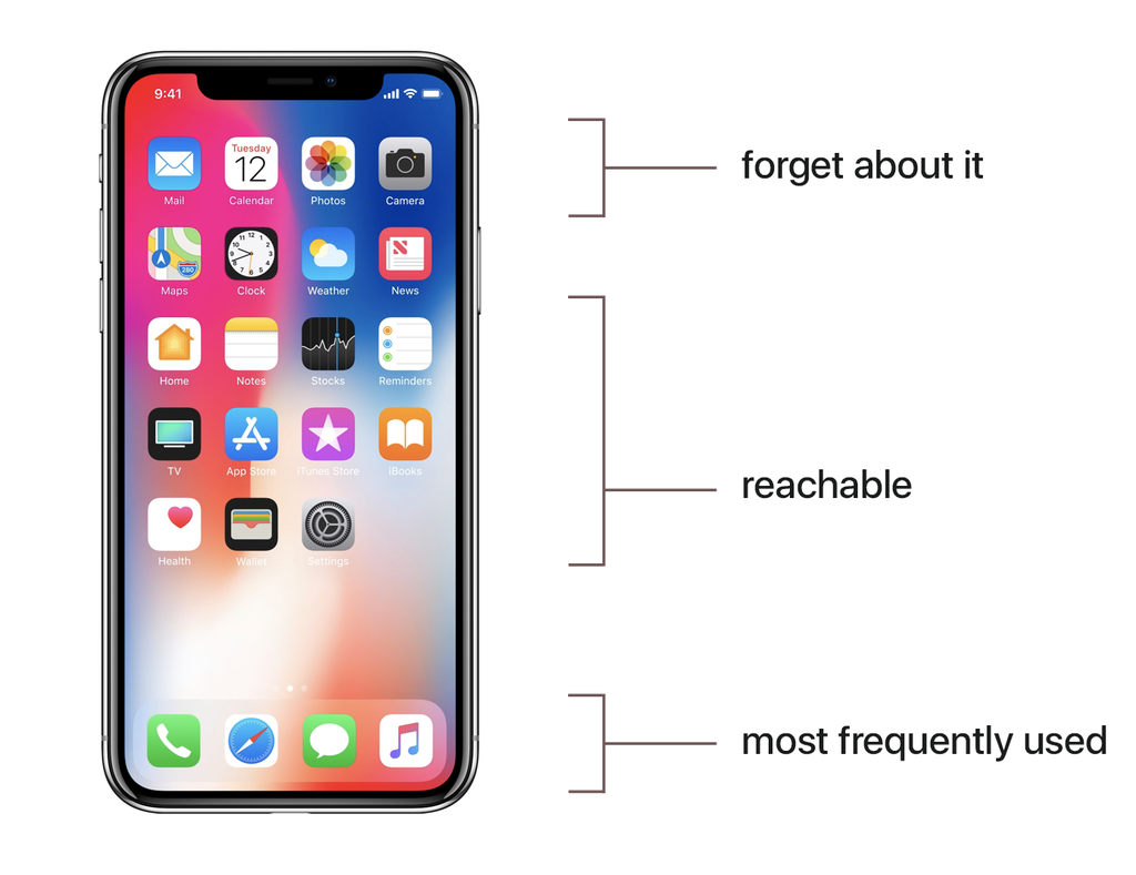
To start mocking things up, we listed all the features of our app and ranked them by importance to the user. When it comes to reading, most of us read from left to right, but as humans we reach things from the bottom up.
If you design with this in mind, it’s called ‘Reachable UI’. A fantastic example of this in the wild is the Maps app for iOS:
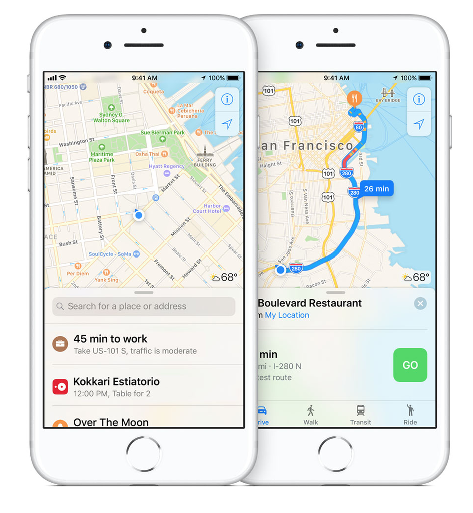
I loved this approach. One of the things that always bothered me on the Plus-sized phones was how difficult it was for me to reach controls near the top of the screen. The iPhone 5 was probably my favorite iPhone for that reason: everything was within reach. Even on the regular iPhones 6/7/8, I had trouble reaching anything at the top of the screen — and I have pretty big hands. iPhone X would be even more affected by this issue.
I had also always been bothered by having some camera controls get in the way of my viewfinder: this supposedly taller screen on the iPhone X would let me finally create a camera without obscuring the users’ view of their subject.
And thus, this was my rough mockup:
We’d place some controls a bit further down, and then place features in distinct ‘quadrants’, depending on how important they were to the user. This is difficult, as tools like cameras have different workflows for different users, but in Halide we already let users customize the button layout so I figured we could let the user pick what was important to them.
Finger Gymnastics
It was time to verify my findings. Here they are visualized:
With the help of a mockup of an approximate device size, I found that putting interactive functions at the top of the display was painful. Not only was it literally impossible to reach, tapping anything at the very corner of the device tilts it significantly, which feels terrible. I realized that I had to take ergonomics in mind far more than when designing for the previous series of iPhones.
Seems simple, right? We wish. I found it was quite difficult to figure out what was ergonomically sound without an actual device to test on.
Then, Ben built an iPhone X.
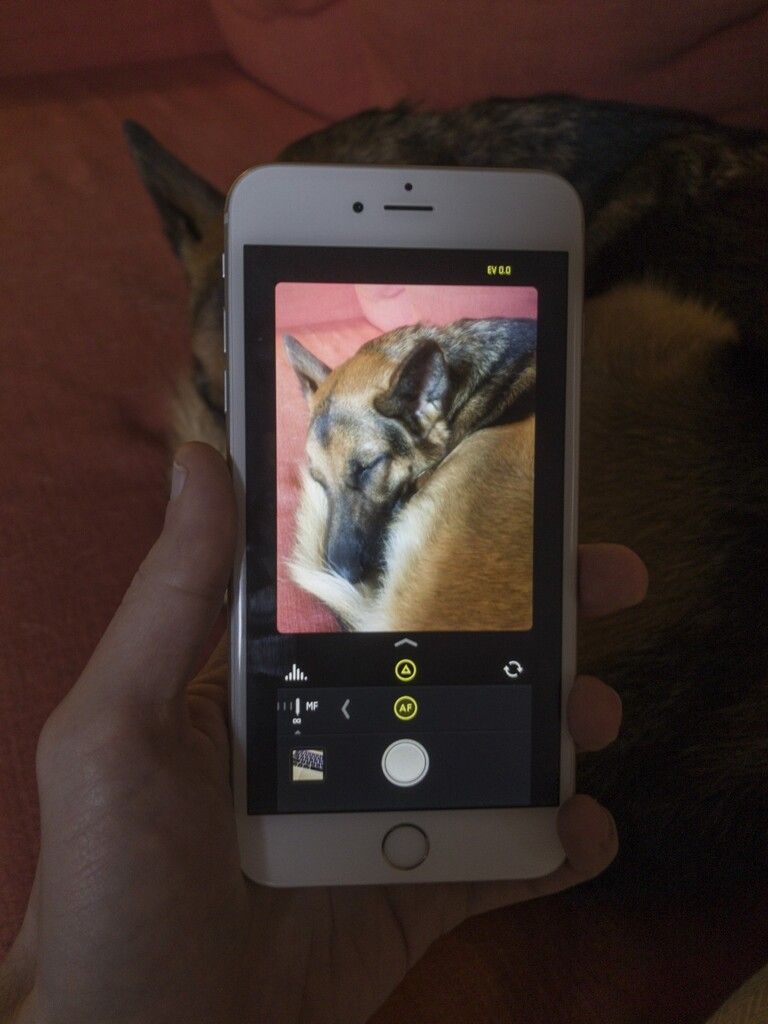
Due to the sheer size of the iPhone 8+, he found we can essentially simulate an iPhone X inside of its screen. He built Halide with a special flag that would put our rough iPhone X layout on the Plus-sized iPhones.
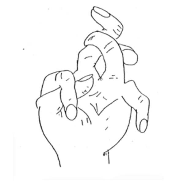
This helped immensely in testing the layout and ergonomics of the app. In fact, it helped me create an ergonomic map for the iPhone X:
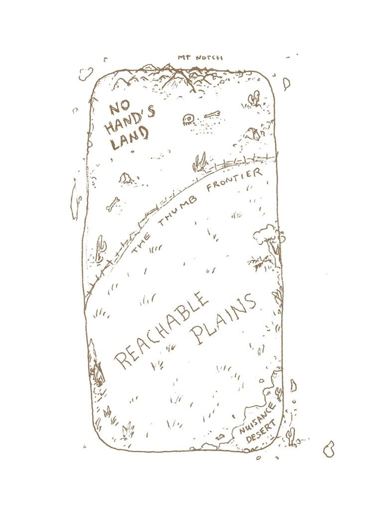
Ergonomics are a very specific thing. There’s an entire field dedicated to it, and I don’t claim to be an expert, but from your own experiments you can deduct there’s different ideal zones for tapping, horizontal swiping and vertical swiping, as well as the Thumb Frontier: the limit of how far an average thumb can reach.
This is what should inform your design considerations. For instance, in your day-to-day life this to effectively describes home screen order of preference:
It also explains why people are not too pleased about the notification center and control center gestures: they are utterly unreachable for the majority of users. The gestures to navigate the iPhone X are fun; the gestures to get to the control center or notifications are a finger workout.
Halide for iPhone X
We used the ergonomic map and Ben’s simulated iPhone X to make our Halide redesign for iPhone X.
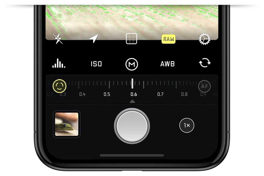
Buttons that require a tap were put in the area that was best for interacting:
We put emphasis on being able to reach the shutter button (duh), the last photo taken, and all the feature controls which we refer to as the ‘Quick Bar’.
Halide features two signature gestures: our up-and-down exposure adjustment / shutter control, and our left-to-right focus adjustment.
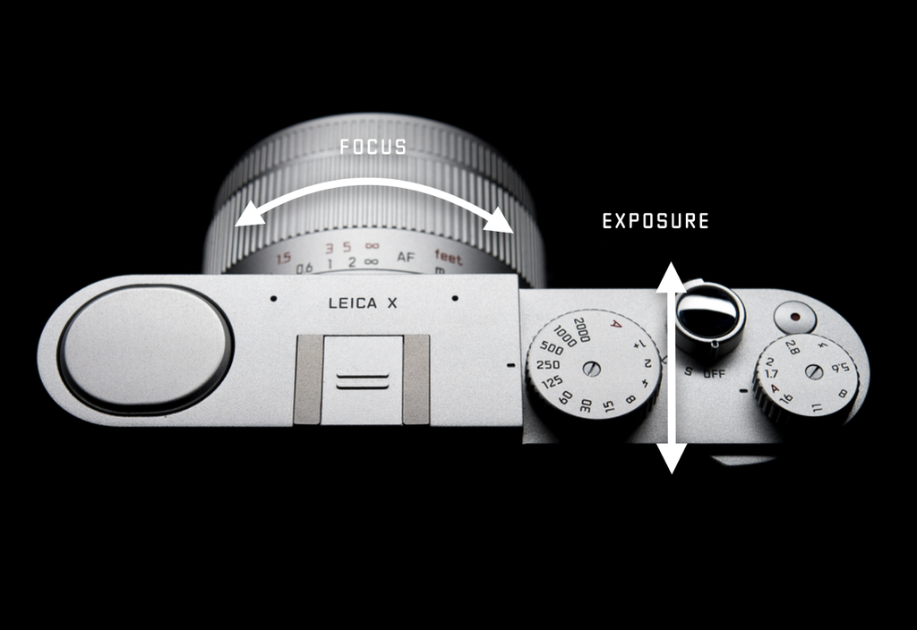
Seems familiar? That’s because we based it on how you naturally control a camera when you are holding it.
We adjusted these to fit the ergonomics of the new device; for exposure adjustment, we ensured you could compensate for at least 5 EV (exposure values) with your thumb, giving you great exposure adjustment without requiring serious finger gymnastics.
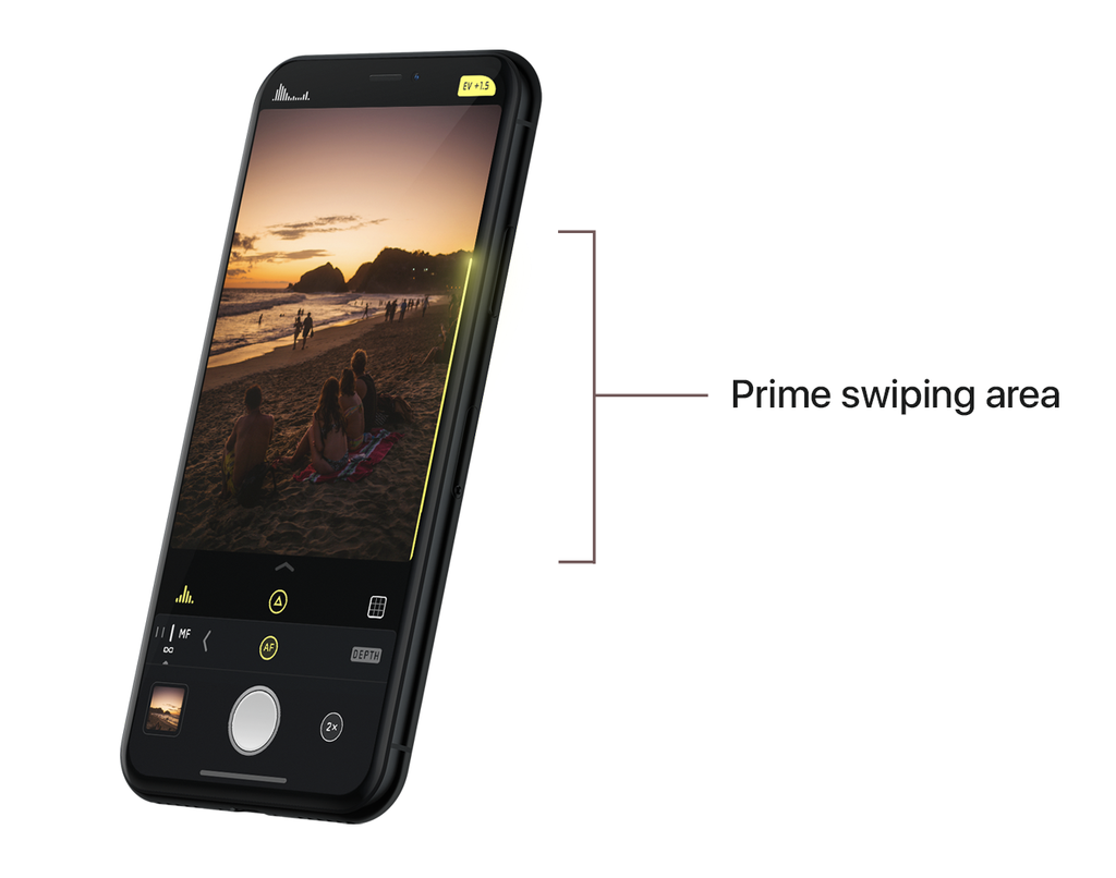
And for focus adjustments, we ensured everything from the AF toggle button and swipe were in the right zone for your thumb to be comfortable. Of course, we ensured this worked for lefties and righties alike.
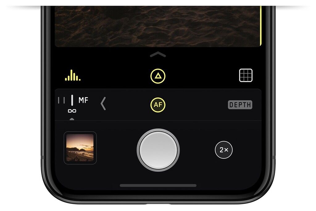
One last thing was our progressive disclosure of the extra camera features, like the RAW capture toggle, the layout grid, etc. — this was traditionally at the top of the camera, but I had designed it so it was sitting snug above the shutter button, clear of the actual viewfinder. It requires a vertical swipe to expand.
Little did we know, the vertical swipe was one of the primary gestures of the iPhone X, so this was in a great ergonomic zone. It felt right in our prototype, so that worked for us.
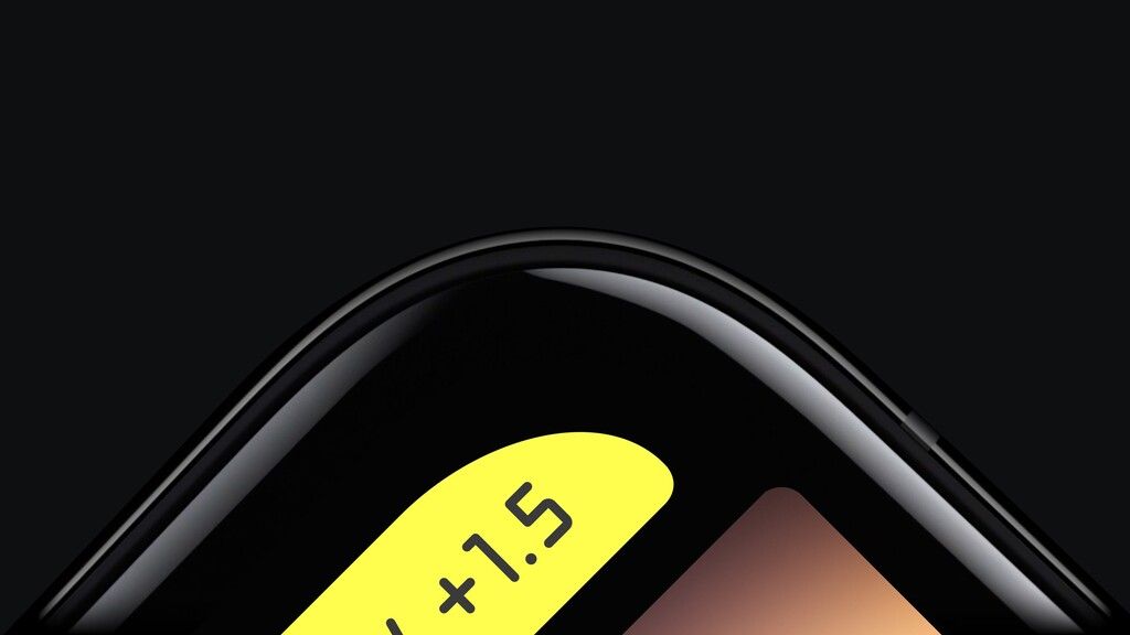
The last things we had left were the non-interactive items: readouts. We previously had these values (like shutter speed / exposure compensation and levels) on top of our UI or in the corner.
We found we could tuck them perfectly into the ‘ears’ of the iPhone X. Since we had to pick one to be more accessible than the other, the exposure compensation value or shutter speed went in the top right; users can still double-tap this to reset the exposure if needed. This was a fairly rare interaction, which suits the location of the control.
That was our Eureka! moment. It clicked: this UI was just right. It felt almost like the hardware was designed around the app.
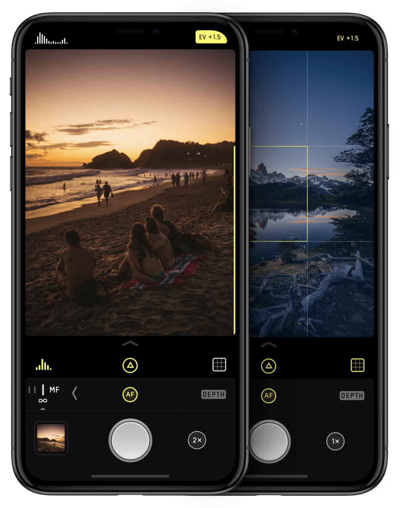
This was Halide for iPhone X:
We crossed our fingers hoping our assumptions were right, just in time for the release of the new iPhone. We submitted the app to Apple days before the new phone hit the store shelves.
These are the realities of being in Apple’s ecosystem: we don’t get a lot of advance notice, nor do we get a test device to ensure our things work well. If you want to get ahead in a crowded market (like, ahem, camera apps) you have to take a risk: try to improvise and use some ingenuity to figure out if you can play to the strengths of a new device.
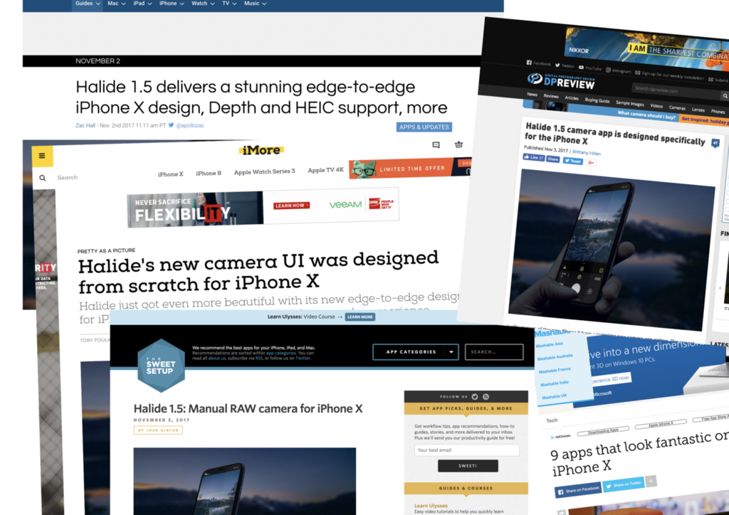
We were incredibly relieved to find that it worked well, and our attempts to embrace the limitations and quirks of the hardware were rewarded with great press coverage.
We’re not done, of course.
We still found that some of our assumptions weren’t perfect: our Halide 1.6 update (which is out soon) adjusts some of the ergonomics for daily usage. There’s nothing like having the actual hardware to make observations and tweak things, but it turns out you can get really far by approaching it with some experimentation!
Takeaways:
Design for ergonomics. On regular iPhones, you have to do much less as a designer to optimize ergonomics. The iPhone X requires you to think about comfortable button placement and usability. Ergonomics is more than just tapping, but also swiping and other gestures. Lay out your UI so all actions are accessible and as comfortably usable as possible.
It’s a whole new device: Design for it. Everyone can stretch an app out to a larger screen, but just like the iPad, a fresh approach is not only welcomed but helps you stand out in the App Store. This is a great time to validate your current design. Are your approaches still valid? Is there a better solution possible? You might come to some valuable insights that you can apply to all your designs, not just the ones for the shiny new device.
Pick your battles. There’s no sense in fighting Apple on how they handle hardware particularities like the notch. Everyone who decided to fight it instead of embracing it in their app ended up looking odd. It’s better to see it as a creative exercise than an attack on your delicate designer sensibilities.
Bonus round: The Hero Shot
We take pride on ensuring we have a great ‘hero image’ on our website, social media and in our package we send to the press. With a few of these promo images in our press kit, we quickly found the preferred shot was the photo of my wife holding an iPhone and shooting with Halide in the redwoods.

This seems natural: rendered materials can look a bit too slick, and makes articles unintentionally feel more like an ad.
It seemed natural to make another photo the press kit for Halide on iPhone X. There was one minor issue.
We had no iPhone X to take a photo of.
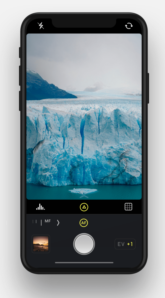
But this is 2017. We have the technology! With the help of Martin Haijek, we created a 3D environment that closely resembled one of our screenshots’ best photos:
Thanks to some imagination, a bunch of Cinema 4D and a lot of Photoshop compositing, we sent out this image just days before the new iPhone hit the shelves:
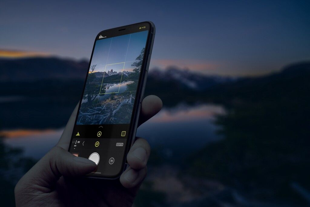
A photo of our app, redesigned for iPhone X, being used to shoot Mount Fitz-Roy in Patagonia on an iPhone X… made before a single one of us had as much as touched the actual device. Now that is what I call getting creative.