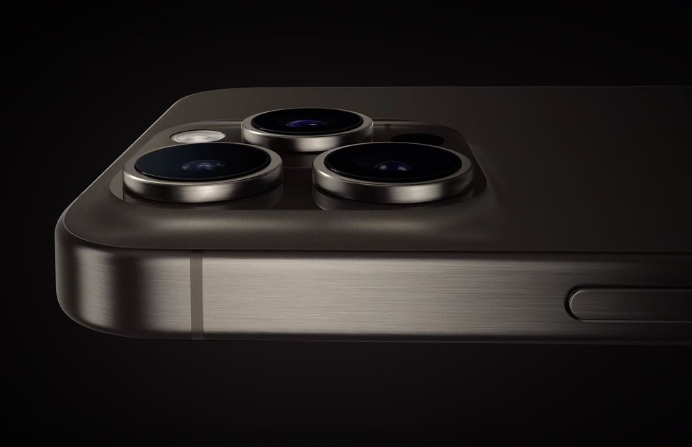
iPhone 15 Pro Max Camera Review: Depth and Reach Featured story iPhone 15 Pro Max Camera Review: Depth and Reach
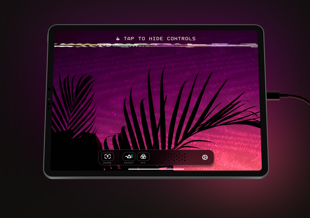
Orion: Finally, a screen that goes anywhere Featured story Orion: Finally, a screen that goes anywhere