It’s been seven years since we launched a little side project, Halide. We built it for us: we didn’t set out to ‘disrupt’ the world of camera apps, or get rich. We wanted to build a beautiful, powerful, and delightful camera app that we would enjoy using.
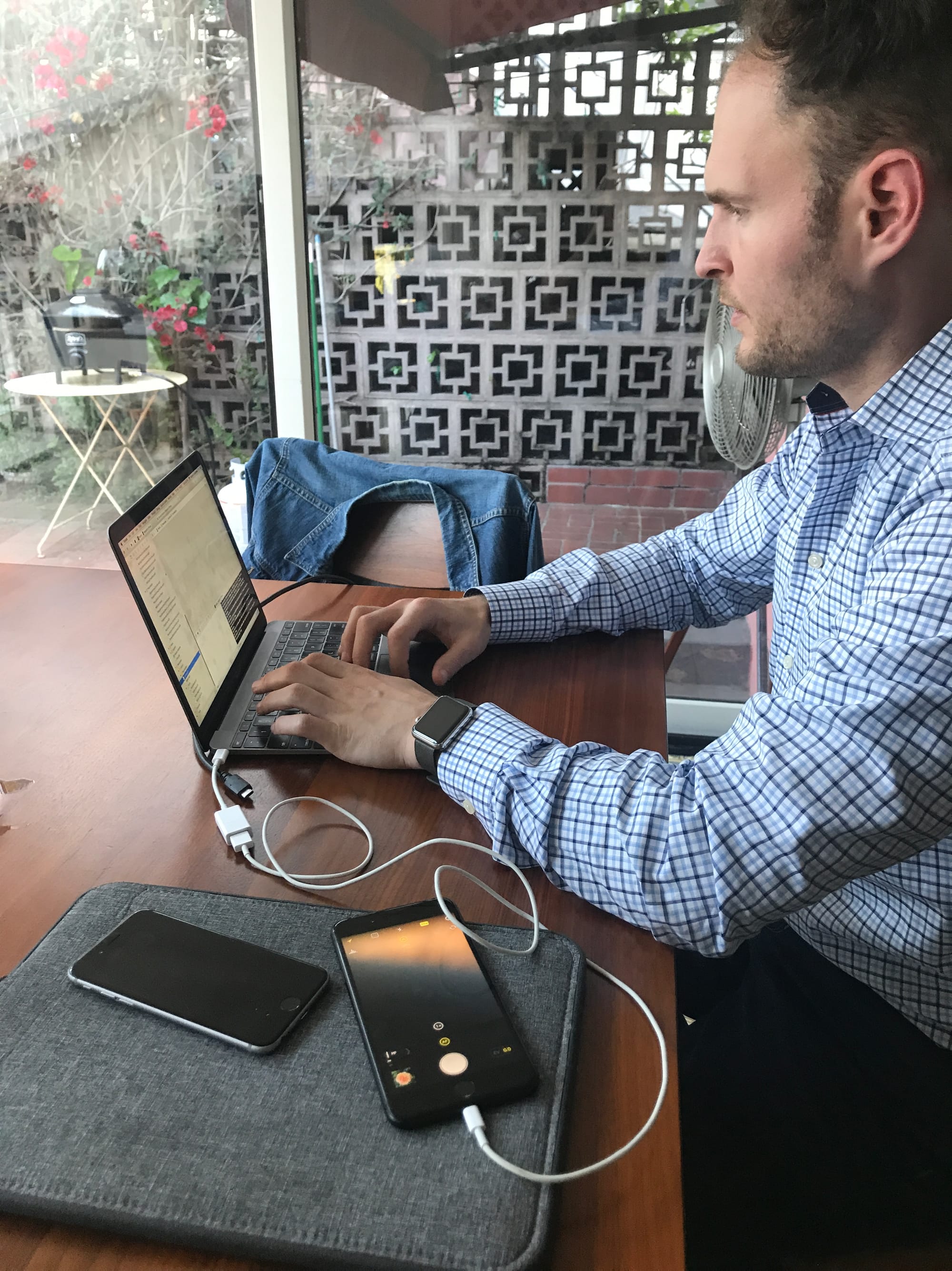
It exceeded our wildest expectations and quickly grew to become an award-winning photography app and a legitimate business. Soon, we quit our jobs to work on apps full-time. Yes, that's plural, apps.
From what we learned building Halide full-time, we spun out one-off projects such as Orion and Spectre (that one went places — a little long exposure app that won 2019 App of the Year). While these were fun diversions, Halide remained the focus of our company. It was what we worked on most days of the week, for the last seven years.
There was just one thing we knew we'd never add to Halide: video. Ever since Halide 1.0, users asked for it, but we knew it wouldn't work. Photography and cinema are different mediums that call for different user experiences.
Instead, Sebastiaan and I talked about building a completely separate app, a "Halide for video." Talk never went past the "Wouldn't it be cool…" phase, because we weren't sure if we could juggle a second major app. We're a small team. Ridiculously small. One designer and developer.
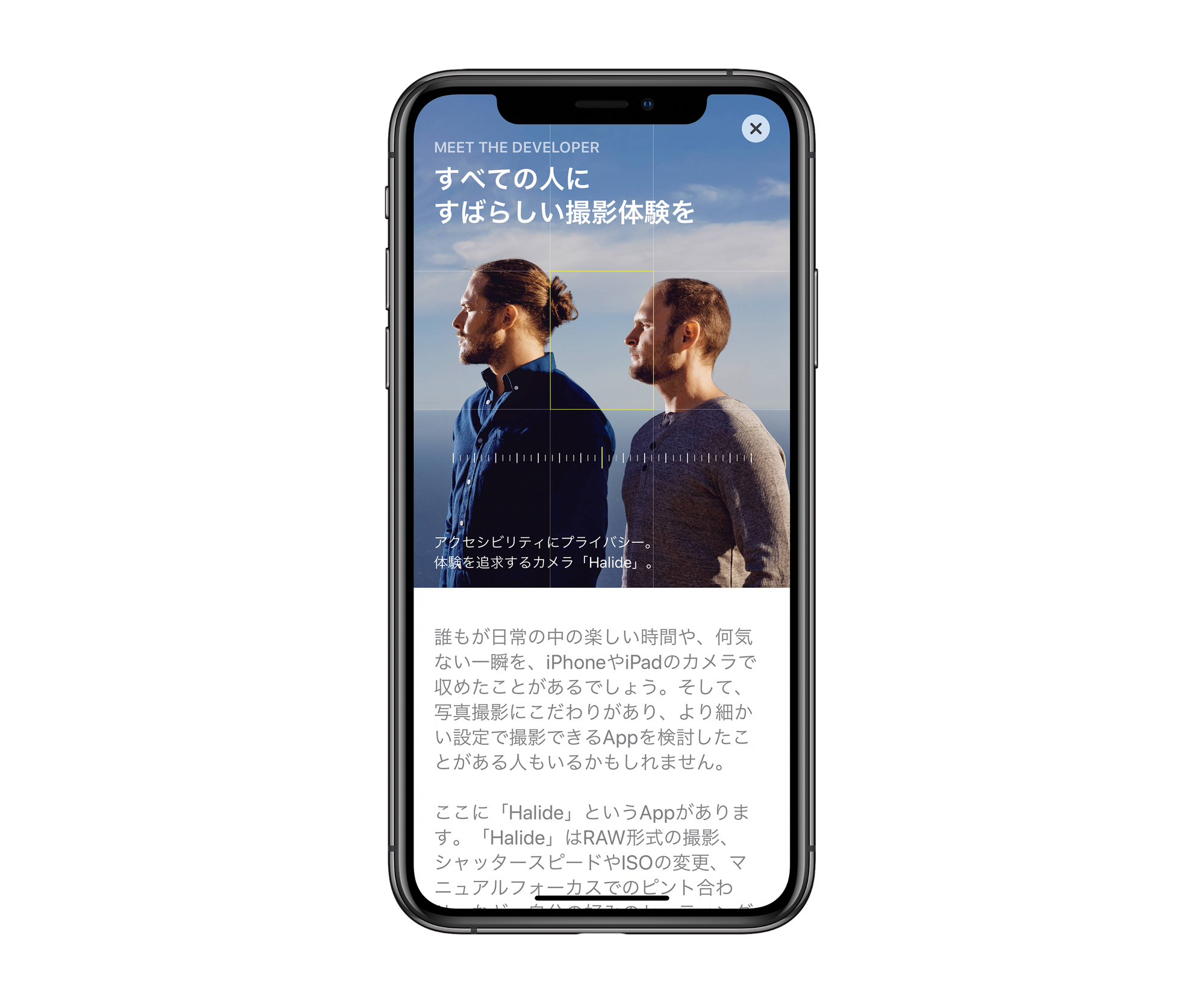
We knew expectations were sky high, and honestly, nothing excited us about iPhone video. It felt photography was at the forefront of the camera innovations.
Our attitude quickly changed in November 2023, and we launched our video app, Kino, six months later. This is the story of why we made the plunge, its whirlwind development, the results, and where we go from here.
Fall 2023: "How hard could it be?"
At the end of last summer, Sebastiaan and I launched Orion, a free app that helps turn your iPad into an HDMI monitor.
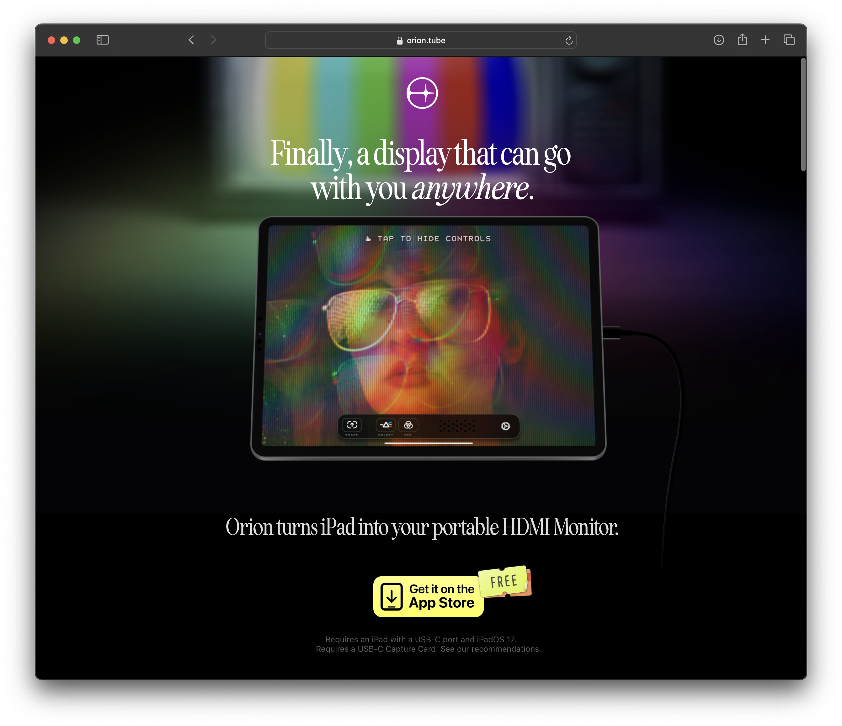
We normally take our time with new projects. Both Halide and Spectre each took one year to ship (though, in our defense, these started as side projects). Orion was a fun challenge to see if our two-man company could ship a brand-new app in 45 days, and it went really well. It reset expectations of what we could accomplish quickly, but it felt a bit exhausting toward the end.
We expected to spend the rest of the year slowing down and turning our attention to Halide. We were in the home stretch of a brand new feature that we were very excited about, and with another month or two of work, we could bring it across the finish line.
I could also use a little breather for the rest of the year, as I expected my first kid at the end of February.
Those plans changed moments after the Orion release, with Apple's unveiling of the iPhone 15 Pro. We watch every keynote paying close attention to changes in photography, which we'll weave into our fall Halide update. This time we were blown away by the announcement of "log video."
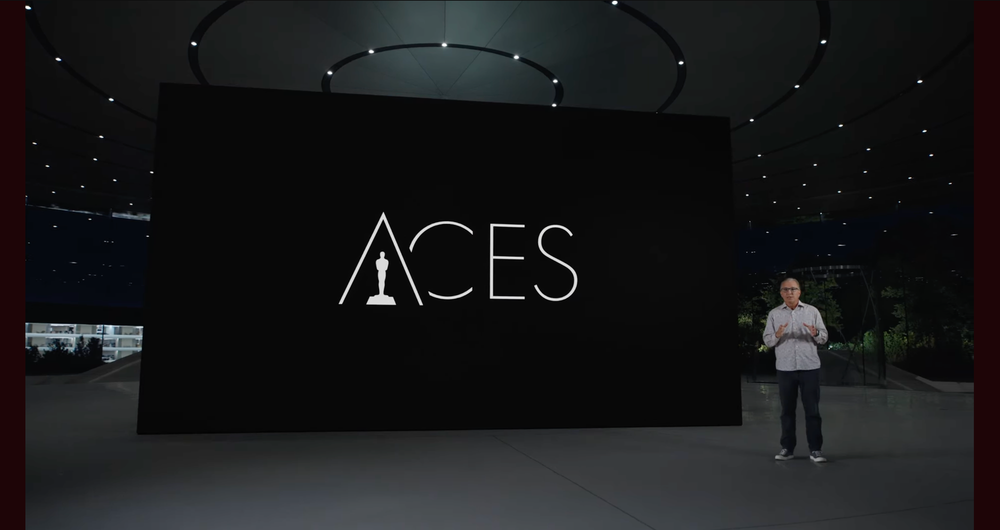
Log video is a very big deal. It contains much more information than conventional iPhone video, allowing ridiculous control over the final image. Apple called it Apple Log. Of course.
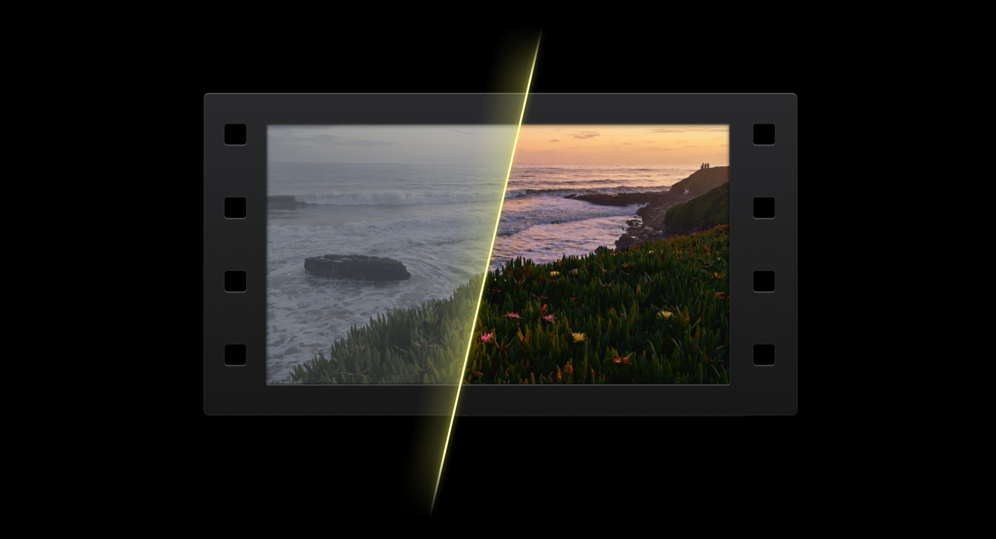
As Apple Log made waves in the filmmaking community, we got a sense of déjà vu. Our minds went back to the Summer of 2016, when Apple iPhones would soon capture RAW photos, allowing incredible editing superpowers. Sebastiaan and I felt that was the right time to build Halide. Now, with Apple Log, we felt iPhone video was about to have its RAW moment.
That said, there are only so many hours in the day. Could we add another major app to our portfolio without supporting ou breadwinner, Halide?
Well, Halide is overdue for a refresh. Its foundations were built seven years ago, and Apple's newer technologies would vastly improve the product. Orion wasn't just a fun side project, it was a test as to whether Apple's new technologies were mature enough to start rolling into Halide. If so, how much do they improve our productivity? The result was "yes," and "a ton." We were able to accomplish some tasks for Orion in hours that would take days in Halide.
But Orion wasn't nearly as complex as Halide. Our video app would let us build a foundation for the future. While our photo and video apps would never share user interfaces, we could architect them to share underlying technologies. If we do this right, we can manage the workload.
The Deadline
Maybe the hardest part of our job is planning everything around Apple's schedule. We spend summers readying our apps for the Fall iOS release, which launches alongside new iPhones. Then we scramble to test our apps and support the new camera hardware. If we're lucky, we get six months a year to define our product direction.

That said, constraints help you focus. We decided that Orion had to launch when iOS 17 dropped, because we expected lots of similar apps to pop up over time, and we wanted to be there right out of the gate. Orion had to ship in 45 days, so we made it work.
I'm not advocating crunch time, where developers work long hours for the sake of unrealistic deadlines. Quite the opposite. Deadlines force us to accept that we won't get everything done in 1.0. We have the freedom to cut as many features as needed to keep things sustainable. The old adage goes, "Work expands so as to fill the time available for its completion," but can't the same be true for work shrinkage?
The question was whether we could ship a whole new camera app within four months, before my baby's due date. It might sound ridiculous, given Halide 1.0 took one year to ship, but Orion proved how much more productive we could be with the latest technology, and this time we were building a camera with seven years of experience in Apple's AV stack.
One reason that Halide and Spectre each took a year was that we handled 100% of each project ourselves. With Orion, we worked with Anton Heestand on its wonderful over-the-top onboarding, and Cabel Sasser wrote us an intro song! It turns out we can delegate work and collaborate with friends without losing any character.
The biggest risk with our four-month deadline had nothing to do with code. We were worried that we didn't yet understand what we were building. There were already plenty of free apps that let you record Apple Log. What could our new app bring to the table?
Defining the Product
After surveying the app landscape, we quickly realized that every app that supports Apple Log targets advanced users. These types of users look at a high-end camera rig and go, "Wow! Cool!"
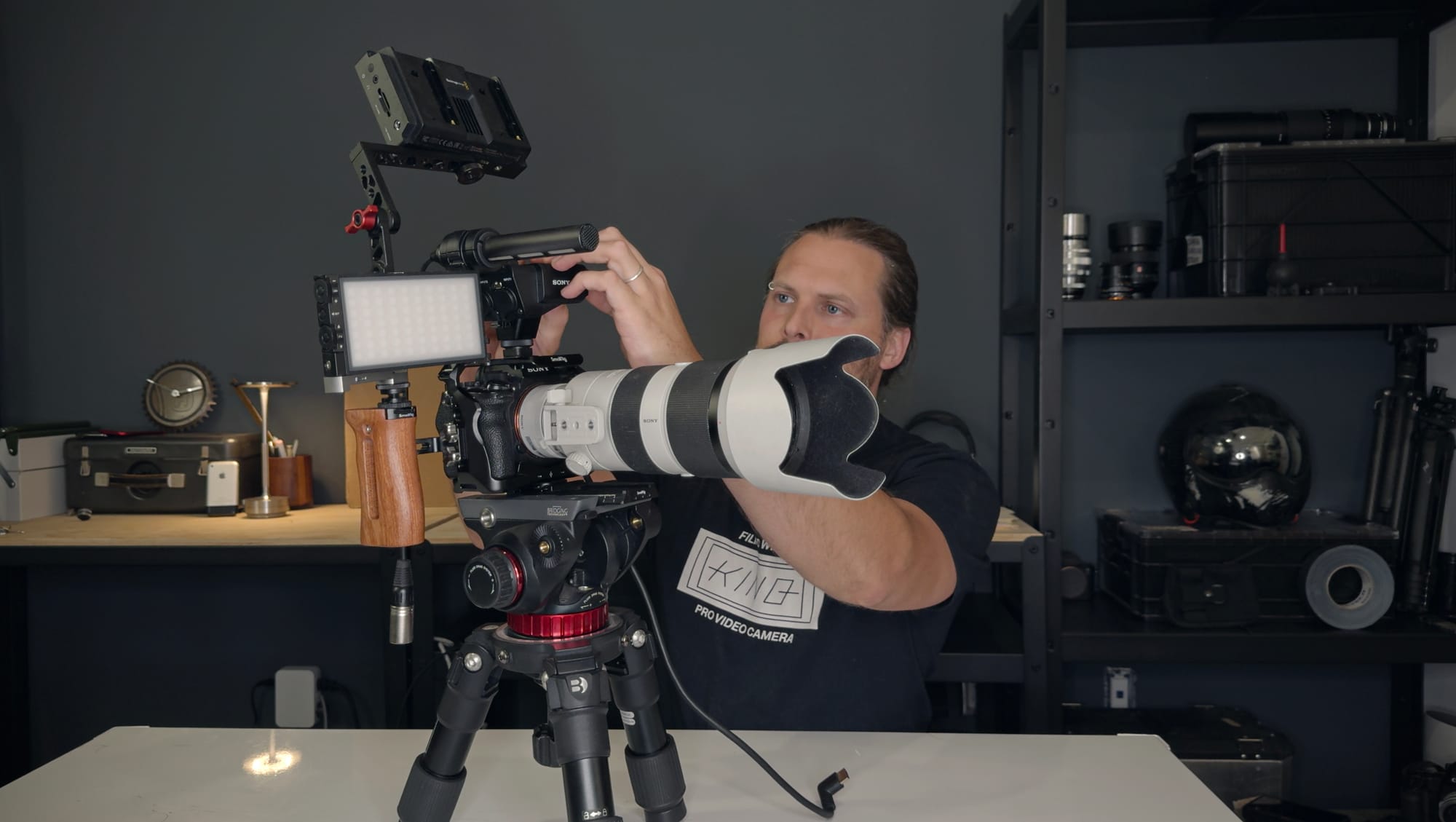
Don’t get me wrong, we love this stuff, but we weren't excited to build a high-end tool exclusive to pros. But as we dug into the techniques of filmmaking, I had a flashback to the late 90s and early 2000s. I grew up on the cusp of digital filmmaking and had lots of fun making short movies with friends.
In the mid-2000s, we used a ridiculous camera that had been modified to shoot 10-bit log footage. That hacked camera required a handful of portable hard drives that would overheat at the worst times, but these technical shenanigans piqued my
curiosity, and led me down a path where I now build camera apps for a living.
Returning to the world of filmmaking excited me. I could build an app for 99% of people just starting who wish they could record beautiful, cinematic videos, but can't make heads or tails of "colorspaces" or "shutter angles." I had the chance to
build the camera I wish I had decades ago.
If we have one guiding principle, it’s the belief that "intuitive" and "powerful” do not have to be mutually exclusive. We thought our app could deliver 95% of the features demanded by high-end professionals without making the app too complex for novices. We'd start with an approachable 1.0, and carefully layering on more advanced features over time.
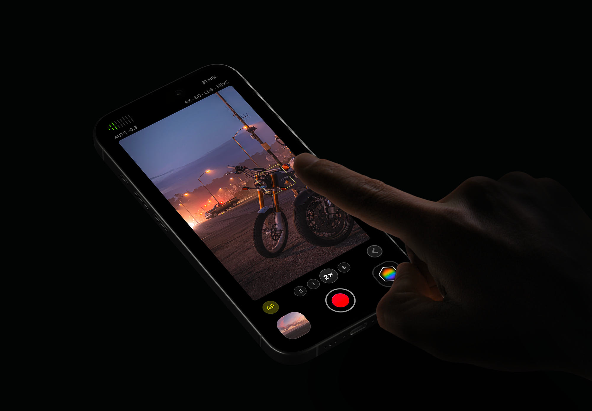
It turned out, Sebastiaan had been quietly designing concepts for a video app for quite a while. This is how early some of Kino’s most recognizable visual elements were born, like the recording tally light ring that follows the curvature of your iPhone’s screen, or the little segmented audio levels.
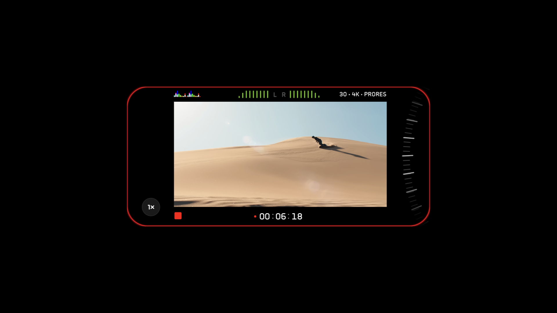
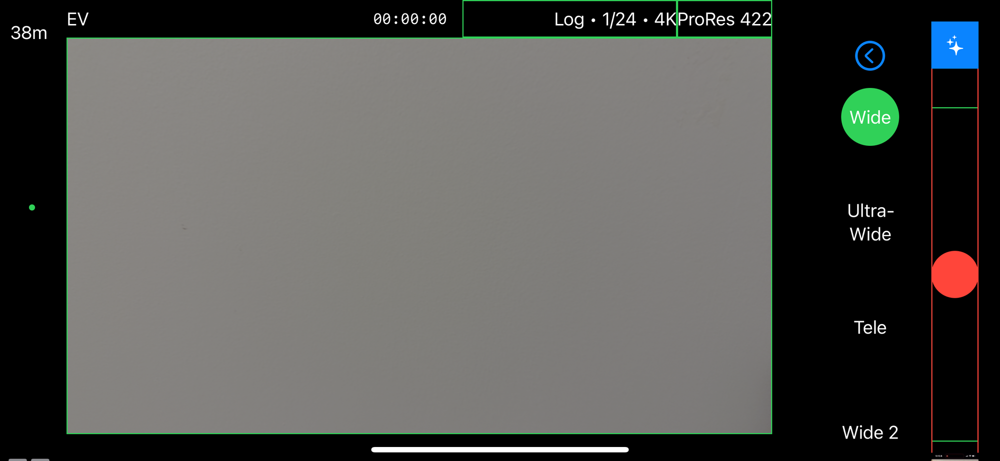
That said, the worst way to explore a product is with a pixel-perfect version. A beautiful UX takes extra time, and pretty images can distract you from fundamental problems. So in the interest of speed, I spent the next few weeks focusing on a functional prototype that resembled Sebastiaan's concepts. It could record Apple Log footage, connect to an external microphone, and let us quickly experiment with UI concepts.
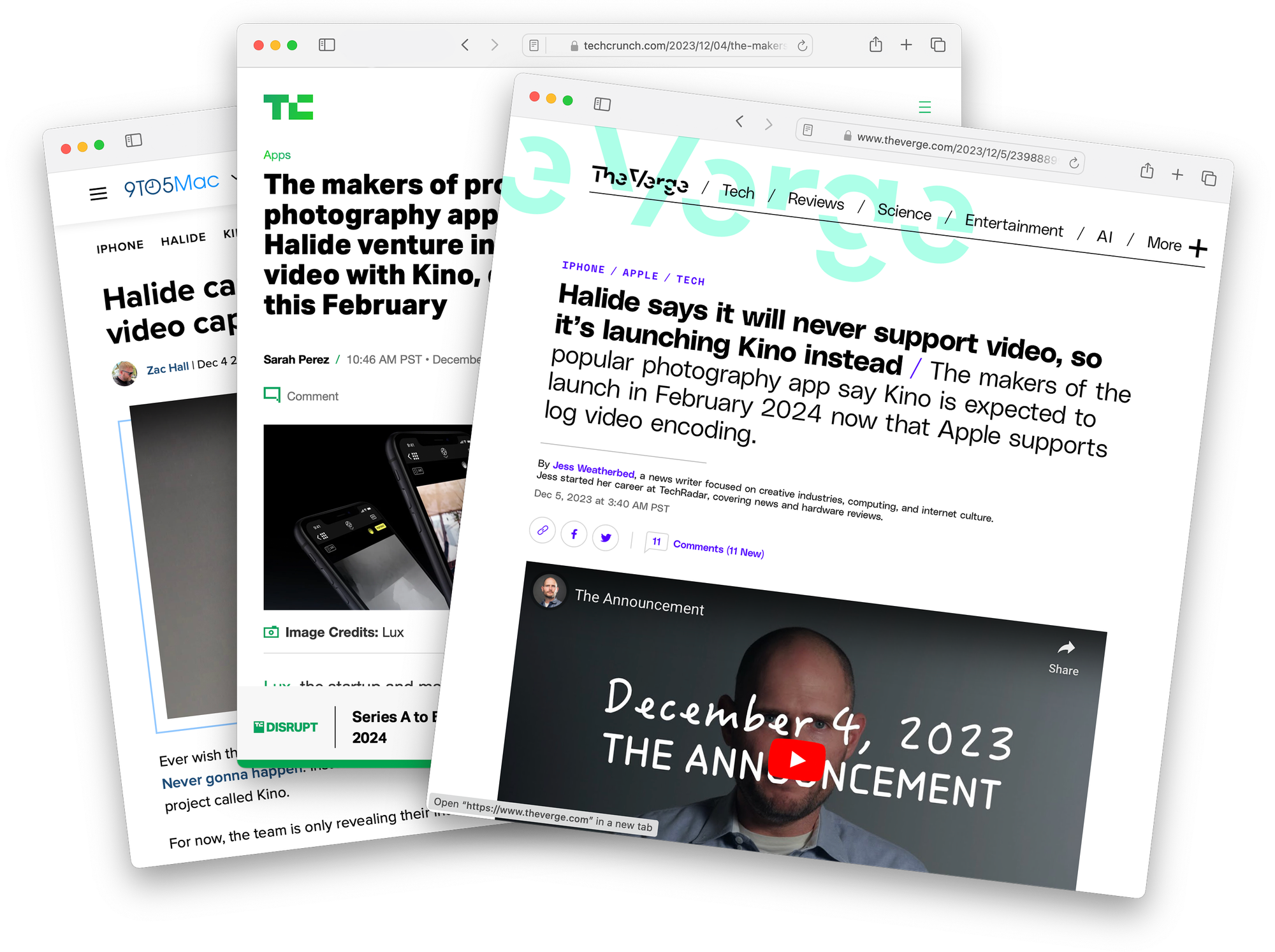
In December 2023, just as our prototype built momentum, news broke that Filmic Pro— the most popular filmmaking app on the App Store— was shutting down. This left a vacuum in the ecosystem of filmmaking apps and a material loss in our tiny community of camera apps.
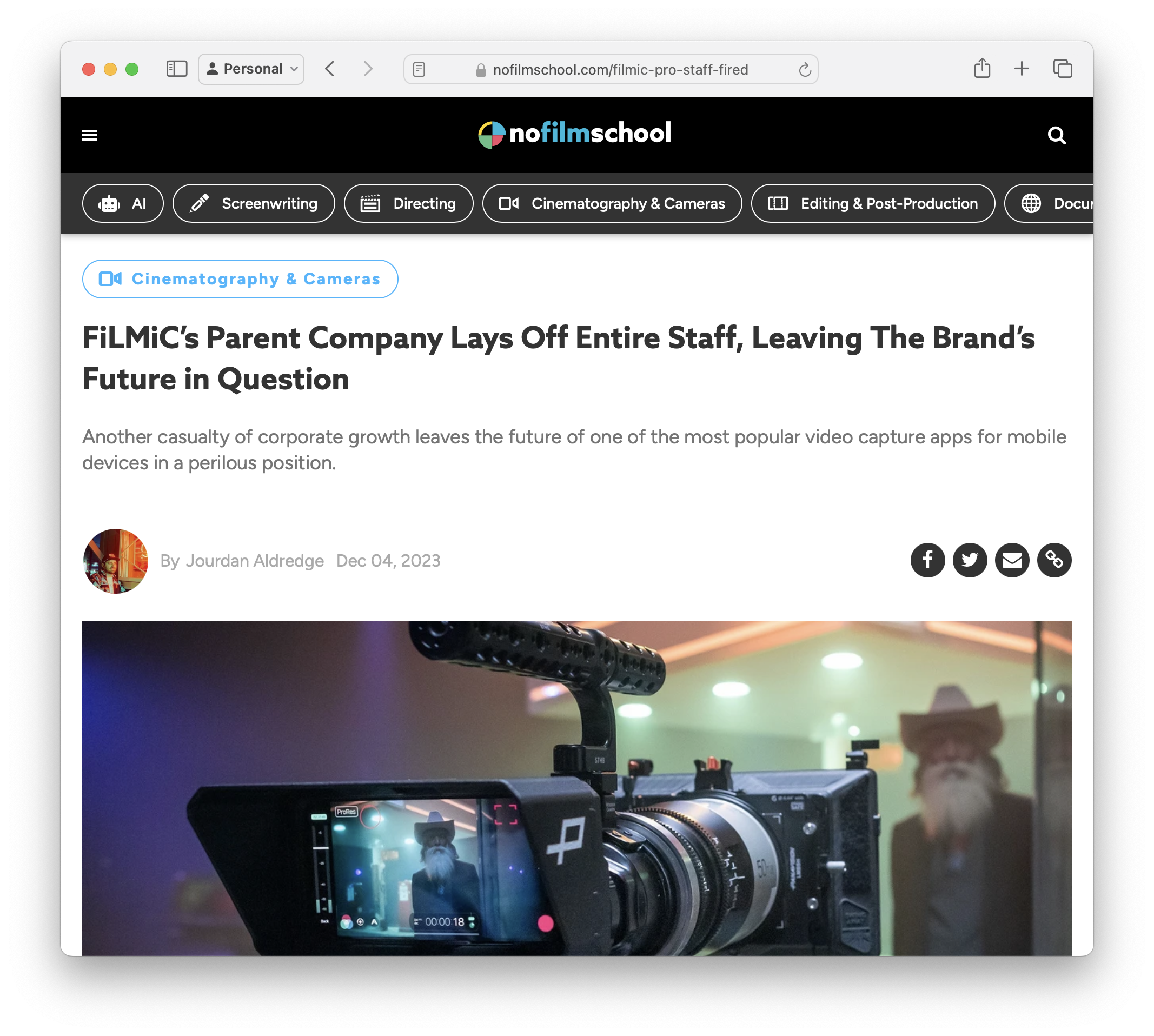
Normally, we don't pre-announce products. Part of it might be Sebastiaan’s ex-Apple penchant for secrecy, to announce stuff and surprise and delight. But it also raises expectations and runs the risk of committing to features that might not work out. At the same time, the demise of Filmic was an invaluable opportunity to announce our new app and test demand. We decided to pre-announce.
First, our app needed a name, and we didn't want to repeat the pronunciation ambiguity of "Halide." (Note: Sebastiaan says Hey-lide, and I say Hal-ide, but we switch every other week.) Sebastiaan floated a name that both encapsulated ‘craft video’ and sounded friendly: Kino.
I spent 24 hours shooting an announcement video with our alpha build, and we launched a teaser page at shotwithkino.com.
The reception to our video was overwhelmingly positive, and it felt like we had a hit on our hands.
Now we just had to ship it. Wait… what were we shipping?
December: Instant Grade
Sometimes building products is like writing a story. Writers don't go, "Once upon a time," and finish the story in one pass. Many writers approach a blank page with ideas for characters, major plot points, and themes running through their heads. The hard part is forming loose ideas into a cohesive structure. It's called "cracking the story," and there's a similar process in building products.
We decided a good starting point was to shoot videos. When you're forced to eat your own dog food, you quickly figure out what works and what doesn't. In a meta turn of events, we made a video about making Kino.
We appreciated the natural look of Apple Log footage, as it didn't have the same post-processing you see in iPhone video. The hard part is giving log footage a nice treatment. Straight out of the camera, Apple Log looks… uh…

Log footage is supposed to look that way. It just contains the ingredients that can make up gorgeous images, and it's your job to bake them. You're supposed to bring it into a high-end tool like Davinci Resolve to "color grade" it. While these tools feel empowering to professionals, to a novice, they feel as intuitive as the cockpit of a commercial airplane.
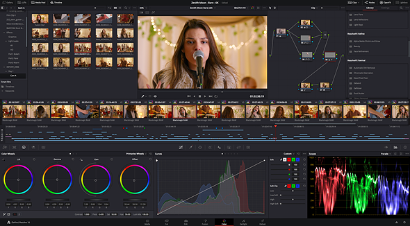
We knew Kino could be a game changer if it let everyone grade their footage right in the app with a tap, by using a handful of packaged presets.
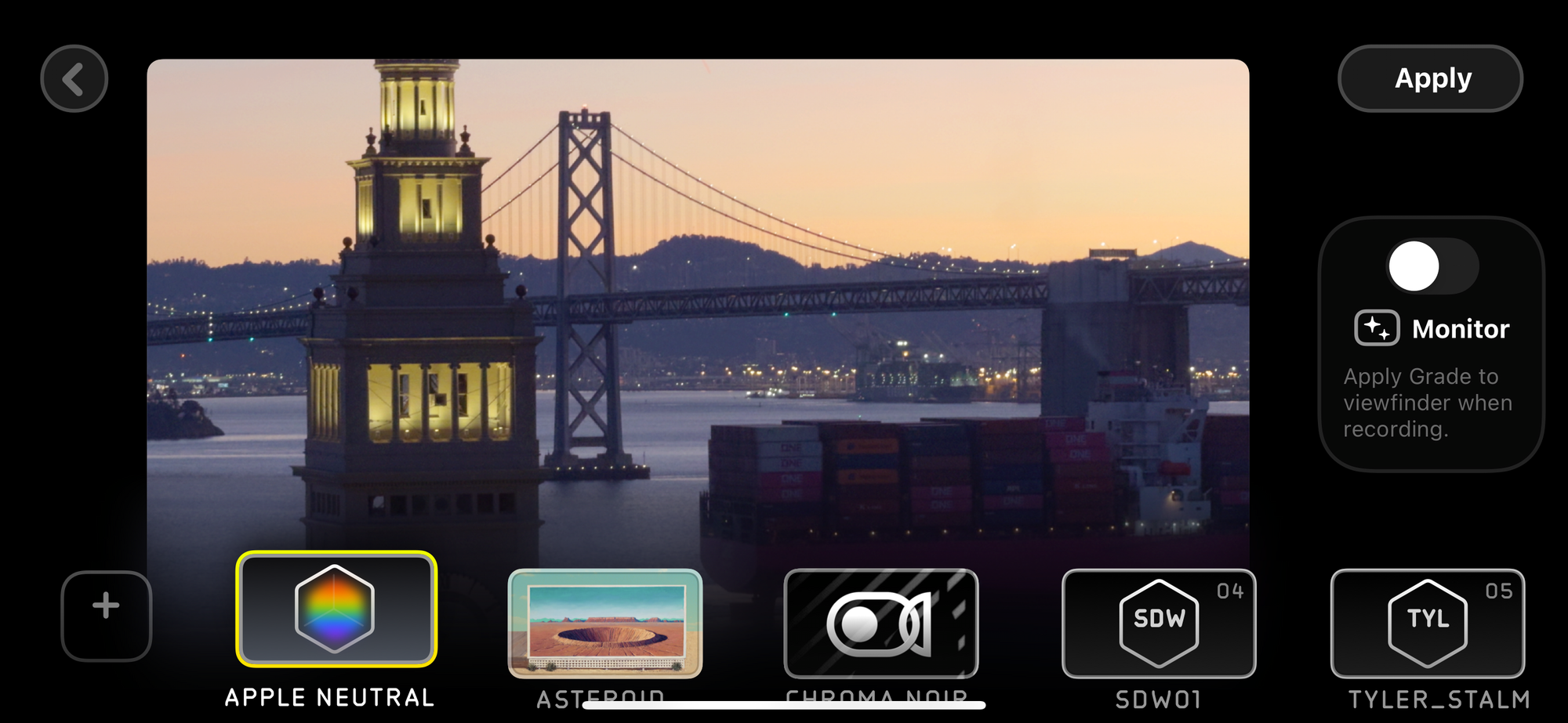
But why stop there? We could let you import a preset from anywhere. Apple Log was only a month old, but pros were already selling great grade packs, ready to be imported into your favorite editing suite.
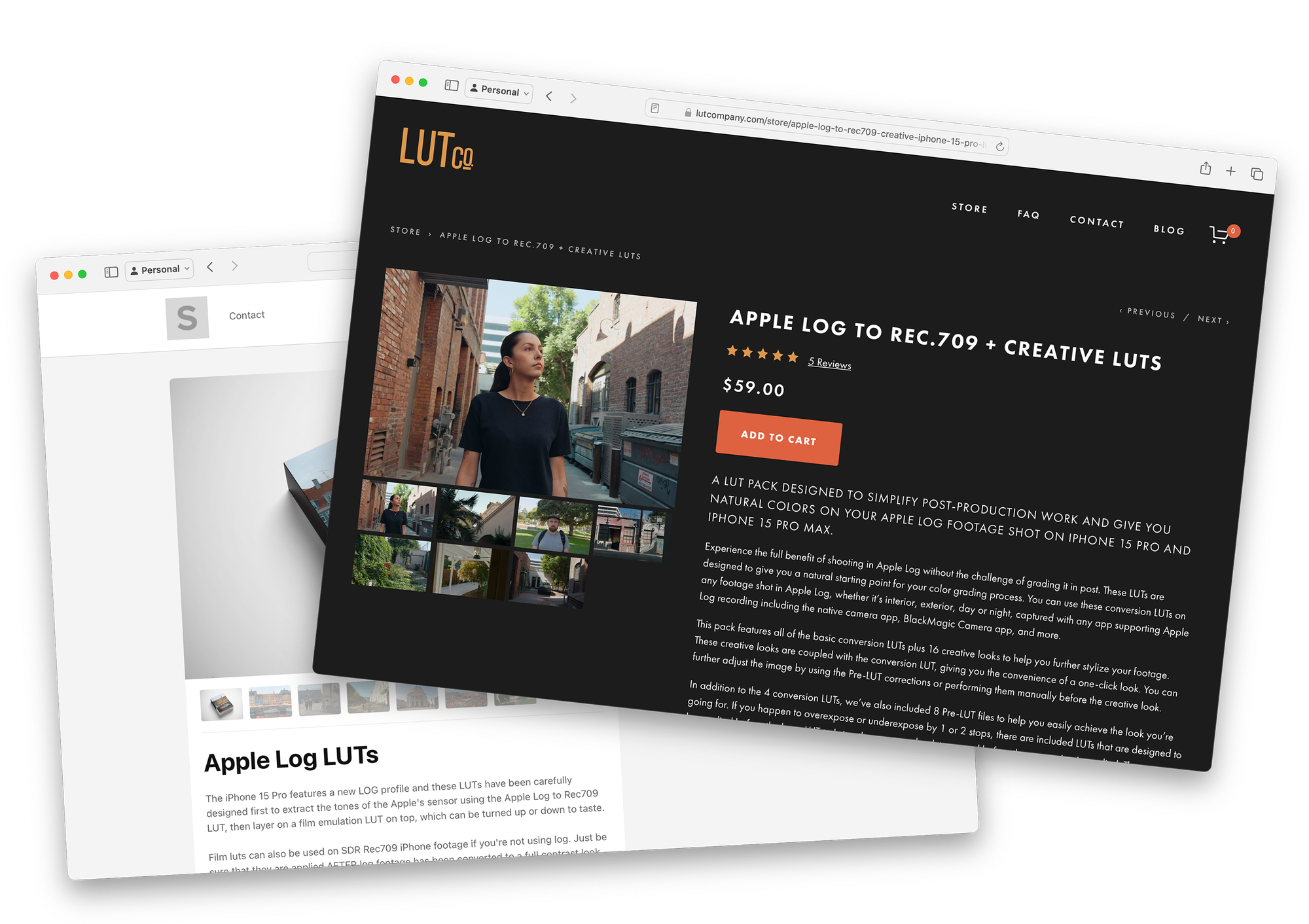
And if you're a high-end user, you could even author your own looks in Resolve! Speaking of the high end…
Tackling the High End
On the other end of the spectrum, we had to figure out what professionals demand. We packed up and flew down to Los Angeles, where Sebastiaan booked us into the only NFT hotel in town (Sebastiaan Note: So sorry, I had no idea).


It led us to interview Stu Maschwitz, Adam Lisagor, and others. We asked what they would want in an app, but it was ultimately up to us to decide what features work with our casual user experience.
Pros wanted two things: adjustability, and consistency. Adjustability was straightforward. Like Halide, we just needed a manual mode that lets you adjust the shutter, ISO, and more.
Consistency was a bit more nuanced. For example, Pros want to lock exposure settings at the start of the recording. This doesn't happen with the iPhone's first-party camera, where exposure settings can change mid-recording. This means that if someone walks into your video wearing a dark shirt, the image could change its overall brightness to compensate. This feels off, and you never see it in real movies.
However, locked exposure could confuse casual users. We could already imagine confused customer support emails like, "I started recording a movie inside my house, I walked outside, and everything was too bright!” They aren't wrong. Most people expect their cameras to just work.
Exposure locking warranted a toggle, which we'd leave off by default.
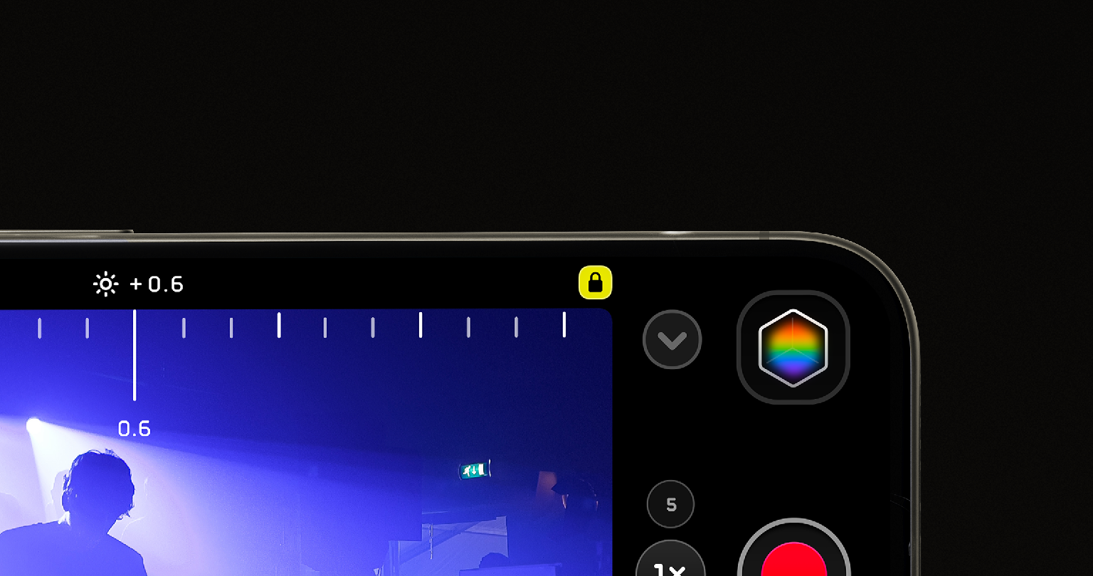
But how would a professional know this feature exists, to begin with? We settled on an extra screen in our first-launch experience that lets you dig into all the customizable options.
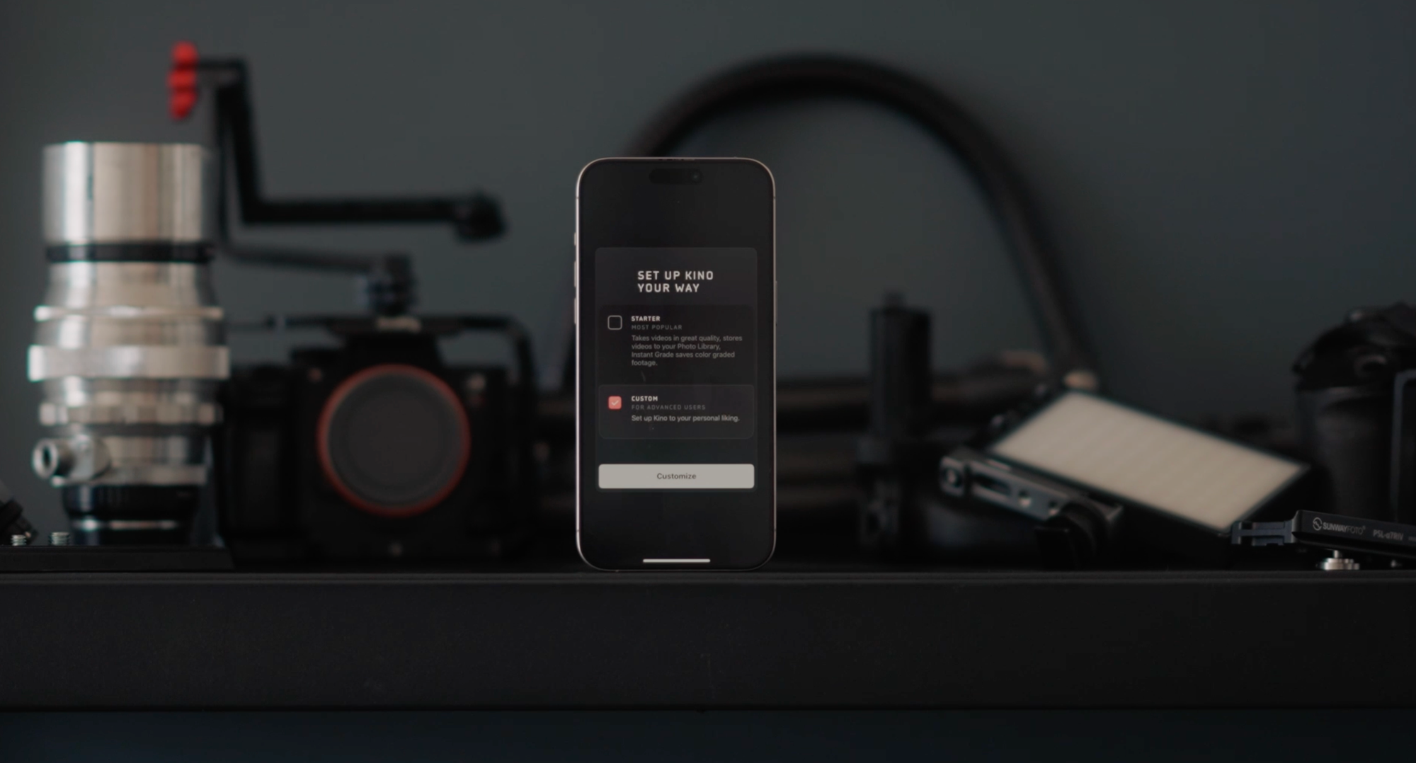
Giving users extensive options makes things harder to test and develop, but we couldn't take a one-size-fits-all approach. We think this struck a nice compromise, and everything felt on track for our February release.

January Battles
With Instant Grade now in our early alpha, something funny happened: we began using it all the time. It wasn't because we had to, but because we loved the results. This was a good omen, since we had two months left on our schedule, and this was the point that the app should be coming together. Soon we'd have to shift gears into polishing the interface and hunting for bugs.

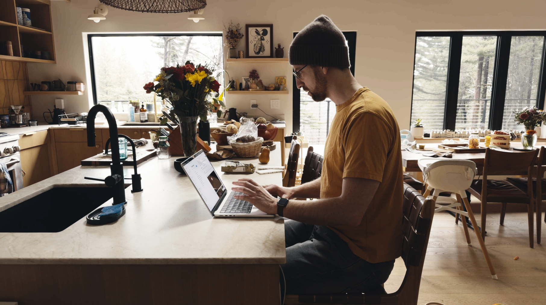
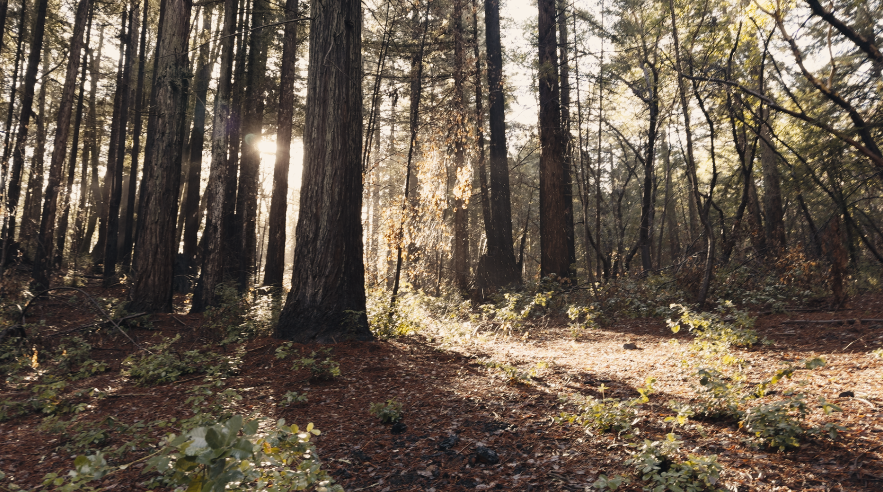
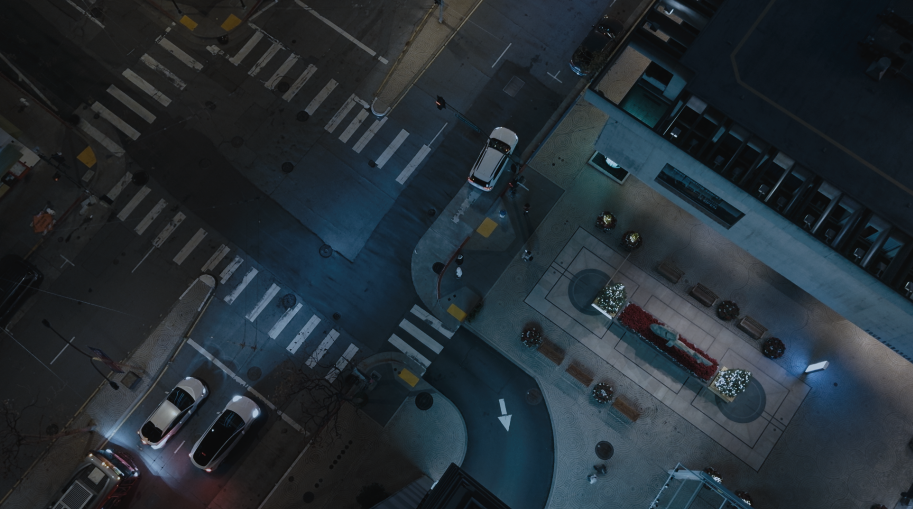
Some frames from footage graded with Instant Grade with a cameo appearance of Ryan McLeod, who was in town for the launch of Apple Vision Pro and his amazing game Blackbox.
According to Sebastiaan, there's a Dutch saying, "The last lead weighs the most." It stems from typesetters, who had to take little lead letters and set them in a clamp to write out text. Near the end of a sentence, things get heavy, and the final words are the hardest to set.
Once an app rises in quality and things feel "real," weaknesses stand out more, and as we were about to finish off our sentence, we realized we missed a word.
A few weeks into January, we knew something felt off. Stepping back, we realized it was onerous and silly to reach for manual exposure controls to create that signature "180-degree" look you see in films. If you aren't a camera nerd, 180 degrees means nothing, so bear with me.
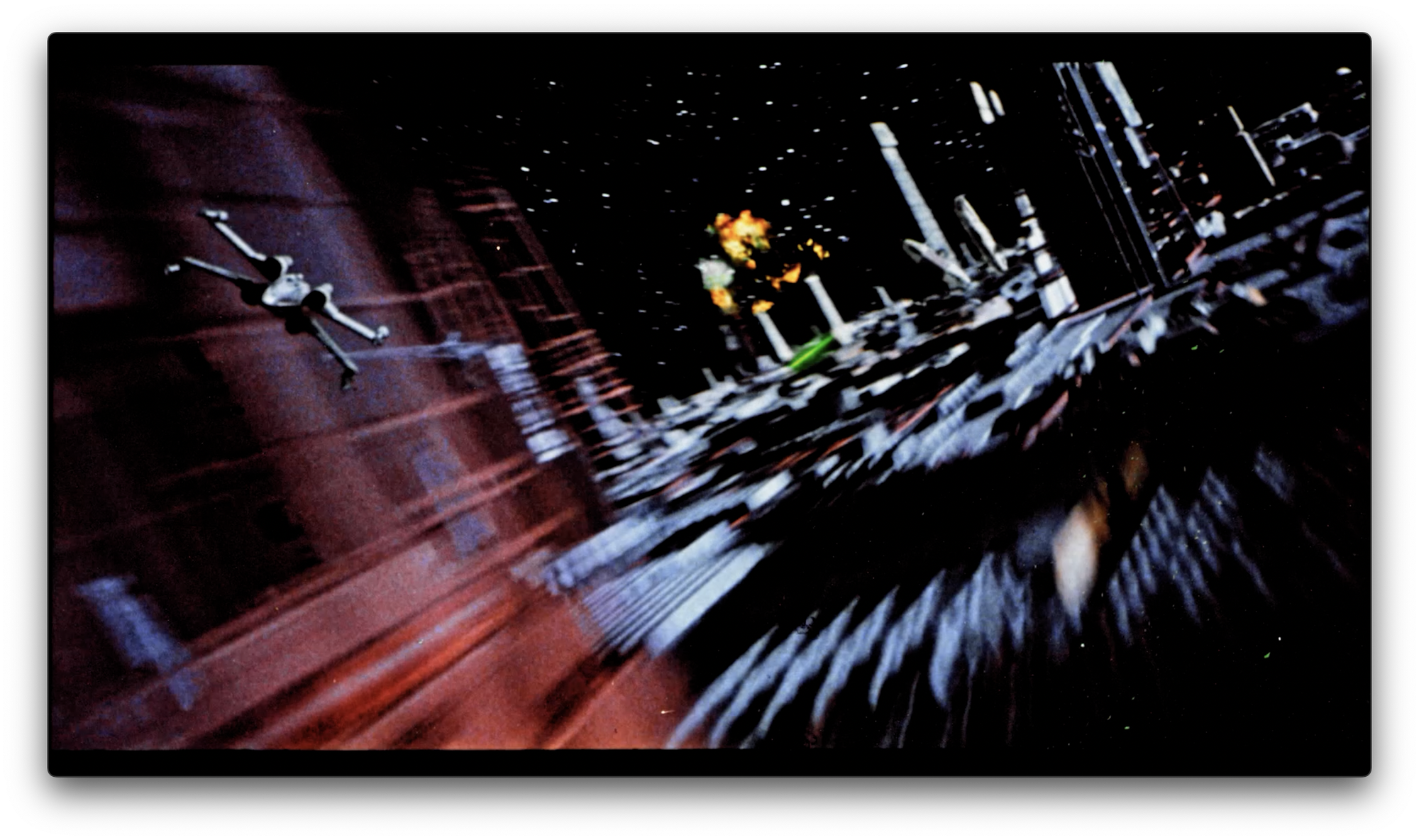
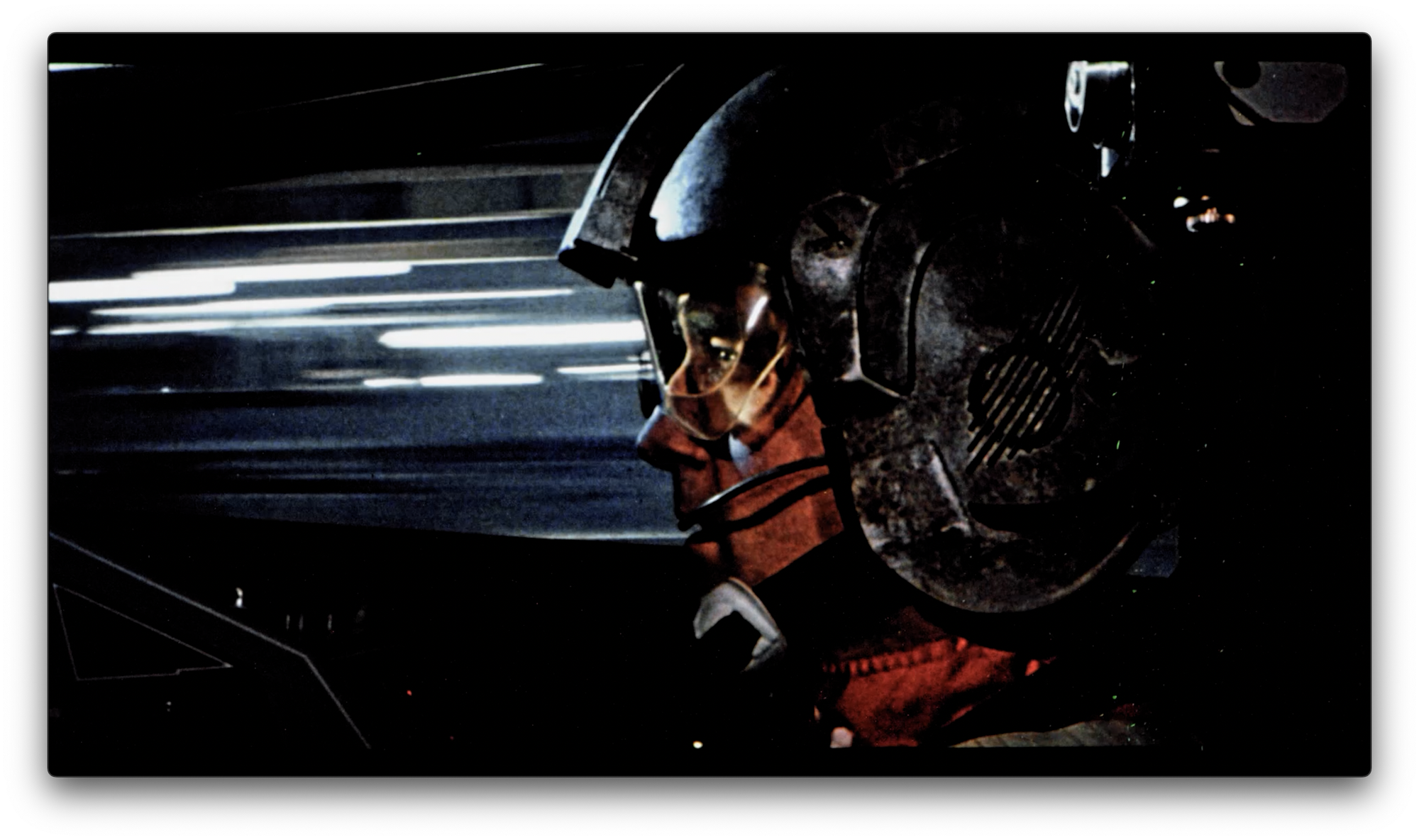
Just like a photograph, every frame of a film or video is exposed to light for a split second. The longer you expose an image, the more blur you see when objects move. While photographers generally avoid motion blur, in filmmaking, motion blur is a subtle detail that gives Hollywood films a certain feeling.
To that end, most cinematographers set their cameras to expose at half the frame rate; most movies are shot at 24 frames per second, with each image exposed at 1/48 of a second. The term "180-degree shutter" dates back to analog cameras, which had spinning wheels in front of their film gates.
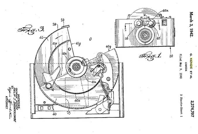
All of this stuff overwhelms beginners. If we set out to make cinematic video accessible to everyone, we had to do more than make manual settings friendlier. Kino should just handle these settings for you. You tap the record button, and an algorithm handles the 180-degree shutter. It automated cinematic motion, so we branded it... "AutoMotion."
I knocked out a simple version of AutoMotion in a few hours. It only worked when the user enabled that exposure-lock feature I talked about earlier because it was easiest to calculate these settings once, at the start of the recording, rather than updating it continuously. It didn't take long to realize the feature was awesome. Combined with Instant Grade, it produced videos that really did look like they came from a cinema camera.


AutoMotion (left) vs. without.
There were just two issues. First, AutoMotion can't work in bright daylight without attaching an ND filter in front of the lens. It's just a limitation of light and physics. Hey, if Kino is a smash hit, maybe Apple could address this with some sort of integrated ND filter in the iPhone 18? Until then, users will want to know if it's active or not, so they have a chance to fiddle with lighting. We solved that by turning the "auto” button green when you're good to go.
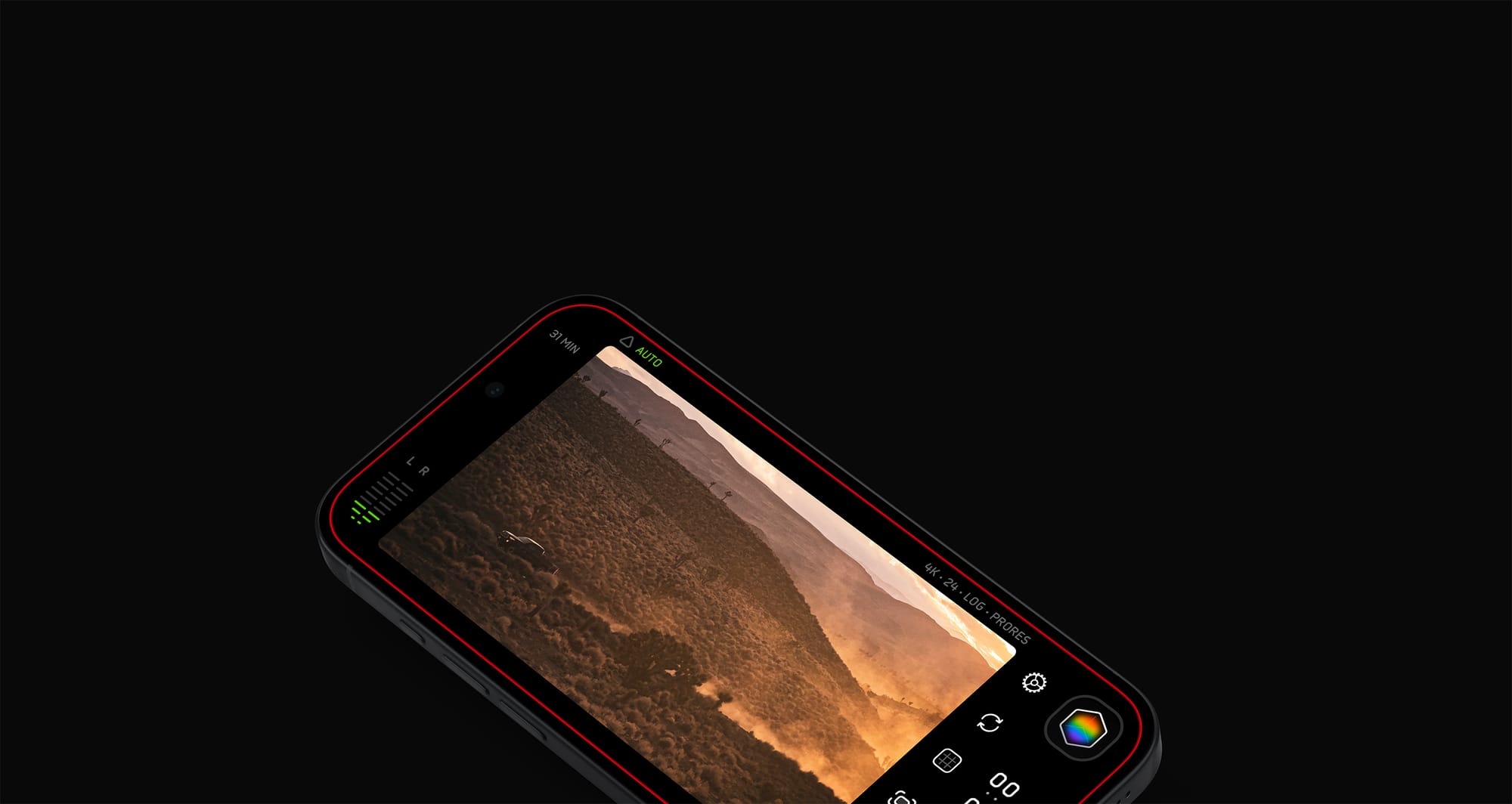
The second issue came from feedback from our early testers. They expected exposure to continue to adjust during recording. And— ugh — they were right. If we were to serve beginners, "AutoMotion" had to work out of the box without toggling any advanced features. So we made the difficult decision to derail the schedule a bit to get this working with continuous auto-exposure.
Onboarding Reset
We love to make the onboarding in our apps fun. We started with a little book in Halide that works as a manual, recalling old vintage camera manuals. In Orion, you unbox your ‘appliance’. We had big plans for Kino, but we were short on time and our plans to use a subcontractor had fallen through, which meant that we had to build it ourselves.
Scaling back our ambitions, we married our two past approaches: Kino would open up to a similar "manual" concept that we previously used in Halide and Orion. If we had time, we'd add a little unboxing.
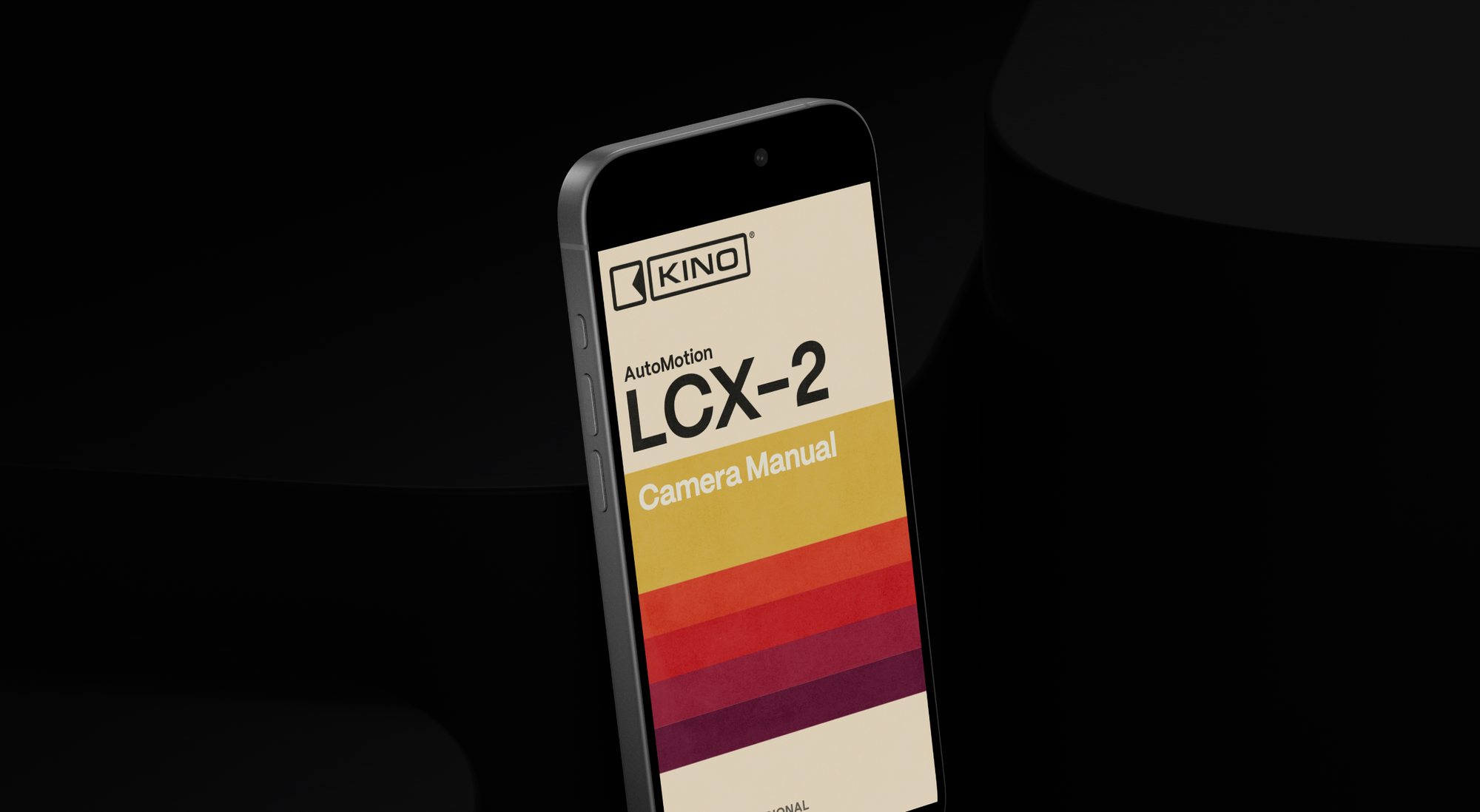
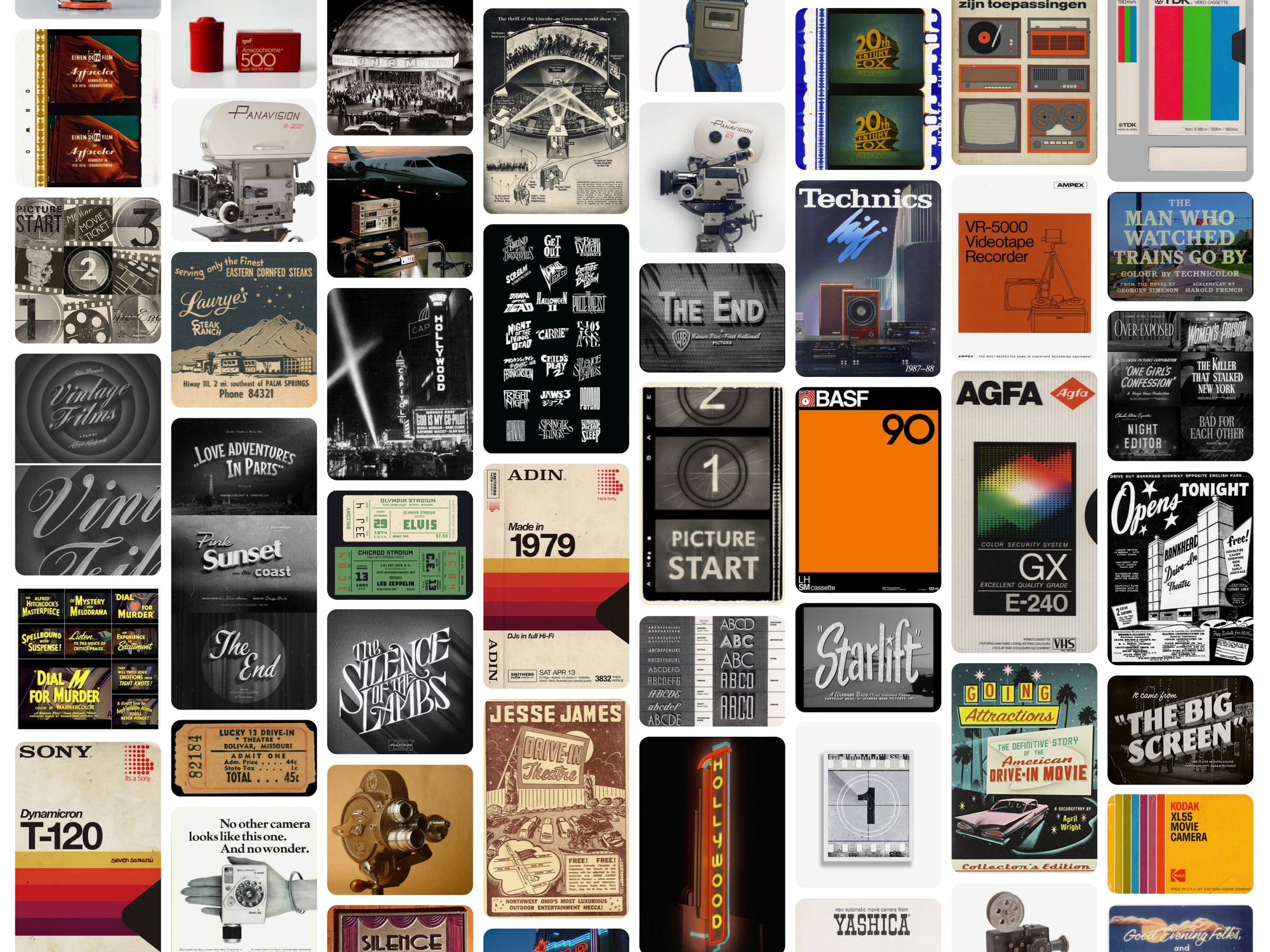
It was also time to nail our app's overall styling. We wanted something less ‘campy’ than Orion's over-the-top 80s-electronics theme. There would be no custom VCR display typefaces, but we did take inspiration from Sony’s vintage camcorders.
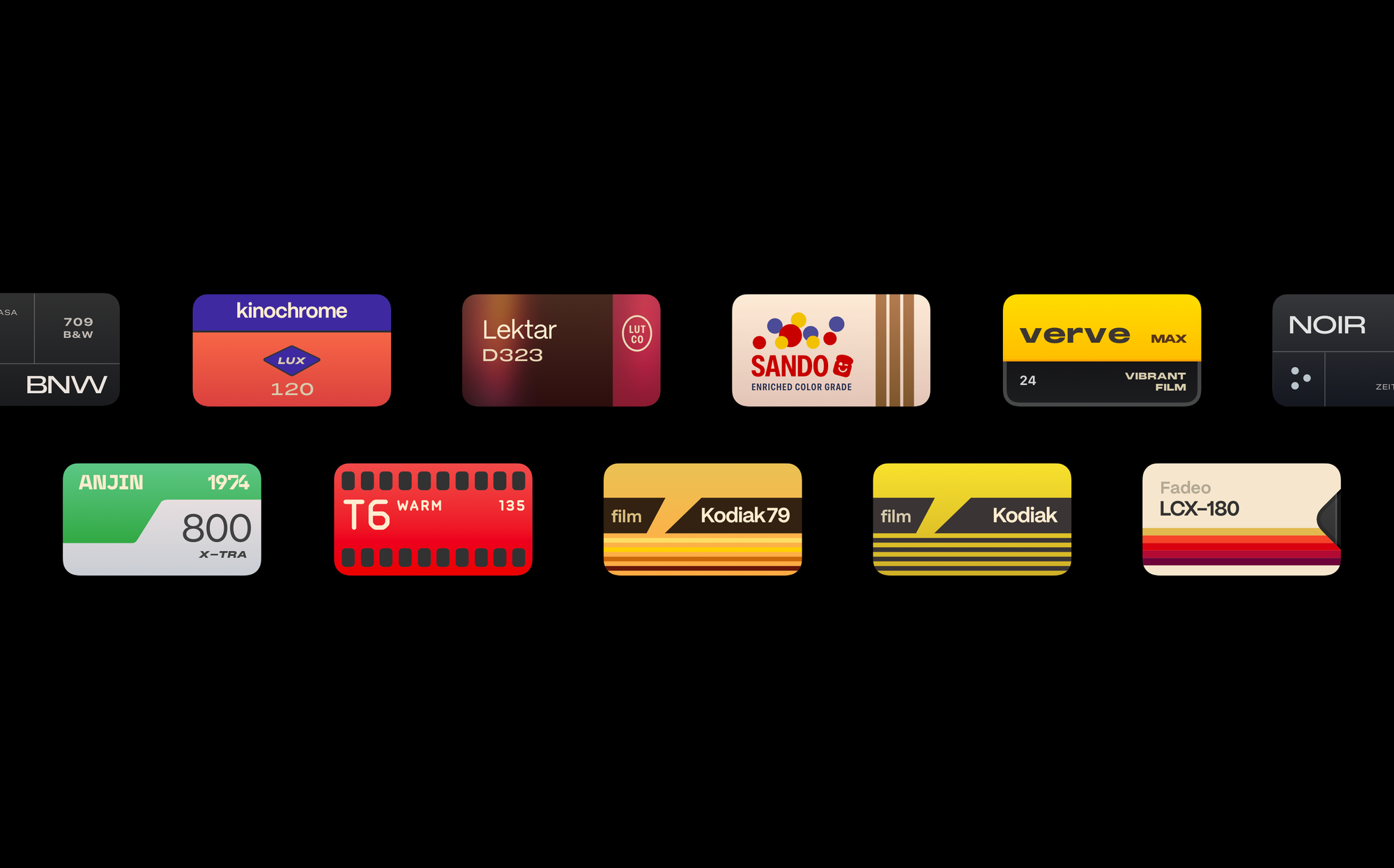
With Halide and Kino being siblings, we wanted stylistic consistency, but this time with more color. Sebastiaan initially conceived of our built-in presets having small, emoji-like icons or frame previews, though he settled on more film-like packaging.
Working with longtime collaborator and designer Jelmar Geertsma, we even created a set of retro-like feature graphics for some of the features of the app. We only ended up using these on the box you open to start the app, but that’s OK. They’re still really cool.
Jelmar’s work is also in other areas of the app — like in our very own family of typefaces we call Ambrotype, including a monospaced version that shines everywhere from the format settings to the timecode.
Death by a Thousand Configurations
Halide introduced us to the reality that everyone shoots differently, and video brings even more choices. For instance, Hollywood filmmakers usually shoot at 24 frames per second, while respected video creators like Marques Brownlee prefer 30 FPS. Rather than present every possible option, we started with a drop-down menu that let users pick from common presets:
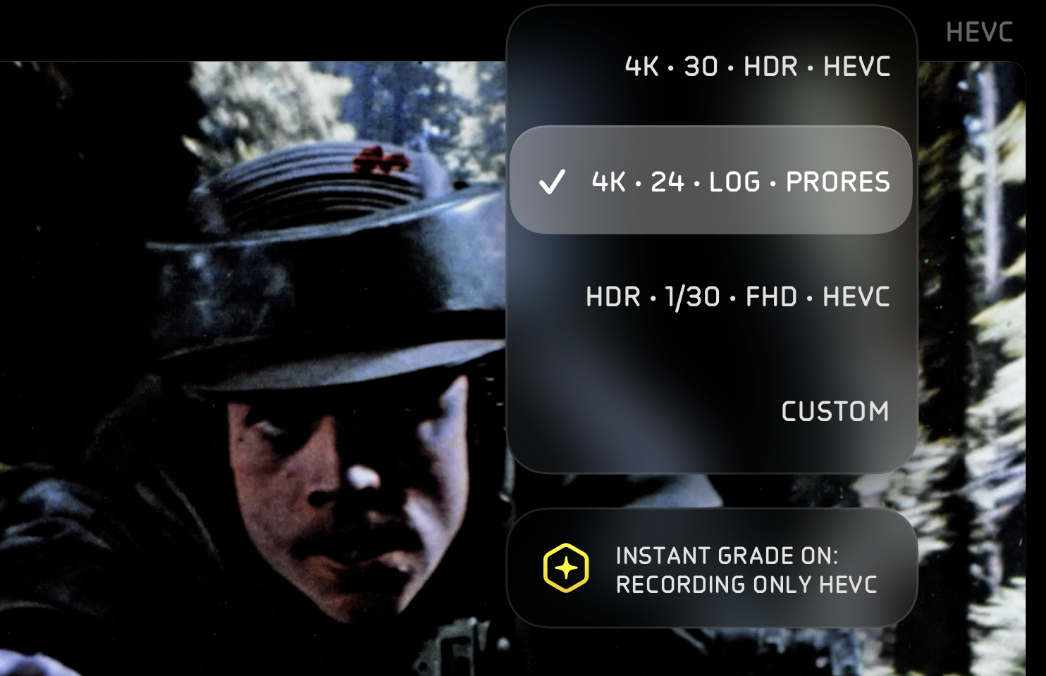
This was too limiting for pros, so if you needed more than that, we have a nice screen to build your own custom configuration:
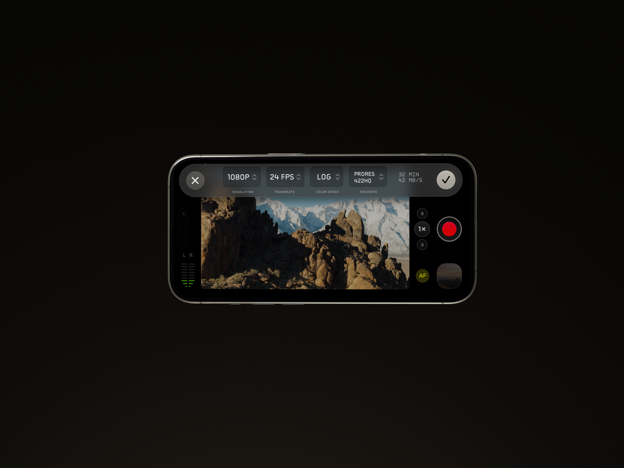
This felt perfect from a product perspective, but once you give users infinite control to customize settings, they are guaranteed to come across every weird bug in iOS.
For example, we discovered that on the iPhone 15 Pro it isn't possible to shoot:
1) Apple Log video;
2) at 60 FPS;
3) with stabilization enabled;
4) when shooting from the telephoto camera.
We can't explain why that one particular camera has the issue, but if the user configured things that way, the video stream shuts down. We called these "dead viewfinder" problems. We haven’t done the math on how many permutations there are for settings across all iPhones, but suffice to say there are a lot.
Despite how much we thought we knew about the iPhone's AV system, we spent a good chunk of January discovering weird edge cases and searching for workarounds.
February: The Schedule Changes
January's setbacks cost weeks of our schedule. Entering February, we knew exactly what to ship with Kino 1.0, but hitting our deadline would mean sacrificing quality. The app wouldn't be polished, and we felt uneasy about how few devices we had tested.
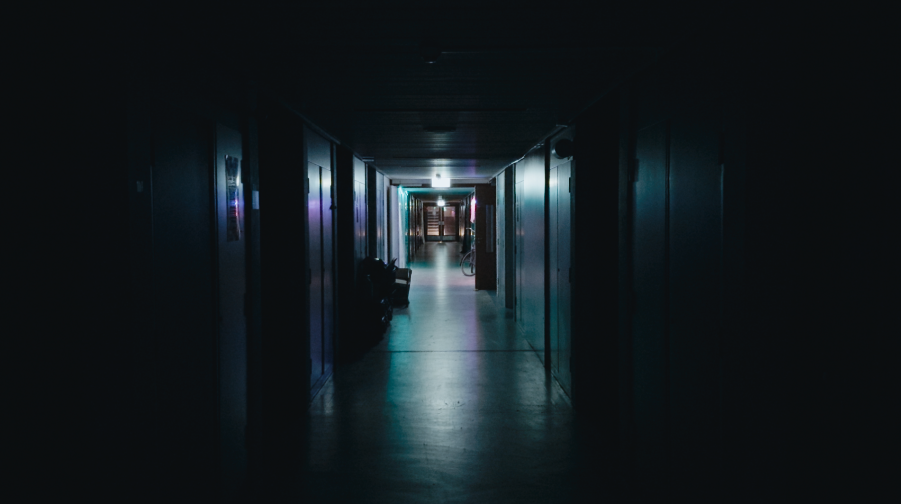
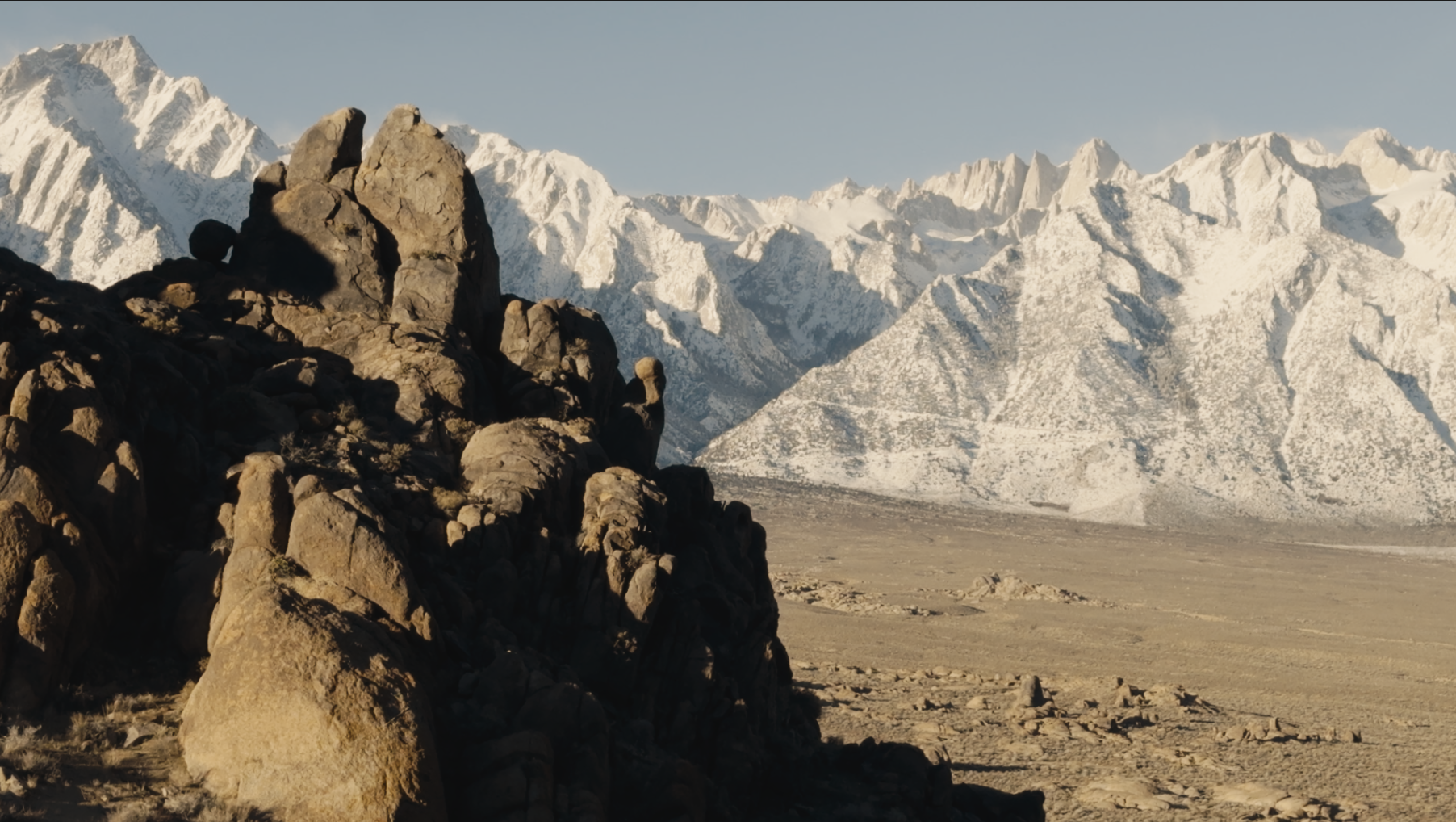
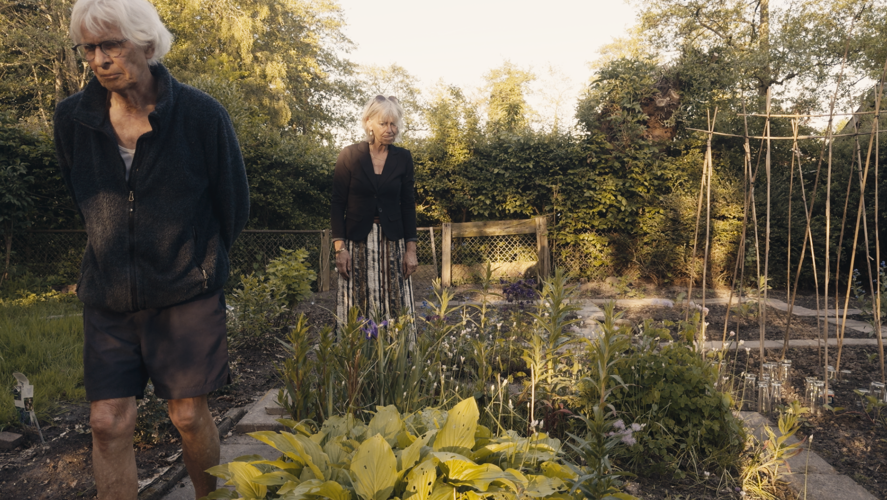
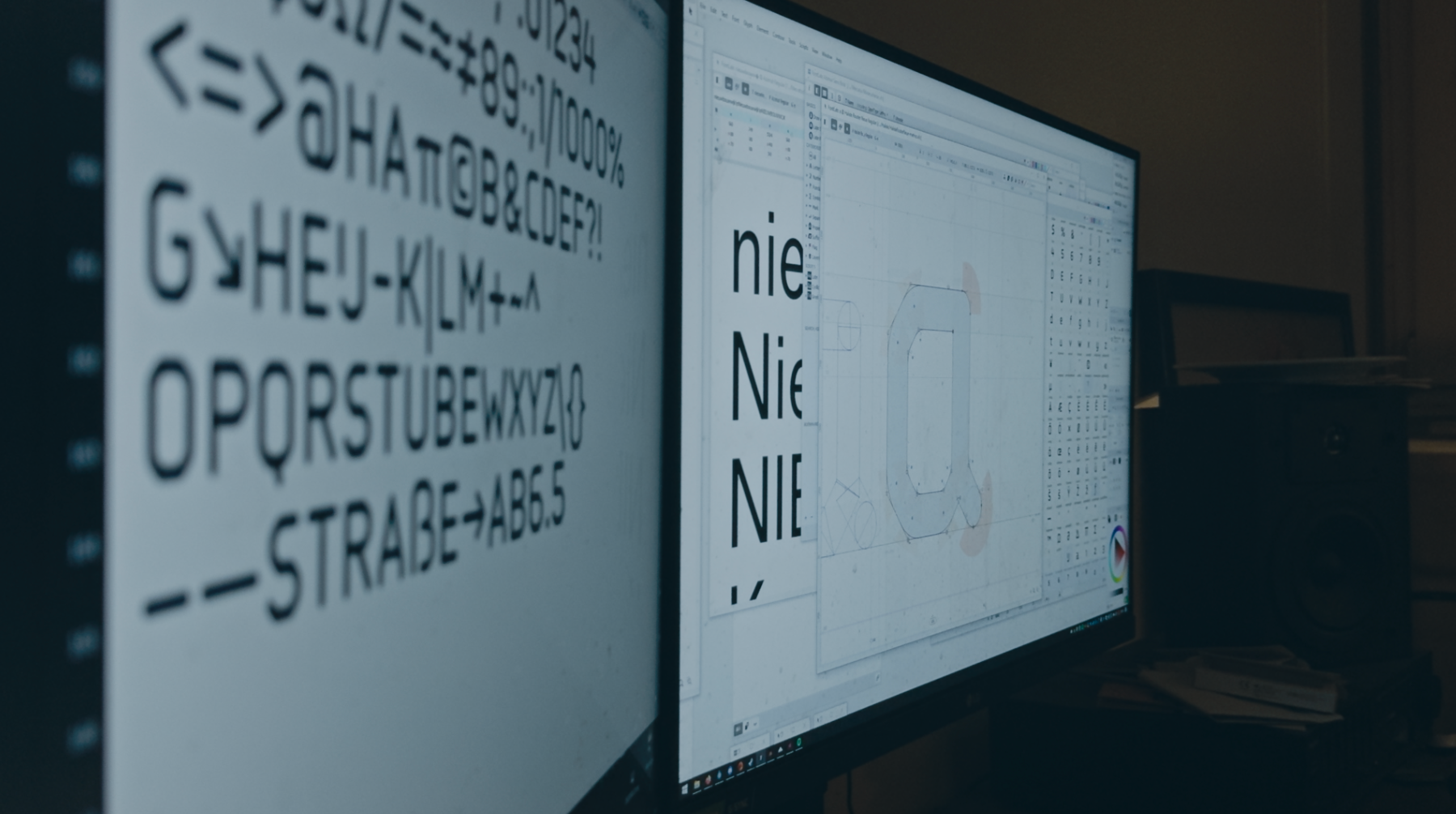
A visit to the Netherlands by Sebastiaan for design; more Instant Grade shots.
We considered limiting Kino only to the latest devices at launch, but as it turns out the App Store doesn't have a way to limit device support at a granular level. Apple wants iPhones to have a long life, so it makes sense they make it hard for developers to opt out of supporting older devices.
It was a tough pill to swallow, but we accepted that we weren't going to hit the 1.0 deadline that we announced. We kept our chin up and acknowledged that it happens to the best of teams. "A delayed game is eventually good, but a rushed game is forever bad."
Rather than throw out the deadline entirely, we changed the goalposts. We'd release a feature-complete beta version to a large group of testers. Over paternity leave, the team would collect bug reports and other feedback, so I could hit the ground running when I returned. We'd target the new launch date for the end of May, coinciding with the seven-year anniversary of Halide 1.0.
With the new schedule in place, we began compiling a beta tester list, preparing release notes, writing up known bugs, and… and… well, then life had other plans.
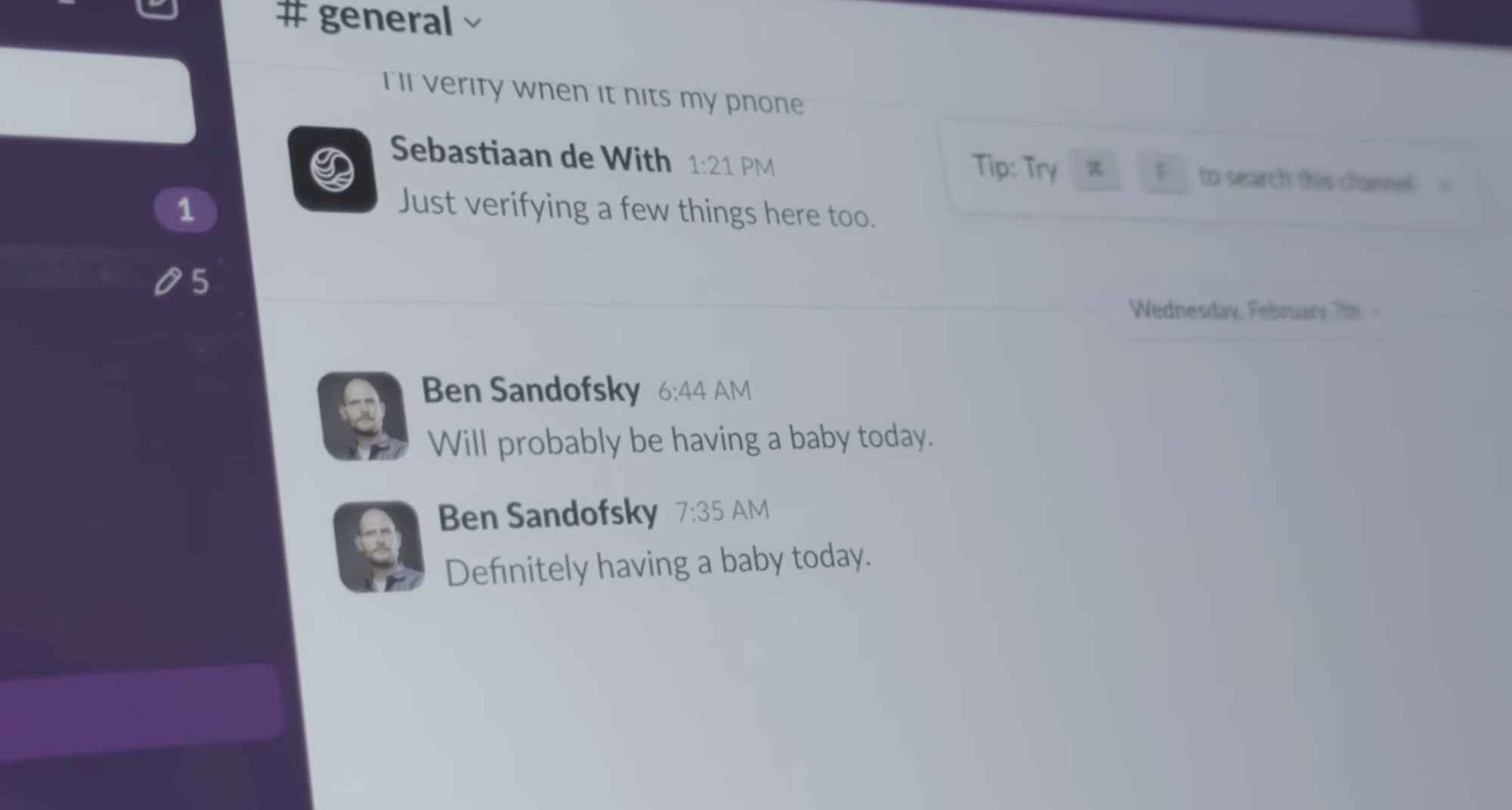
On February 7, 2024, our prenatal check-up discovered my wife had run out of amniotic fluid. That's bad. We ended up shipping our son, Ethan Marc Sandofsky, that day.
#ShotWithKino. There were no second-takes.
I'm off for a bit.
Spring 2024: The Final Stretch
I’ll take over here. Hey, it’s Sebastiaan! I am the other half of the team building things. While I can’t code (much), we luckily entered Ben’s paternity leave with Kino solid enough for a beta release without his involvement.
While a deadline slipping is always a bad situation, it was also an opportunity for us to seize on extra time to build out our product more. While we’d gather feedback, index our weak spots and find bugs, I was going to work hard on the most important part of the app: helping people get great-looking shots.
I like to say that there are two ways to help people get a better picture. You can create a shiny button — whether that is a preset, filter, effect, algorithm, or something else — to make an image look beautiful. This helps a lot: it can make otherwise unimpressive shots look great, is super approachable, and often simple. The problem, possibly, can be that everyone gets similar results.
The second way, which is far more difficult, isn’t to make the image nicer looking. Instead of offering a button, offer teachings. Make the user better at photo- or videography. It’s far more difficult, but also more satisfying for users, and allows anyone to discover their own style.
Ideally, Kino would cover both of these. But it meant a lot of extra work — extra work I now had some time for...
In Grade Company
Video is far more complicated than photography, and Apple Log allowed for beautiful results that were far from homogenous with the color-grade presets I made for Kino. That being said, I mostly edit photos — video color work wasn’t my expertise.
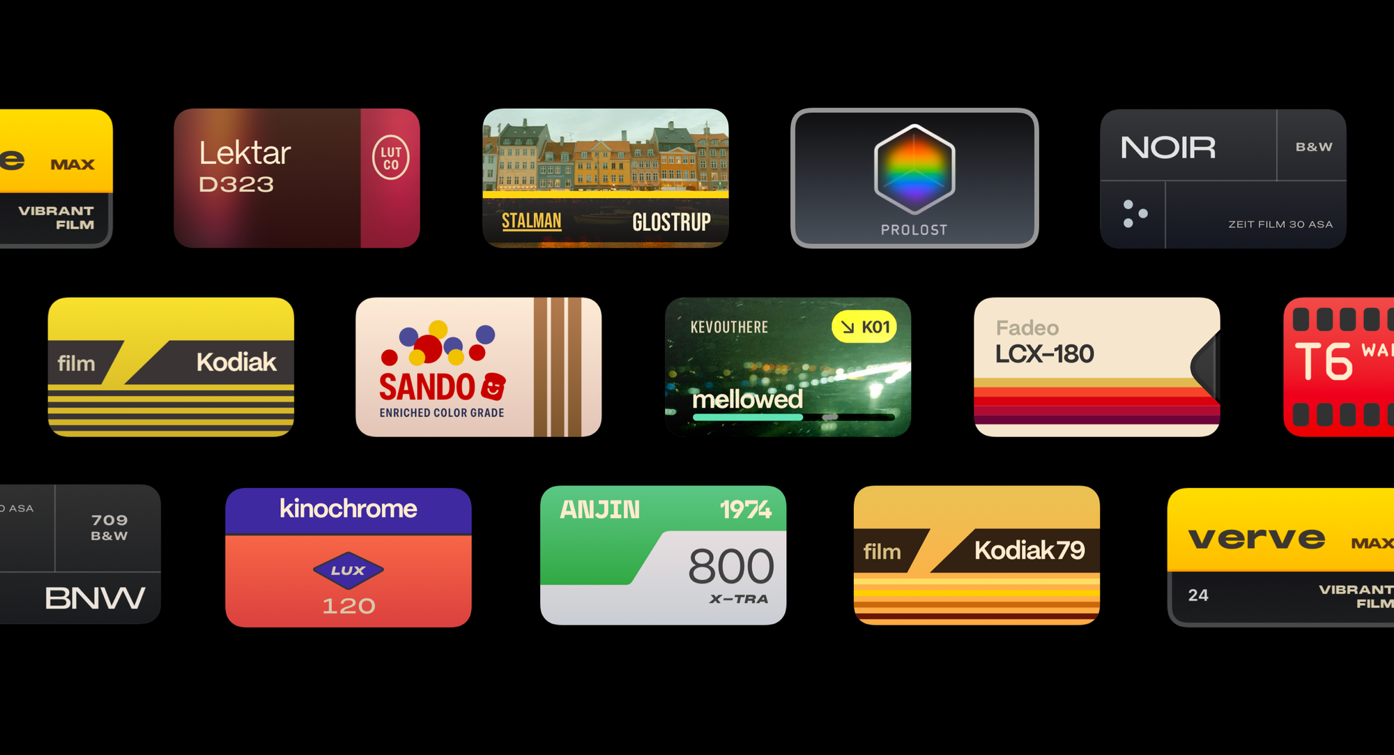
I decided to reach out to the people I admired the most in the field. Some were longtime friends, like Adam Lisagor. An incredibly kind man with an inimitable studio Sandwich Video, he was eager to help — bless him. Other, newer friends like Tyler Stalman, whose presets and videos I absolutely loved also got on board with enthusiasm.
Stu Maschwitz was a new acquaintance, introduced to me when we went to ask pros in our network — a fantastic, gentle, patient and hyper-talented guy who helped me a lot during my process, to the point of sitting down with me in his studio to talk about color, workflow and pipelines. I returned the favor by personally implementing his suggestions.
Then there were people I wasn’t that close with. I had never chatted with Kevin Ong or Evan Schneider, but after I explained our vision for Kino they too were interested in working with us. Evan ended up providing me with tons of helpful feedback — he is a fantastically skilled colorist and creative, and was generous with his time to help me become wiser about the craft and to help Kino be as great as it could be.
Then there were the teachings.
Teachings, to me, don’t mean dropping a textbook or floating tips in the app.
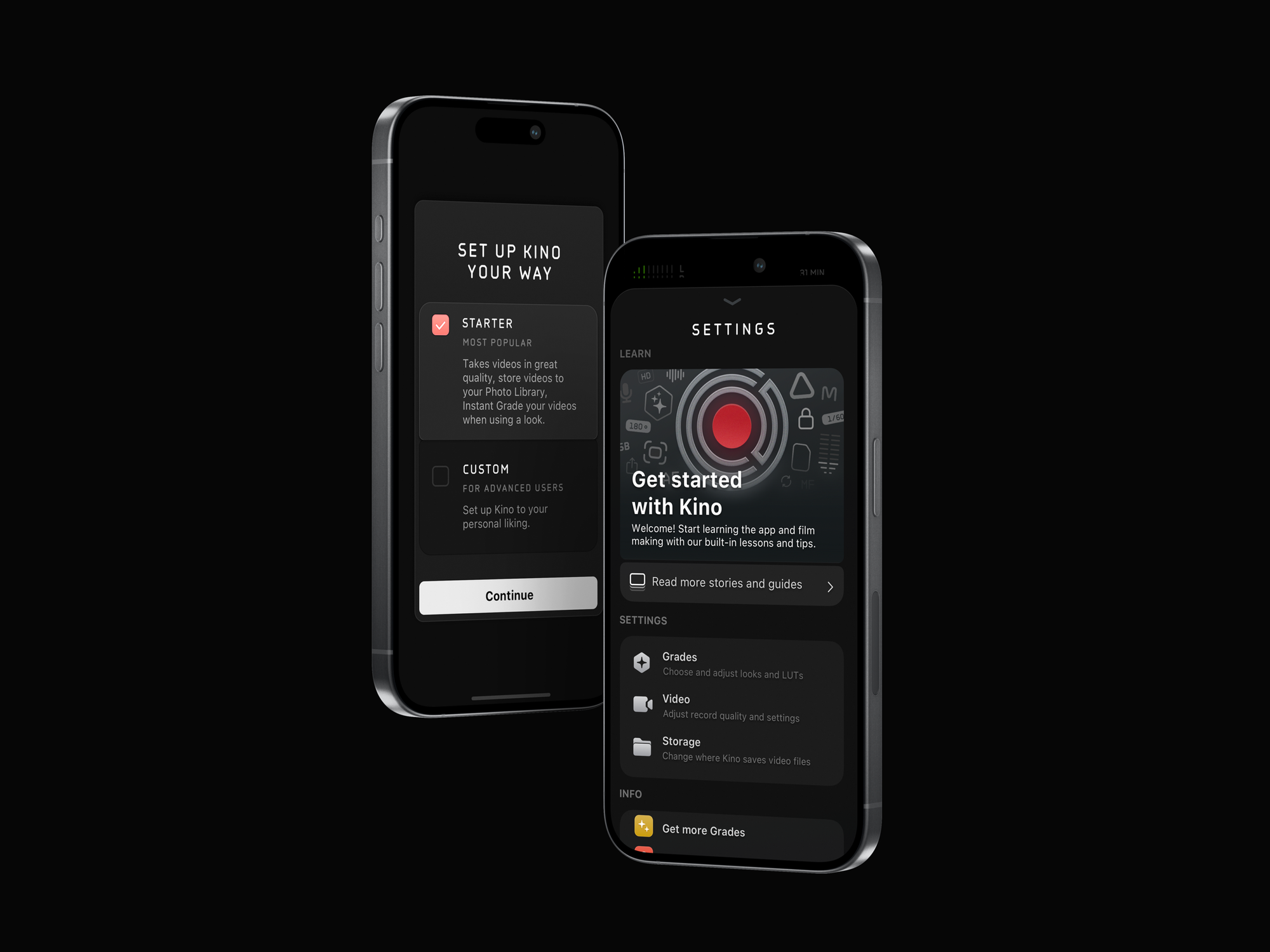
The best software interfaces are obvious, and empowering in their intuitiveness.
Not all concepts can be intuitive from the start, but if you think about it, there’s a name for a simple, pared-down interface or example of a complex problem: it’s a lesson. Whether it’s a scenario of two trains meeting in math class, or a simpler interface to camera exposure that shows you how the image changes as you swipe a slider, they both help you get acquainted with the fundamentals of something by absorbing the underlying concepts. It does that by only giving you a little bit at a time in an understandable way. If you remove complexity, what remains is more clear, and less overwhelming.
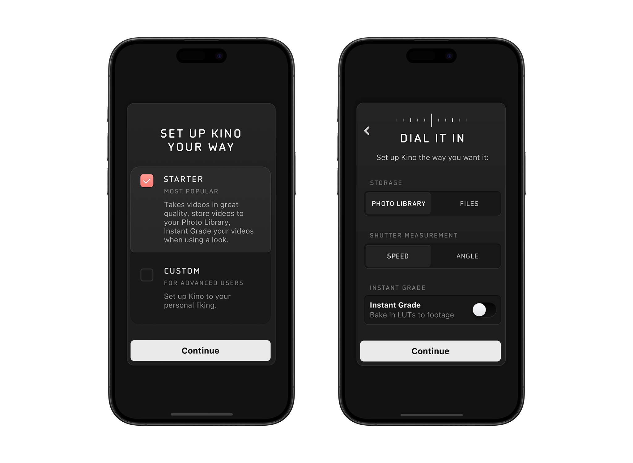
I worked tirelessly on re-doing our onboarding, thinking of ways we could help people get started, and sketching out a set of online resources that users could immediately dig into. Covering frequently asked questions, but also writing a detailed manual for those who wanted to go deep.
For my last coup, I would exceed what we’d done before: I would film some tutorial videos to help people get started.
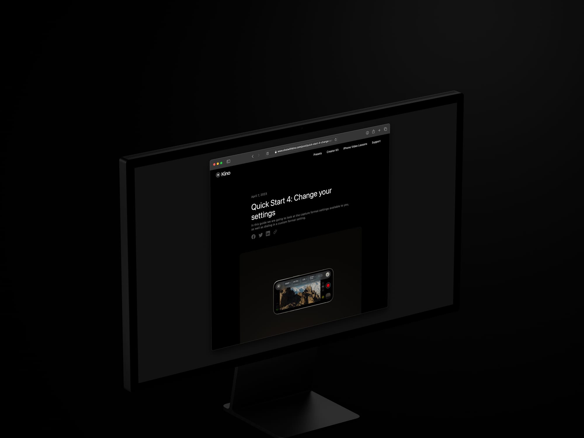
I am incredibly proud with how much of this we managed to get done, but my inexperience with video led me to one major realization: video is hard, and takes a ton of time. I managed to get great color grades in from myself and my dear new and old friends, and designed our best website yet with the most resources at launch, but tutorial videos didn’t fit into the crunch time.
In early March, Ben's mother-in-law visited for a few weeks to help ease his workload at home, giving him a chance to check in and survey the major bugs. It helped ease the transition into…
April to May: the Home Stretch
Hey! It's Ben, and I'm back, (with a) baby!
As planned, I returned to work in April, hitting the ground running. Most bugs discovered in our wide beta test were fairly mundane, but it still felt like the right call setting the launch in May, rather than pushing to make April.
As we fixed bugs, tested older devices, and tied up loose ends, Sebastiaan worked on the final version of ShotWithKino.com. Our friend Adam at Sandwich helped us with the final, authoritative test of Kino: using it on a real production.
The experience was wonderful, messy, and genuine. When the crew ran into issues, we quickly fixed them and turned around a new build. It was a great way to harden Kino for its 1.0 release. There was only one remaining item on the to-do list: charging money.
I doubt anyone who makes products enjoys the part where you ask for money, and it's even worse with App Stores, where people do not like paying for apps. It's no wonder that the two dominant business models are advertising and freemium.
When we launched Halide in 2017, folks found it a breath of fresh air that we just charged up-front for our product in an era when subscriptions and in-app purchases were becoming the norm.
When we launched Halide Mark II in 2020, conventional wisdom said that the pay-up-front business model was dead. We decided to change things up by offering a low-cost subscription in addition to a pay-once option. Subscriptions were a huge win: let us offer free trials, Apple takes a smaller portion of sales, and predictable, recurring revenue made our business healthier and more sustainable.
We considered following Halide's business model, but building a great “paywall” takes time. And honestly, we just didn't feel up for a wave a negative reviews at launch.
Ever since Halide began offering subscriptions, we started receiving a steady trickle of negative reviews. People see that the app is free to download, and get upset to find out we charge money; adding all-caps text at the top of our listing warning people that Halide costs money did not help. On top of this, some people leave negative reviews for any apps that offer subscriptions at all, even though we continue to have a pay-once option. We have thick skin so it isn't the end of the world, because this stuff gets exhausting.
If people claim they'll support non-subscription products, and they're happy to pay for products upfront, let's give it a go and see what happens. We decided to make Kino pay upfront at launch.
The Launch
On May 29, 2024, we released Kino into the world, to overwhelmingly positive reviews. It shot to the #1 top-paid app, where it remained for three days.
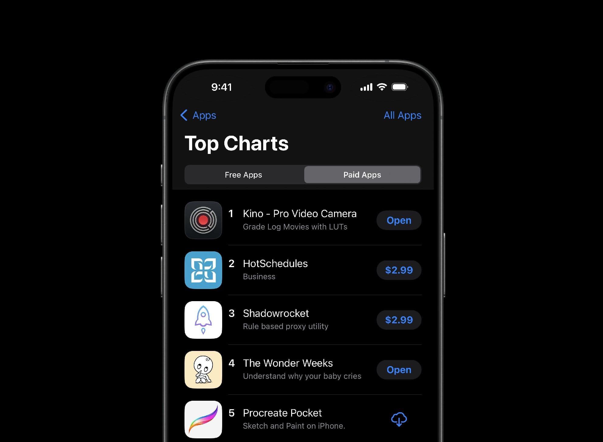
As for revenue, Kino made 25% more than Halide 1.0's launch, after adjusting for inflation. Sales significantly decayed after a week, but if there's anything I've learned since launching Halide 1.0, it's that the story never ends with the launch. It's the end of the story's first act.
The hard part comes next, as you're inundated with bug reports and feature requests, and you ask yourself "What did I get myself into?”
Despite the 100 beta testers leading up to the launch, the larger audience introduced a slew of new bug reports. Most trouble came from users on older phones, usually when recording at 60 frames per second. Other bugs were simply random, like the image stabilization system causing trouble with our AutoMotion algorithm.
Luckily, WWDC arrived a few weeks later, and I showed up to Cupertino with a long list of questions in hand for Apple's AV engineers.
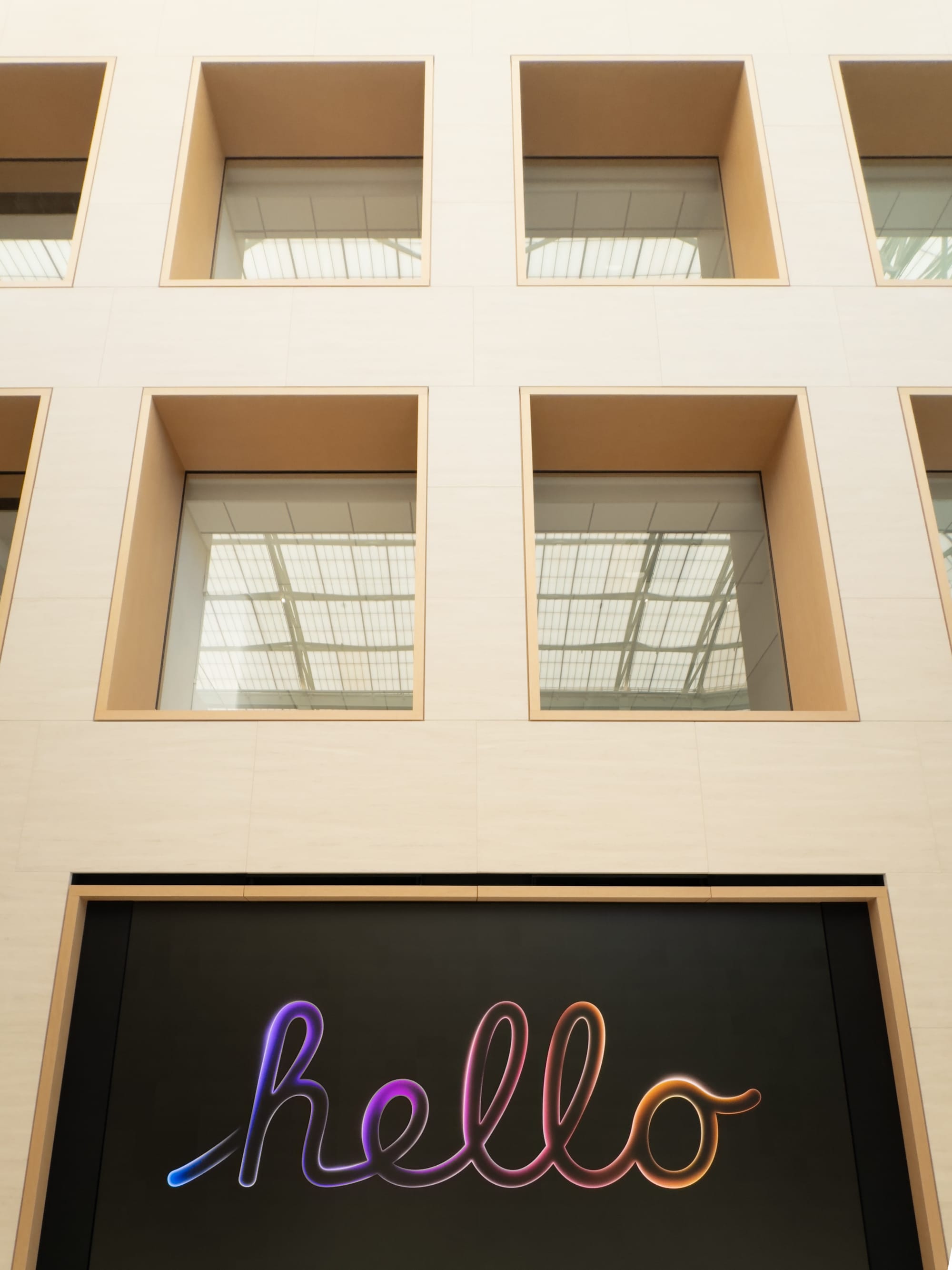
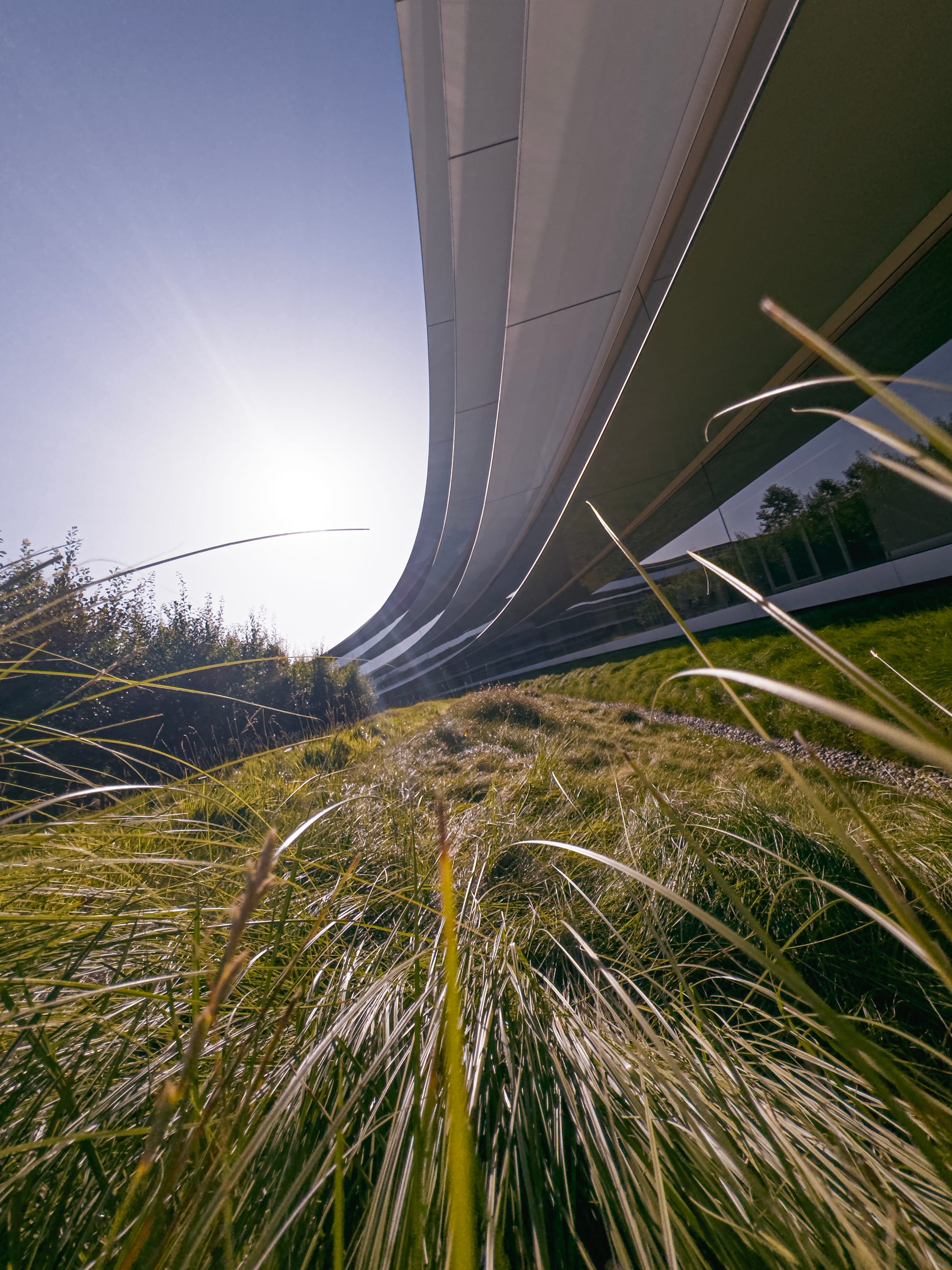
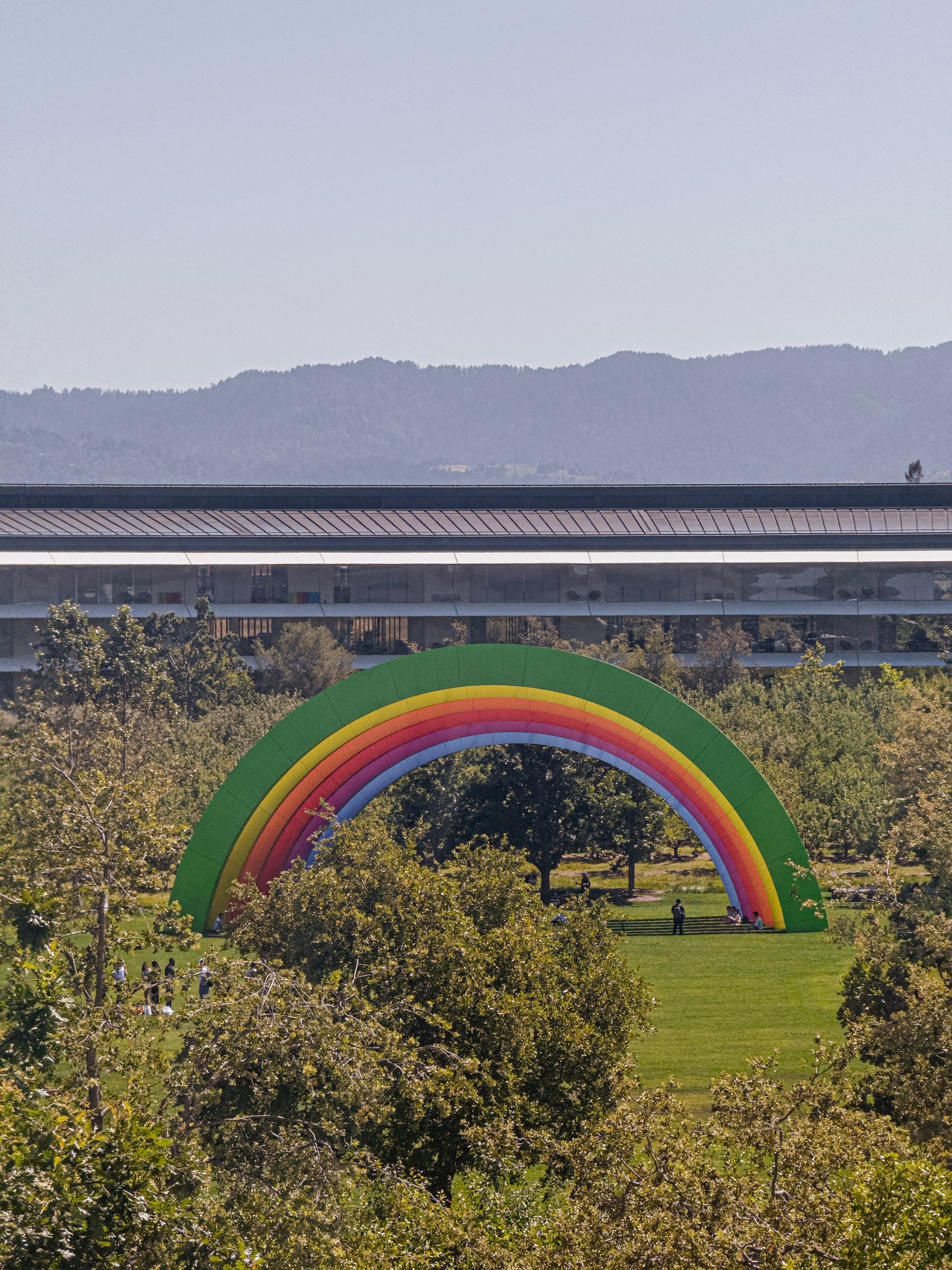
Halide shots from WWDC24
It took a month to squash these major bugs, getting Kino in a stable post-launch state. Then we shifted our attention toward feature requests, which we launched last week.
Kino 1.1: The First Big Update
Following our goal of serving both casual and high-end user needs, we shipped features for each group.
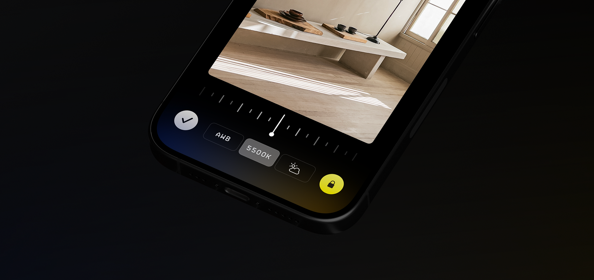
For the Pros: Manual White Balance
Our high-end users asked for extensive control over white balance. Much more so than Halide, where we simply let users pick from several presets — which we do because RAW images allow for full white balance control during editing anyway.
When shooting video, you might want to dial in a specific white balance that's consistent with multiple cameras, or you want to ensure that every shot in a series has the same settings. Whatever your reason, Kino supports both white balance presets, and manual configurations through our beautiful, tactile picker.
Tap to Focus
When researching Kino's UI, we noticed people are ultra-careful to not touch their screens during recording. After all, one errant tap could cause a sudden change in focus, ruining a shop. We made the conscious decision to launch Kino without the "tap to expose" or "tap to focus" that you see in Apple's camera app.
While professionals are comfortable fiddling with a focus dial, it turns out everyone else expects the camera on their phone to support tap to focus. Even professionals prefer to tap to focus at times. So we went ahead and added a tap to focus, but with an option to disable it.
Better Both Ways
Remember Sebastiaan’s talk about buttons and teachings?
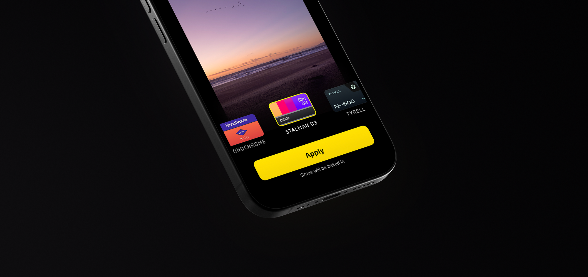
Well, we worked on a lot more of both. We added three new Grade presets, and a short tutorial for beginners that pops up the first time you open the app.
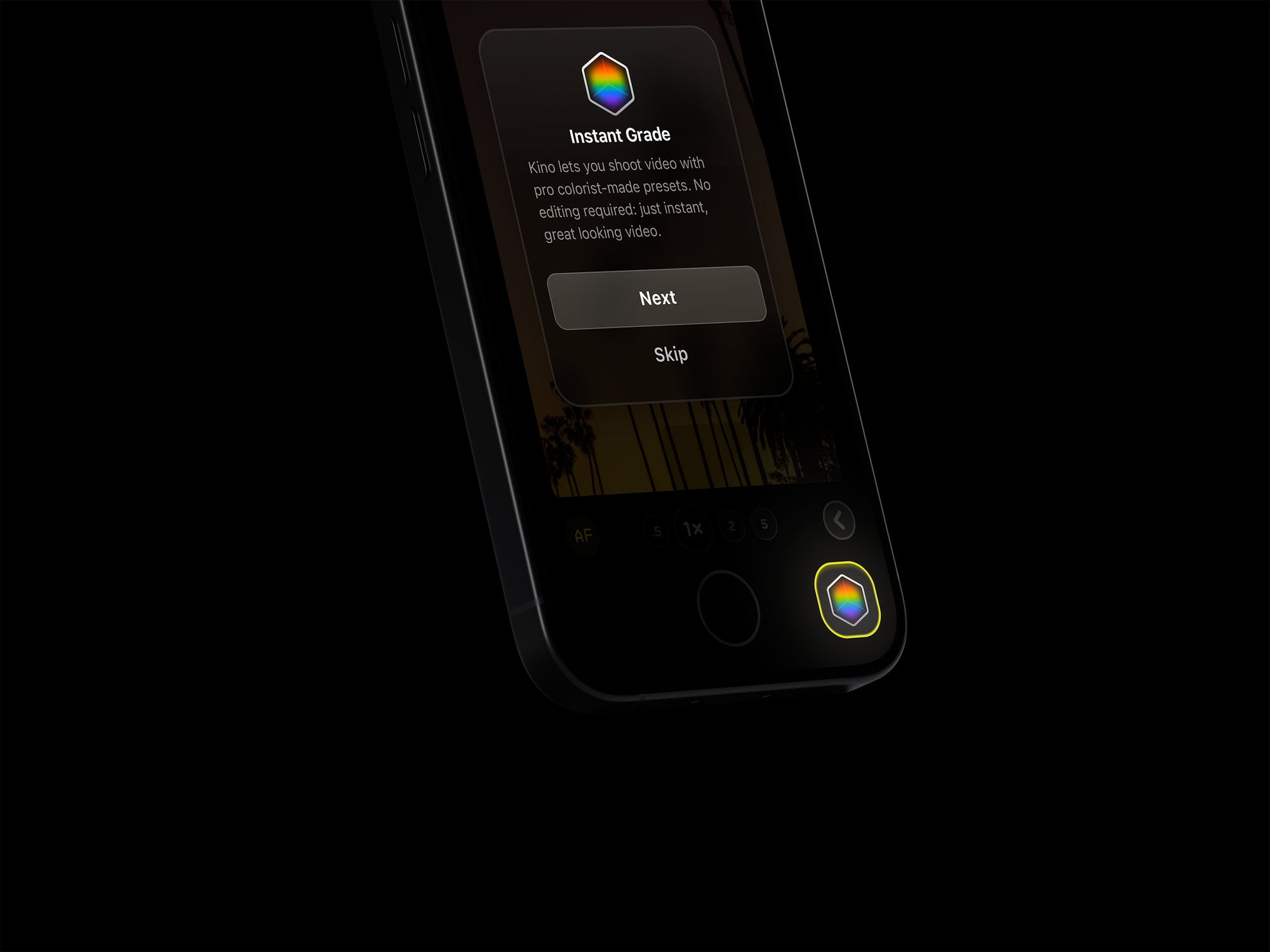
Sebastiaan also made a comprehensive tutorial video. Check out our Quick Start guide! More to come.
Finally, we changed the default setup when you first launch the app. Previously, we things to mimic Apple's own camera app, for the sake of consistency. In retrospect, we should configure it in a way that stands out from Apple's camera. To that end, we now default Kino to shooting Apple Log with a beautiful grade applied.
Revisiting Price
Kino's revenue is off to a great start, but nowhere near the level of Halide. That's to be expected, as it took several major releases for Halide to hit its stride.
That being said, we're going to experiment with its price. Kino is normally $20, but we launched at $10. To celebrate our 1.1 launch, we're running one more 50% off sale. With those data points, we're going to play around with prices until we find the sweet spot. That might end up being $15, or it might be $60. After that, maybe we'll be ready to assess the state of pay-up-front apps in 2024.
Final Thoughts on Kino 1.0
We set out to build Kino in four months, and while we're proud we launched that beta, we did not hit that deadline. I do think we could have hit it if we hadn't struggled with quirks in Apple's AV platform, managed to delegate more things like onboarding, and didn't ship AutoMotion in our 1.0.
However, every project has surprises, and sometimes products are way better off by letting things gestate a bit longer. There will always be things out of your control, no matter how many resources you throw at a problem. "Nine women can't make a baby in one month.”, as they say.
#ShotWithKino
It's still the early days, but we're bullish on Kino's potential. There’s undoubtedly a lot of work ahead, but we're going to take a break from Kino to focus on… Halide!
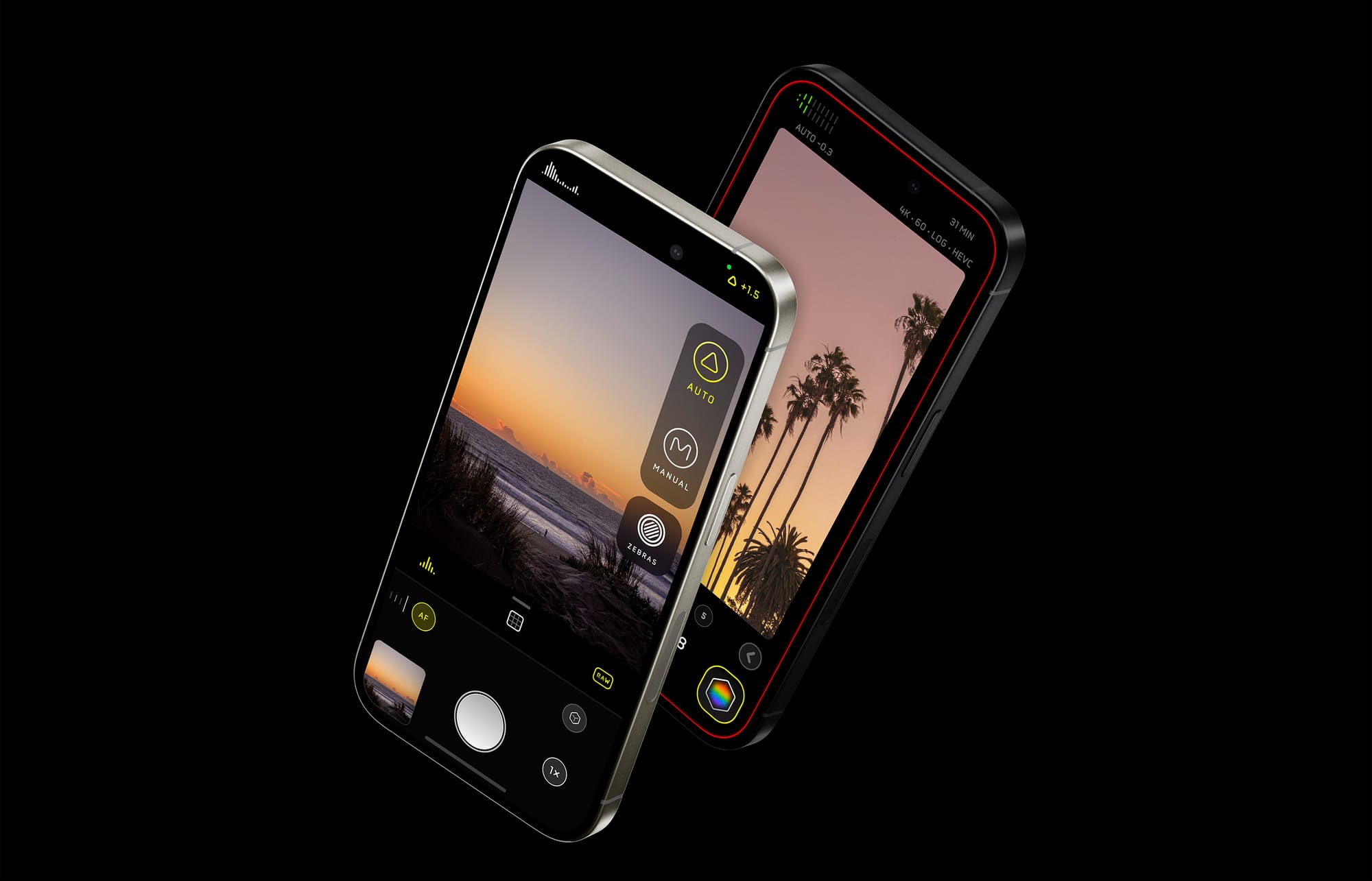
We're ecstatic about Halide’s future thanks to the lessons we learned these last six months. Kino yielded new technology we can bring over to Halide, from our fresh image processing pipeline to our improved SwiftUI chops.
Just as valuable was the fresh perspective. As I mentioned at the start, we're now in the home stretch of a huge new feature in Halide, but we're picking up where we left off with a fresh set of eyes. Can the next stage of Halide strike a similar balance between novice and professional?
It's tempting to tell you more, but Kino reaffirmed our decision to err on the side of surprise. We'll talk plenty about the product when it's done. If there's anything we've learned in the last year, it's that you never know what’s ahead.


