After eighteen months of work, today we’re excited to announce a new photography app. It takes everything we’ve learned since launching the acclaimed manual photography app, Halide, and combines it with the technology developed for Spectre, Apple’s 2019’s iPhone App of the Year.
We call this new app Halide Mark II.
Mark II is more than an update: it’s a new camera. An elegant, intuitive camera casual photographers can enjoy, while providing the most advanced features expert photographers demand.
We have a lot to talk about — so much we can’t fit it all in one post — so today we’ll highlight the things that most excite us.
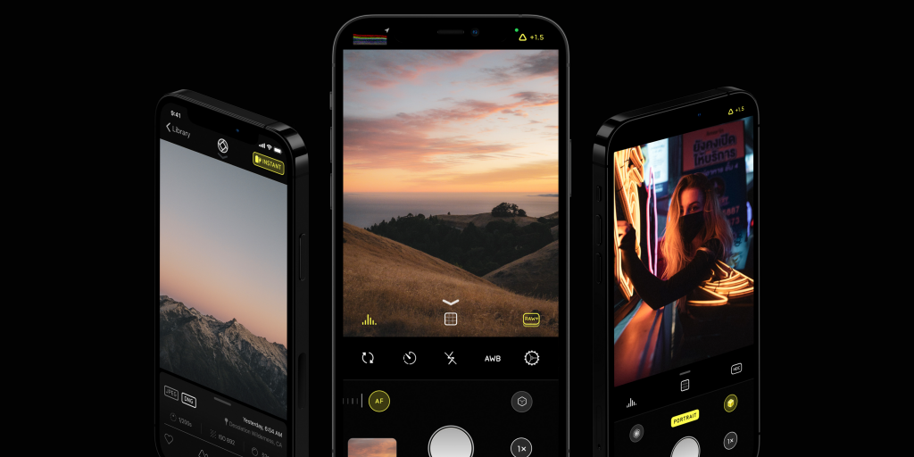
Next Generation Design
In 2016, we set out to build a camera that is both approachable to beginners and intuitive to experts. Three years in, we knew it was time to take things to the next level.
We approached this as a bottom-up redesign. We set out retain all of our strengths, while improving every single aspect of how the app looked and felt. We looked through every screen — every pixel — from the fresh perspective only possible with years of real-world use.
The result? At first glance, Halide Mark II looks as simple as the built-in camera…
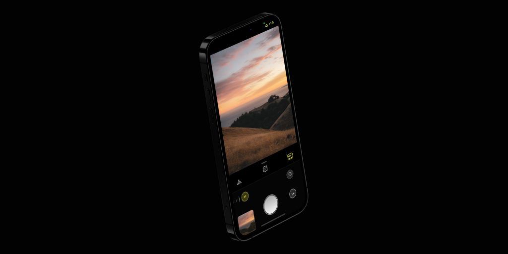
But looks can be deceiving. Tap the “AF” button to disable auto-focus, and watch the UI transform to support manual focus, with focus aiding tools.

There’s a theme that runs throughout the interface: “Stay out of the way.” For example, when you begin dragging the focus dial, our new Focus Loupeactivates. When you release your finger, it deactivates. We call this Intelligent Activation.
You’ll notice something else: as you tap to toggle any of the icons in the focus dial, Halide will briefly describe your action:
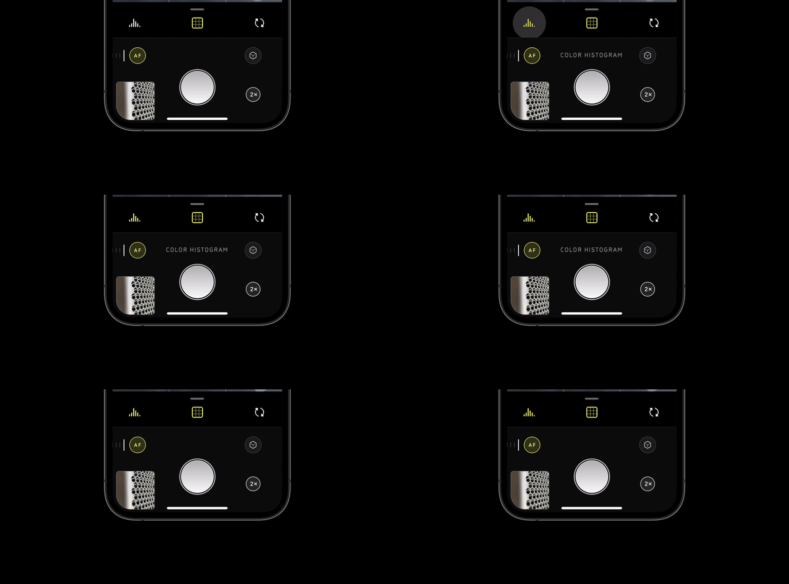
Not only does this confirm your action, it also helps new photographers learn the names and purpose of these features. We want Halide to be a powerful tool to not just take photos, but learn more about photography. We’ll talk more about that later.
As form follows function, technical advancements freed us to further simplify our interface. Consider our manual-exposure toggle. In Halide 1 we put that button front-and-center because, at the time, we frequently switched to manual controls to deal with noise. At the time, it made sense to have that control within thumb reach.
A few years later, we tackled that noise problem head-on by developing our own auto exposure algorithm. Now we find ourselves reaching for the manual exposure toggle less often, so we’ve freed up that prime “thumb reach” zone for other controls. It feels really nice.
If you still need to switch to manual a lot, have no fear! Simply swipe left from the edge of the screen — or tap the ‘Auto’ icon in the top right ‘ear’ of your iPhone — to reveal the new mode switcher.
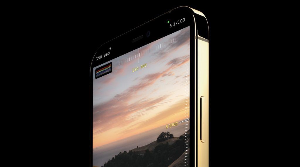
All of this is typeset in a beautiful, all-new typeface. It’s one of three completely custom typefaces in Mark II designed from scratch to resemble the aesthetic of the etched text on film cameras, with a modern twist. We call this family of typefaces Ambrotype, consisting of a new regular, bold and monospaced variant.
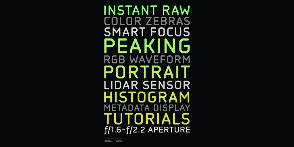
Its weights and design language were harmonized from the get-go with our in-app iconography and the styling of modern iPhones.
We embrace using every pixel of the iPhone screen, and that goes for the latest iPhones too.

The new OLED displays of the iPhone 12 curve up right to the edge, and so does our interface: you will notice the space next to the ‘notch’ is used for our histogram or new waveform; we show if you have location tagging enabled with a small icon up in a wee corner of the display, and even your last shot sits tucked into the bottom left, with its shape adjusted for the curvature of your particular iPhone’s screen corner.
That lets you see more of your last shot, and enjoy every bit of screen real estate you have. It also frees up more space for what matters: the photo you are framing.
But not everything is about chasing the latest and greatest: The new interface of Mark II was an opportunity to rethink everything, and nowhere is this clearer than on iPhones with home buttons, like the iPhone SE 2.
When the iPhone X launched, we redesigned Halide to cope with its new, taller screen. Now, we’re bringing that reachability to every phone: All controls fall within easy thumb reach.
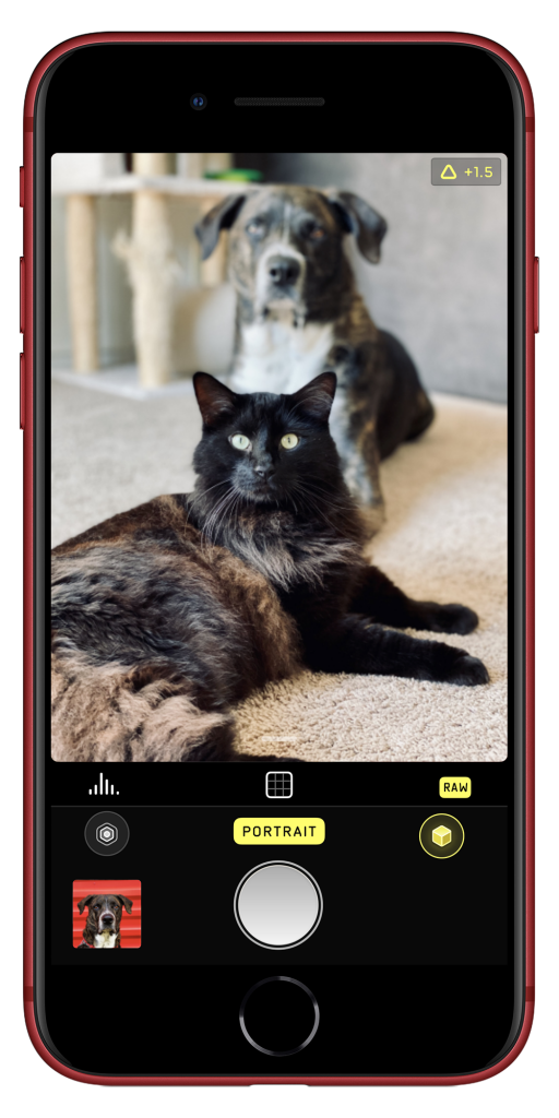
The Halide photo reviewer has also been redesigned and gained many features. You’ll notice it gives you more information at a glance, but you can now also dig in to surface relevant metadata about your photos.
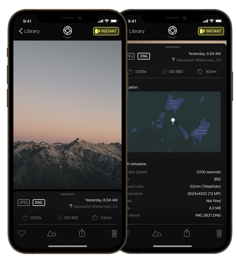
There’s also a new, powerful feature in there, and we have some big plans for our new reviewer in the future.
But first, let’s talk about one of the biggest new features in Halide Mark II:
The Power of RAW without the Complexity
Halide is well known and beloved as a way to take RAW photos on iPhone.
When you take a photo with the built-in camera app, it makes a ton of important creative decision on your behalf by saving your shot as a JPG. Think of shooting in JPG as the camera doing a lot of very quick edits.
That’s great for most people, but a photographer’s involvement in development is part of the artistic process.
While cameras today are incredibly smart, they aren’t mind readers. This is why many folks shoot RAW: you get an image file with zero edits applied, so you can make choices yourself.
This year Apple embraced this advanced workflow by announcing ProRAW. ProRAW allows you to adjust — or just disable — the iPhone’s various computational photography features such relighting and much more. This feature is coming to third-party apps soon, and Halide is ProRAW ready.
That said, it’s way too early to tell just what ProRAW provides out of the box, and any tradeoffs compared to “classic” RAWs. It’s also not coming to every iPhone that is out today and only half of the ones coming out tomorrow, as ProRAW is limited to iPhone 12 Pro.
So today, let’s talk about three challenges we’ve seen when beginners dip their toes into RAW. Then let’s talk about what we’re doing to address them.
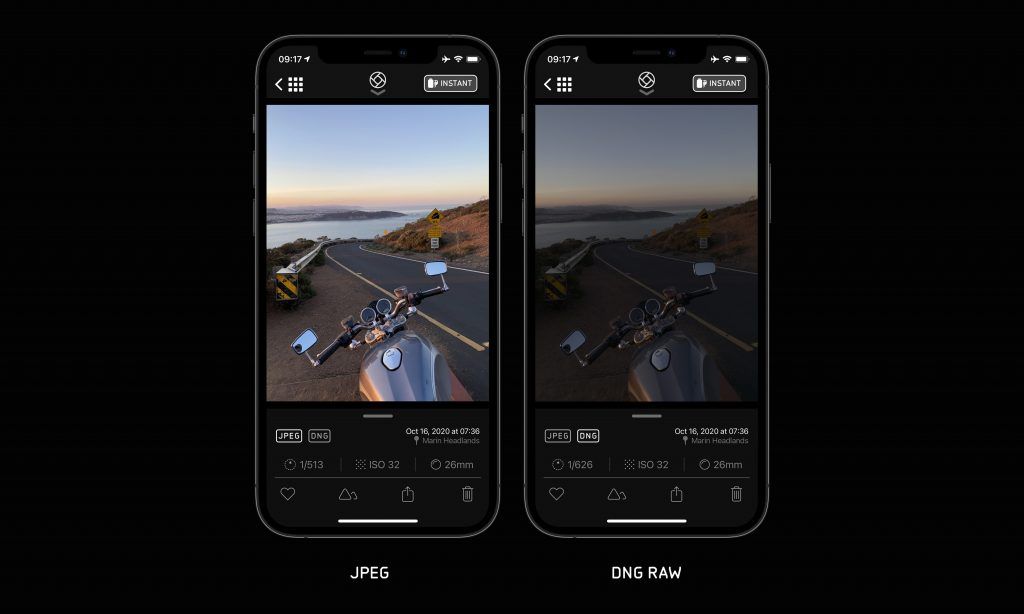
First, unprocessed RAWs look pretty bad when you first load them. Beginners have no idea what levers to push and pull to get what the system JPEG gives you automatically. Many folks give up. Some reach out to support to ask, “Why are my RAWs worse than JPEGs?”
A second problem is that today’s iPhones can’t perform advanced computational photography while capturing classic RAWs. This is confusing if you enable simultaneous “RAW+JPEG” capture and discover your JPEG is sometimes worse than what you’re used to.
The third problem affects beginners and experts alike: the most popular photo filter apps can’t load RAWs. This means you have to open your RAW in a dedicated editing app to create a JPEG, just to bring your photo into the app you actually want to use. It’s a cumbersome experience.
These problems leave photographers in a conundrum: “Do I want to take a photo that’s ready to share, or easier to edit?” Now you can have the best of both worlds.
Coverage: RAW Without Compromise
Mark II is the first camera to capture both classic RAWs and computational photos in one burst with a feature we call Coverage. Now you can take amazing photos that leverage all the advanced photography of the latest iPhones, while having a RAW in your back pocket in case you think you can do better.
Coverage takes a photo with all of Apple’s smartest processing: that is, Smart HDR 3, Deep Fusion, the works — and then also snaps a RAW DNG and saves it all in one file. So you can shoot first, and ask questions (like “Do I want to edit this as a RAW file?”) later.
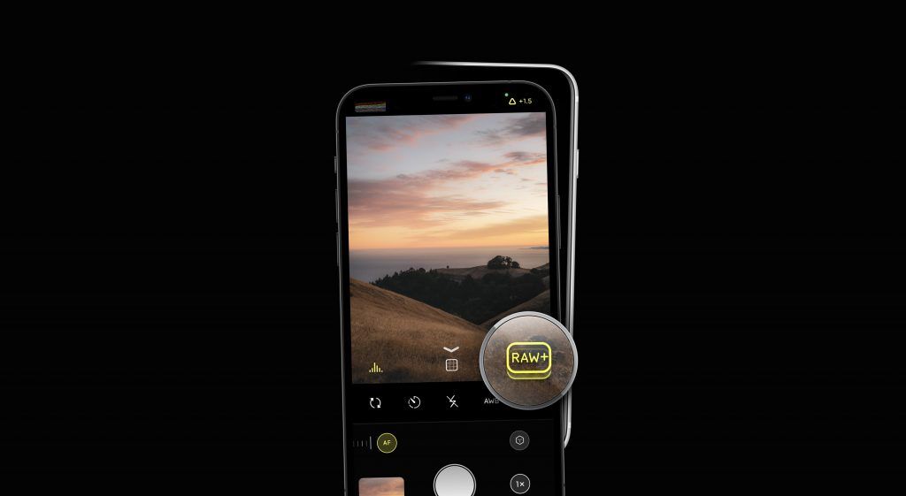
We built Coverage through software-based bracketing, which unfortunately leaves a split-second delay between the RAW and processed images. Since this might confuse casual photographers, we leave Coverage off by default. You can enable it in “Capture Settings.”
You’ll see Coverage is enabled in your viewfinder when the RAW icon looks like a little stack.
Instant RAW
Next, Mark II removes the complexity of developing RAWs with a feature we call Instant RAW.
To really harness the power of RAW, you have to do quite a bit of editing to get it looking even somewhat like the JPG your iPhone produces. We know that RAW files can have amazing results:
But not everybody has the ability or time to develop RAW files precisely to that level. It makes RAW inaccessible to most users.
Instant RAW develops your RAW file in one tap. Just like how Smart RAW helps Halide expose RAW correctly using Machine Learning, with Instant RAW Halide goes through a 17-step process of intelligently developing your file to get the best possible result. It’s optimized differently for different iPhones; it enhances detail and color; and above all, it’s neutral.
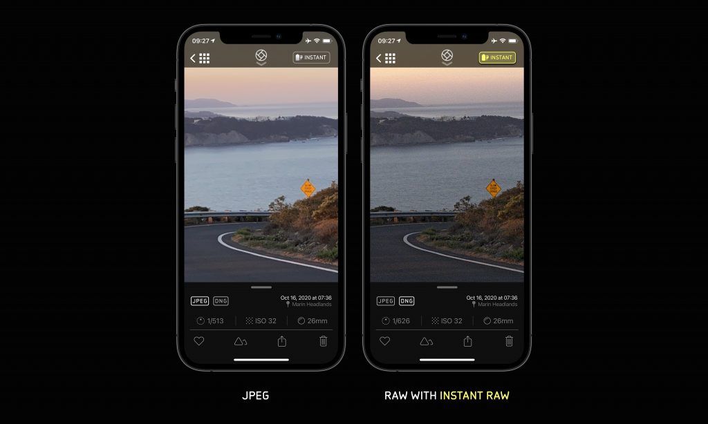
iPhone photos are increasingly intelligently processed: they are a result of many photos, merged, intelligently combined, enhanced and massaged. A RAW capture is a single shot. It makes for a very different look —and yes, it has grain, just like a film photo — but we think it’s beautiful.
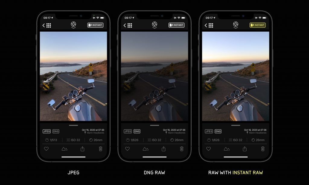
Instant RAW can work as a midpoint between a completely unedited RAW and a totally processed JPEG. In a world where the-built in camera has its own filters, Instant RAW is a “No Filter” module. You are free to use and share the result directly, or use it as a starting point for editing, just like ProRAW.
That said, sometimes results are amazing straight-out-of-camera.
Look closely at the fur in the following photos. (Instant RAW on the right)
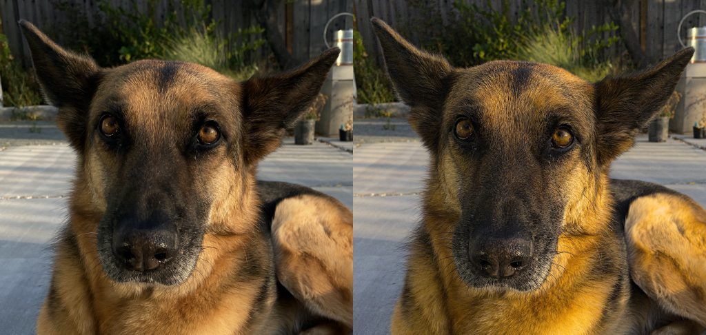
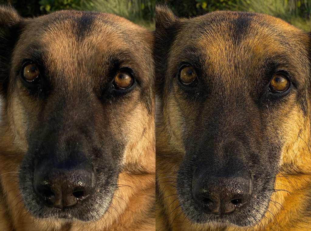
How do we recover so much latent detail? As we said before, Instant RAW is much more than a photo filter. Our process hooks into the RAW processing pipeline so we can operate on linear, 16-bit data as we process exposure, color, local contrast, and more.
In summary, we’re really excited about what we’ve heard about ProRAW, and will embrace it as soon as it’s available. But folks on every device that isn’t iPhone 12 Pro (or just end up preferring “classic” RAWs) have a lot to be excited about today.
Groundbreaking Focus and Exposure Tools
Mark II overflows with new tools to help with focus and exposure. First we revamped our existing Luminance and Color histograms. You can now keep them small and out of the way if you want your full attention on your photo, or enlarge them to obsess over fine details.
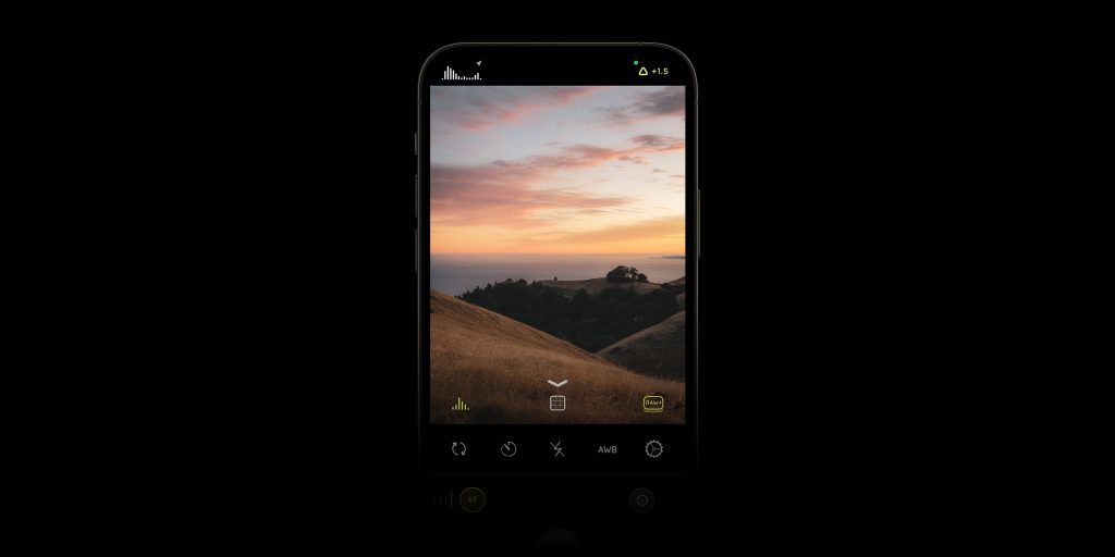
But our groundbreaking change is the addition of a third type of visualization, the Waveform. Up to now, this powerful tool was only used in high-end motion picture work, and we’re the first app to bring it to photography. In short, this tool horizontally scans over your image to exposed which color channels are clipped.
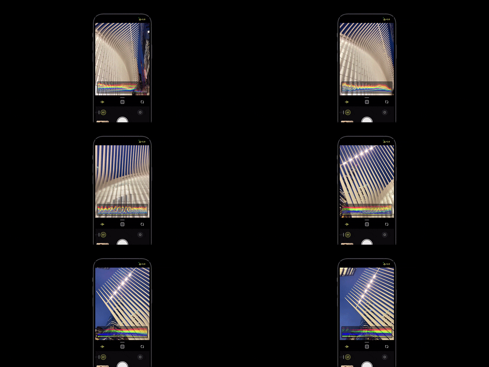
If you don’t quite get it, don’t worry, we’ll go into detail in a future post. In the mean time, marvel in how cool it looks.
You may be familiar with our next tool, Zebra Stripes. These stripes appear when parts of your images are either clipped, or fall below a noise threshold.
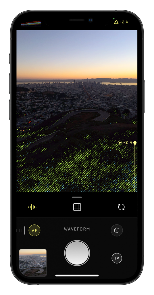
However, it’s often overlooked that images are made up of three separate channels. So you may take a photo of a bright red rose thinking nothing is overexposed, only to find out later that the red channel is clipped.
What if we color-code the zebra stripes when you enter this danger zone? We call them Color Zebras. 🌈🦓
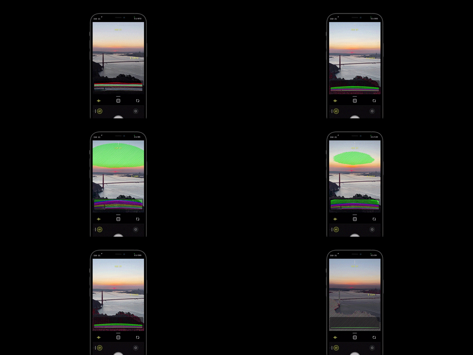
If both red and green are clipping, it turns yellow. If all three channels are clipped, you get familiar grey stripes. Don’t worry about memorizing this stuff. Just know that when you see different-colored zebras, you’re in a danger zone.
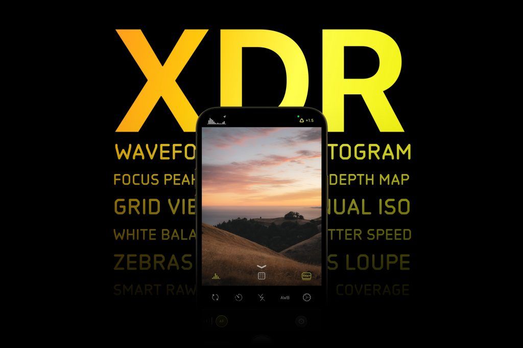
XDR
These are all incredible features on their own, but there’s one final aspect that makes all of these tools revolutionary. It’s a little technical, so bear with us.
Up to now, every image visualization tool you’ve used, on every camera, has lied. You think that the data you see in the image represents what will be recaptured by your camera. In fact, every camera shows you post-processed, 8-bit result. They’re close, but if you’re trying to get the absolute best results, close doesn’t cut it.
Consider that video of the Golden Gate Bridge from earlier. Your histogram, analyzing 8-bit data, might think the sky is clipped. If you saw that in your zebra stripes, you’d say, “It’s over exposed, I should go down turn things down a bit.” In fact, the cloud are not over exposed in the RAW, and there’s no need to turn down your exposure. By under exposing, you’re now going to lose details in the shadows!
Halide is the first and only camera app that visualizes the full 14-bit RAW data in real time. We call this XDR Analysis. When RAW streaming is active, the zebras, waveform, and histogram is based on the real sensor data.
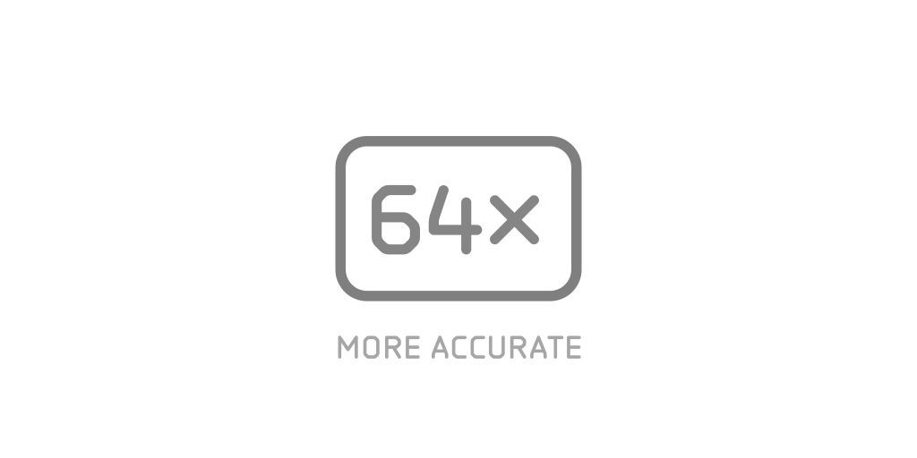
Why is this a big deal? We have a deep technical dive planned for the future, so today we’ll keep this short. Bits work in powers-of-two, so jumping from 8-bit to 14-bit means 64x more accuracy.
We’re not going to lie, this took a lot of shenanigans to get working. For performance and battery life, we only enable RAW streaming when interactively adjusting ISO or shutter speed. You’ll notice the moment it engages, as your exposure tools will suddenly shift to reveal the honest truth.
A Camera That Makes You A Better Photographer
We have users that range from professional National Geographic photographers and journalists to people that have never used any camera but their iPhone’s. We pride ourselves on being easy to use, but photography is still a pretty complicated hobby to pick up.
We found that there’s two ways to help people take better photos.
The first is creating a button or a filter to magically make images look better. This is great: it makes for instant results, feels empowering and requires little effort from aspiring photographers. In a way, Apple’s Smart HDR and our Instant RAW do this. Unfortunately, this does limit creativity, as you have to make decisions on the photographer’s behalf in how images are taken and rendered.
The second is helping people learn the fundamentals of photography. Our simple interface has already helped many of people learn more about RAW, manual focus, and more. But we can do better. We can be an app that makes people better photographers.
That’s why in Mark II, you’ll now be able to start learning more about photography in the app. We’re starting this in a simple 10-day course for new and experienced users alike, that highlights the features of Halide, but also explains photographic concepts through easy examples.
In the future, we’re building further on this, working with photographers to create lessons and content that are great for both beginners and advanced Halide users alike.
And more
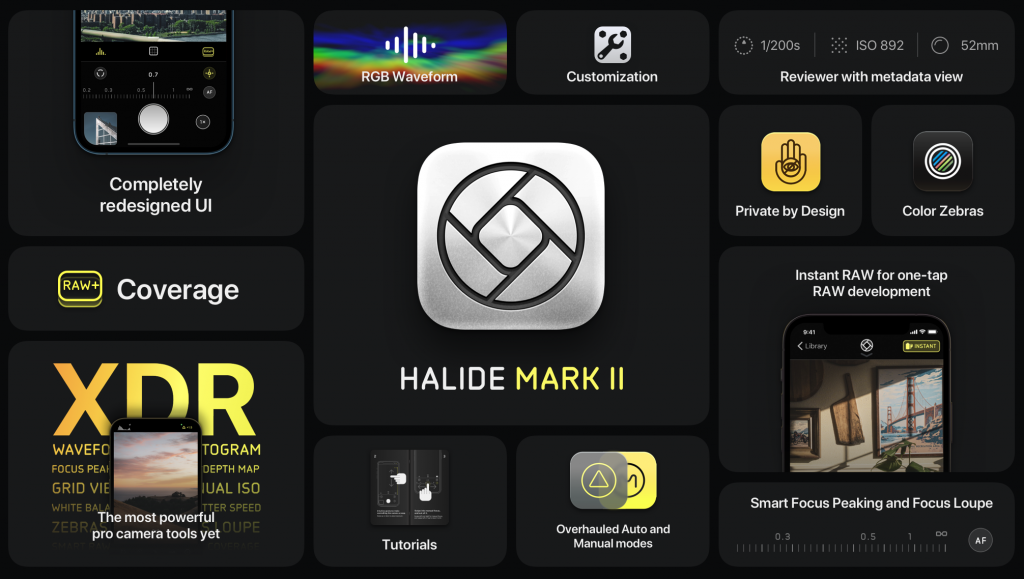
Phew. And that’s not it. As we said before, we can’t squeeze everything into one post — we’d love for you to discover what is new. We packed in over 50 new features and changes. You can download Halide Mark II here.
What’s Next?
The old saying goes, “If I had four hours to chop down a tree, I’d spend the first two hours sharpening the axe.” Well, much of the last eighteen months has involved building sharpening our axe, laying down new infrastructure to ship bigger, more ambitious features faster than ever before. This is the foundation of our new Halide. We have some really big plans for the future.
And now for the most important question:
How much does Mark II cost?
Halide is now three and a half years old. We haven’t charged for an update in all of that time.
We could write a whole blog post on our approach to pricing, because we put a lot of thought into this.
We fiddled with the price of Halide 1.0 to figure out “price elasticity.” We compiled a list of Pay-Once prices for similar apps, and found prices ranging from $30 to $60. Finally, we solicited feedback from Mark II beta testers; after walking folks through all the new features, we asked them to name a price. Any price.
With all that in mind, we’re confident launching Halide Mark II at $36 (for new users). To celebrate the launch, we are discounting it to $30. As we have done in the past, we plan to raise that price as we add more features.
Editor’s note: this post was published in 2020. In that time we’ve adding Macro Mode, an iPad version, and much more, so Halide now retails for $50. This strategy is going well, so we expect the price to continue to rise as we add more features.
Introducing Memberships
Pay-Once is not going away, but we’ve decided to offer an alternative that fits quite well into our long term plans. We’re calling it a membership. We think there are three reasons to consider a membership.
First, there’s price. $11.99 per year. Yes, year, not month. Long term, this is cheaper than buying future upgrades.
Second, memberships include perks above and beyond the core Halide experience, like exclusive icons.
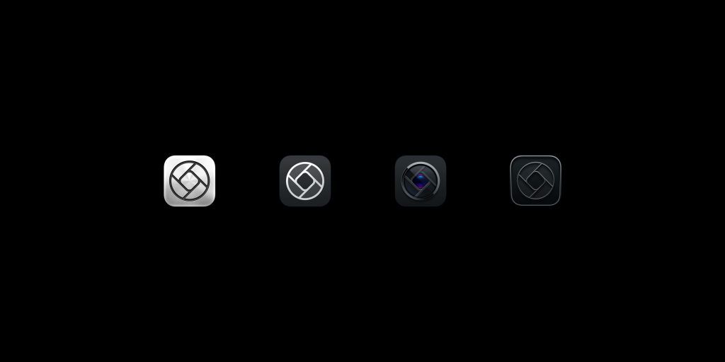
Third, memberships allow us to offer things with ongoing costs in the future.
We recognize subscriptions are a new thing. If you’re willing to take a chance with us today, we’re going to reward you by locking in $9.99 at launch. In the near future, we will raise it to the normal $11.99. As we build out more features, we expect the price for new members to rise. Existing members keep whatever price they started at.
We want our early supporters, decades from now, bragging to their friends about how little they pay. We want to be the next Costco Hot Dog.
And one more thing to sweeten the deal: we’re offering a one week free trial.
Unfortunately, we now have to make Halide free-to-download for all of this to work. Any sort of subscription — even optional — acts as a lightning rod for toxic reviews. If you like what we’ve been doing, please consider taking a moment to leave a review. It goes a long way.
The Price For Existing Users
Now what about existing users? Unfortunately, the App Store does not offer upgrades. We explored workarounds, like clever uses of app bundles, but found these tricks too complicated. They also require having two Halide’s in the App Store simultaneously, and we don’t want new users accidentally downloading the wrong version.
Next we considered locking new Mark II features behind an In-App-Purchase in Halide 1, but that would mean carving up our app into chunks and delivering an inferior experience to some users. That just feels wrong.
If we want to do right for our most loyal users, there’s really one solution.
Anyone who has already paid for Halide 1 gets Mark II for free. We’re also including a year of members’ updates.
We’d still ask that if you love the app, consider supporting us by purchasing a membership. You will lock in today’s introductory low price, and we’ll even give you special black icon that only early supporters are able to unlock and use.
Summary
Well that’s enough for one day. Keep your eyes out for future posts where we dive into more detail about these huge big features in Mark II. But to summarize…
Halide Mark II is a whole new app. It’s completely redesigned, features an all-new set of RAW tools for everyone, and packs the most powerful pro photography tools on the App Store. We packed over 50 new features and changes into the app.
This huge update does cost money, but existing Halide users get it for free. New users can either pay once, or join a premium membership for added perks.
This has been an epic undertaking for our three-person team. It wouldn’t have been possible to spend the last year on this without your support. From the bottom our hearts, thank you.
It would mean so much to us if you would spread the word on Twitter, Instagram, etc. — and tell your friends. Again: thank you! We can’t wait to hear what you think.
— Ben, Sebastiaan, and Rebecca aka Lux
Special thanks for this release go to:
Jelmar Geertsma (type design);
Martijn Bosgraaf (3D rendering and modeling);
Jackson Hayes (video, web, testing, support and too many things to count);
Louie Mantia (icon design of some of these special app icons);
Jonathan Hollander (web engineering);
Our testers and supporting users;
Friends and family that have missed us and supported us all these sleepless nights.
Thank you all so much!


