Ben and I have an annual ritual. For the last half decade, around this time of year, we run to the store, hastily unbox the latest iPhone and get shooting. We do this because we're passionate about finding out everything there is to know about the new camera — not just to make sure things work well with Halide, but also because no other camera has as many changes year over year.
A byproduct of this ritual? A pretty thorough iPhone review.


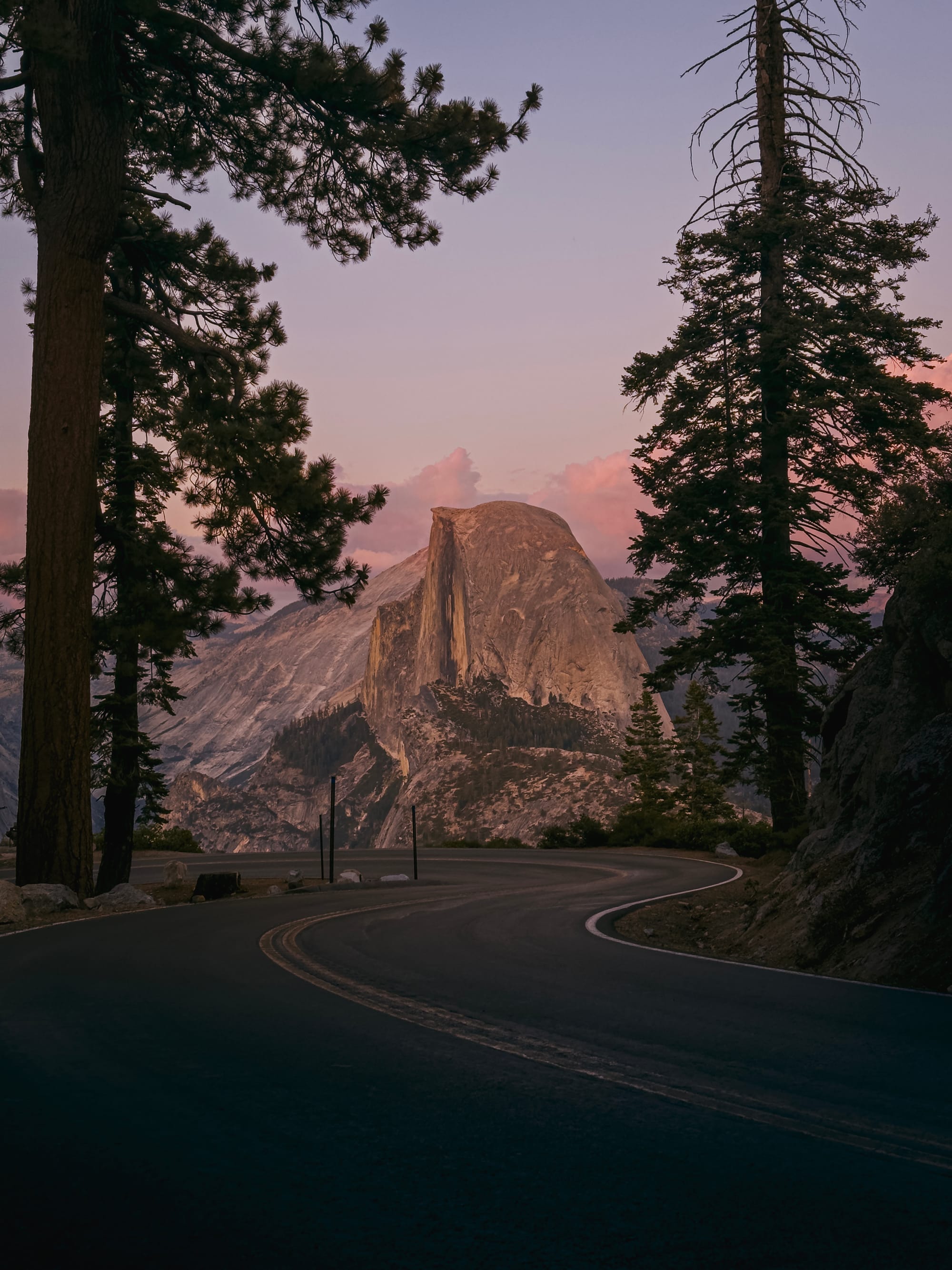

If you've read our reviews before, you know we do things different. They’re not a quick take or a broad look at the iPhone. As a photographer, I like to focus on reviewing the iPhone 16 Pro as if it were purely a camera. So I set off once more to go on a trip, taking tons of photos and videos, to see how it held up.
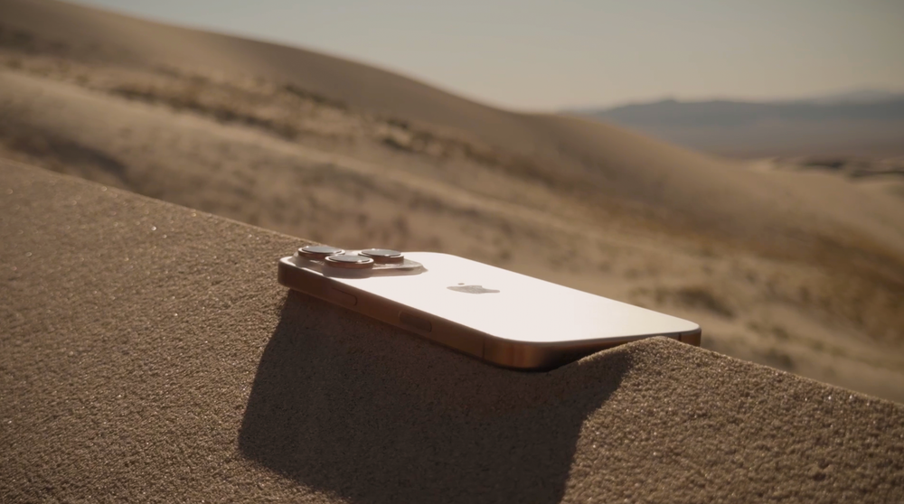
For the first “Desert Titanium” iPhone, I headed to the desert. Let’s dive in and see what’s new.
What’s New
Design
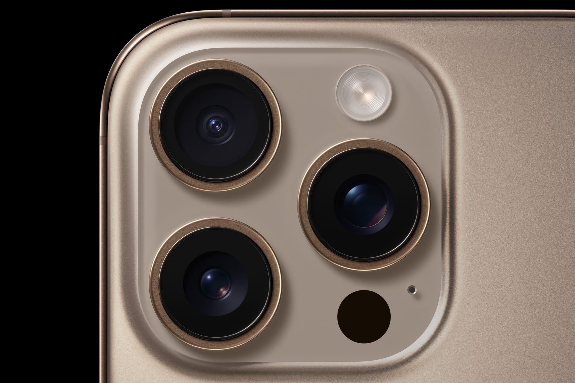
As a designer from an era when windows sported brush metal surfaces, it comes as no surprise I love the finish of this year's model. Where the titanium on the iPhone 15 Pro was brushed on the side rails, this year features more radiant, brushless finish that comes from a different process.
It is particularly nice on the Desert Titanium, which could also be described more like "Sequoia Forest Bronze":
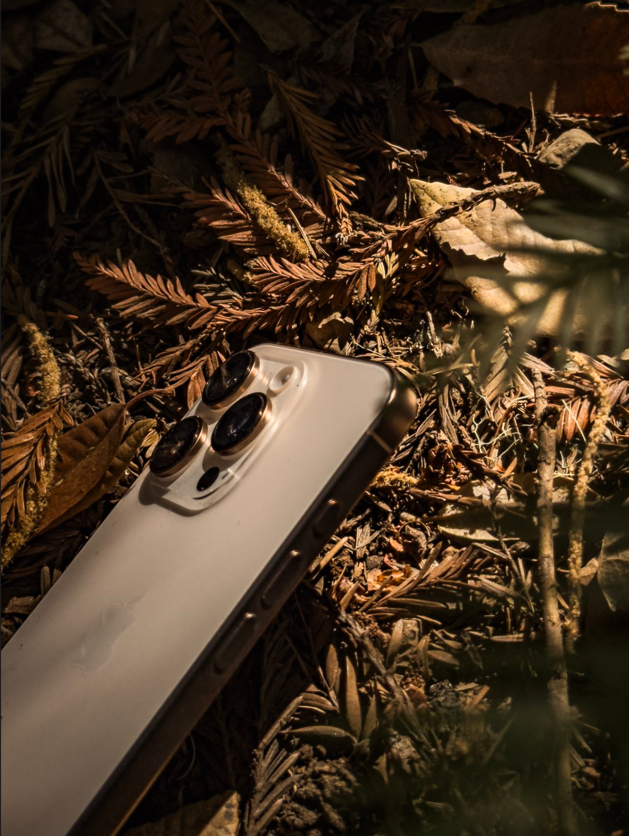
The front features the now-standard Dynamic Island and slimmer bezels. The rear packs the familiar Pro camera array introduced way back in iPhone 11 Pro.
Its less professional sibling, iPhone 16, features a unique colored glass process unique to Apple. This year's vibrant colors feel like a reaction to last year's muted tones. I haven't seen this process copied anywhere else, and it's beginning to earn its rank as the signature style of the iPhone. The ultramarine (read: "blue") iPhone 16 is gorgeous, and needs to be seen in real life. I went with the color Apple calls "teal," but I would describe it more as "vivid Agave."
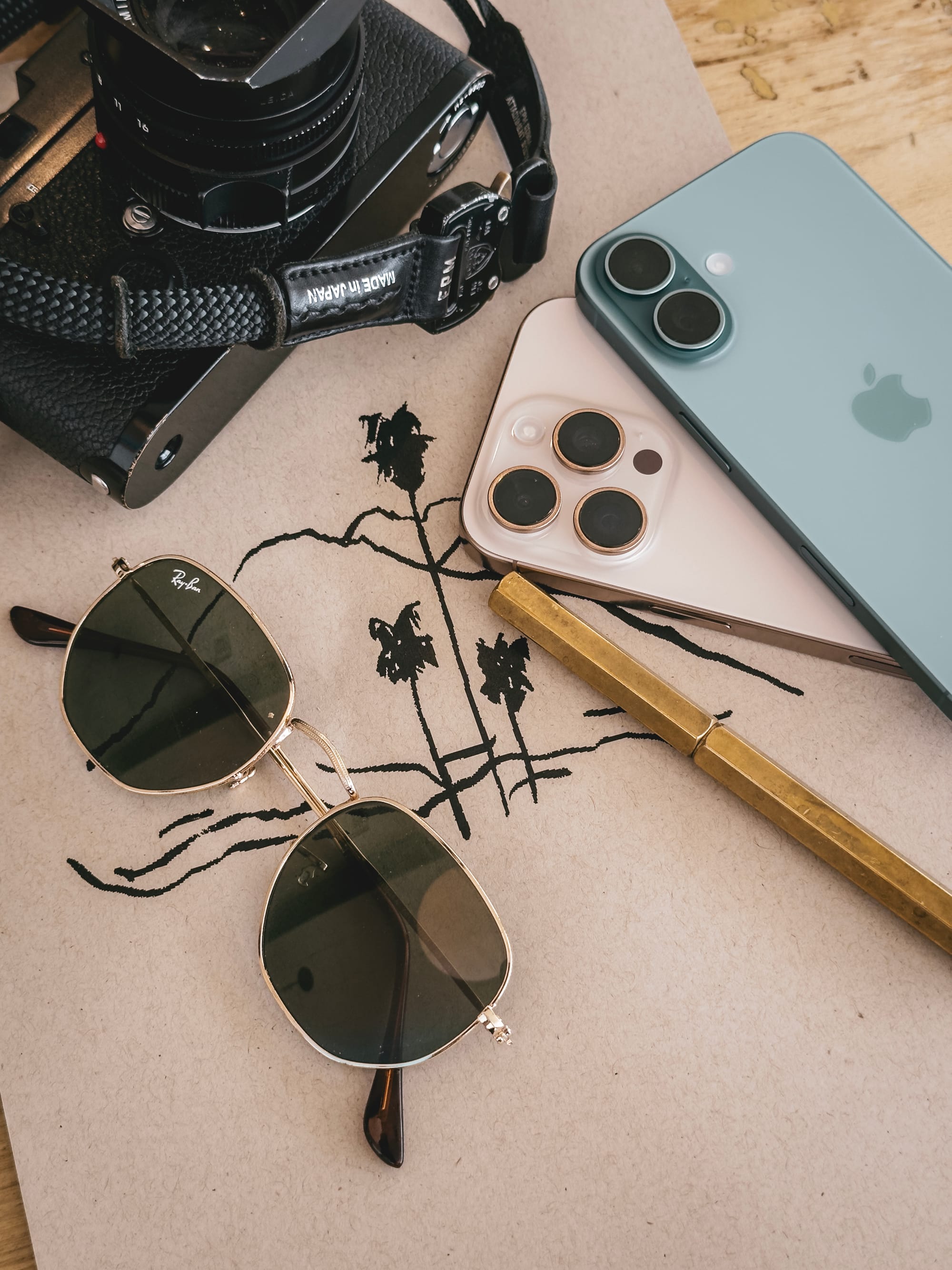
The sensor array on the 16 non-Pro has returned to the stacked design of the iPhone X. The motivation behind the change may be technical— better support for Spatial video— but from an aesthetic perspective, I also simply prefer the vertical arrangement.
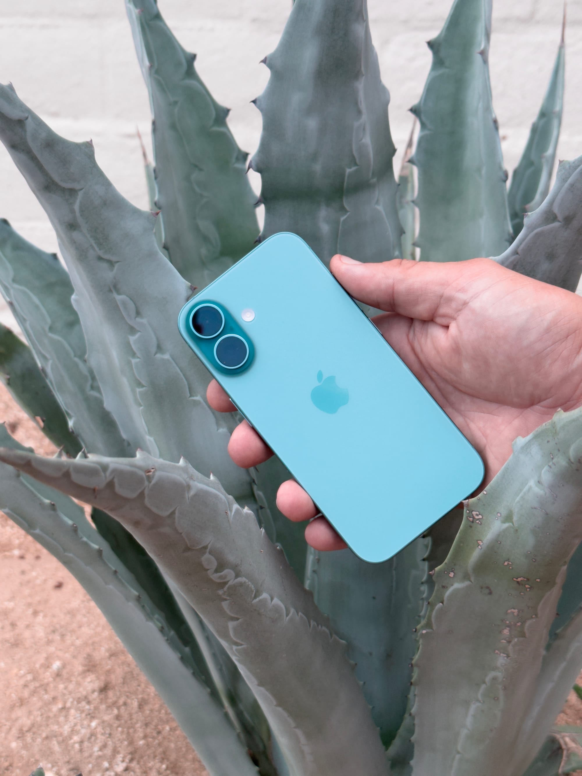
While beautiful to look at, that’s also about all I will say about iPhone 16. While a less colorful, it’s the iPhone Pro line that has always been Apple's camera flagship, so that's the one we'll dive into.
Inside iPhone 16 Pro
A New 48 Megapixel Ultra Wide
The most upgraded camera is the ultra-wide camera, now 48 megapixels, a 4x resolution improvement from last year. The ultra-wide shows impressive sharpness, even at this higher resolution.
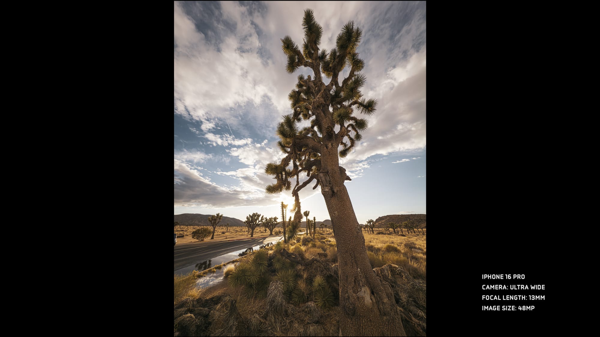
At 13mm, the ultra-wide remains an apt name. It's so wide that you have to be careful to stay out of frame. However, it does allow for some incredible perspectives:
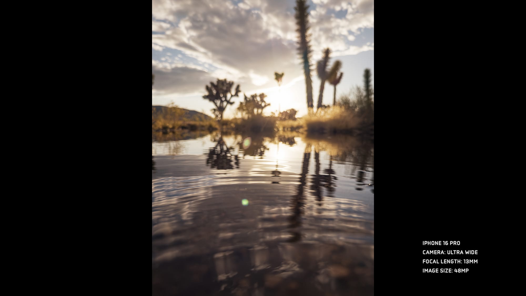
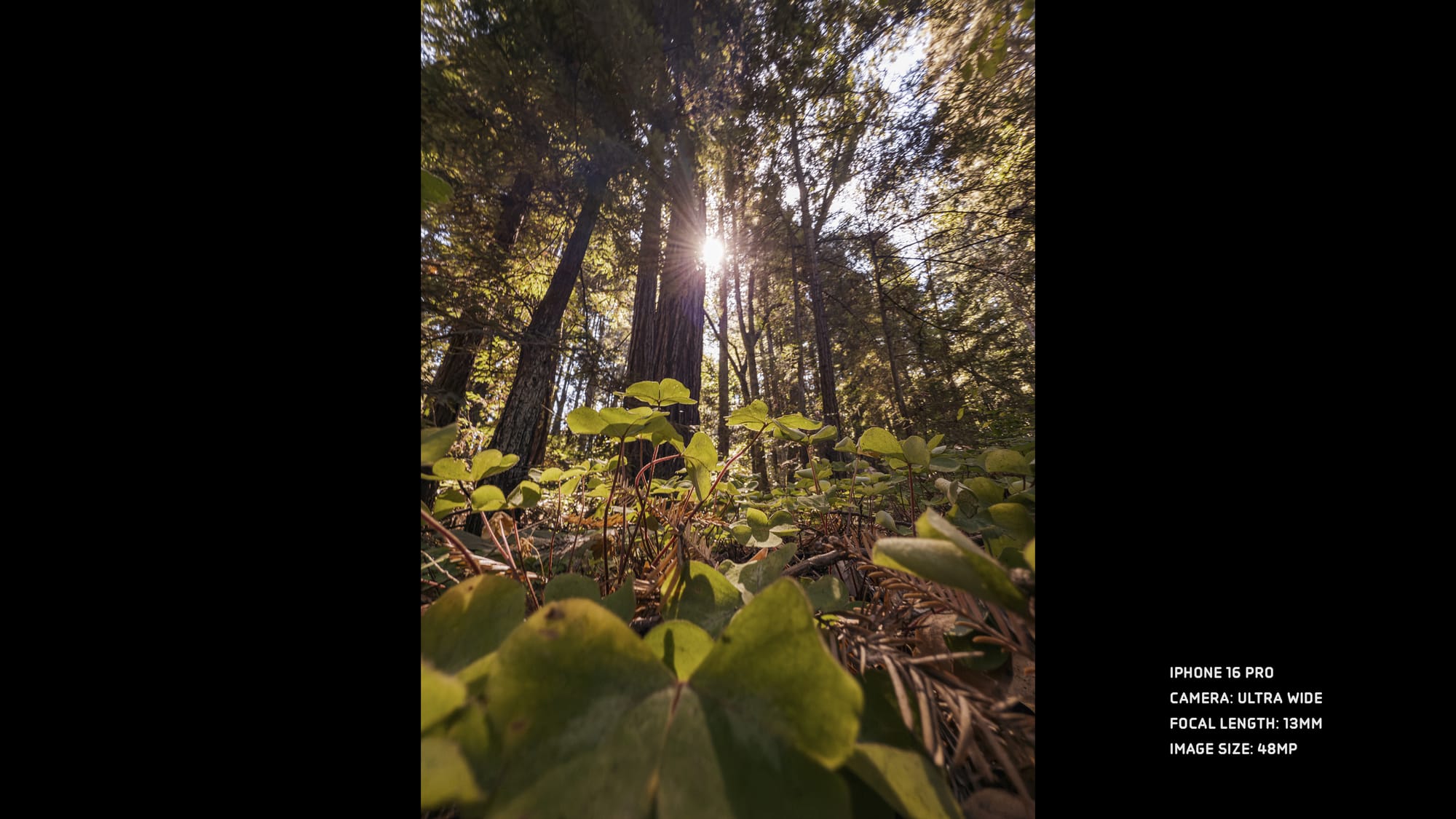
At the same time, temper your expectations. While the iPhone 14 Pro introduced a 48 MP sensor for its main camera, they almost doubled the physical size of the sensor compared to the iPhone 13 Pro. This year, the ultra-wide is the same physical size, but they crammed in more photo-sites. In ideal lighting, you can tell the difference. In low-light, the expected noise reduction will result in the some smudgier images you'd also get from the 15 Pro.
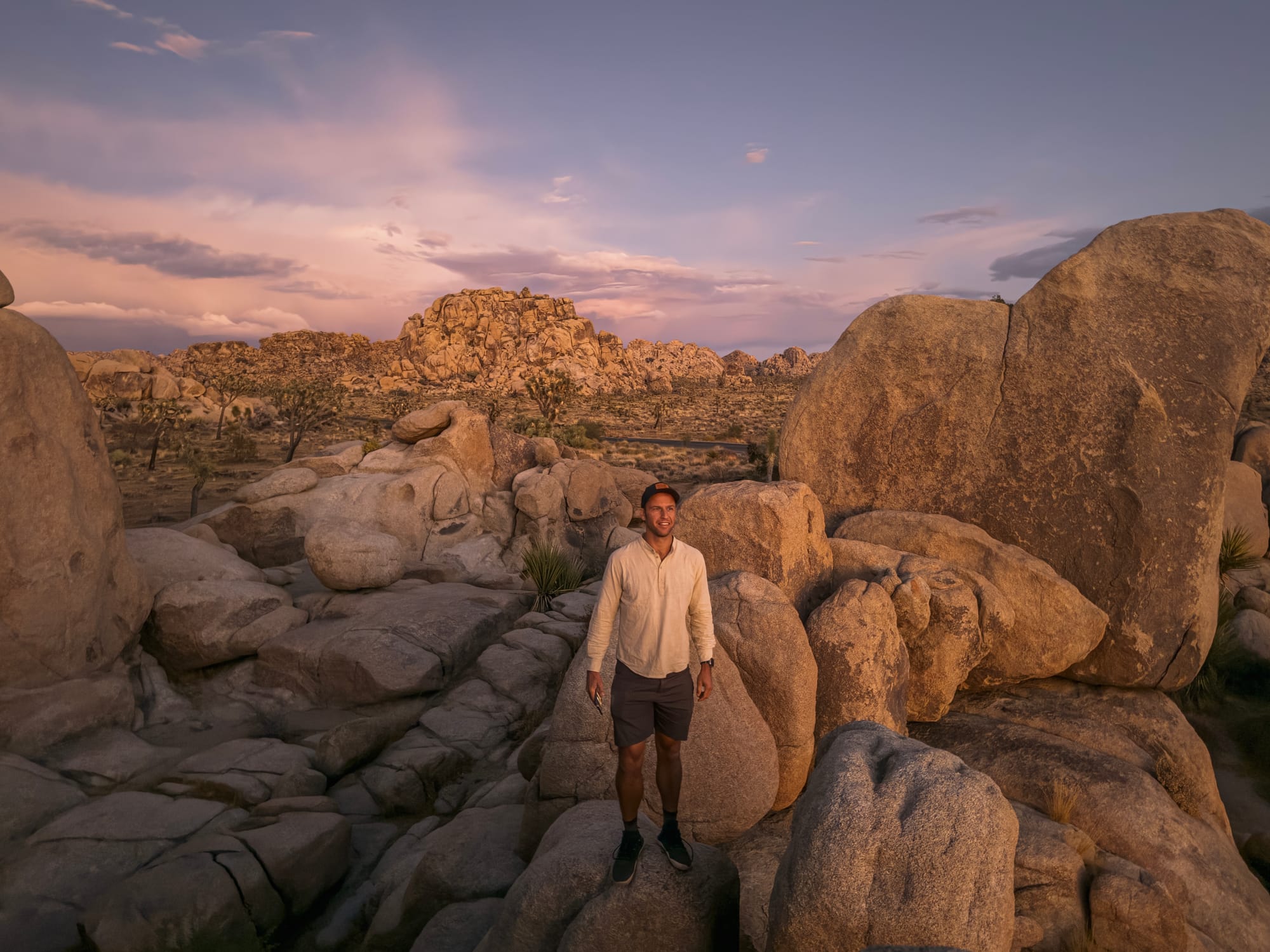
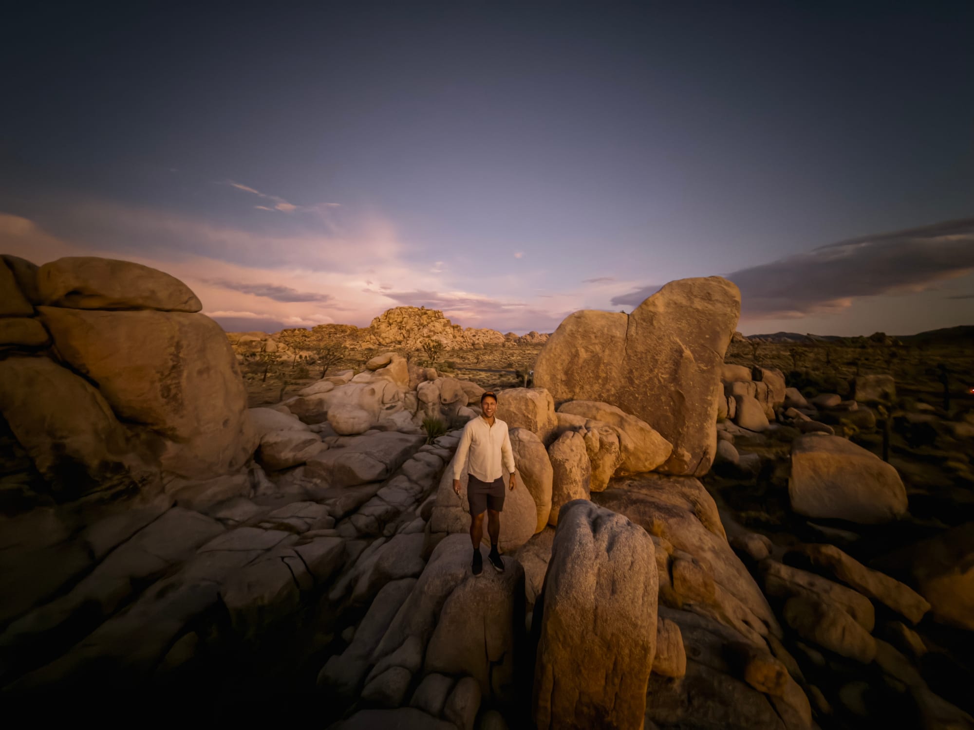
In the same time and place, the ultra-wide fails to match the detail of the main camera
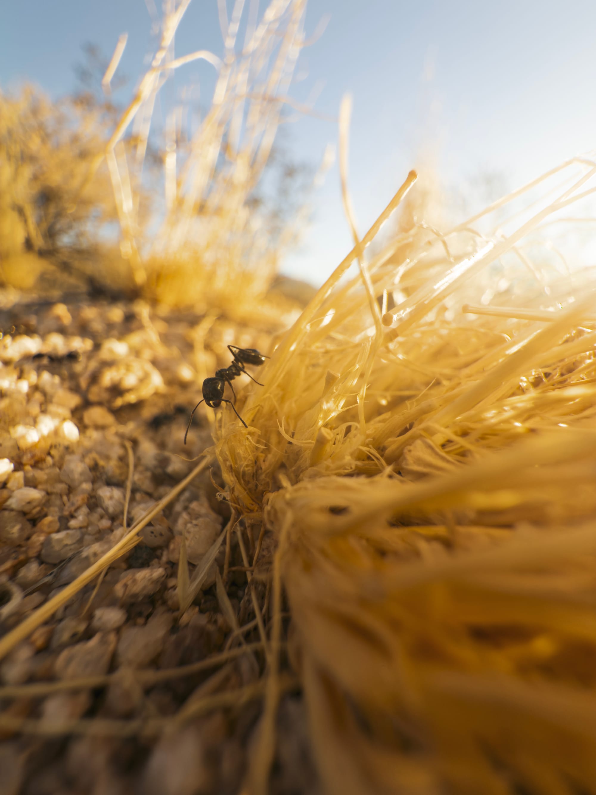
One very compelling bonus of the 48 MP upgrade is that you get more than for the high-resolution shots. It does wonders for macro photography.
Since the iPhone 13 Pro, the ultra-wide camera on iPhone has had the smallest focus distance of any iPhone. This let you get ridiculously close to subjects.
The problem was that… it was an ultra-wide lens. The shot above is a tight crop of a very wide frame. If you wanted a close up shot like that, you ended up with a lot of extra stuff in your shot which you'd ultimately crop-out.
In the past, that meant a center crop of your 12 MP ultra wide image would get cropped down to a 3 MP image. In Halide, we worked around this with the help of machine learning, to intelligently upscale the image.
With 48MP of image however, a center crop delivers a true 12 MP image. It makes for Macro shots that are on another level.

‘Conventional’ macro (left) vs. Super Macro on Halide with a 2× optical zoom on iPhone 16 Pro
Fusion Energy
Here’s the main meat - the camera most people shoot almost all their shots on. iPhone 16 Pro’s 48 megapixel main camera sensor.
iPhone 16 Pro packs a new 24mm main camera, they now dub the Fusion camera. It is a new sensor, the ’second generation’ of their 48MP shooter introduced in iPhone 14 Pro. iPhone 16 is also listed as having a ‘Fusion’ camera — but they are, in fact, very different cameras, with the iPhone 16 Pro getting a much larger and higher quality sensor.

‘Fusion’ refers to the myriad of ways Apple is implementing computational magic that produces high quality shots. If you were to zoom in on the microscopic structure of the sensor, you would see that every pixel is made up of four ‘photosites’ — tiny sensor areas that collect green, red, or blue light.
When iPhone 14 Pro quadrupled its resolution, Apple opted for a ‘Quad Bayer’ arrangement, dividing each photo site into four, rather than a denser ‘regular’ arrangement. There’s a huge benefit of this arrangement: the sensor can combine all those adjacent sites to act like single, larger pixels — so you can shoot higher-quality 12MP shots. This was already employed in video and Night mode.

The ‘Fusion’ workflow is essentially using the 48 megapixels worth of data and the 12 megapixel mode to combine into great 24 megapixel resolution shots. I think this is perfect. I firmly believe most people do not benefit from giant 48 megapixel photos for everyday snaps, and it seems Apple agrees. A very Apple decision to use more megapixels but intelligently combine them to get a better outcome for the average user.


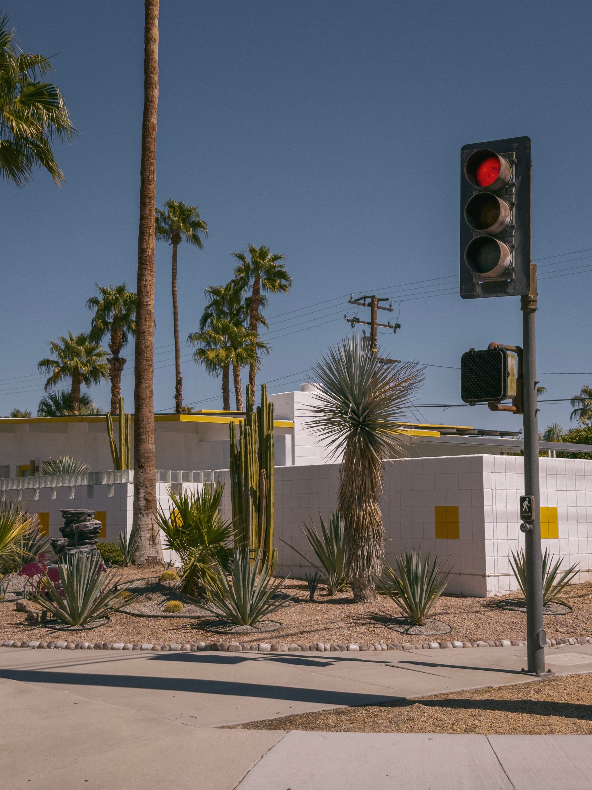


Is processing very different from last year? No, not really. It was great, and it’s still great. While there’s slightly more processing happening, I found it difficult to spot a difference between iPhone 15 Pro and iPhone 16 Pro captures. The sensor is the same physical size as last year’s iPhone 15 Pro / Pro Max, and still has delightful amounts of depth of field as a result.

The larger the sensor, the nicer this is, and it really renders beautifully — especially in its secondary telephoto lens mode.
Telephoto: 5× and Fusion at Work
The telephoto camera is a defining characteristic of the Pro line of iPhones. Last year only the 15 Pro Max featured the 5× 'tetraprism' lens. This year it's standard across the Pro line, and I'm happy I have the option of going smaller this year.
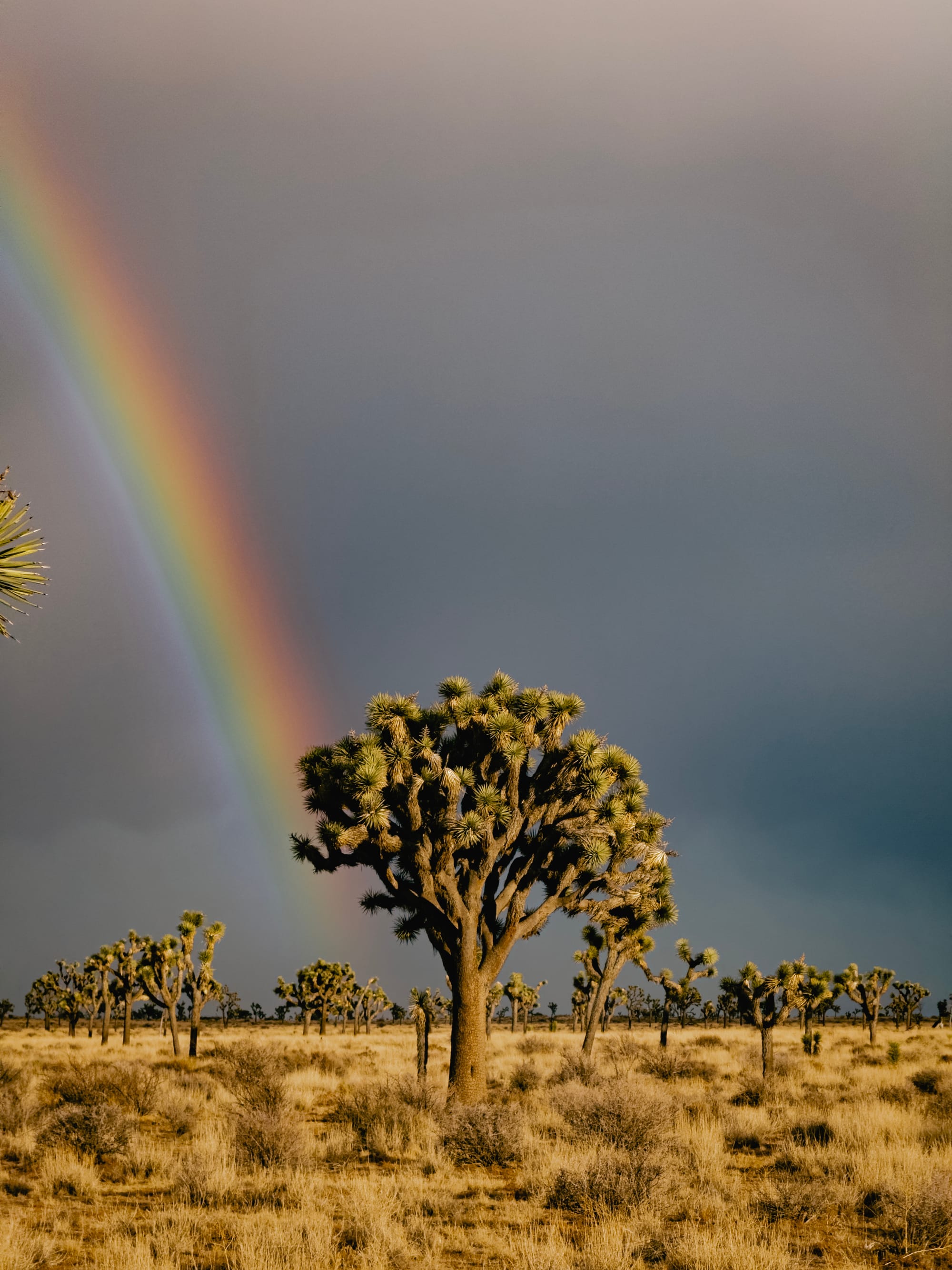
That said, I'm a huge fan of the outgoing 3× lens. It was dang near perfect for me. Now, every focal length between 1× and 5× is bridge with the 48 MP main camera, and it's a bit controversial. Because of its quad-bayer configuration, there's been a question as to whether the 48 megapixel on the main sensor is really 48 MP, since it needs to do a bit more guesswork to recover details.
Well, comparing a 12 MP crop on the sensor to a "real" 12 MP image shot on iPhone 12 Pro, I preferred my ‘virtual’ output on the 16 Pro.
I'll admit that years ago I was a skeptic. I like my lenses optical and tangible, and it feels wrong to crop in. Well, this past year, I've been sporting the iPhone 15 Pro Max with its 5× zoom, so I found myself using the imaginary 2× lens much more to bridge the gap between focal lengths.


The difference between 1× and 2× is more than just a closer look — a change in focal length like this helps make the background proportionally larger
Thanks to wider aperture on the Fusion camera, the virtual 2× produces better results than the physical 2× of the past. I really like it. I no longer want Apple to bring back the physical 2×. Give me an even larger, better Fusion camera.
As for the 5×, after a year of real-world use on the 15 Pro, I don't want to lose that reach. It’s like having a set of binoculars, and amazing for wildlife, landscapes, or just inspecting things far away.
On a creative level, the 5× can be a tricky focal length to master. While the ultra-wide camera captures everything, giving you latitude to reframe shots in editing, the 5× forces you to frame your shot right there. Photographers sometimes say, "zoom with your feet," which means taking a few steps back from your subject to use these longer lens. This requires a bit more work than just cropping in post, but the results are worth it.


At night, the telephoto camera suffers as the only remaining 12 MP sensor and narrower field of view that lets in less light. I’d be appreciative of a larger or 48 MP sensor in the future, not for the added resolution, but to reduce noise through binning. What this camera needs more than anything is more light — it would be transformative, and I hope Apple takes things in this direction in the future.

For portraits, which usually happens in a more controlled lighting environment, the 5× telephoto also truly shines. It’s a great lens, and we’re all better for having it on all the iPhones Pro.
Night Photography
With the sun setting, I noticed the latest display made a big difference. With a screen that goes down to one nit, I found it really nice when shooting out in the dark.
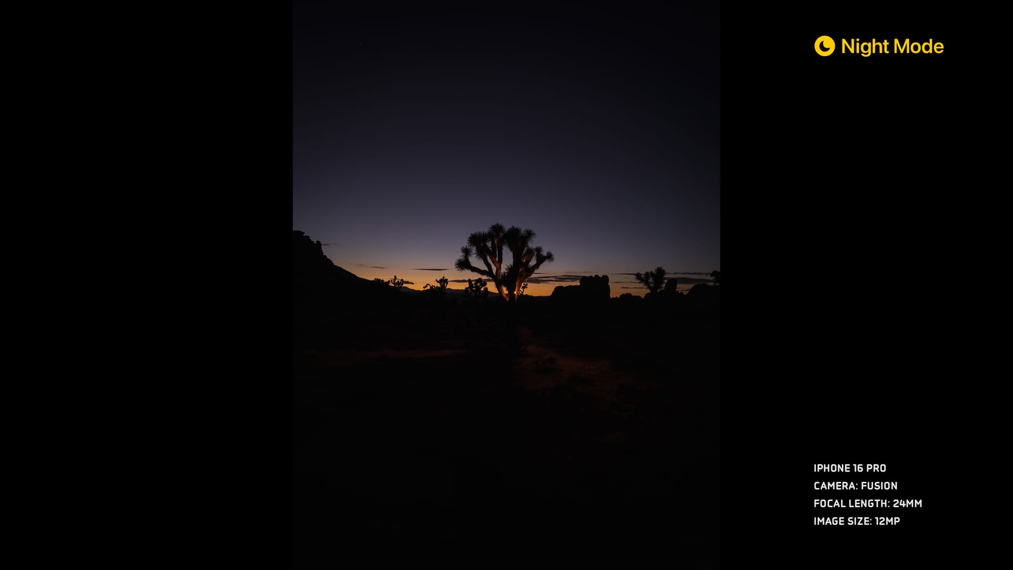
Within night mode, the HDR now allows a larger range dynamic range to be captured. However, it was still a frustrating dance at times to get exactly what I wanted out of the exposure, with some exposures over-done, and inconsistent exposure times. In fact, I enjoyed shooting on the iPhone 16 Pro outside of night mode, as it gave me darker, contrasty shots.
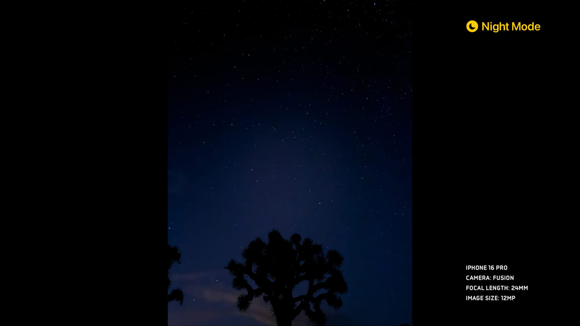
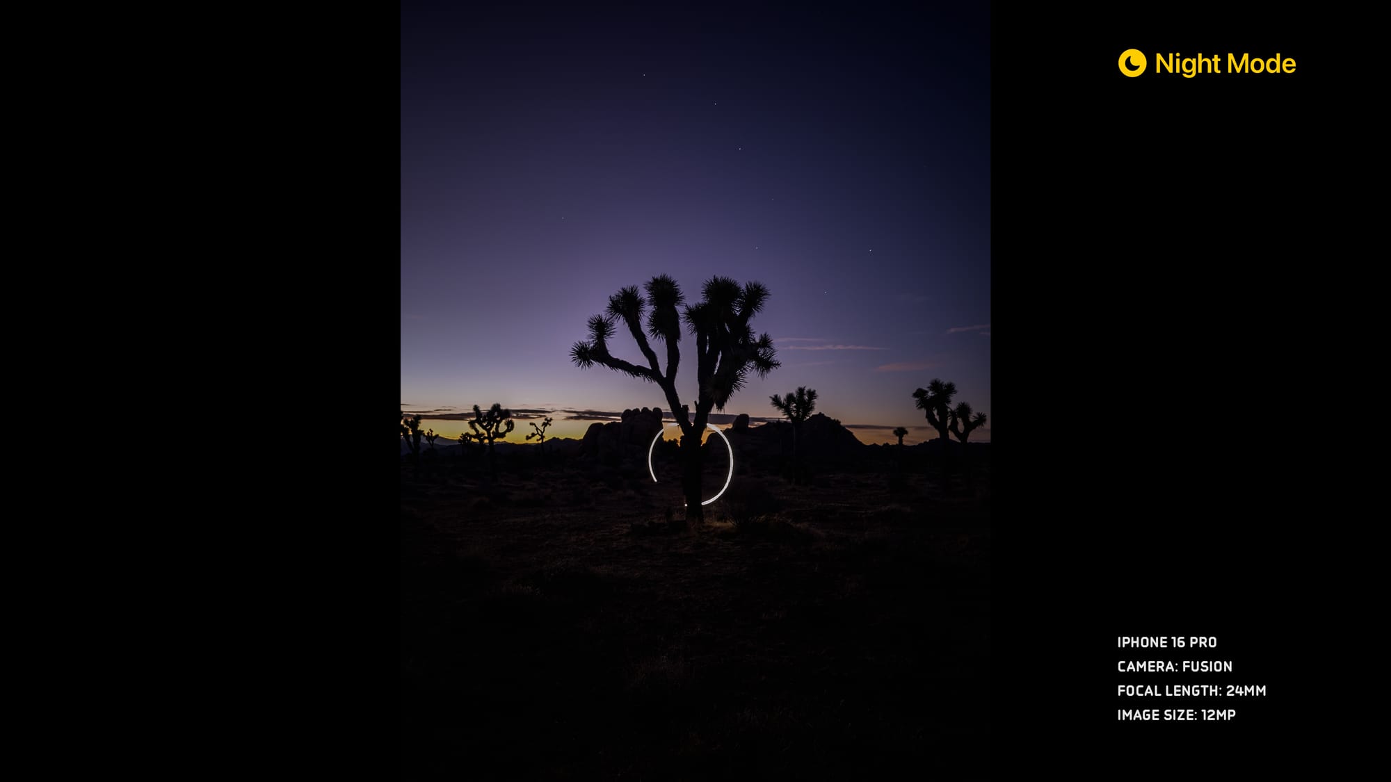

While Night Mode remains incredibly impressive, and the intelligence produces solid results without thinking — but at times it can still be frustrating to get exactly what I want. I wish there were an API for apps like Halide to dial in manual settings.
(If anyone at Apple reads this, we filed request FB11689438.)
Under the Hood
If you were to treat this as a review of the iPhone as a camera, there’s actually more to talk about than the cameras. This is a unique year, because the iPhone 16 Pro packs improvements that go beyond the cameras — touching on every part of the photography and videography workflow. In my testing, USB transfer speeds were faster than my iPhone 15 Pro. On the wireless front, Wifi 7 offer up to 46 Gbps, in theory.
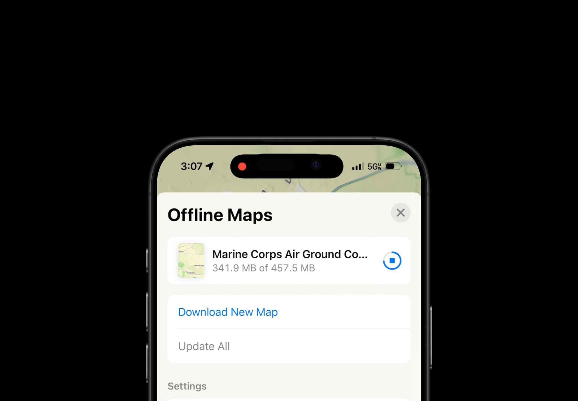
The new modem in here has given me easily my best cellular download speeds — in more places. I pulled down a 450 MB offline map of the Mojave Desert in Joshua Tree in less than a minute.
On the wireless power front, I noticed much faster wireless charge speeds with a new MagSafe cable, and also when plugged in. All those things add up to minutes to hours to days saved on the job.
Thermals are a make or break aspect of an iPhone, especially now that it shoots computational intensive video like Apple Log with ProRes. I tested by shooting 4k at 120 FPS for a bit, and found it considerably less hot than the 15 Pro under similar demand. In fact, I never got it to overheat!
Average users will appreciate these quality of life improvements, and Pros will appreciate how it lets them push these devices further than ever before.
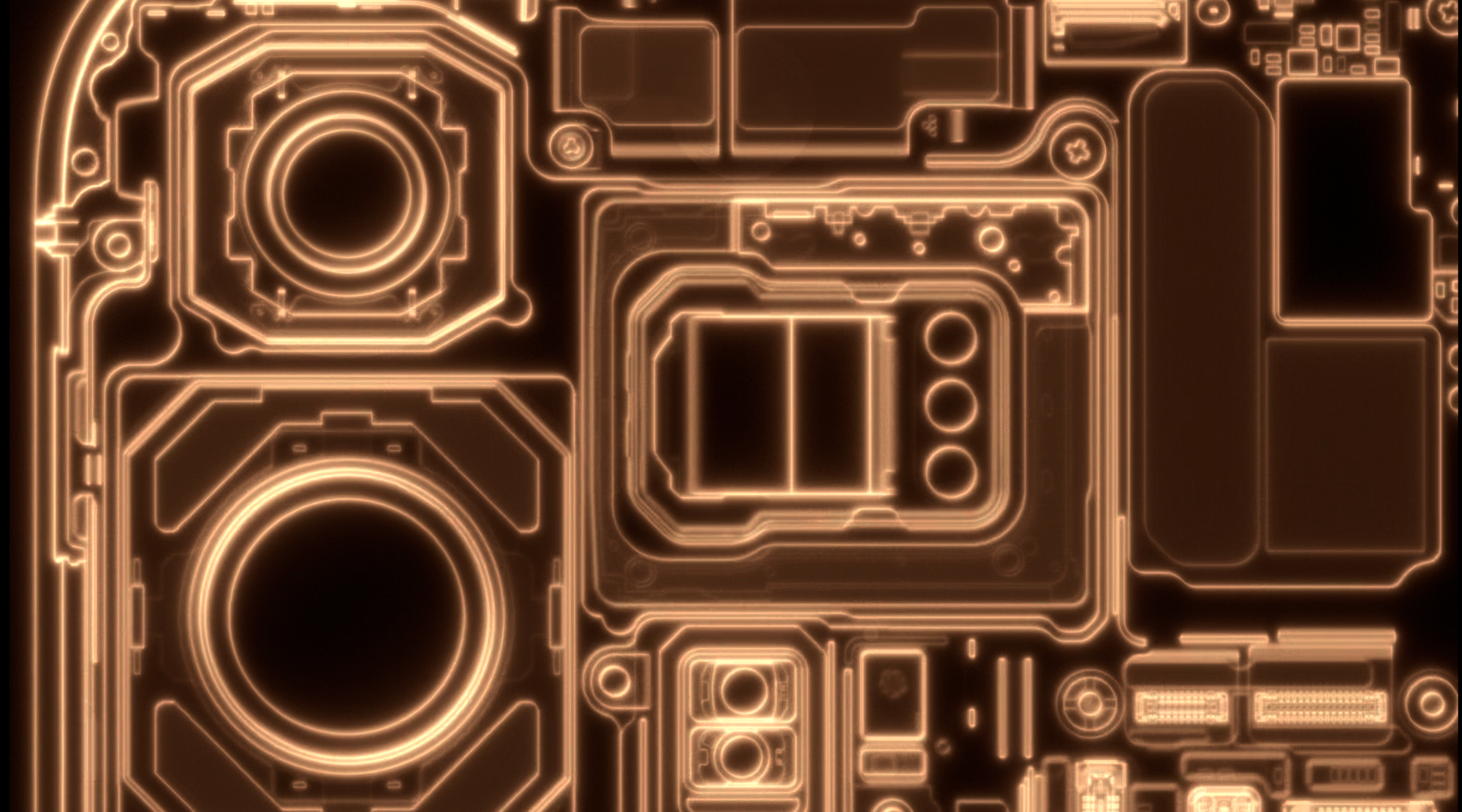
Digging deeper into the camera subsystems, the new "Apple Camera Interface" internals allow for faster sensor readout times. This improves features like QuickTake (not that Quicktake), that feature that let you quickly take videos by holding the camera button.
Previously, it wasn't possible to quickly reconfigure the camera system for high-quality video. It seemed on par with your viewfinder's video feed, which isn't as high quality as when you recorded from the camera's video mode. On iPhone 16 Pro, QuickTake has far better processing — Dolby Vision HDR, 4k resolution, the works. It's noticeable.
Burst ProRAW 48MP capture performance is also much faster. When absolutely mashing the shutter, 48MP ProRAW frame rate clocked in at 2× the iPhone 15 Pro’s speed. This is good news, but doesn't solve the tradeoff that comes with ProRAW files — the lag. Apple talked about ‘Zero Shutter Lag’ in the keynote, and that’s exactly what that is about.
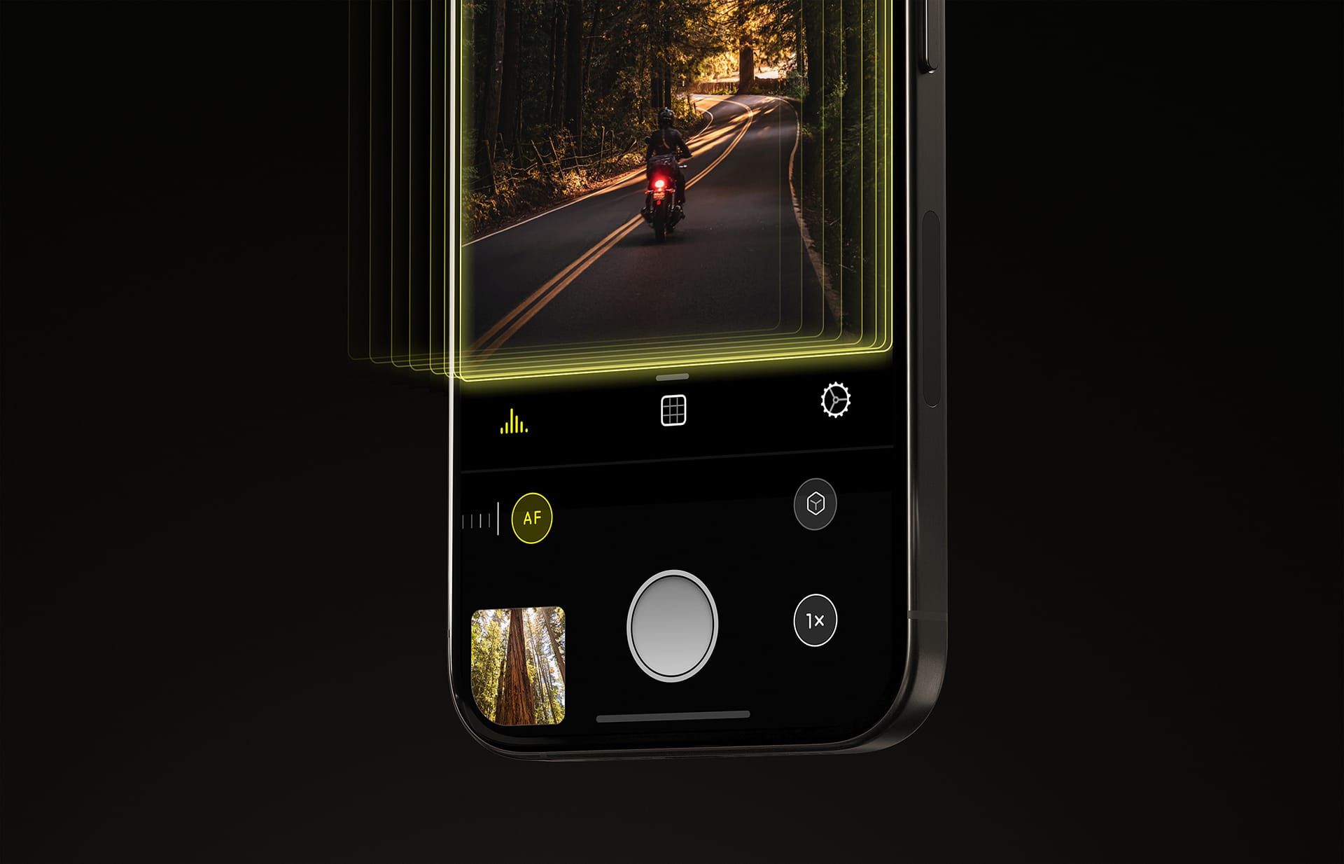
When an iPhone captures a ProRAW photo, there's a two step process. First, the iPhone captures a burst of photos, and then it merges those photos together with the help of sophisticated computational photography algorithms. The iPhone 16 is faster at the first step, grabbing source photos. It still takes several seconds to process the resulting shot, but if you tap the shutter button the camera will now take a photo practically instantaneously — where there was a very real delay before.
The improvement is huge in practice. In total, the iPhone 16 Pro beat the iPhone 15 Pro by anywhere from 400 to 900 milliseconds. Hundreds of milliseconds matter in the moment, and could mean the difference between getting the shot or missing it completely. It's a massive improvement and a huge achievement, technologically.
Software
While hardware was upgraded, iPhones 16 also come with iOS 18 — a huge update that touches on every single part of the photography experience. We won't touch on Apple Intelligence or Clean Up, which won't be ready until next month, but there's still plenty to talk about with iOS 18.0.
Capture overhaul
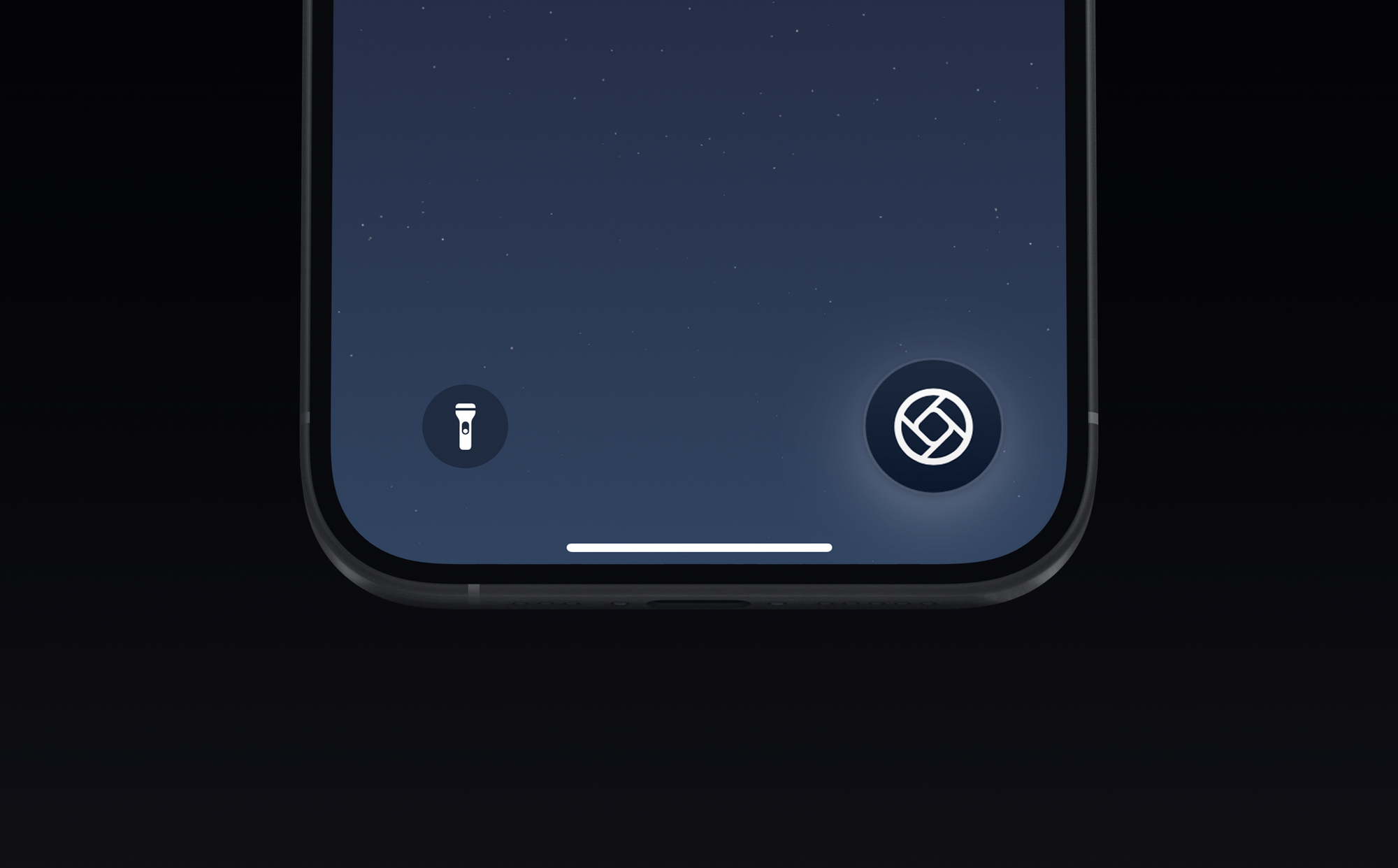
You can finally open camera apps from the Lock Screen, which is the single biggest feature request we've had from Halide users. In the past, we had to make do offering widgets you could load on your Lock Screen, but real Lock Screen support goes way beyond that, letting you capture photos without unlocking your device.
Aside from several changes in the camera app like being able to pause recordings and keep music playing while you record, there's an elephant in the room… Photos.
This year, Photos received biggest overhaul since the first iPhone, and the results are subjective. For me, it’s been challenging to adapt — but I do believe in their mission. Photos’ fundamental interface has not changed in 16 years, and I do think has to evolve. For most, it might really work better. Its added customizability is a step forward, and fits into the theme of giving you greater control.
Shooting in Style(s)
Which brings us to Photographic Styles, which have also been overhauled. When they were introduced in the iPhone 13 Pro they were simple filters. You could pick from a warm look, a more contrasty look, maybe a more cool look, but the results were all pre-canned.
Now consider this salt flat. You might want to bring out the coolness of the sunrise and really make that a vivid blue in contrast to the sky above:

But if I apply a simple filter, it would apply the look to both skin color and the sky equally. Blue skin doesn't work outside James Cameron movies. These new Photographic Styles can target undertones, the way the filter affects skin tones in your shots, making things feel more natural.
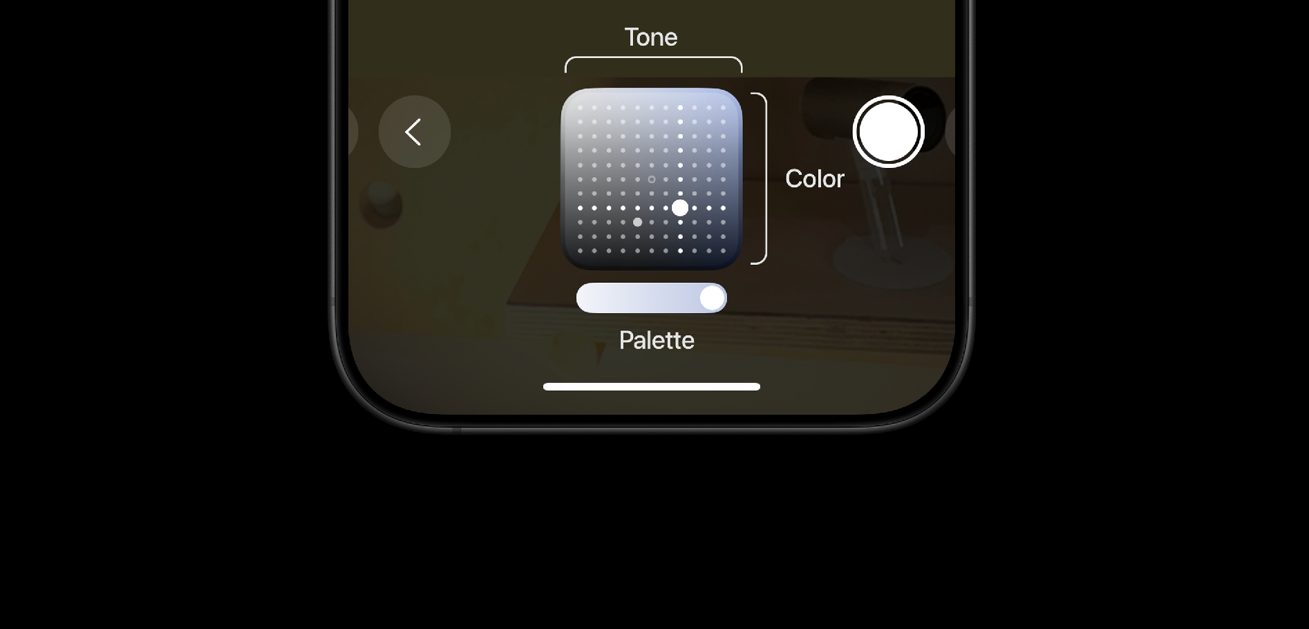
These filters are named after moods, such as "Dramatic" or "Quiet." You can fine tune them with a two dimensional pad. There's also a slider to adjust the color palette.
Maybe it’s just me, but I found the UI a bit bewildering at first, so I drew this legend to illustrate.
Your adjustments get wiped after a while, though, if not configured to persist.
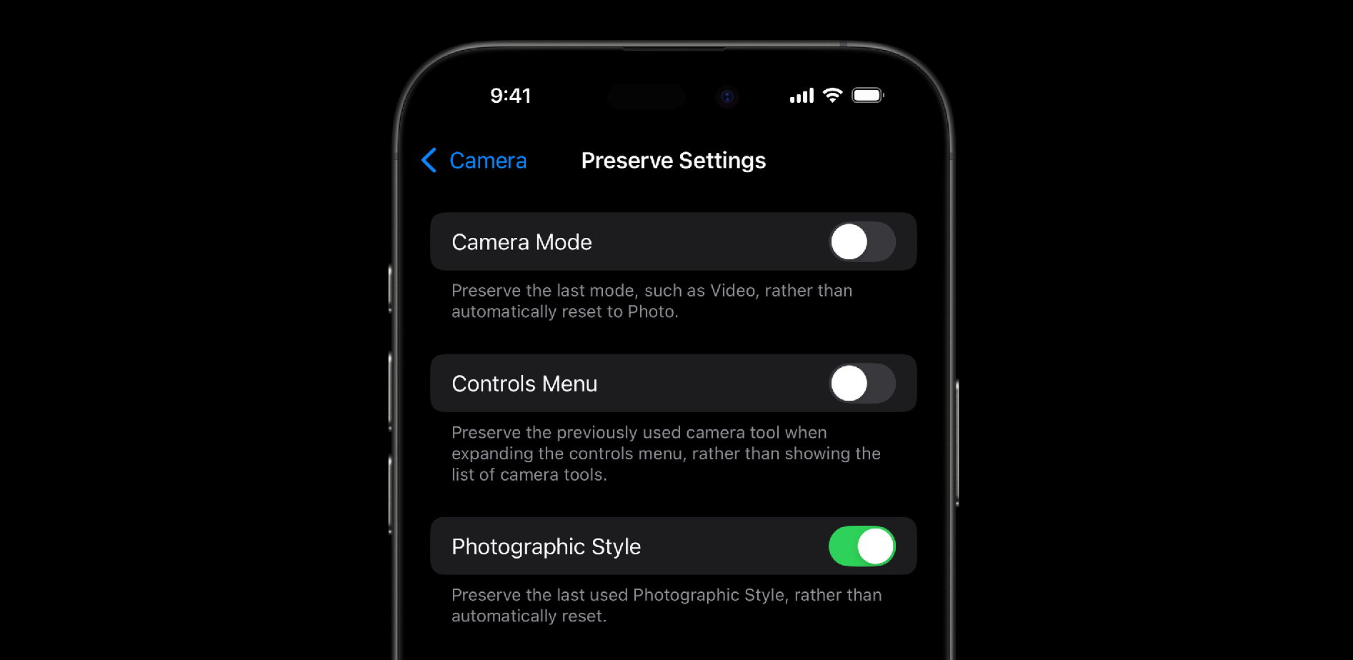
In the past, I avoided photographic styles, because they were destructive; if I went with a black and white style, I'd lose all the color information. The coolest change to photographic styles this year is that they're "perceptually non-destructive." You should be able to reverse the effects of the style, later.

It passed my test — it worked great for me. This even survives an AirDrop to your friend — they can undo or edit the Style when the metadata remains intact.
The added control in Photos also allows you to tune down the "HDR look," one of the more polarizing aesthetics of iPhone photos. However, Photos doesn't reduce sharpening, noise reduction, and subject-based adjustments. They still give your photos a "Shot on iPhone" look, whether or not that's your cup of tea. For deliberate photography, I'm sticking to RAW. For quick snapshots I'll be shooting in a custom Rose Gold Style.
Video and Audio
iPhone 16 Pro brings 4K 120fps video, including ProRes Log (!). It's a huge upgrade, and the improved controls in Photos to adjust playback speed are a welcome change too. 4K 120fps video can be recorded in HDR / SDR and with full processing (Slo-mo video uses a visibly lower quality process), whereas ProRes can only be captured using an external SSD. I love the ’new Apple’ that is shipping features like this clearly aimed at the professionals; I don’t see many people shooting iPhones with an SSD attached, but for those that do, this is a fantastic improvement on what has already proven to be the best phone to capture video on.
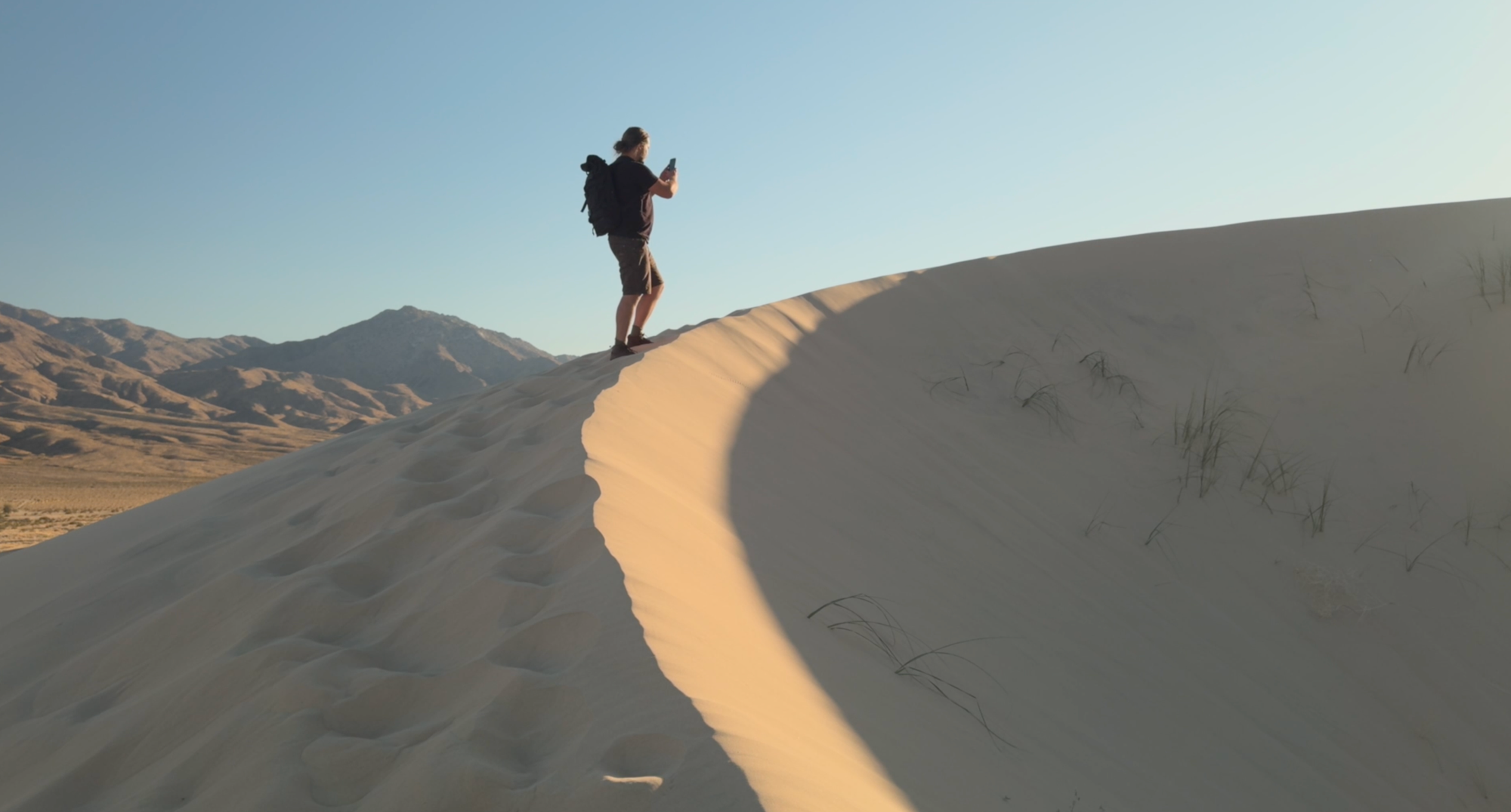
With Log and ACES, shots from iPhone simply fit into a nice workflow and can slip in undetected as deep depth of field B-roll no problem:
I am not a tremendously huge user of iPhone mics, but both iPhones (iPhone 16 and iPhone 16 Pro) get an improved 4-mic array that support a new Audio Mix feature. It lets you filter out background noise or re-render your audio recording as it if was in a studio or mastered more cinematically.
iPhone 16 Pro can capture Spatial Audio along with your Spatial Video, and does this computational audio processing a bit better than its amateur sibling. It’s very impressive, and can be a huge benefit if you find yourself without a mic — which for most people is probably most situations!
A minor improvement I would suggest to make this useful to us is to allow us to run 4-mic audio capture sessions during recordings that use an external microphone. The peace of mind of having a usable backup recording with Audio Mix would be tremendous.
Camera Control
Okay, here’s the really big deal. Something entirely new on your iPhone.
Over the life of the iPhone, buttons its buttons have either remained the same, evolved, or vanished. Here’s the original iPhone: home, power, volume down, volume up, and a ringer switch.
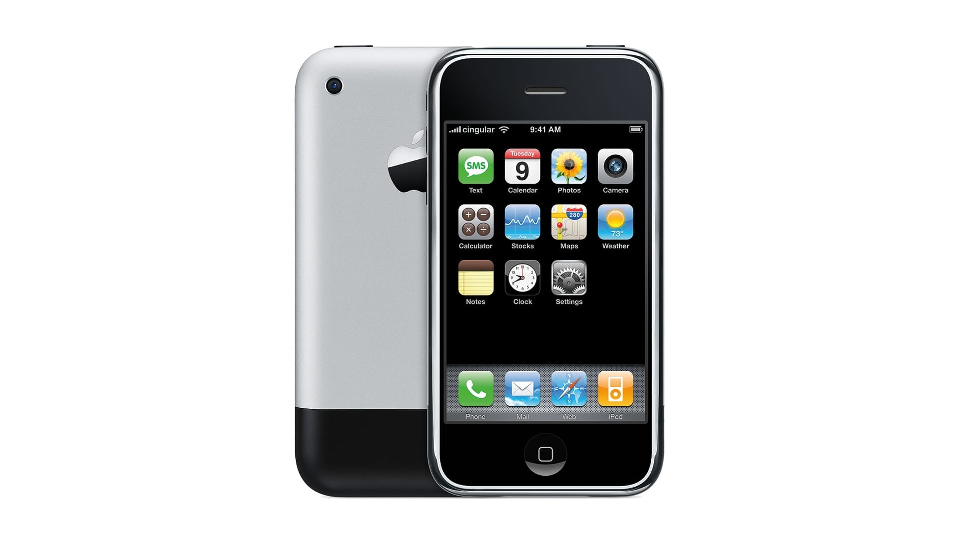
The first thing to change was the home button. It became a fingerprint sensor and was no longer actually clicking down. With iPhone X, it was finally put out to pasture: a full screen phone didn’t need a home button. A system of gestures worked much better, and Face ID removed the need to scan your finger to unlock.
After that, things stayed the same up until last year, when the ringer switch became an action button. That’s evolution on par with the home button. The only thing so far has been evolution or reduction.
The addition of a new control, then, is a huge deal. I feel like everyone is being fairly casual about this, when Apple is extraordinarily focused on reducing things down to the bare essentials. This showing up on the outside of your iPhone means Apple views it as essential.
How is in actual use? To me, the most important part about controls on a camera is that they become an extensions of you. You can get it in your fingers, and use it blindly. You know what a press or swipe sets. Camera Control delivers on this on some fronts, and not on others.
At the core of the Camera Control experience, there’s several fundamental interactions: one is to open your camera — truly, yours; it can be any camera app — and the other is to interact with it.
The Button
The first was something I had truly underrated when I saw the announcement. What caught eyes and headlines about the Control is the way you can half press and swipe on it; after all, we’ve had camera buttons on phones before. When I got my first iPhone, my then-girlfriend was deep into fancy Nokias — her Nokia N95 had a camera button (and a lot of other ones, too). Nothing new here. Or is there?
I found myself grabbing my ‘old’ iPhone 15 Pro after just days of using the 16 Pro and pointlessly mashing the side of the phone instinctively when I went to take a shot. The Camera Control (don’t call it a button!) is flush with your iPhone; it does not detract from the regular, familiar iPhone hand feel. But it will change the way you interact with it all the same.
Take a beat right now if you are reading this on your phone. Imagine a sudden flash of light causes a gorgeous rainbow to appear in an instant outside your window. Close your eyes. What routine do you have to quickly open your camera?
I had one. We all have some kind of routine, and after years of iPhone use, it’s pretty hard wired. It might take you some time to override this on iPhone 16 Pro, but once you do, it’s much, much faster. You just press that button. Locked? Press the button. Reading in the News app? Press the button.
When I reflexively went to do it on my older iPhone, the phone felt broken — as if you’d press the side button and the screen didn’t light up. I think we’ll see this camera opening button on many if not all Android phones very soon. It just becomes routine so fast, and once this gets in your muscle memory it’s extremely frustrating when it’s not there. You miss a shot. Because of that stupid button-less phone.
When Apple adds something like this, it tends to be just a bit more thought out than a new button that takes a photo — not a thing tacked on as a quick shiny thing to entice buyers. Thoughtful details are abound with the camera triggering press: in your pocket, iPhone won’t open the camera if you press it by accident, as was so wonderfully tested in Faruk’s review:
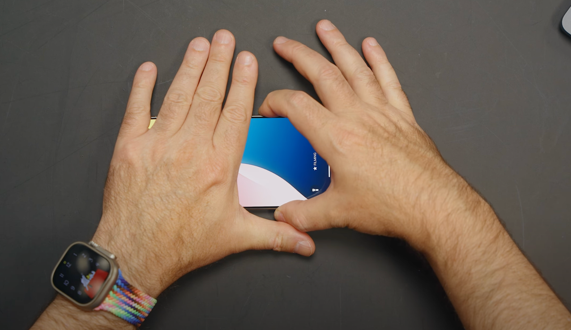
John Gruber wrote an excellent part of his review going into more into detail on what makes it behave the way it does. Myself, found all this 'smart' behavior solid — I haven't ended up with any errant snaps.
Let’s talk about the rest of this control, though — what is beneath the Sapphire surface.
The Adjustments
This button can be half-pressed, which is to say, not pressed fully. A light press on the button while Camera is open opens an Adjustment menu. Swiping on the control itself lets you dial the selected setting. The settings are (sequentially): Exposure, Depth, Zoom, Cameras, Style, and Tone.
By default, it behaves as a zoom dial. The dial ’snaps’ to the native focal lengths of each lens fairly aggressively, which is a good thing because a swipe on the Control has momentum if you swipe and let go. For precise adjustment, keeping your finger on the Control will allow pretty fine-grained dialing-in with minimal finger movements. I am impressed with its precision.
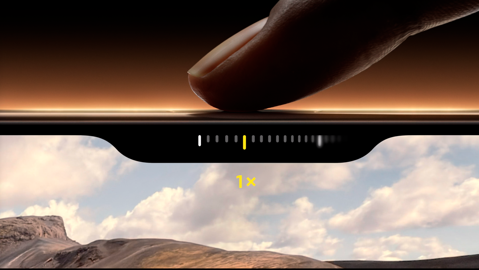
Regardless, if you are like me and consider zooming no more than cropping your shot, Apple has a ‘Cameras’ Adjustment that is by far my favorite way to use it. The Adjustment has all 4 ‘lenses’ in a row — from 0.5× at the far end to 1×, 2× and finally the 5× telephoto at the other. The result is a quick, pleasing way to cycle through your framing options with a satisfying level of precision — and delivers an amazing interaction iPhone cameras have never had.
The Cameras adjustment can be used... blindly. This may sounds bizarre at the face of it — why would you want to operate the camera without seeing it on a smartphone? Well — recall that reflexive habit-forming I described of opening your camera without looking at it by pressing the Control? The same applies here. Not only can I open it, but I can swipe and feel the haptic click or being on the ultra-wide or telephoto and raise my camera to take my shot.
You'll see photographers look at a shot and have a hand on their lens, snapping to a setting and then raising it to their eyes to shoot. It's essential. With this, I can hold my phone in an awkward position with little visibility and shoot through one of the lenses without seeing the screen. I ended up using this a lot. It’s really hard to put into words, but it becomes something in your fingers; a really tactile camera experience that is more of an extension of you. It’s so nice. It’s just like using a camera lens.
That brings me to the not so good part: the Cameras adjustment experience is so nice, integrated and good that it makes the rest of the adjustments feel less great.
Apple has successfully kept a lot of its Camera app paradigms rooted in traditional concepts of photography. Portrait mode features f-stops for its depth effect; lenses are described in full-frame equivalent focal lengths. This stuff matters: it exposes users, even casual ones, to the fundamentals of photography. Through the most popular camera, everyone continues to be educated about these things and can learn what they mean in a very hands-on manner.
Camera Control offers a lot of options, and in doing so, I feel like the Camera Control somewhat breaks from your traditional expectation of what a ‘dial’ on a camera does. Dials do one thing. This does many. In doing so, departs from a camera convention whose simplicity is appreciated by amateurs and professionals alike.
In my ideal setup, Camera Control simply has one, potentially mode-dependent, adjustment. Ideally, it has a logical and predictable start and end (‘opening up’ an aperture can be done without looking at the lens — a similar thing goes for the zoom range). Simplicity can be its flexibility: ideally, it is so predictable and applicable to the camera task at hand that it works even if you cannot see an on-screen interface. Having a "double light press" and navigating a sort of mini-meta-menu system just ends up feeling kind of clunky and odd.
It ends up packing a lot of on-screen interface, and that can also get in the way: If I launch into the Camera, swipe quickly to get to the ultra wide, then hold my finger on it to be ready to shoot, the Camera Control keeps hovering over my frame.
In all, I think the relative plethora of Adjustments makes it feel clumsier and less sleek and snappy than it could be. Given its soft haptic feedback and many options, it can seem a bit overwhelming even to more photographically savvy users. Those more conspiratorially minded might assume Apple added more features here to compensate for the iPhone having fewer at launch; I myself think it’s just a commendable first attempt to do something new.
Focus
For us as developers, it is an interesting new thing. It seems, for now, uniquely catered to us: not only can you set the Camera Control to open any (camera) app like Halide, you can also create your own Adjustments. The API allows us to pick a system icon and use a basic picker — no custom interface — to tie into features of our own app.
It was tempting to just rush into this and have something on day one, but we really wanted to experience the Camera Control and devices for a while to see how it would work in our way. We like to do things a certain, opinionated, focused way. And that’s exactly what we did: Camera Control in Halide offers 2 Adjustments: EV, to adjust exposure, and Focus, at the end of the scale.
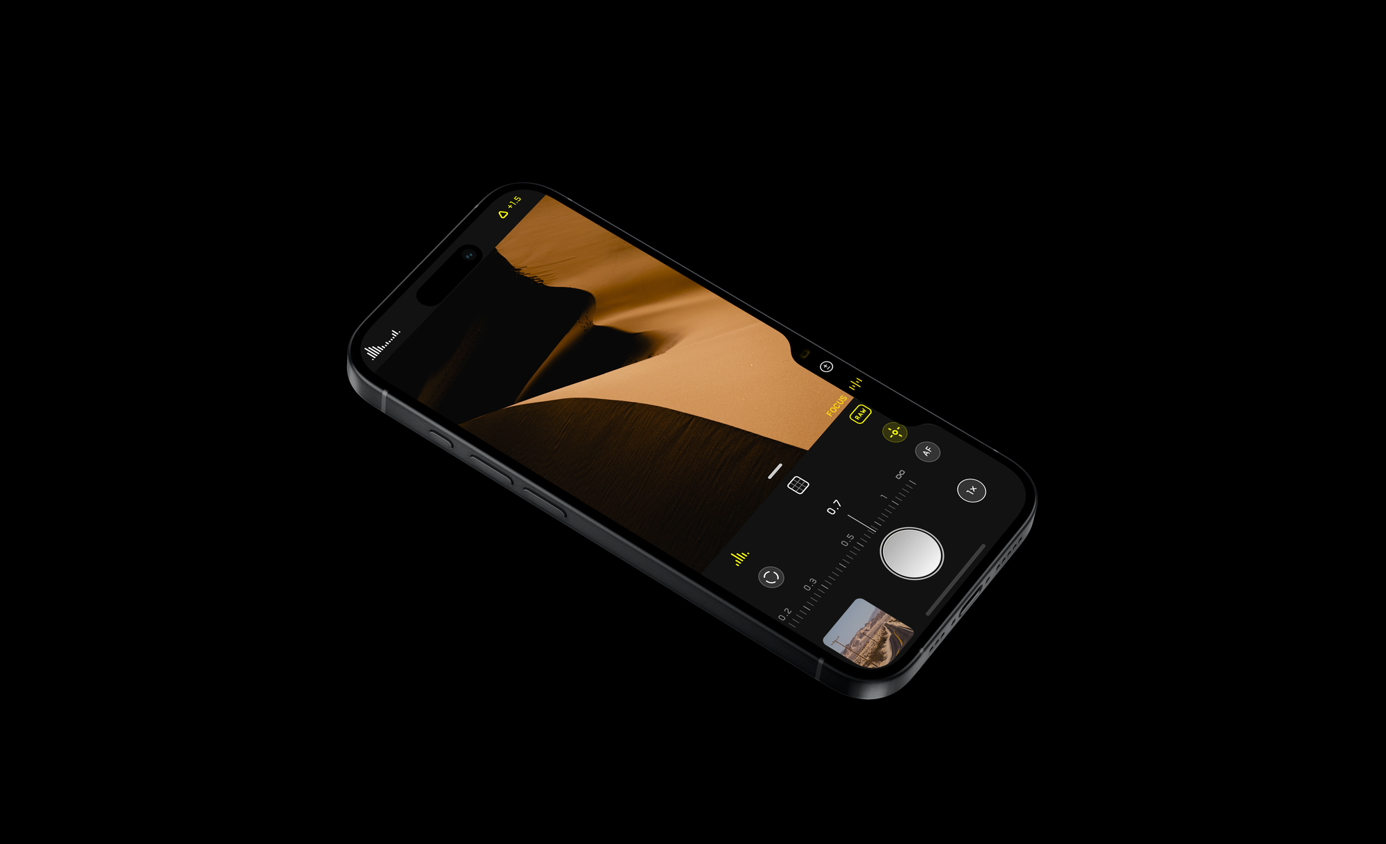
Much like Cameras, a manual focus adjustment allows you to quickly focus something as close as possible without looking at the phone. Adjustment for exposure lives in the middle, with a bit more latitude than the system (we go up to -/+ 6 EV, vs. 2) — and the top one is like the middle of your gearbox: “Lock”. Leaving a simple locked adjustment at the top level means Halide does not suffer from any accidental triggers in case you have sensitive adjustments.
On The Nature Of Shutters
There’s an invisible aspect to Camera Control I want to touch on before we move on. I noticed it is also deeply integrated into a low-level improvement I mentioned before — and to understand that, you have to look at how cameras take photos.
Try pressing a shutter button on a regular camera. Film or digital — it will make a quick click. The moment the button reaches the bottom of its throw is when a camera takes a photo.
iPhone 16s do not do that. In fact, they cannot do that. What do I mean by ’that’? Taking a photo as soon as you press down. They take a photo when you release the button. This is something we worked hard to avoid in Halide: when you press the shutter, you want the smallest possible delay; a shutter should fire when the shutter is triggered, not upon release.
But the Camera Control can be long-pressed to take a video. How, then, do you still capture what you see on your screen? Therein lies the smart part of this camera — using the aforementioned Zero Shutter Lag, it can offset the ’slowness’ of the button by grabbing a photo in its buffer. It’s remarkable, and works great for getting a steady shot despite your press, and despite any delay from raising your finger.
The Long Game
I am obviously excited about what the Camera Control brings to the iPhone. It’s a huge change, but it’s easy to miss the long view here.
There’s a reason this isn’t on just Pro phones like a telephoto. Apple knows something about cameras, and that is that they will mean something very different in the years and probably decades and beyond to come.
As our devices become our intelligent companions, cameras are their most important sensors. Their eyes to the world — and accessing the toggle to let them see and interacting with the world is exactly what this control is about. While I feel tremendously catered to, I do think the long view here isn’t to use this as an aperture ring or a focus dial — it’s a button and aperture for the intelligence inside your device.
Processing
And that brings us to the intelligence that does live in this device and controls how every image comes out: Apple’s intelligent image processing.
Image processing has been a hot topic of this review for a while now, and this generation is no different. It's something a lot of reviews of the iPhone 16 actually already have talked about in varying ways.




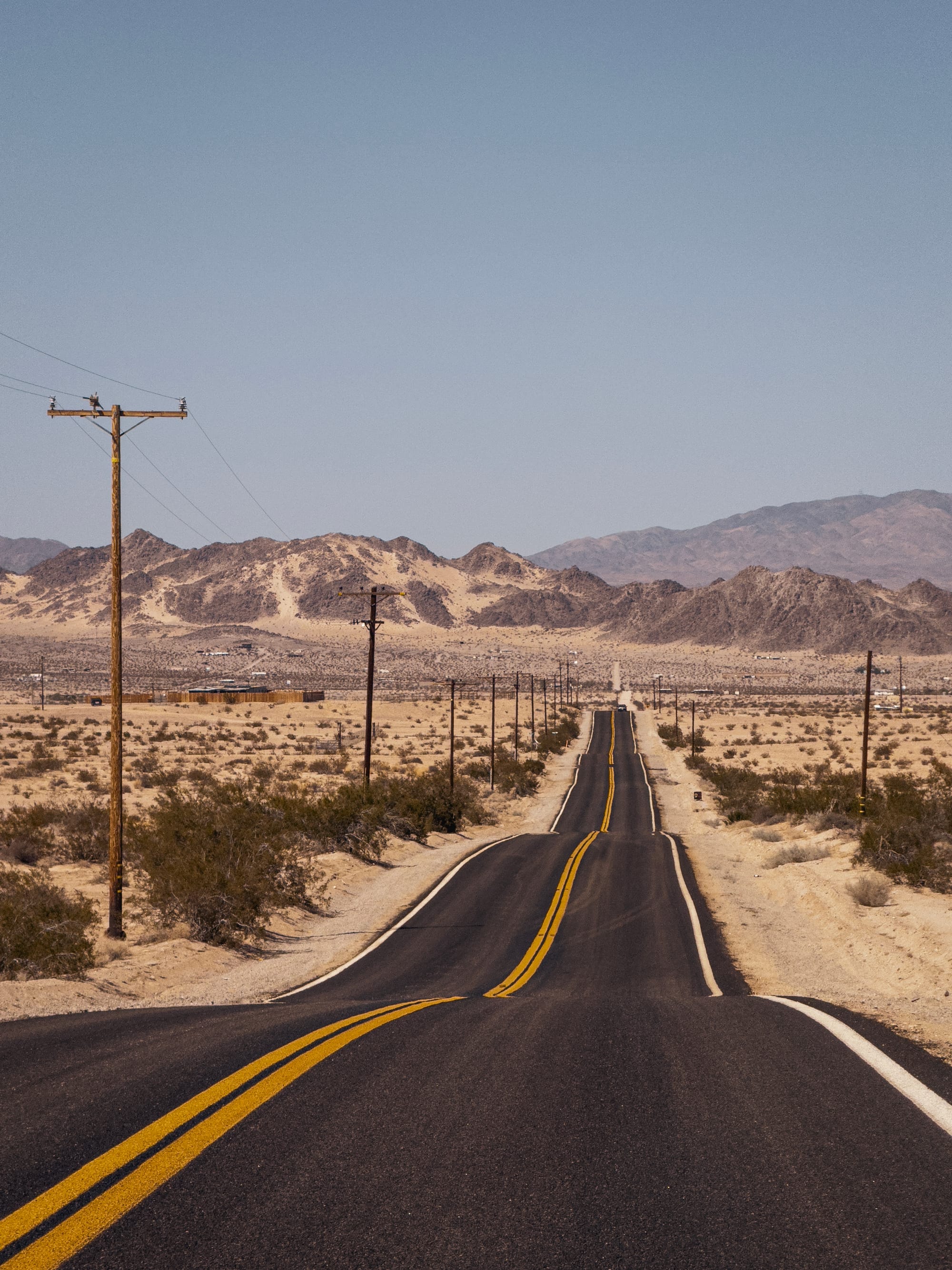
Here's the thing that won’t change, review after review: an iPhone is just better at being a computer than a camera. That’s the reality of it. If you have a large camera with a big lens and a big sensor, it can gather a lot more light. That's just physics.If you have a small camera and a small sensor, you're going to have to make up for it somehow. The way the iPhone makes up for it is by being a better computer than a camera. All this computational magic that it does, merging a dozen frames into one, gives it great dynamic range. It lets it take photos at night. It does magic — stuff a small camera shouldn’t be able to pull off.
It's honestly invisible and fantastic when it works. But when it doesn't, and it does something unexpected, it's not great. Is that different this year?
In brief: if you were a fan of the iPhone 15 Pro’s processing, you will enjoy what iPhone 16 Pro is offering up this year. And if you didn’t, there is now a genuinely useful and mostly-lossless way to get shots looking very different than the past years’ iPhones without editing them.
I think there’s people at Apple that probably want the iPhone camera to have a more opinionated ‘look’ — but at this point, a billion people use it. It’s an eternal balance of being a tool for creatives and the most popular tool in human’s hands to capture the world around them as it exists. Not an easy task.
That being said: I think Apple should put almost all of its effort into achieving the seemingly-impossible: a noise reduction method that looks more natural than AI ‘making up’ details, or watercolor smudging. If anyone can make grain a symbol of photographic craft and authenticity, even out of a digital camera, it’s Apple. I still get shots from iPhone where it will go through tremendous lengths to prevent me from having a noisy shot. I can see that extracting detail from the noise is difficult; but the resulting image just looks odd.

People add back noise into shots like these often, as it looks more natural to our eye than the smooth dark rocks. This is the natural noise from the sensor — a bit too much for the average user, but a bit more pleasing to me.
If there is one theme to iPhone’s approach to photography this year, it’s more control — and that might apply to the Camera Control, and Photographic Styles, but it remains rather processed whether you like it or not. My advice?
Start to accept that highly processed images are here to stay.
As technology marches on, we are using cameras that help us achieve greater results than the physics would even support — but in doing so, some level of creative control is lost. And while we have tools, like our Process Zero, to achieve what I would call ‘old fashioned photography’ — We are not sure if that will even survive through the long future.
As we strive for ever thinner devices, folding phones and the tech we see in science fiction, processing is the only thing that enable cameras to work in the increasing constraints on power and size they have to fit into.
Even on your new iPhone, camera quality isn’t only quantified by sharpness of a lens or rendering of a single image anymore. The definition of color and sharpness have given way to photography reborn as data science. Your camera gathers signal — and in that signal is noise. The more signal it can acquire, the better. It can handle the aberrations, it can handle the noise with extra processing — as long as it can maximize its light input. In native raw captures, we see more color fringing than years ago; it’s just very well processed out of your shot. Lenses get ‘worse’ — but the photos get better.
That’s why I am here to tell you not to be optimistic about our cellphone cameras going towards less processing. Cameras are being optimized for the future, where photography relies increasingly on magic — and it today’s processing will seem quaint. Things in a decade will be very different than what it is today.
iPhone SE (Spatial Edition)
I’ve talked a lot about photography and video changing, but if you’ll humor me for just one more moment, I’ll talk about one change that excites me. Apple’s push into Spatial photo and video might not be for everyone, but its existence helps a chicken-and-egg problem in an emerging medium that has moved more people close to me to tears than I can recall.
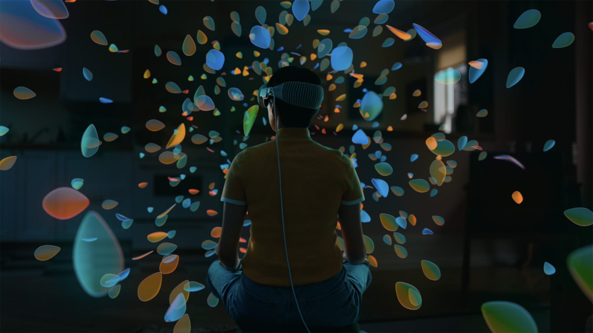
Spatial media — that is, photos and videos shot in 3D for you to relive on a device like Apple Vision Pro — is still nascent.
There’s various tools for capturing immerse and spatial video and audio, but if this is the first iPhone built for the ground up for AI, it’s equally fair to say it’s the first one built from the ground up for Spatial Capture.
That excites me, not because I am an avid lover or consumer of it, but because it’s a genuine new form of media arts that does not involve boiling a lake to generate an image of an astronaut riding a cat. I love that Apple’s working hard to make tools, regardless of demand. The only way we can experience amazing art is if we invent the tools to make it, first.
Verdict: A Camera That Adds Something
iPhone 16 Pro, along with iPhone 15 Pro and 14 Pro, are all what I would call a ’seismic’ camera release for Pros: the kind that has such significant changes that you would not consider it an incremental move but one that makes it practically impossible to go back.
iPhone 14 Pro brought us a large, gorgeous 48MP main cameras.
iPhone 15 Pro ProRes Log.
And now, iPhone 16 Pro brings Zero Shutter Lag and Camera Control.
If you want a quick verdict: the iPhone 16 Pro is a tremendous camera because between Camera Control, Zero Shutter Lag and its advanced Photographic Styles, it will capture more moments than any iPhone ever did by a huge margin — and that in itself makes me recommend it over any previous one.
That being said, there’s a larger feeling I am left with after reviewing this device in my hands.
As I feel myself getting older, I hold on to the idea of what I think a ‘camera’ or ‘photography’ is more and more. The same happened with cellphones. People used to ridicule that your telephone had a camera on it. No doubt there were purists that said, “well, in my day, this was a thing you took phone calls on. Not a computer in your pocket.”
Here I am: in my day, a camera was a thing you took photos on. Not a computer brain’s eyes to the world. Perhaps I am feeling this is a big change because possibly, this is the close to the last of its kind or the link in evolution: an iPhone that has long since redefined what a phone is, but is about to redefine what a camera is, and what photography means.
Recall the introduction of the iPhone as a phone, an internet communicator, and an iPod. Notably lacking? The camera.
This iPhone is a camera. Maybe the first, if you were to define a camera as a device that has dedicated control for it.

It was in a place like this where one of Steve Jobs’ greatest inspirations once stood and imagined a revolution in photography that shocked the world. He imagined something simple: Instead of having to hire a photographer with a camera, who would bring film to a lab or go into a darkroom to present the shot days later, he imagined a small, elegant metal rectangle that fit into your pocket.
You could simply take it out, slide your finger on its surface to adjust your shot, and take the photo. The real magic? You’d take it and see it; no need to develop any film. Instant gratification.
That man was Edwin Land. He envisioned something most considered impossible: the Polaroid SX-70. It changed photography forever. It seems futuristic today. And guess what? The only controls on that camera were a button... and one slider, right here at the top.
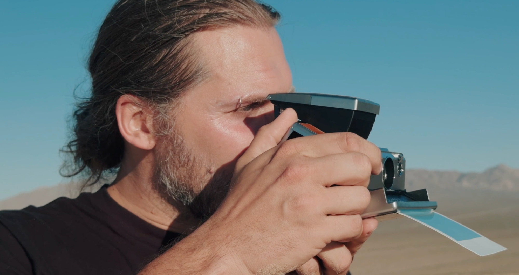
Land didn’t create this because he was obsessed with technology. He wanted to strip away the complications of photography and make it accessible. To focus on the craft, and art and less about worrying about know-how or technique. To truly bring it to its essence: empowering anyone to capture a moment. Surely, some lamented the loss of craft. The loss of essential parts of photography.
Perhaps it was the camera phone that was the next step that truly made photography even more accessible and instant. But many feel like something was lost. It’s telling, then, that where Land removed so many parts of the camera, Apple is adding one.
Apple adding the a new control - a button, a dial - to iPhone isn’t a move it does casually. It’s an admission of a fundamental change of iPhone's nature that happened over time. An admission that iPhones are far less phones today, and far more cameras.
But as a photographer, remember that ‘camera’ might really mean something entirely different than what we are used to — phones once made phone calls. Today, cameras take photos. In the future? Perhaps this is much more a lens to see and process the world with. A camera, as it is defined in the 21st century.
If I’m reviewing this the way it is, then, I’m really enjoying what I have in my hands. A device on the edge of the sands of time — rooted in the cameras I love, with just enough of the future of photography packed in here for me to manage.


