


This is the second in a series of posts on RAW photography on iPhone. I previously wrote about what RAW is by explaining a little on how cameras work, how you can use RAW, and what some key tradeoffs of using RAW are. New to this series? I suggest you start there.
I’m the design half of the team that builds Halide, a camera app for iPhone. As a result, I take — and edit — a lot of photos on my iPhone. This guide will walk you through the basics of RAW editing and adjustment. Most of these pointers also apply to editing RAW files from other cameras, but some parts focus on iOS editing workflows and how to transfer your RAW files from your iPhone to your Mac or PC.
Most of Halide’s (and other iOS RAW camera apps’) RAW shots come out fairly ‘flat’, as they are basically designed to give you maximum editing freedom instead of looking punchy right out of the camera. My workflow is typically to edit them a bit and share them:
Editing RAW files can be done right on your iPhone, or on your Mac or PC. But we’re getting ahead of ourselves: the editing process starts as soon as you are done taking photos and start reviewing your shots.
Before you edit
You’re about to jump into a creative process where your options rapidly multiply to millions of possible outcomes.
Since editing is time-consuming, whittle down your shots first. Select your best photos, then go through that selection again, more critically. Are these really the best shots? Great. Let’s get started.
Before I start editing a photo, I like to at least commit to a certain mood I’m trying to nail down.
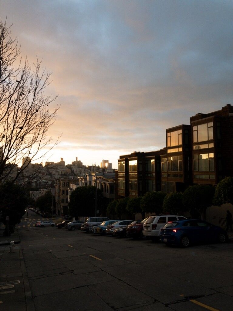
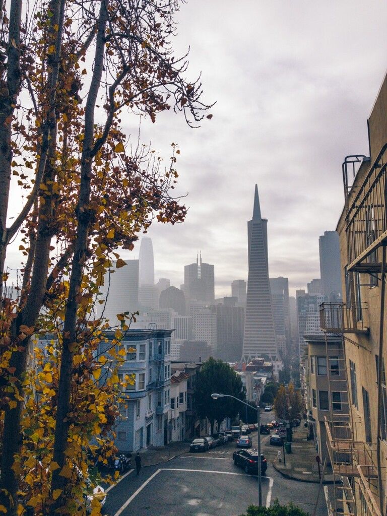
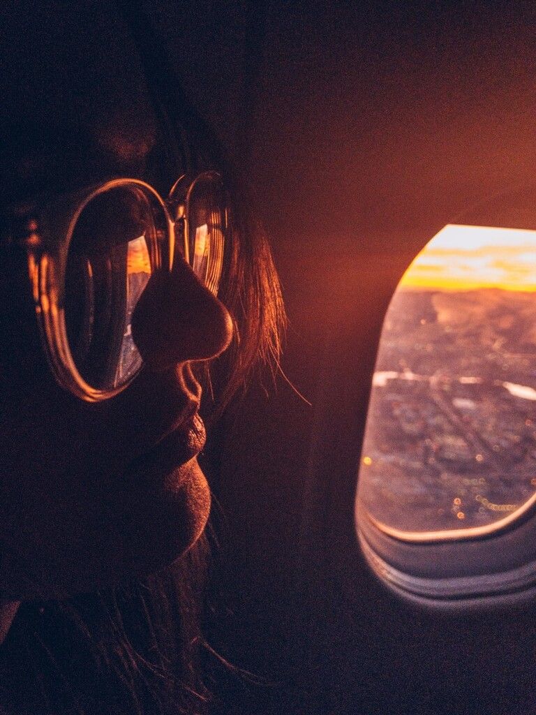
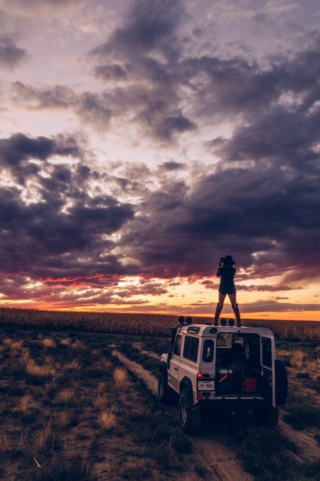
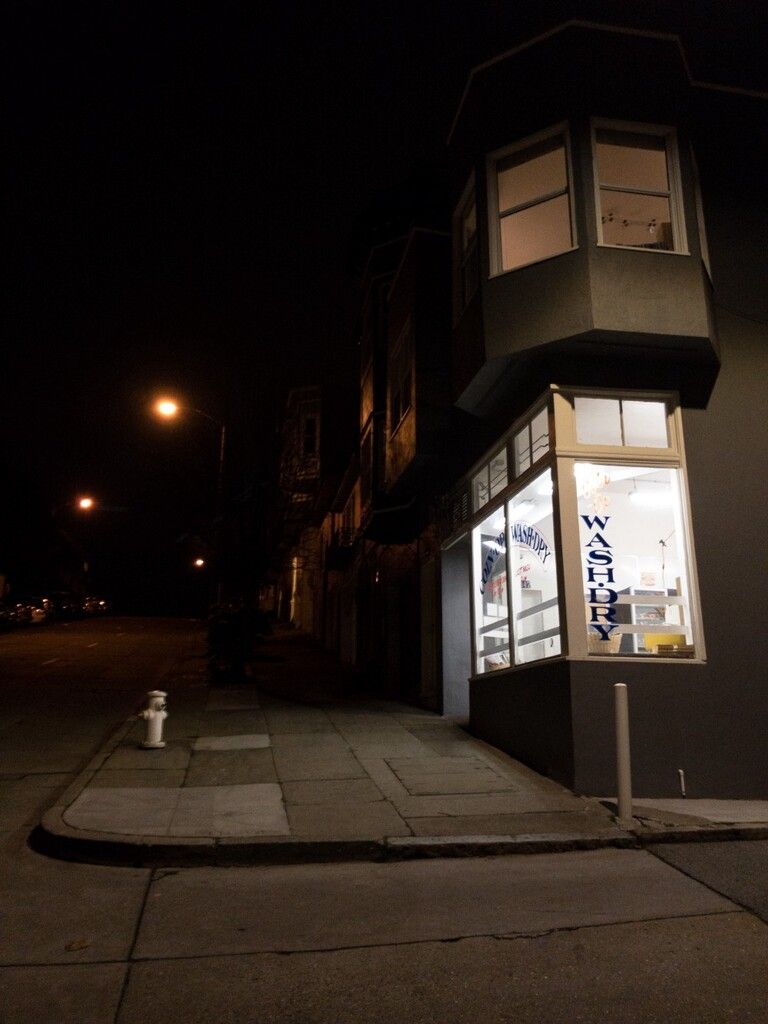
Let’s take this shot from the first article. I asked myself, “Why are you editing this shot?”.
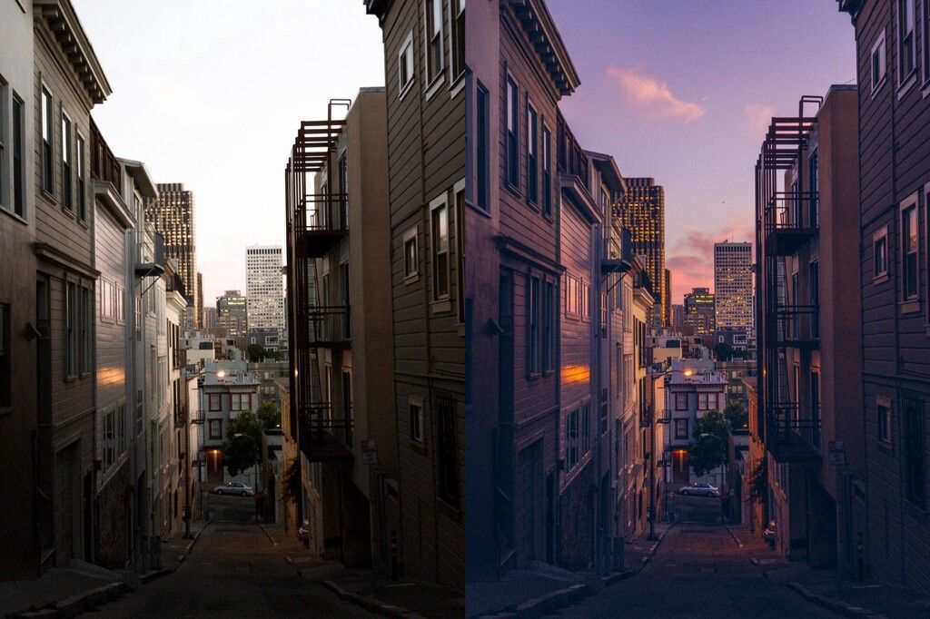
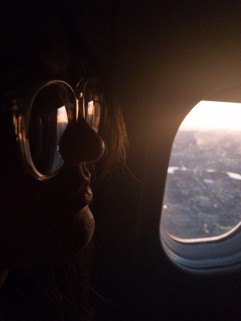
In my case, I was walking down to get dinner when I was surprised by some really beautiful sunset colors in the sky. I saw orange and purple light casting over the entire city, and looking left, the sheer warmth and vibrancy of twilight struck me.
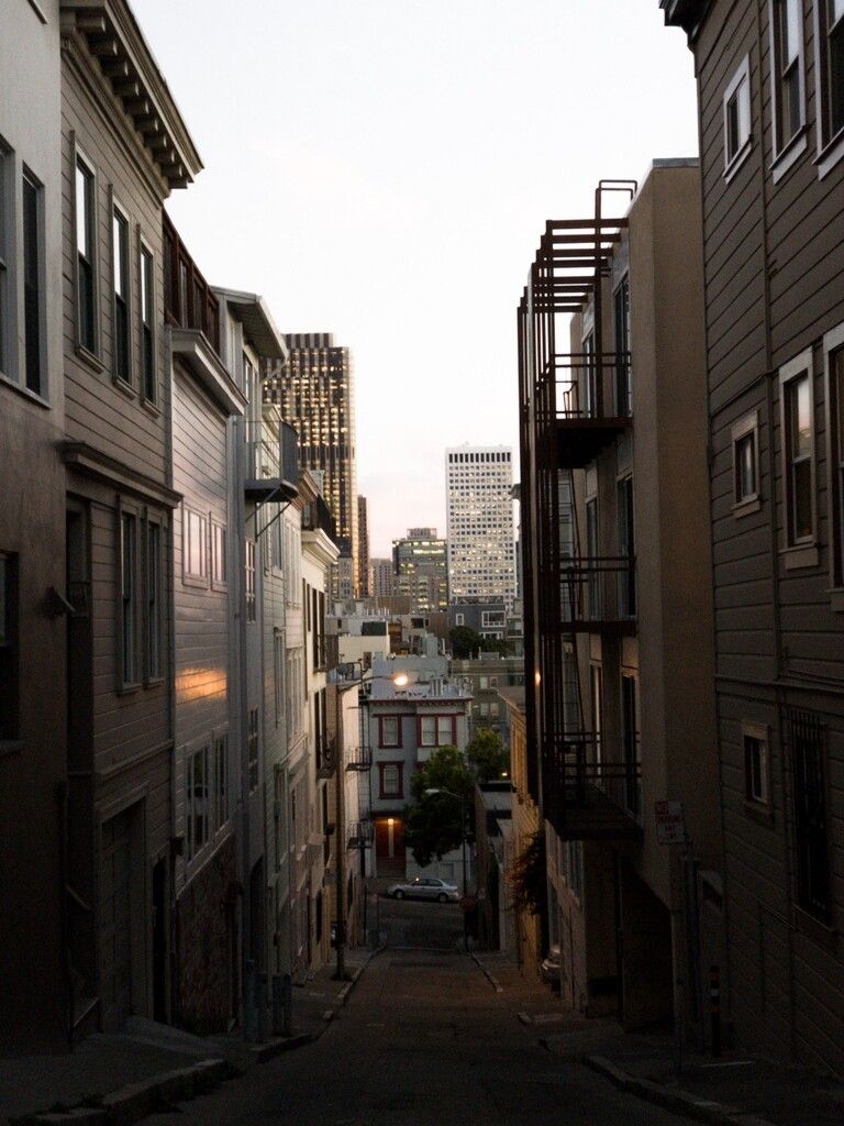
Unfortunately, my image came out of my iPhone looking dull and overexposed in the highlights — the sky was very bright.
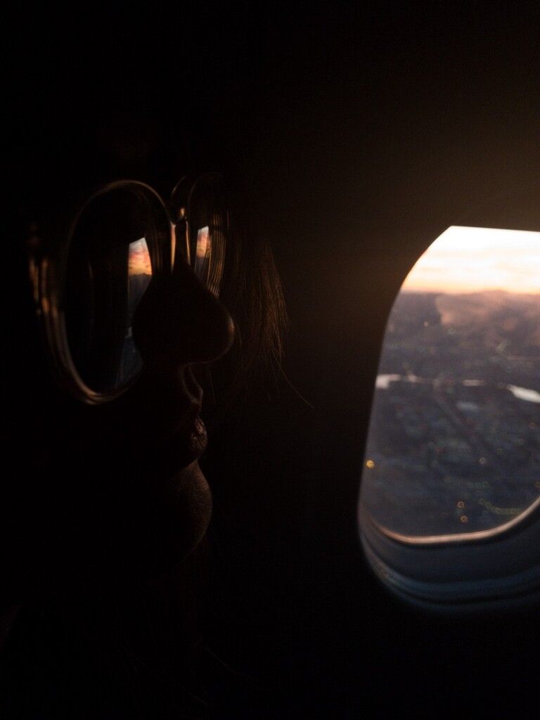
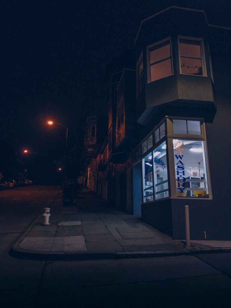
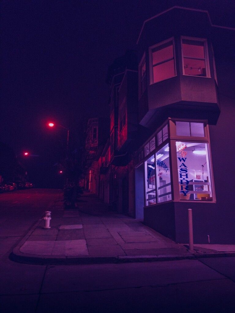
That’s not how I saw it. I wanted to edit it to look more like the way I saw it when I walked down the hill, and also slightly exaggerate the effect to better convey how beautiful it was in person.
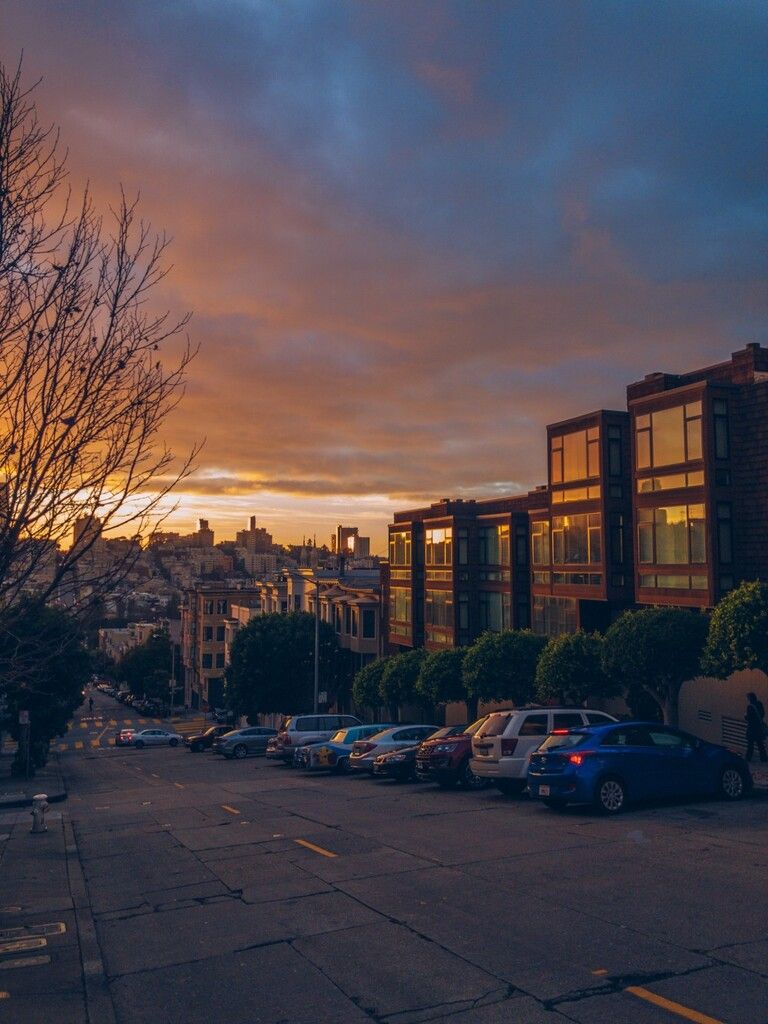
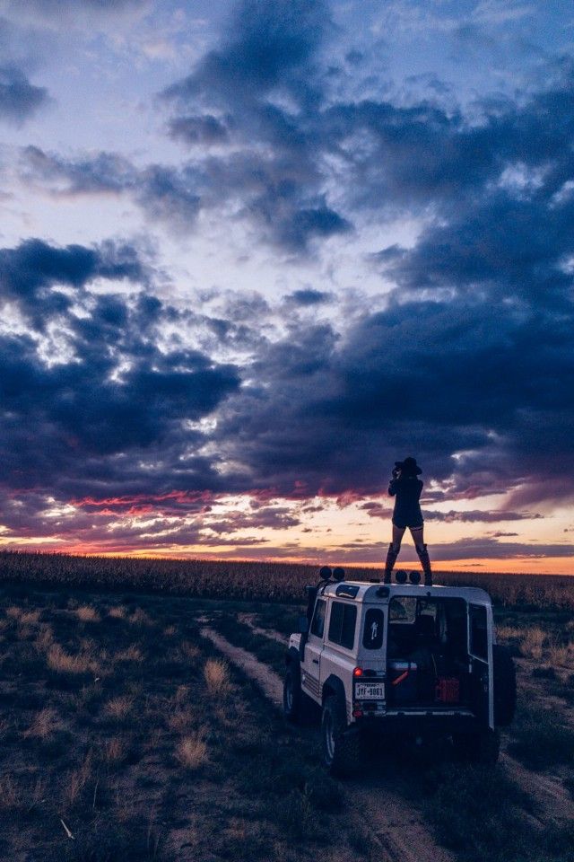
The result:
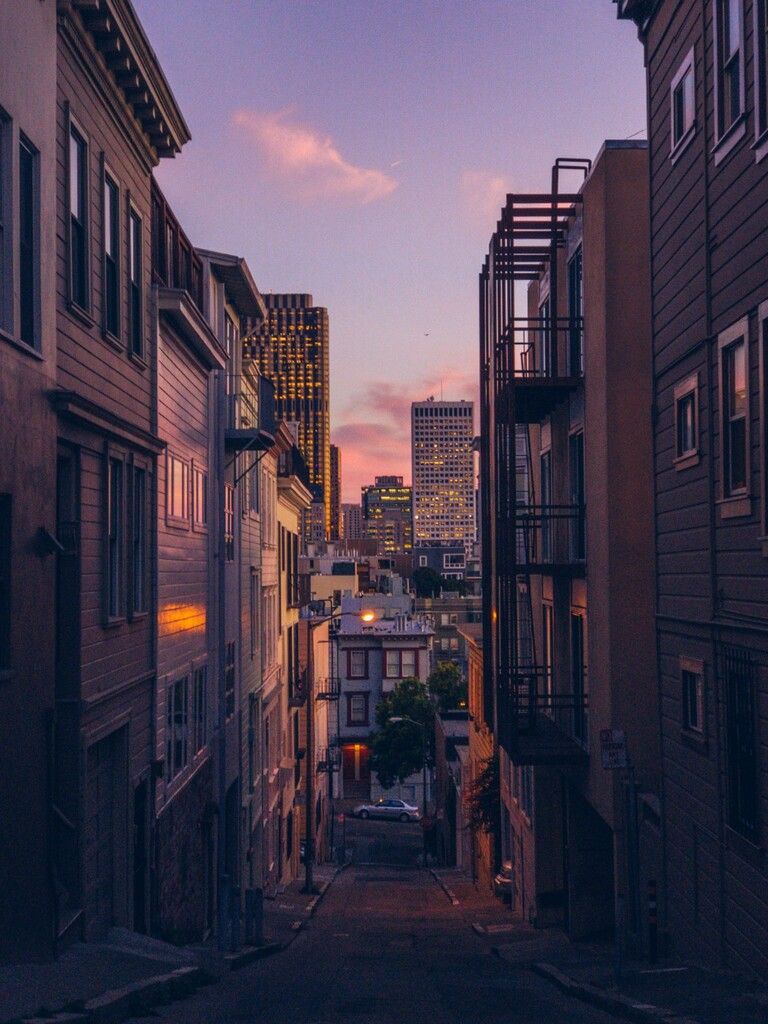
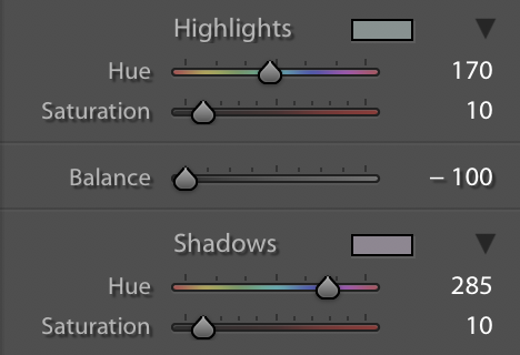
I skewed the white balance a bit towards purple, and applied some split toning to get the same impression I got when I was standing there taking the photo. Therein lies the parallel between image editing and acting: it’s best to slightly overdo it, as long as it doesn’t overtly distract from what you’re trying to communicate.
Know thy Edits
When editing photos, there’s a slew of sliders, knobs, buttons and levers. We can break these down into three basic groups.
Brightness and Contrast
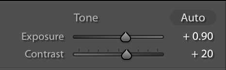
The first thing I tend to edit in an image is getting the exposure right. It’s important to get exposure right when you are shooting*, but nobody’s perfect, and there is more to exposure than just the amount of light on the sensor.
In an image, I consider the ‘true exposure’ to be the image roughly as I saw it. The human eye has an impressive dynamic range, which means that it can see lots of detail in bright areas while still being able to see details in the shadows. Digital cameras haven’t quite caught up yet, but that’s nothing our tools can’t fix.
*more tips on how to shoot and camera settings in a future article.
Some people go as far as to do multiple exposures and merging them into what’s called an HDR image (HDR stands for ‘High Dynamic Range’). Your iPhone occasionally does this as well, when you are shooting a subject against some backlight. It’ll automagically merge several shots to get more details in the highlights and the shadows.
For our RAW edits, we won’t go into that; the tools we have work plenty well without additional shots.
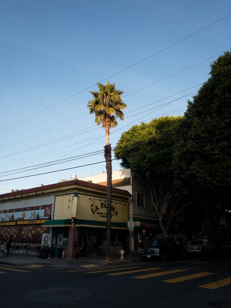
Let’s bring up this image:
With a slight exposure correction, it looks a bit better. But we’re losing some detail in the background here.
We can adjust the light levels in specific regions of the greyscale image. They’re Blacks, Shadows, Midtones, Highlights and Whites. Adjustment of these can be done individually with sliders, or on a continuous curve, which is called a Curves adjustment. Your editing app might have both!
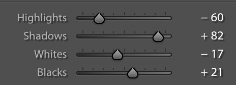
Here, we push down the highlights and whites while pushing up the shadows. Be careful with pushing up the shadows excessively: not only can it look jarring, it will also bring out a lot of unwanted noise. Pushing up the blacks can give it a very washed out look — fun for stylistic purposes at times, but not what we want now. I find the noise kind of cool looking in this shot, so we’ll go all-in on boosting the shadows.
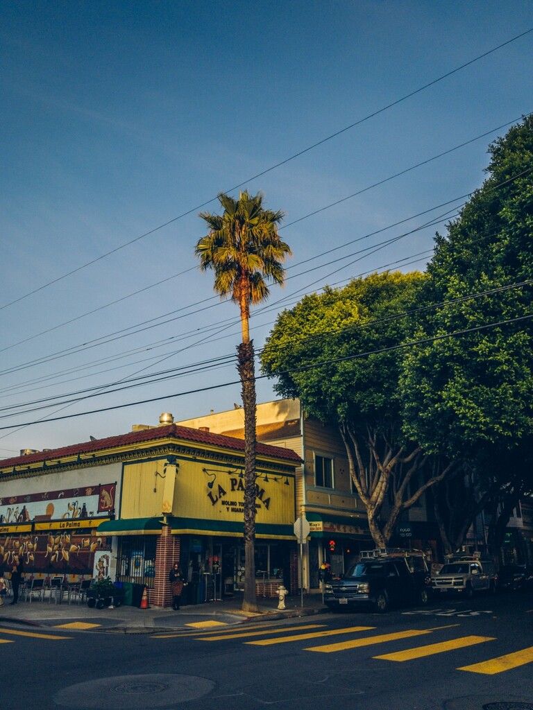
Here we go, with color adjustment:
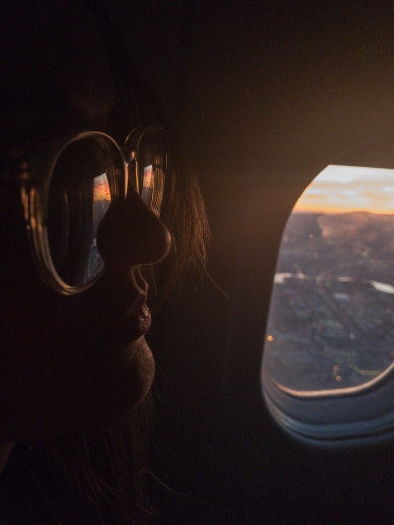
Contrast to the original image, and you can see we got something closer to what I saw in the first place. 90% of my edits are simply making the image look more like what the naked eye can see.
Notice that this can all be done in greyscale, if you prefer. This first step of editing is all about getting the basic shadows and highlights to the right place before we move on to color.
Addendum: some apps offer more fine-grained adjustments of contrast than just a global contrast slider. There’s a lot of different names for this: Clarity and Structure are among the popular terms for it.
Essentially, Clarity is an adjustment of local contrast: it adjusts the contrast where a dark area of the image meets a lighter area. Sometimes these tools can be used to give the image a stronger ‘pop’ or bring textures forward. Use them sparingly: excessive local contrast adjustments produce halos around dark objects, leading to jarring results:
There’s a great subreddit about images like this: /r/shittyHDR. Let’s all makes sure that none of our images end up there, OK? OK.
Color
Color might seem like a minimal adjustment. Either your colors are more vivid, or they’re less vivid. There’s far more to editing colors than that.
As I mentioned in the first post, the big advantage of shooting in RAW is the freedom of adjusting white balance. The white point in an image determines the cast of all the colors in a shot, so being able to customize it gives enormous creative freedom.
In this sample image, the camera captured the image slightly warm. Most cameras have a bias towards cool or warm; the newer iPhones bias slightly warm. This tends to look more pleasant, so I often skew warm in my edits as well.
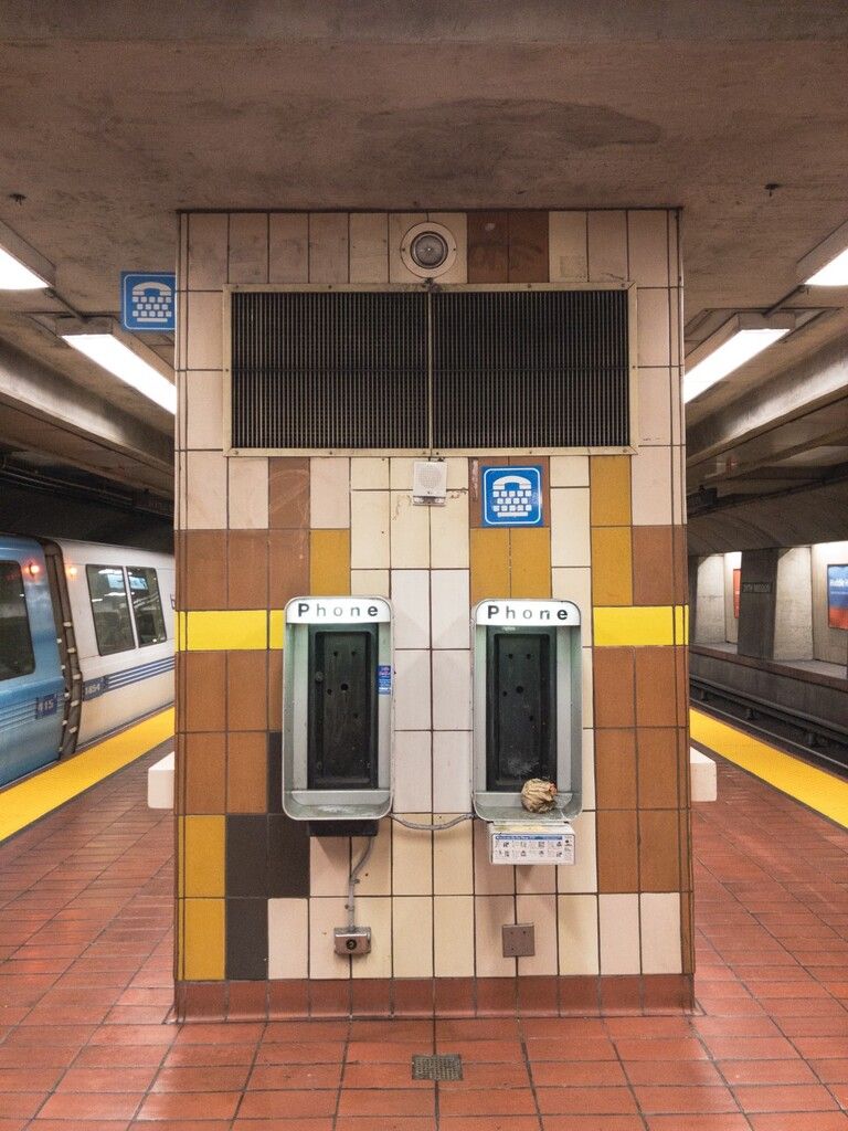
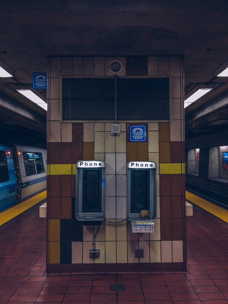
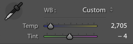
In this shot, I pushed it towards cool a bit, while also moving the white balance from pink to green a bit more. It helps establish the mood in the shot, and mirrors the lighting conditions; the fluorescent bar lights are fairly cool.
I also slightly adjusted saturation and vibrancy. Vibrancy is a clever tool: not all apps have it. Essentially, vibrancy adjusts the intensity of muted colors that are not already highly saturated. High vibrancy will bring out those muted colors more, while leaving saturated colors alone preventing over-saturation.
Two other creative color tools I use are selective color adjustment and split tones.
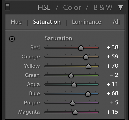
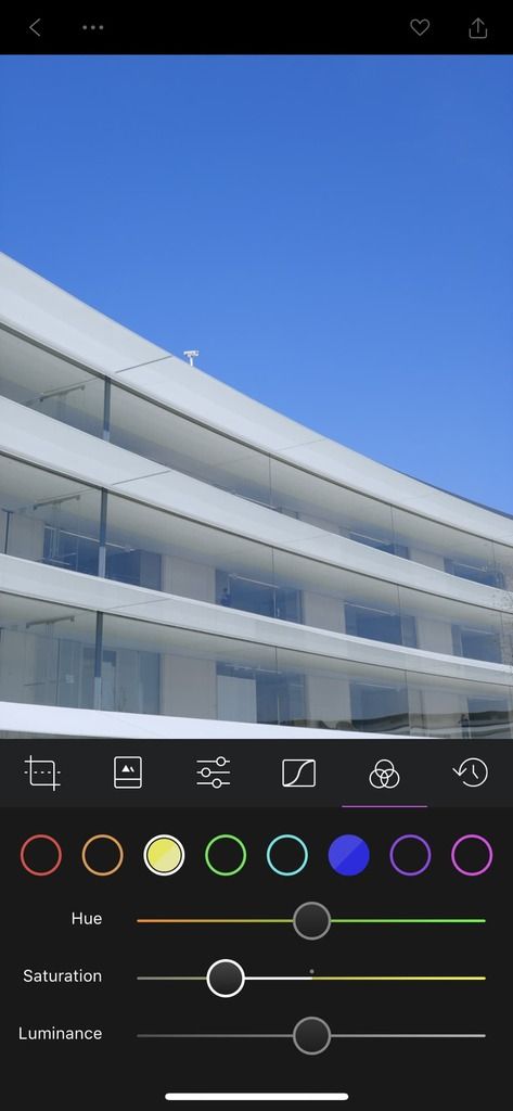
Selective Color. We’ll use Lightroom for Mac in this example. Lightroom’s selective color adjustment panel is called ‘HSL / Color / B&W’. HSL is short for Hue, Saturation and Lightness, and it lets you adjust individual colors in the image along those axes. We’ll stick to the HSL tab for now.
In this image, I adjusted the hues of red, orange and yellow to make a warmer looking image, and saturated them a bit more. I then complemented it with boosted blues. I left the luminance alone.
You can shift a color substantially, but not to a completely different shade. I tend to only shift it slightly; for crazy color swaps you’ll need a tool like Photoshop. Also, keep in mind that pushing the luminance of a color down increases its saturation, and pushing it up reduces it. You’re essentially pushing that shade closer to white light.
Remember how I mentioned 90% of my edits are just to make the image look like what I perceived with my naked eye? Selective color adjustments are perfect to let you tweak individual colors so they look ‘right’. Don’t get too caught up in wild adjustments; try to make it faithful to the mood and look of what you shot.
Split Tone is an interesting tool that many novice users are blown away by. Once you have used it, you can’t help but see it everywhere: in major motion picture color grades, in graphic design, and in almost every nicely edited photo you come across. Excessive split-tone editing was the basis of some of Instagram’s early filters, giving it the signature aged film look.

With a split tone adjustment, you assign a tint to the highlights in your image and a tint to the shadows — preferably contrasting tints like yellow highlights and blue shadows. This gives the image a color contrast, which is visually interesting and pleasing. It changes the entire look!
I’ve pushed the saturation of the split tone to the extreme in the leftmost shot to illustrate how split tone adjustments color the scene.
With split tone, I was able to tint the light inside to a cooler tint while giving the light outside a warm purple tint. It reinforces the emptiness of the scene, and works with the warmer light sources of the street lights and the blueish laundromat lighting.
As usual, be conservative with this edit. You can usually control the power of the split tone adjustment as a whole, and you should be careful not to make it obvious. The best edits are the ones that people don’t notice at all.
Addendum: There’s a lot of companies selling packs of presets you can use to instantly get a particular ‘look’. If you enjoy these, try recreating them now that you know about these particular tweaks. It’s fun, and you can often get better results since you are the best judge of what your image should really look like.
Corrections
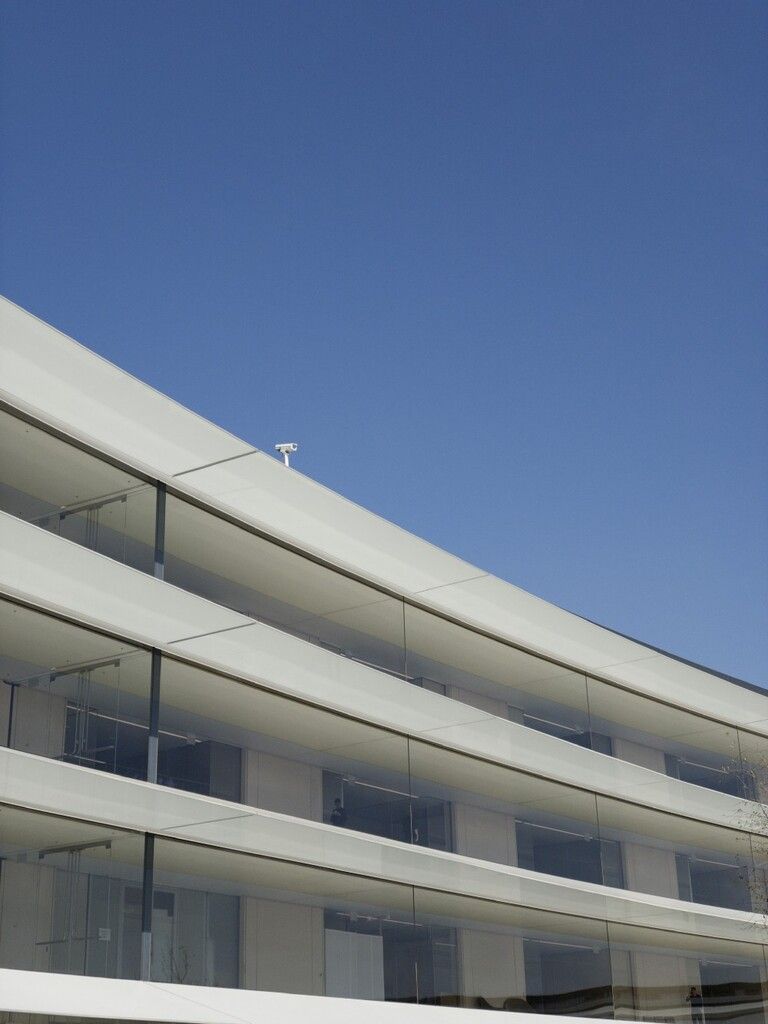
Corrections can be used as creative tools, but I personally tend to use them purely for accuracy. Correction tools include rotation (to make your image level), perspective correction tools (skewing the image on a 3D axis) and smaller spot correction tools like blemish and dust removal. If you take a lot of photos of architecture or city street photography, being able to adjust the perspective later is fantastic:
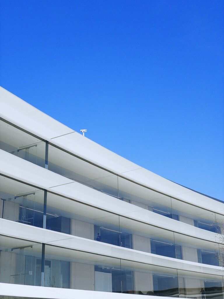
If you’re editing in Adobe Lightroom, it’s automatic perspective correction tools are incredibly powerful:
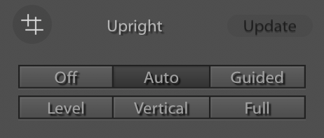
It takes but a click to automatically figure out the lines in the image and set them up right. It sometimes totally botches it, though, so be prepared to get your hands dirty.
Several iOS apps now also include perspective correction tools — even Instagram ships with a simple set of tools to get your perspective lined up right.
With regards to noise reduction: I consider noise reduction a correction tool, but I tend to avoid using it. I find noise reduction almost always reduces the detail in your images, and I find grain on modern iPhones fairly pleasant to look at.
Editing RAW on iPhone
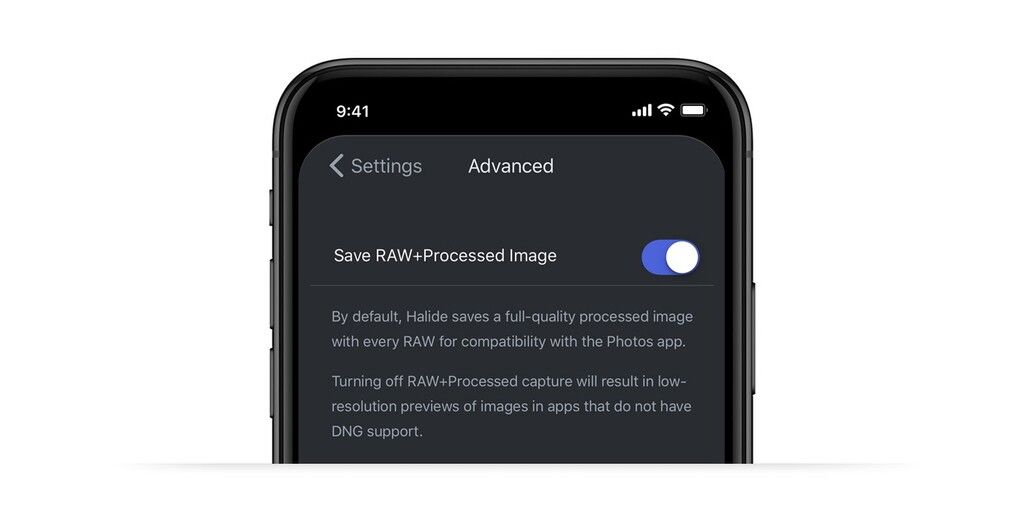
Let’s get our hands dirty. Once you shoot your RAW photo with an app like Halide, it’s time to actually edit. It’s worth noting that the Photos app, despite its Mac counterparts’ excellent RAW support, does not support RAW.
This is an issue we get a lot of support tickets about. Photos will not show any badge to indicate your photos are RAW images, and will only read either a lower-resolution JPG preview generated alongside the RAW file, or a second, processed image created at capture time (we have a preference in Halide to pick one).
This means you have to choose an app to edit your RAW files. Here’s some iPhone apps that support RAW editing:
- Darkroom
- Lightroom
- VSCO
- RAW Power
- RNI Films
- Afterlight
- Photogene
- Snapseed
Myself, I prefer to use Darkroom. Darkroom doesn’t just support RAW, it also has full support for the DCI-P3 color gamut, which most other apps do not. Apple went to great lengths to have a wider-gamut color capturing camera sensor and pipeline and equips iPhone X and 8 with wide-gamut DCI-P3 capable screens with gorgeous, vivid colors. No sense throwing all that extra color away!
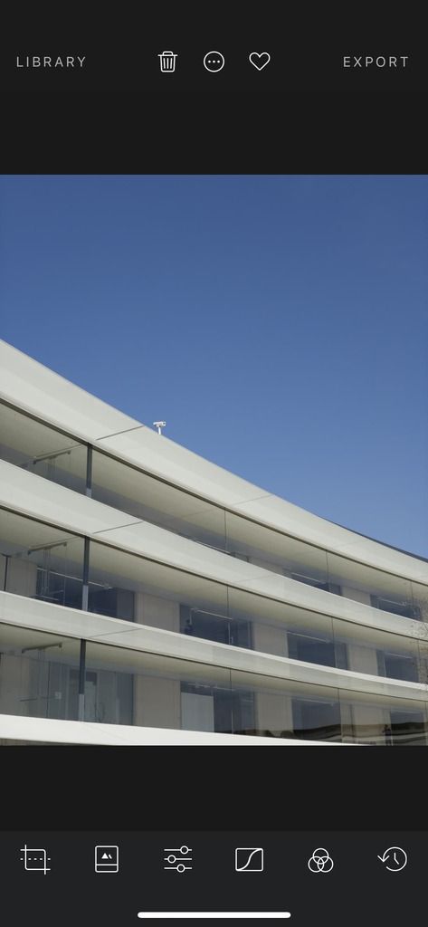
‘Importing’ RAW files into Darkroom is a breeze. There’s no ‘importing’ step: simply tap any photo (Darkroom, as opposed to the Photos app, shows a small ‘RAW’ badge on your RAW captures).
There’s no such thing as a perfect set of filters to apply to your images. This is exactly why most people are so tired of the ‘VSCO look’ of Instagram shots today. What I recommend you do instead is trying to approximate what you feel like the image looked like to you.
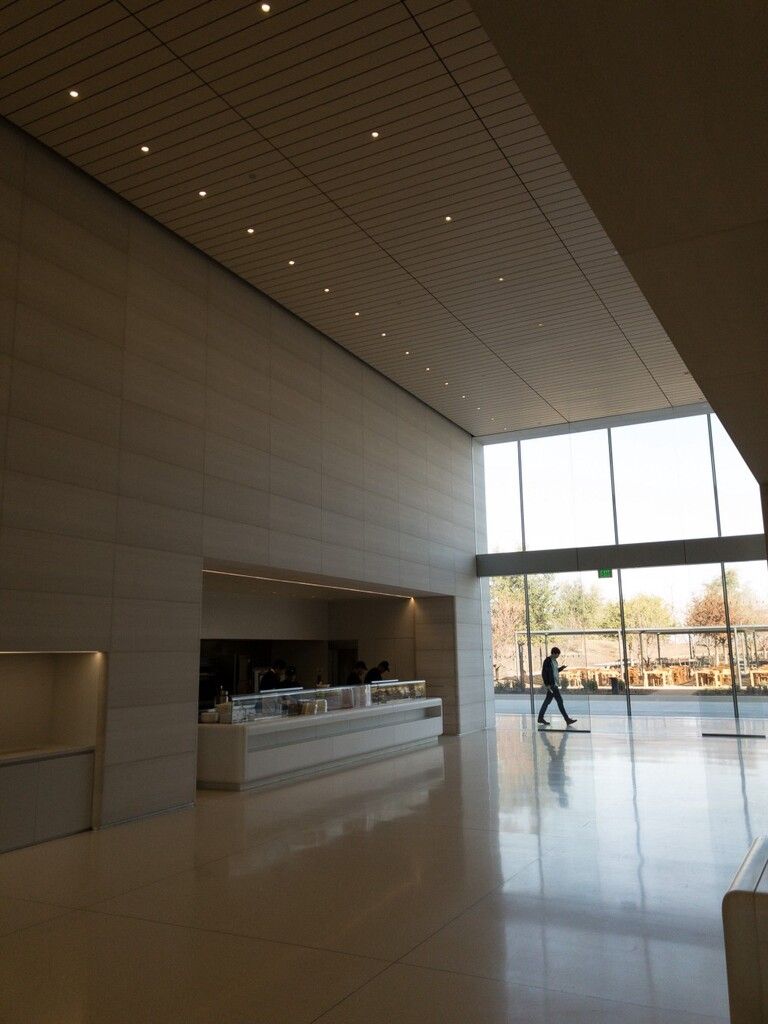
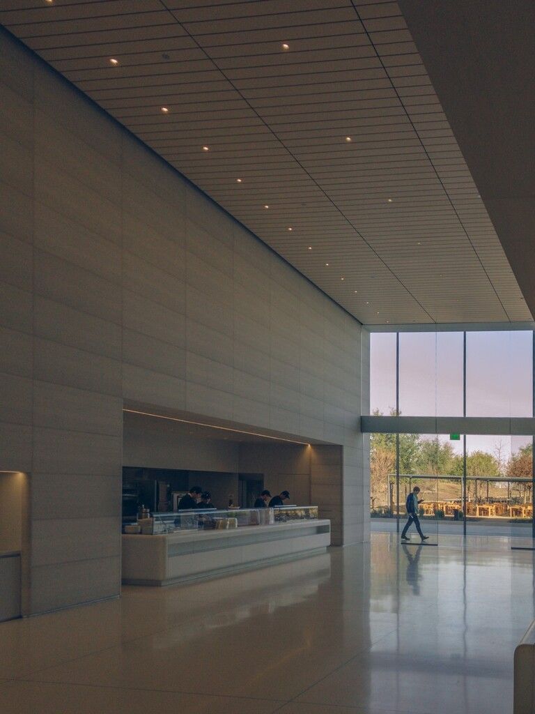
An image like this is a perfect use case for RAW:
We’ll use Darkroom’s RAW Exposure slider, which lets us boost some of the light in the scene as if we changed the exposure at capture time:
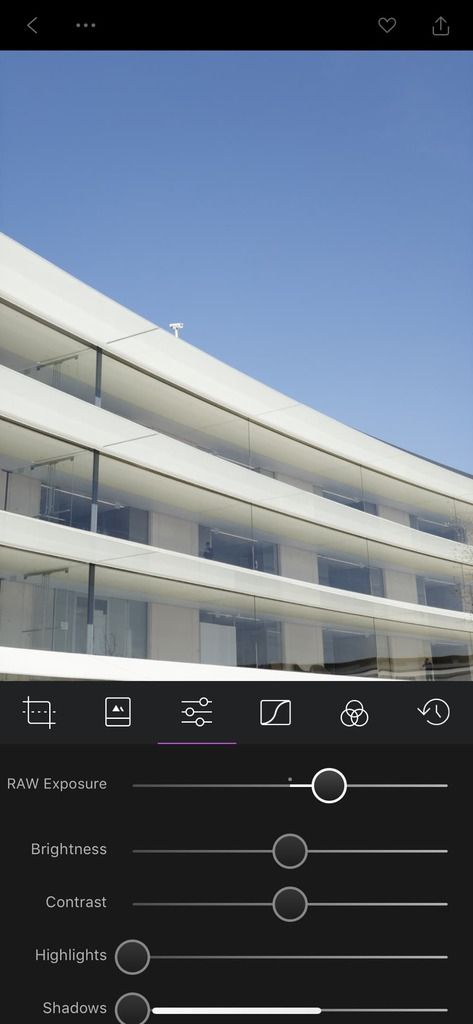
With this light, we lit up some of the surroundings and the subject, but the view from the window is now blown out. This is a RAW; no sweat. Push down (in Darkroom, up!) the highlights to bring out detail in the window.
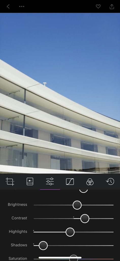
Now let’s tweak white balance and colors. We’ll push the colors a bit colder, and boost saturation (but not really vibrancy; let’s keep the neutral greys fairly grey).
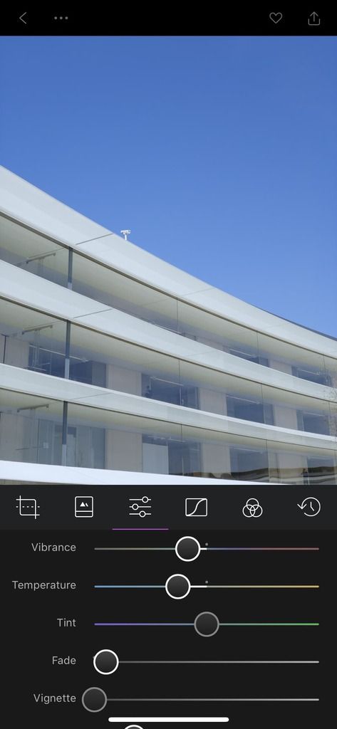
Finally, we can selectively adjust color to bring the slightly warm tint of Apple Park’s walls down. One small contrast adjustment later, we have our image:
Darkroom lets you save the result as a copy or as an edit to the original. You can set the copy to save as a HEIF file, which saves a lot on space and generally looks better. Cutting edge stuff!
Naturally, after you save the copy, you can share it to your social media platform of choice.
Addendum: One of my favorite things about Darkroom is being able to easily save your adjustments as presets. It comes with quite a few solid ones, but I find that over half of the time I just want to do the same quick adjustments to a shot before sharing it. Darkroom makes that a breeze.
Editing on your Mac / PC
Editing on the ‘big screen’ is nice. Mac and PC offer more powerful editing software and let you really see the photo at scale. I edit over half of my iPhone shots on my Mac.
The first step you’ll want to take when editing your iPhone RAWs on your Mac or PC is getting them off your iPhone.
Importing RAW files on Mac:
There’s really zero fuss to getting RAWs on your Mac. If you have iCloud Photo Sync on, open Photos and watch your RAW images simply appear. RAW photos taken with a Processed image (JPG+RAW capture) enabled will show with a little ‘J’ badge.
When editing these, Photos will not automatically grab the RAW file: you have to press ‘Edit’, then go to the Image menu and select ‘Use RAW as original’.
You can also export the RAW file over to your favorite image editor like Pixelmator Pro, Photoshop or Acorn.
You can use AirDrop on your iPhone to drop photos directly to your Mac to open them in your favorite apps. There is a caveat: due to iOS Photos’ lack of RAW support, it will attempt to send the JPG component of a RAW+JPG capture over instead of the RAW file. In Halide, you can choose to send the RAW DNG file when sharing from the app; alternatively, you can turn off saving a Processed image along with the RAW file.
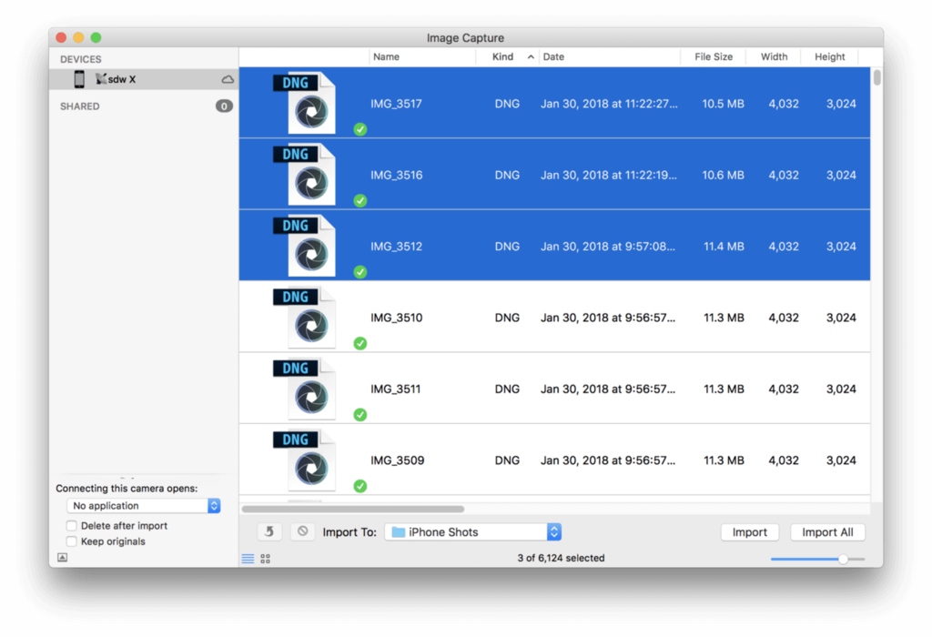
Myself, I prefer to use Image Capture to import photos on my Mac. Image Capture is a small utility that lets you import photos from cameras and more. Connect your iPhone, unlock it, and simply pick the photos you want to import them to your Mac. Sort by ‘Kind’ to only grab the DNGs. That was easy!
If you also have a few different iPhones, like I do, it lets you automatically save images from different cameras in unique folders named after the device you are importing from. Great feature.
Finally, some other apps like Lightroom and Capture One are able to import right from your iPhone into their libraries as well. Note that Lightroom has no support for Live Photos, so you have to be careful to separate the movie component of each image during import or you end up with lots of broken files in your library.
Importing RAW files on PC:
There’s a slew of apps that can easily import RAW files from iPhone on PC, but as it’s not my primary platform I’ll keep it a bit more brief. The first three of these options have been explained in depth by iMore.
- Windows’ built-in Photos app can import your files easily with little fuss. It will even do basic edits!
- You can access the iPhone’s photo library from the Explorer and import the files to disk from there
- With the Windows iCloud Control Panel, you can sync your latest images to your PC
- Finally, Lightroom can import your RAW files directly as it does on the Mac.
Time to edit!
I’m not the biggest fan of Lightroom, but I’m fairly locked into Adobe’s ecosystem. Using Lightroom is an easy way to edit your RAW photos on your computer. There’s a few things Lightroom can do that most iPhone editing apps cannot, like multi-exposure merging, noise reduction options and retouching, but I rarely use these.
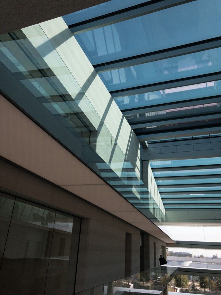
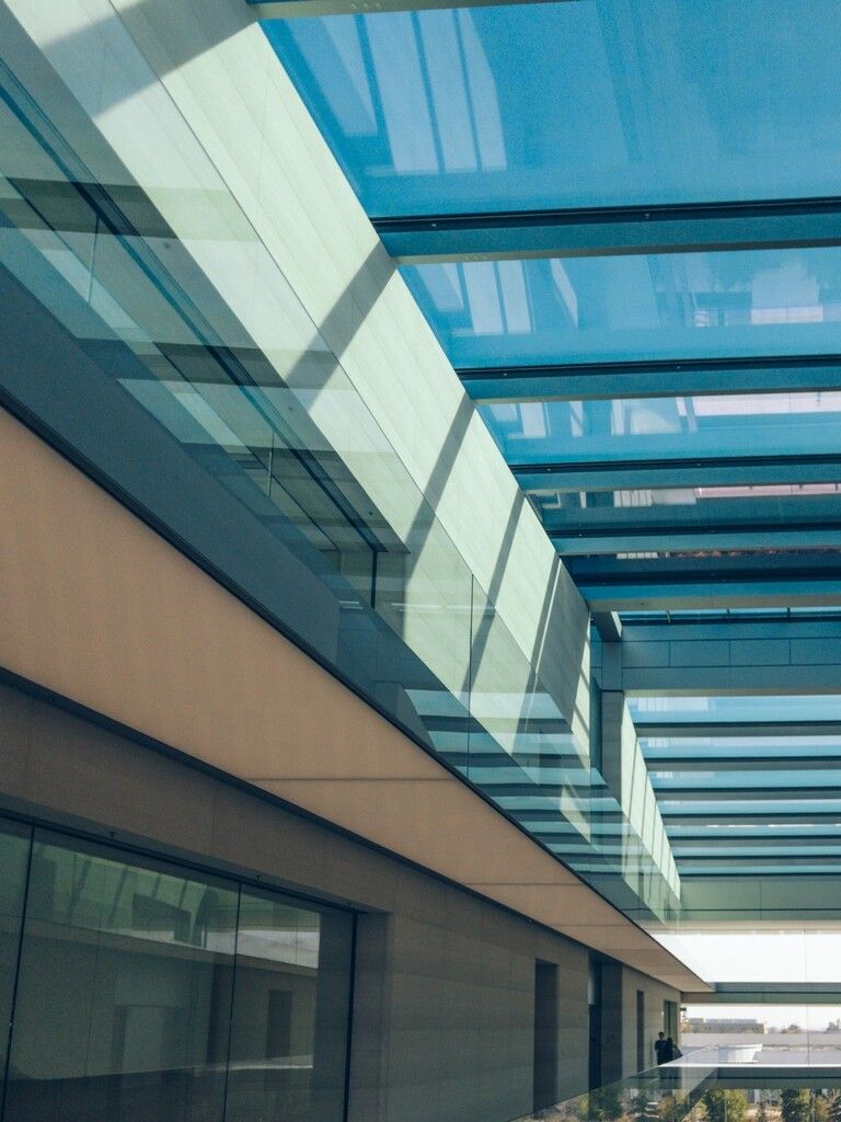
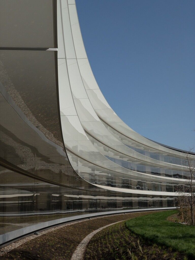
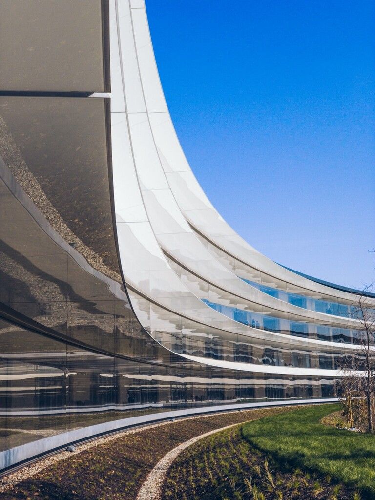
Here’s how I edited this shot (my favorite photo I’ve taken of Apple Park):

We’ll start with the bare basics: exposure adjustment.
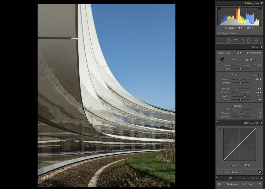
In this case, I want to recover some highlight information but want to keep the whites nice and bright. We’ll recover quite a bit of shadow as well, but keep black dark as the contrast will really make the shot.
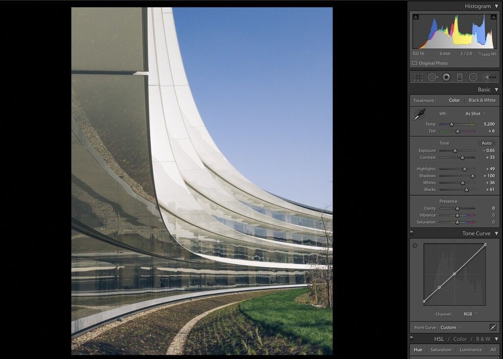
With the exposure looking right, we’ll adjust the white balance to look good. I am making it colder and greener; it’ll reflect the blue sky and the green lawn nicely, and the source image skews a bit too warm.
I am pushing some extra saturation, vibrance and clarity here. The clarity here is mostly used to highlight the crazy textures of the reflections in the building.
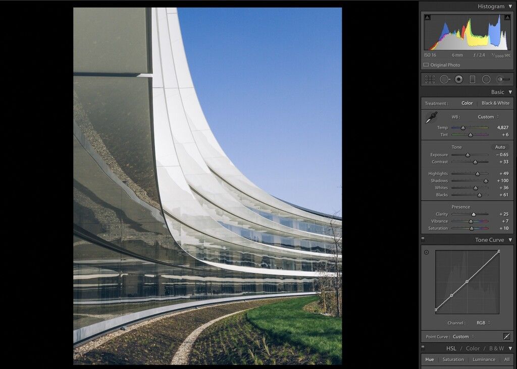
And here’s what makes the shot: I made the green a bit warmer, pushed reds and purples (barely noticeable), and pushed saturation on yellow, orange, green, and blue. Finally, a small luminance boost on the blue gives the sky a nice, bright rolling gradient.
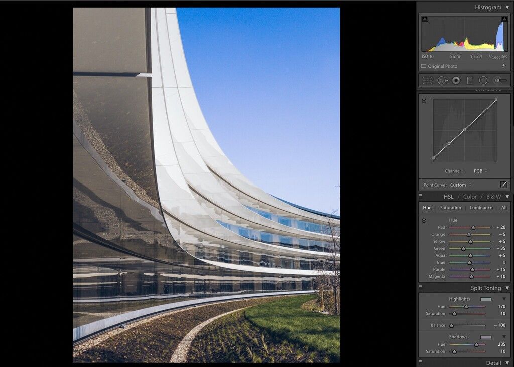
And there we have it:
If you want to make it a perfect roundtrip, you can now AirDrop your edited photos to your iPhone and post them on Instagram! I also add them to an ‘Edited’ album.
Conclusion
You can get a lot more out of your iPhone camera by shooting RAW and learning a bit about editing.
Don’t go overboard: Make sure you have somewhat of a vision of where you want to go with your edits, then dive into apps on your iPhone or Mac / PC to adjust your shots.There’s a wealth of tools that are available to you: experiment a little, and you’ll be surprised at how quickly you get familiar with editing photos and getting great results.
In a future update to this series, I’ll cover advanced edits and editing with depth channels. Our new update to Halide, Halide 1.7, will be out soon, and focuses on Depth and Portrait effects, as well as integration with a very cool app for quicker editing. Happy shooting!
Thanks to Tim Van Damme.