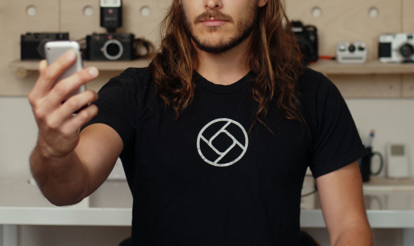
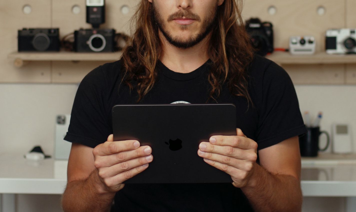
We have a big announcement. Very big, in fact. Four times bigger than any previous announcement.
We make Halide, a camera app that combines intuitive, polished design with the powerful features found in professional gear. Today we’re bringing Halide to a whole new form factor.
Meet Halide for iPad!
We set out to build something much more than a large iPhone app on a bigger screen. We had to completely rethink our design to for the big, bigger and biggest portable screen.
Halide for iPad is a whole new app — it sports an interface designed from scratch for iPad, some special features for iPad shooting, and it manages to also bring all of Halide’s powerful features along for the ride, too.
Let’s talk about some of the challenges and our solutions.
The Challenges
With Halide for iPhone, we set out to build a camera that blends the simplicity of the built-in Camera app on iPhone with the flexibility and power of a professional camera. It features manual exposure and focus, a discrete depth capture mode, file formats like RAW (and now ProRAW), and more. Packing in all these features is one thing, it’s another to do all of this with an eye on keeping it usable.
Usability is hard to summarize: it includes visual and structural UI design, accessibility, and far more. But one of the most important aspects of it is physical usability: ergonomics. We designed Halide for iPhone knowing you hold your iPhone in your hand—one hand—and with screens were getting taller year over year, we had to find a way to keep important controls within thumb reach and out of No Hand’s Land:
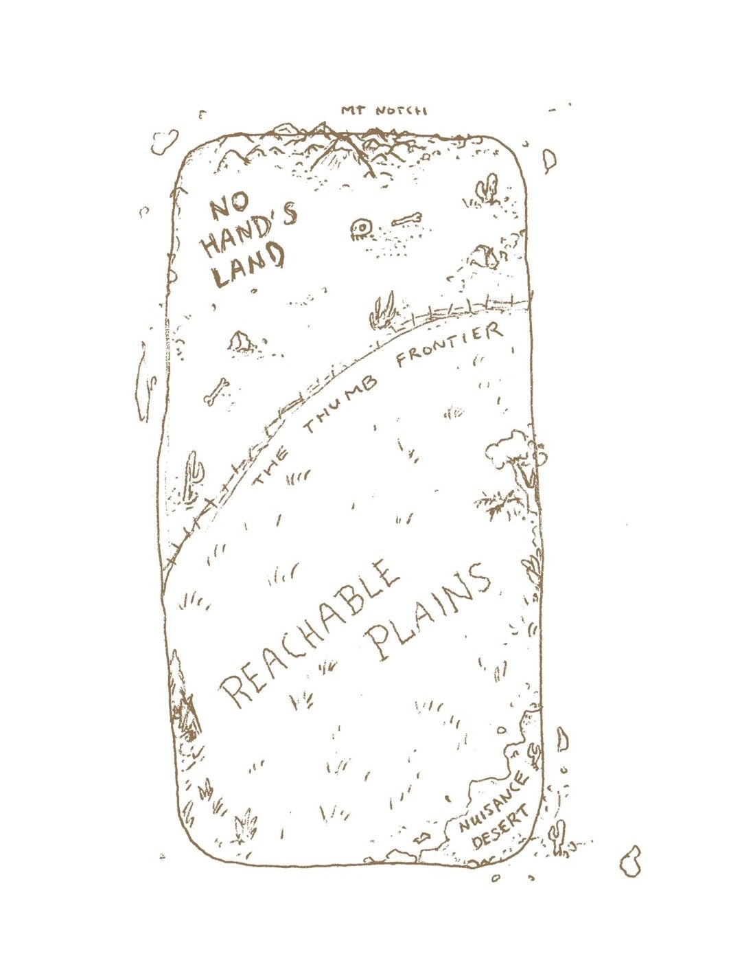
Our solution? Halide has a row of icons living right above the shutter button, which we call the “Quick Bar.” It keeps the user interface reachable and also prevents it from overlapping with your viewfinder, giving you a clear view of the interface.
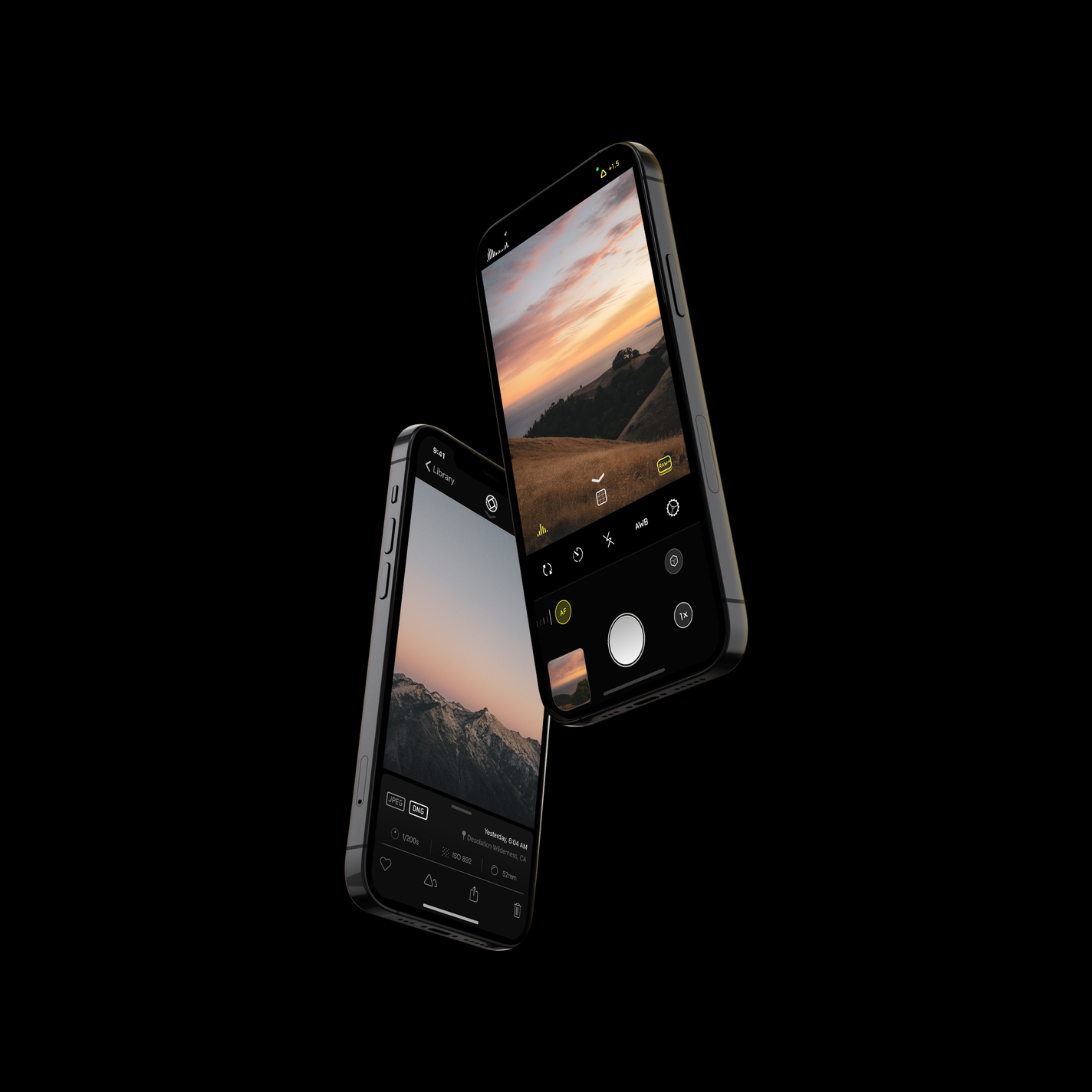
The Quick Bar works quite well on an iPhone screen’s aspect ratio. As iPhones camera sensors have a square-ish aspect ratio, leaving space above and below the viewfinder to place controls, without overlap. The rest of the interface follows suit: all of our important controls stay in the comfortable thumb reach area.
Halide for iPad challenged all of these design decisions. To start, the iPad is a two-handed device. If you ask the user to tap a button out-of-reach, they have to balance the device in one hand, making tricky to maintain shot composition. It’s a pretty awful feeling to hold an iPad with one hand.
Hold the iPad in two hands and you realize that controls have to be in a special zone: too close to the edge puts them at risk of being accidentally triggered, as you hold the iPad by its bezels instead of by its edges like an iPhone. Putting them too far risks hand gymnastics that make it feel like you’re going to drop the much-heavier device.
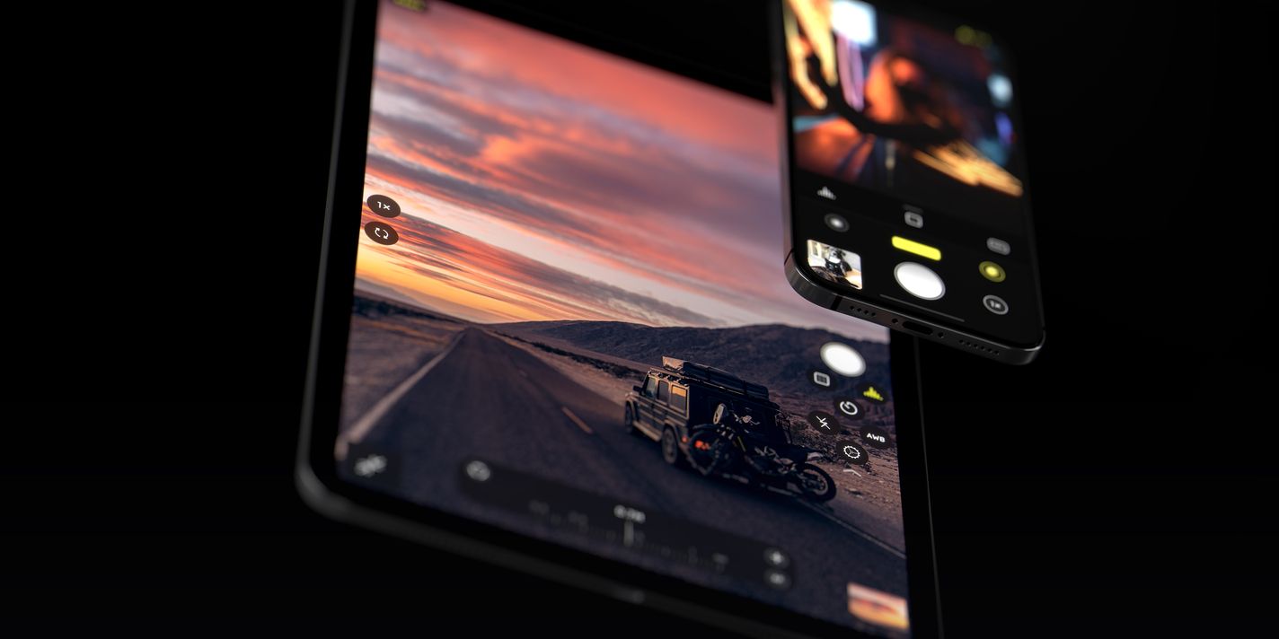
We solved this by placing the important features inside a “Honeycomb” at the edge of your iPad’s screen, alongside the shutter button. Controls like the lens switcher and manual focus live on opposite edges of the screen. The least frequently used controls sit in the corners.
In fully manual mode, the ISO and Shutter Speed dials sit on opposite ends, and you can even control both dials simultaneously. We decided to position the manual focus control at the bottom edge to avoid gesture interference, and gave a very large swipe-target to leave generous room for error.
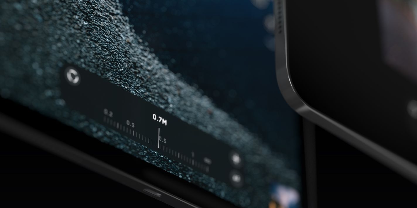
The next challenge is the iPad’s aspect ratio, which approximates that of the camera. A full-screen viewfinder doesn’t leave any room to place controls without overlapping the viewfinder, so every added button and knob creates visual noise that distracts you from your composition.
We solved this by making our honeycomb control dynamic. Just swipe on it to show or hide more controls.
The best UI is usually as little as you can get away with, so just like on Halide for iPad, our exposure dials only appear while adjusting exposure. They fade away into the background after a few moments.
A Camera for All
On iPhone, there isn’t much difference if you’re right handed or left handed. You just hold the device in your preferred hand, and it’s comfortable. On iPad, you have to make a choice: putting controls on either side of the screen means you’re designing your UI with a bias toward right or left handed users.
We designed Halide around our own sensibilities, but we also know that every photographer is different. This is why Halide for iPhone lets you customize the Quick Bar layout, making the app truly “yours.” We brought that to the new Honeycomb too, but added a shortcut to switch the entire interface to be left-handed.
Southpaws, rejoice!
Though 90% of people are right-handed, and we could’ve just left the UI as it is and called it a day, we think it’s a bit of a cop-out to design your products for the 90% of society who resemble your company. Thankfully, we have left-leaning people on our team who provide a diverse perspective while developing our product.
Seeing The Big Picture
Shooting on iPad you might wonder if you’re alone in feeling a little weird when composing a photo on the large screen. It’s not just you: Sometimes we’d shoot a good photo using the large iPad viewfinder, only to find it feels completely different on a small iPhone screen.
This is has to do with human vision. When looking at a photo on your phone, most of the image fits in your central, or “foveal” vision. On a large iPad screen, part of the image spills into your peripheral vision. So you might compose a photo “reading” it one way, only to be “read” a different way. This is made worse by that usability thing again: ergonomically, we shoot very differently on iPhone than on iPad.
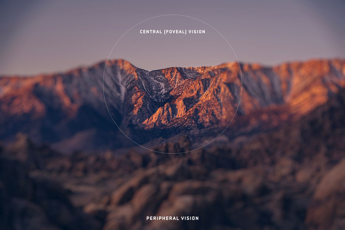
Try taking a photo on your iPhone. How far away is the phone from your eyes?
You probably stretched your arm out and took a photo with your thumb. Only occasionally do most people shoot with the iPhone very close to their eyes. The iPad is most comfortably held with two hands, but much closer to your chest. That means the screen isn’t just larger by size, but also relatively larger in your vision as it is held closer to you. This makes composing a shot difficult.
Say you’re taking a photo in the forest. When composing the shot on a large screen, you may get distracted by the individual leaves. Later, when someone quickly scrolls past your photo in their Instagram timeline, they’ll focus on the overall composition, where larger forms matter much more, literally missing the forest for the the trees.
And that’s not the only photography related issue with these big iPad screens.
Those camera sensors I mentioned earlier are the same shape on iPads, but the iPad screen is much more square. iPhone screens are made tall so they work well in portrait orientation in one hand. iPad screens being more square means that their sensors’ image is (near) identically proportional to their screens. Thus, any camera app will have to put its controls on top of the viewfinder, obscuring part of your shot.
These two issues can be solved with one feature we built specifically for the iPad.
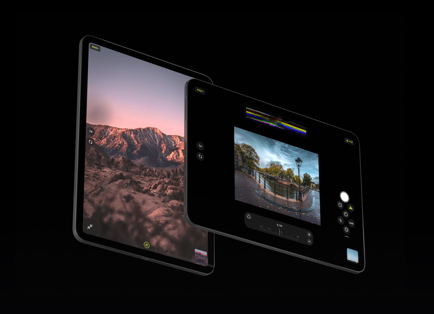
Meet Pro View. Pro View is a toggle that lives in the bottom left of the iPad interface, and it shrinks your viewfinder down so it comfortably occupies the limits of your central vision. It’s a bit larger than you’d find on an iPhone, but small enough to compose shots well and allow lots of extra space. Halide fits some pretty advanced pro tools like a realtime color histogram and RGB waveform, manual focus, and shutter and ISO controls — and they can all be active and easily controlled without overlapping the image in Pro View. Truly, a view fit for a pro.
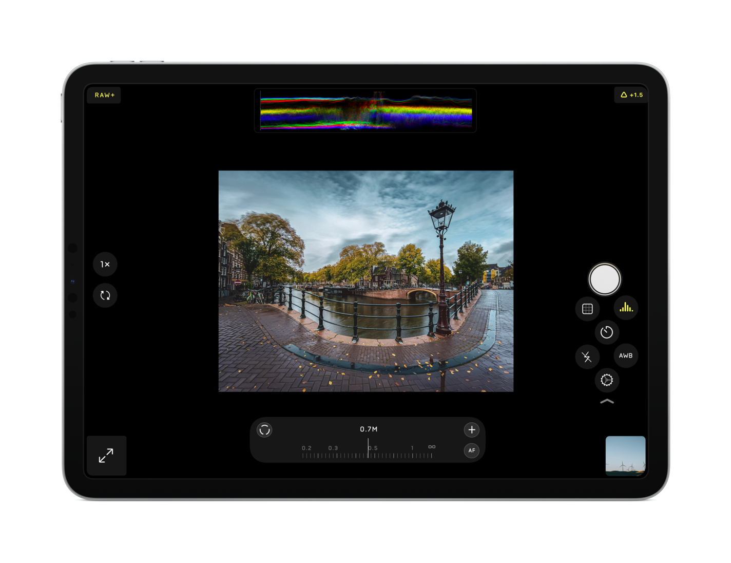
I will add that while some of this is hard science, we don’t collect data in our apps. We make a lot of decisions in our product based on feelings. For most of us, it just feels better to compose shots within a smaller viewport. If you want to use that huge screen to compose with every pixel showing your image at full-bleed, you can run Halide in the regular view just the same!
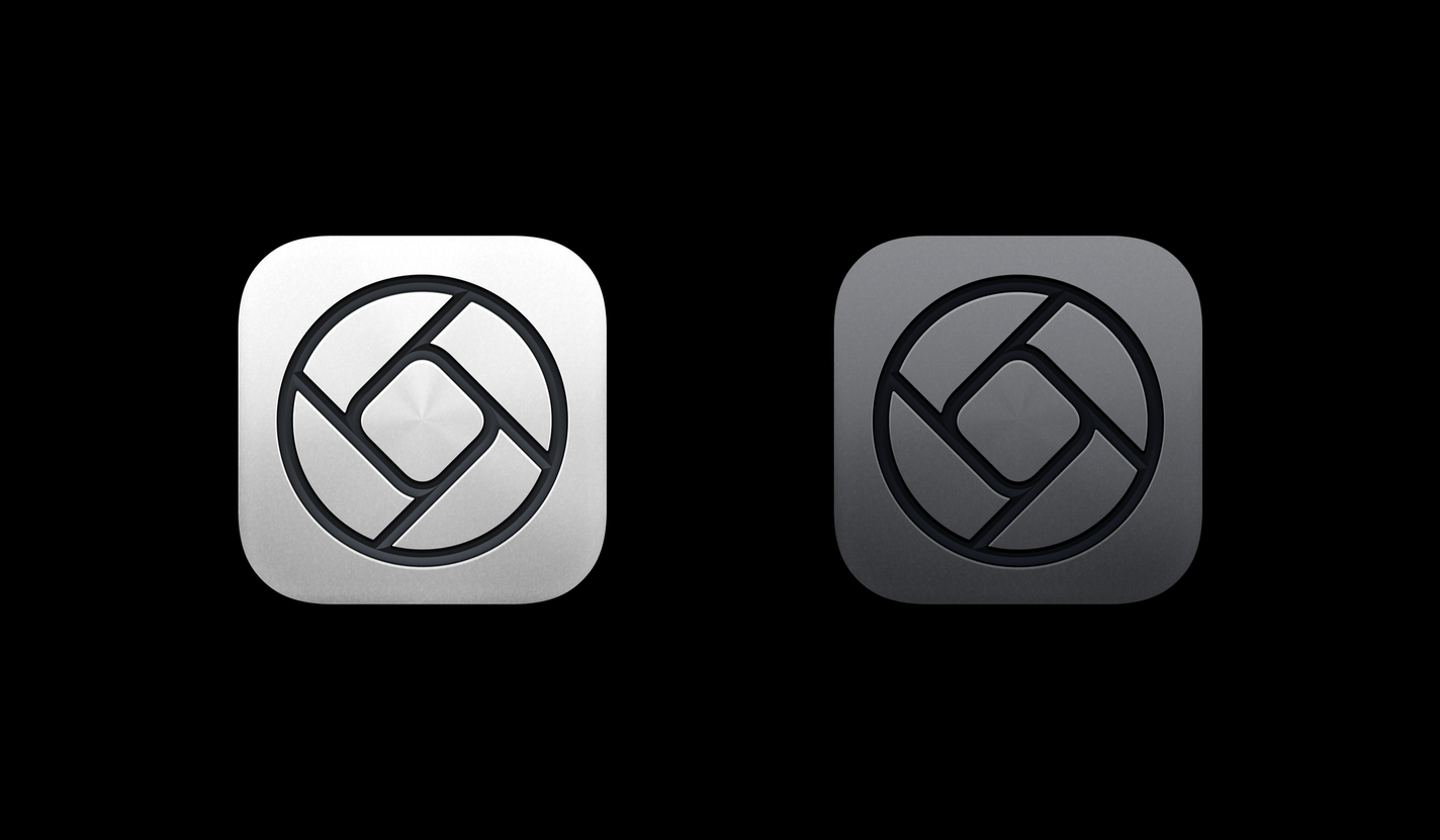
And finally, another iPad detail: we might have even put a new icon in there somewhere — after all, iPad Pro doesn’t just come in only Silver but also Space Gray.
All That And More
And that’s a look into some of the features and interface of Halide for iPad! Like we mentioned at the start, this update goes far beyond simply making a blown-up version of our iPhone app. Instead, the app has been carefully re-designed for the larger form factor.
We did bring all of the powerful features from iPhone, though: You can shoot RAW with your iPad, apply Instant RAW, view images and extensive metadata in detail in the reviewer, access our powerful Depth mode, and much more. Tons of refinements, design details and tidbits were added and changed to be great on the big screen, and we can’t wait for you to discover them all.
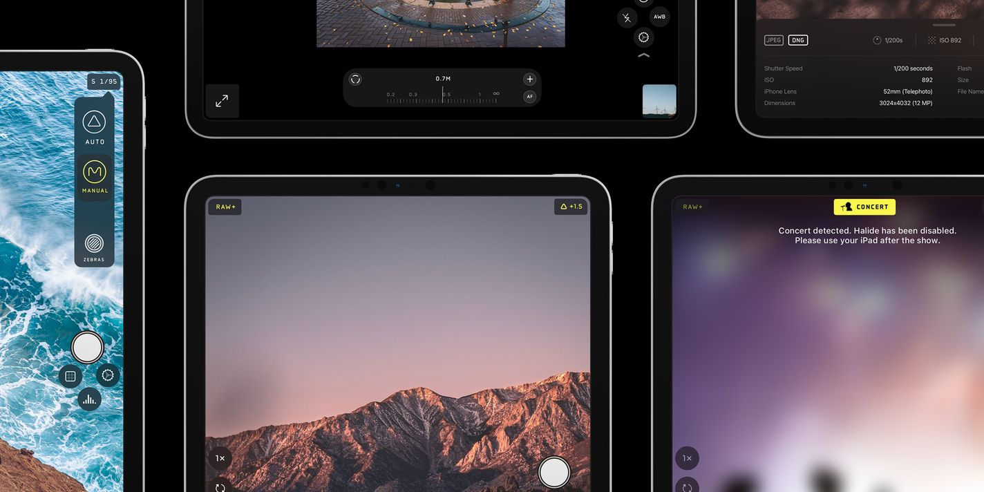
We realize that with great big screens comes great responsibility. We think there’s many a great time and place for shooting with the large iPad, but never forget to be a considerate Halide user.
Get It Now
Halide for iPad is available today on the App Store, and it’s a free update for all existing Halide users. As a universal app, just install Halide. You might get our payment screen once installed on iPad — simply tap the “Restore Purchases” button in that case to unlock it.
If you haven’t bought Halide yet, we continue to offer Pay-Once and Membership options. We aren’t going subscription-only, but we do have some interesting extra things coming up for those on a membership. Stay tuned…
If you love what we’re doing, please consider leaving a review in the App Store, as they help us out tremendously. And share some of your new iPad (or iPhone pics) so we can feature them on Twitter and Instagram! You can tag us or tag your photos #ShotWithHalide.


