Octobers excite us at Halide HQ. Apple releases new iPhones, and they’re certain to upgrade the cameras. As the makers of a camera app, we tend to take a longer look at these upgrades. Where other reviews might come out immediately and offer a quick impression, we spend a lot of time testing it before coming to our verdict.
This takes weeks (or this year, months) after initial reviews, because I believe in taking time to understand all the quirks and features. In the age of smart cameras, there are more quirks than ever. This year’s deep dive into Apple’s latest and greatest — the iPhone 13 Pro — took extra time. I had to research a particular set of quirks.
“Quirk”? This might be a bit of a startling thing to read, coming from many reviews. Most smartphone reviews and technology websites list the new iPhone 13 Pro’s camera system as being up there with the best on the market right now.
I don’t disagree.
But I must admit I don’t take photos like most people. An average iPhone user snaps a picture in Apple’s Camera app, and… I work on my own camera app. I take photos in both Apple’s app and our own — and that lets me do something that Apple’s can’t: take native RAW photos. These shots let me poke and prod at the unprocessed photo that comes straight out of the hardware. Looking at the raw data, I’ve concluded that while Apple has taken more than one leap forward in hardware, they’re in a tricky position in software.
The Importance of Processing
When you take a photo on a modern iPhone — or any smartphone for that matter — you might like to think that what you saw was what you captured, but nothing could be further from the truth.
The zero’s and one’s that your sensor sees would mean nothing to the human eye. They require interpretation. For example, some of the colors your camera sees can’t be represented on your screen, so it needs to find something close. Some bits of processing are creative, like adding contrast to make things “pop,” while other decisions are to compensate for the weaknesses of the hardware, like noise.
Consider this underprocessed iPhone photo:
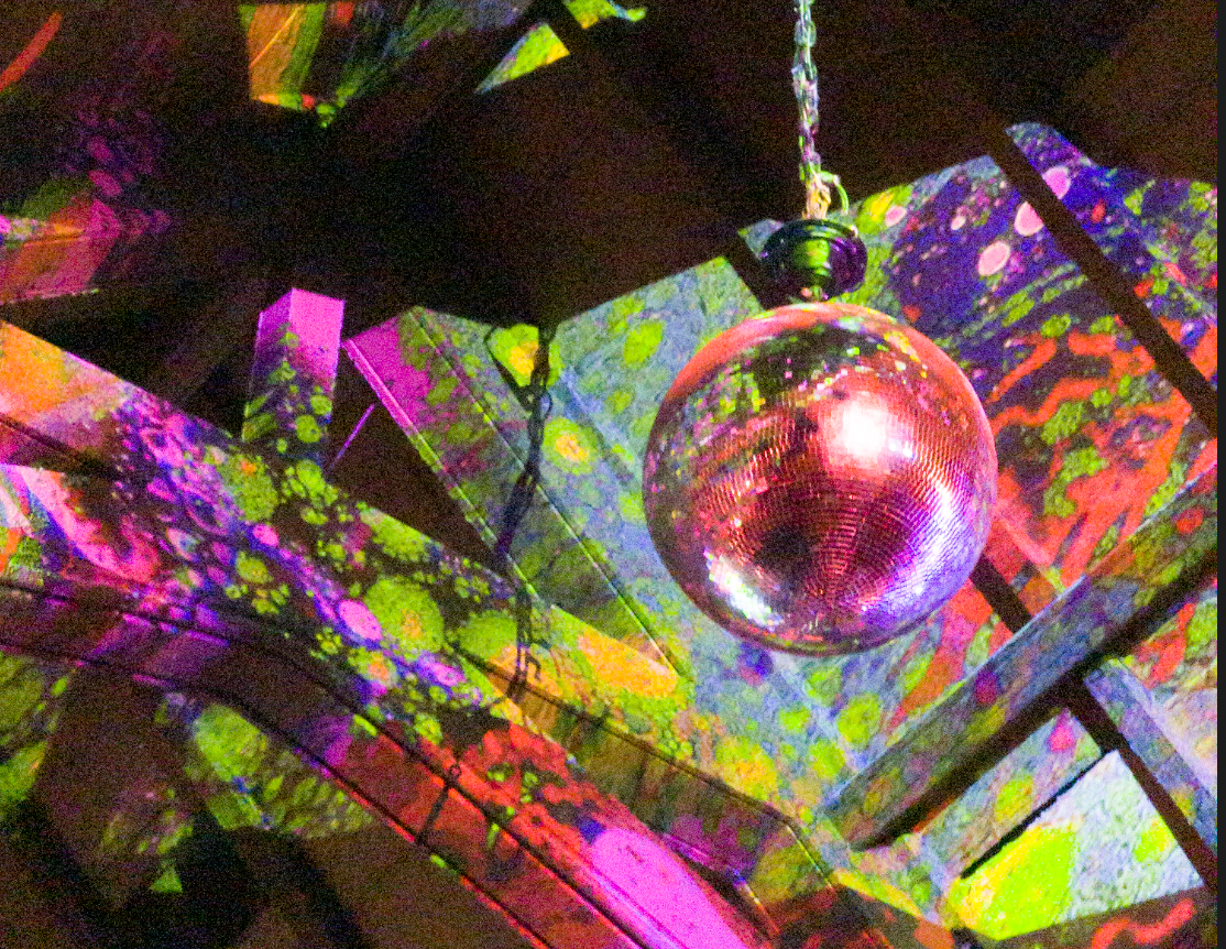
This noisy shot didn’t come from an iPhone 5— this is from an iPhone 13 Pro. This image, which is a ‘raw’ capture, is much noisier than what you’d get from a dedicated, full-size camera. Why? Physics.
Consider this series showing the evolution of Canon’s cameras over more than half a century:

You’ll notice that while technologies come and go, and even the medium changes (this camera, while externally similar, moved from 35mm film to digital), the camera stayed a similar shape, and most importantly, size.
Technology always strives for miniaturization. Your iPhone is enabled by smaller and denser chips with more power than the large desktop computers of decades ago; your iPhone screen is a higher resolution than most TVs, packed into a tiny 5 inch size, and your camera, too, is only a fraction of the size of a digital camera from years past.
Unfortunately, cameras are limited by the laws of physics. A larger lens can collect more light and produce a ‘depth of field’ that we find appealing in portraiture. A larger sensor means less noise and more detail. An inconvenient truth of phone photography is that it’s impossible to make the camera smaller without losing quality. But smartphones have a powerful advantage over their big brothers: the magic of processing. Today, the most cutting edge research (including our own at Halide) in photography is in an area called Computational Photography.
Putting the ‘Smart’ into Smartphone Photography
Around the time of iOS 4 (yes, twelve years ago), Apple introduced an ‘HDR’ option to their camera app to address the most common technical challenges in photography: capturing really bright and really dark stuff at the same time.
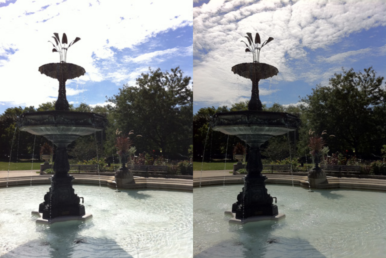
When taking a photo, clouds in the sky get so bright that the camera only sees a white shape. If you turn down that brightness, you’ll the shadows turn black, losing details. While the human eye can see both the clouds and shadows at the same time, an iPhone 4’s sensor has less “dynamic range.”
In fact, this “high dynamic range” problem has existed since the early days of photography. Experienced photographers dealt with it by taking multiple photos of different exposures and patching them together. iOS 4 solved it with an HDR mode you could toggle on and off. This toggle was important because…
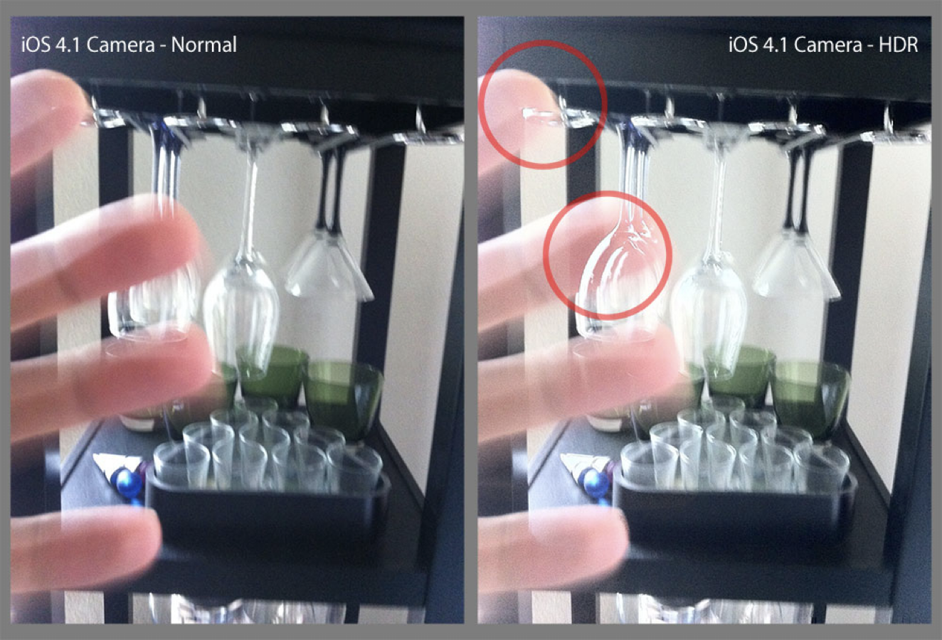
Automatic edits on photos can go wrong. When there are object in motion, the ‘merging’ of photos creates artifacts, or ‘ghosting.” This all worked out with smarter algorithms, more powerful chips, faster memory, and an iPhone that could simply take photos so fast that there were fewer gaps in photos.
Fast forward to today, and your iPhone goes way above and beyond HDR. It has not been a setting you can toggle for a while. When you take a photo now, the camera on the iPhone will merge many shots to get your final result. Today, your camera essentially always ‘edits’ your photos for you. And exactly how it edits them… is a bit of a mystery.
Apple, famous for its secrecy, doesn’t divulge their secret editing sauce. We know it brightens faces while retaining texture in them, it smoothes the sky and brings out color and clarity in the landscape, and in low light, it can smooth over noise while keeping the details of a sweater intact. It’s a miracle of engineering, pulled off in the blink of an eye, thanks to in-house chips optimized for these processes.
It’s safe to say that most camera users benefit from this. While these ‘edits’ can be accomplished by experienced photographers, experienced photographers make up less than 1% of iPhone users. In practice, that means that these edits are part of the camera. To review an iPhone camera’s for most people, the computational processes are as important (if not more important) to assess as the hardware.
What’s A Camera?
And with that, you can see why it is becoming increasingly important to define what we refer to when we talk about a ‘camera’. If I talk about the camera you’re holding, I could be talking about the physical hardware — the lens, the sensor, and its basic operating software in the case of a digital camera — or I could be talking about the package. The hardware with its advanced, image merging, hyper-processing software.
Smartphone cameras really should be judged by that package. The software has become such a disproportional part of the image quality that we can no longer separate the two; if we do, the resulting image is often less than useful. But it’s not purely qualitative: Choosing a lens or a type of film stock can be a creative choice. With smartphones, choosing whether or not to trust in the computational magic or not is rapidly becoming one, as well.
While all the shots in this review come from an iPhone 13 Pro — and the results seem even better than all previous generations— only some of these photos omit the processing of Apple’s Camera software.
As this software begins to make more and more creative decisions for us, and we are able to opt out of it, we should judge it as critically as we would any other component of the camera. And that’s exactly what I will be doing in this review.
The Changes
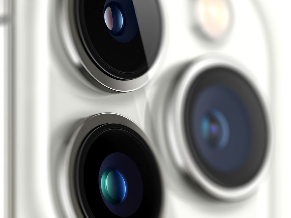
This year’s iPhone 13 Pro saw upgrades across every bit of camera hardware, save for the front-facing (aka selfie) camera. Let’s tackle them one by one.
The 26mm Wide Camera
The iPhone’s primary camera, or ‘wide’, has gotten a larger sensor and a ‘faster’ lens, which means it lets in more light. This allows for shots with less noise in low light, even before the system applies its processing.
Its wide angle continues to be the most versatile, so it makes sense that it’s the go-to camera for most shots. It’s reasonable, then, that Apple continues to invest in making it the best camera in the array. Every iPhone generation sees it improve.
Here are some comparisons against previous generations: the iPhone X, 11 Pro, and 13 Pro. I shot in ‘native’ RAW, which doesn’t apply any smart processing, and cropped in to highlight the details.
It’s harder to make out details on the iPhone X, as it exhibits a lot more noise. While the jump from the X to the 11 is noticeable, the move to the 13 Pro is much less so, despite having a faster lens and larger sensor. It’s possible there is a lot more detail that the sensor and lens can resolve, but we can’t really tell — possibly it’s because the sensor resolution has been the same 12 megapixels since the iPhone 6S, which launched seven years ago.
The iPhone’s go-to 12 megapixel resolution has not been a particularly limiting factor to me, a pretty hardcore iPhone photographer, for the last few years, but we can start to see diminishing returns as Apple sinks such tremendous investments into the camera hardware and processing.
Don’t be surprised if the next iPhone improves the resolution — to, say, a 48 megapixel sensor. Perhaps one reason that Apple has held out is that such a bump in resolution would require 4x the processing power to perform the same computational magic. That’s a lot more data to process in the blink of an eye.
The 13mm Ultrawide Camera
2019’s iPhone 11 added a new trick to our camera bag: the ultra-wide camera. Its super-super wide GoPro-like field of view allows for dramatic captures, and saves us from difficult decisions around what gets cropped in a shot.

The biggest challenge and tradeoff in ultra-wide cameras is distortion. As the image reaches the edges of the frame, the lines start to curve, distorting geometry and shapes. Most are familiar with so called ‘fisheye’ lenses — they produce very “round” images.
The ultra-wide in the iPhone still produces a ‘square’ shot, but at the edges things can start to look… a little weird:
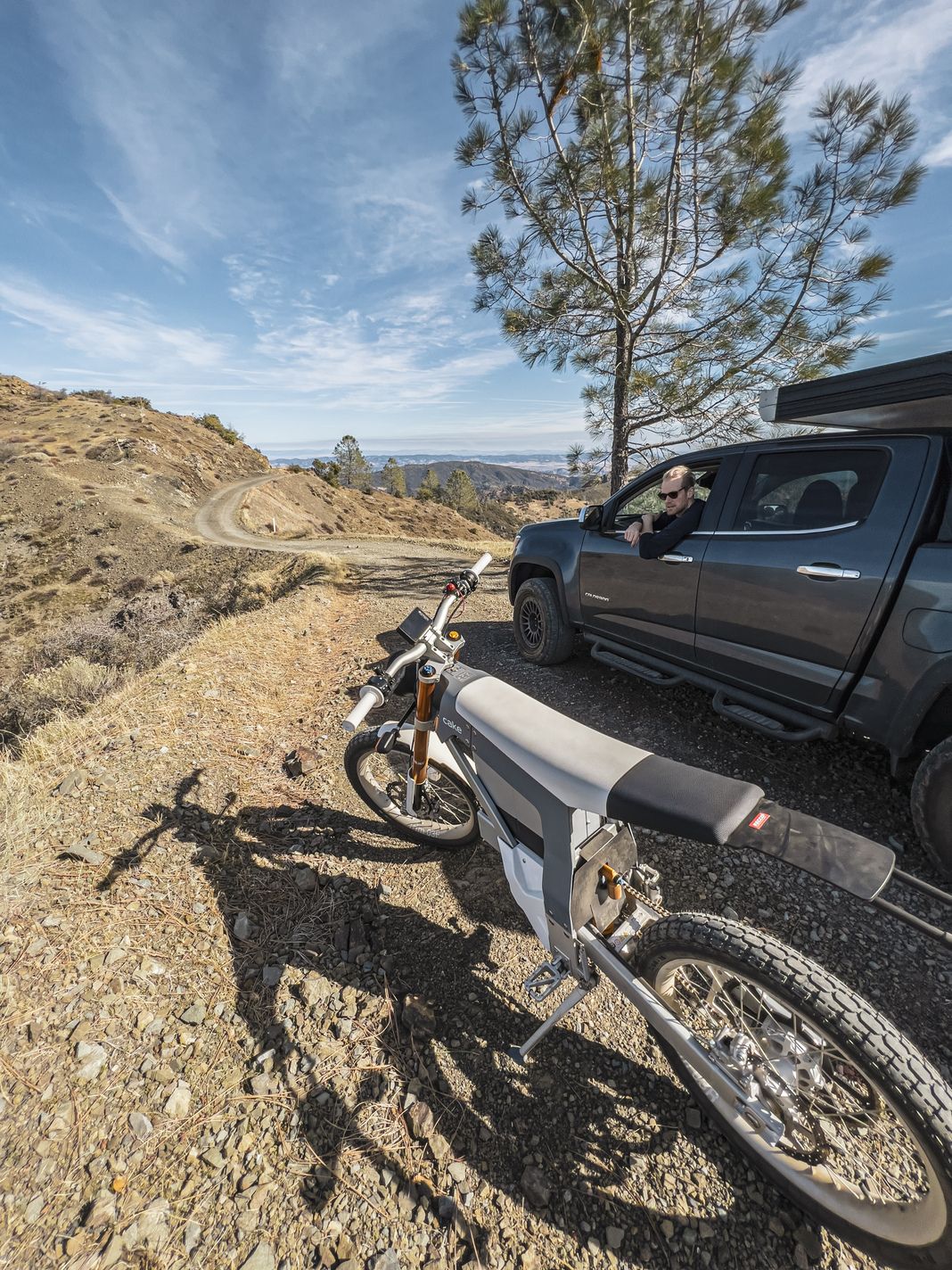
Post-processing produces a less-distorted image, but sometimes you might enjoy the effect. Shortly after the iPhone 11 launch, tinkerers found a way to disable these corrections to see what the image looks like before processing:
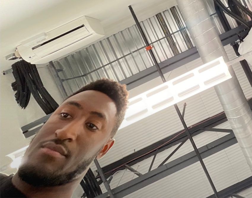
This extreme example shows the importance of ultra-wide lens corrections. This camera relies more on processing than any of the other cameras to produce usable images.
In the iPhone 11 and 12, I found it useful to have the ultra-wide in my pocket— way more useful than the iPhone’s Panorama Mode— but I still mostly avoided it. It was ‘fixed focus’, which means there is no way for the lens to adjust what is sharp. It was designed so all of the frame was in focus. This caused smudgy images, trading clarity for a wider field of view. I never felt like it produced great shots, particularly when compared to the excellent Wide camera.
The iPhone 13 Pro addresses all of this. Without exaggeration, this might be the most significant jump in an iPhone camera since the iPhone 3GS added video.
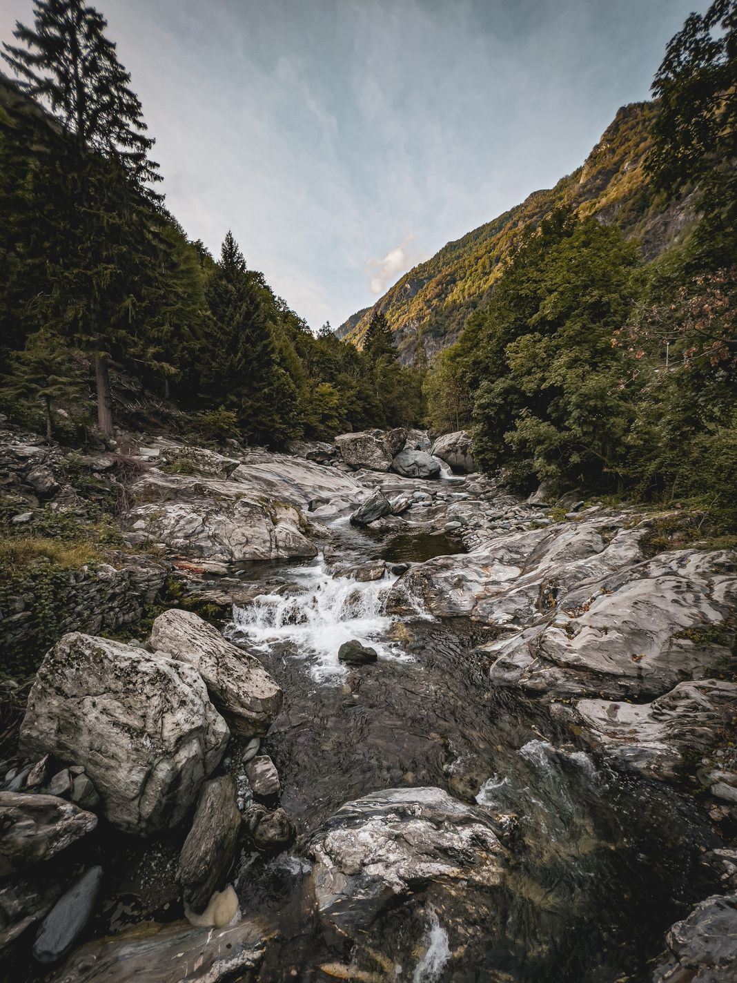
The ultra-wide’s sensor is significantly larger, the lens aperture is much wider, and the lens can now change focus! It’s still a smaller sensor than on the Wide, and it still distorts and softens an image at the edges, but overall, it creates spectacular shots with pretty good sharpness. This is no mere upgrade, this is a whole new camera.
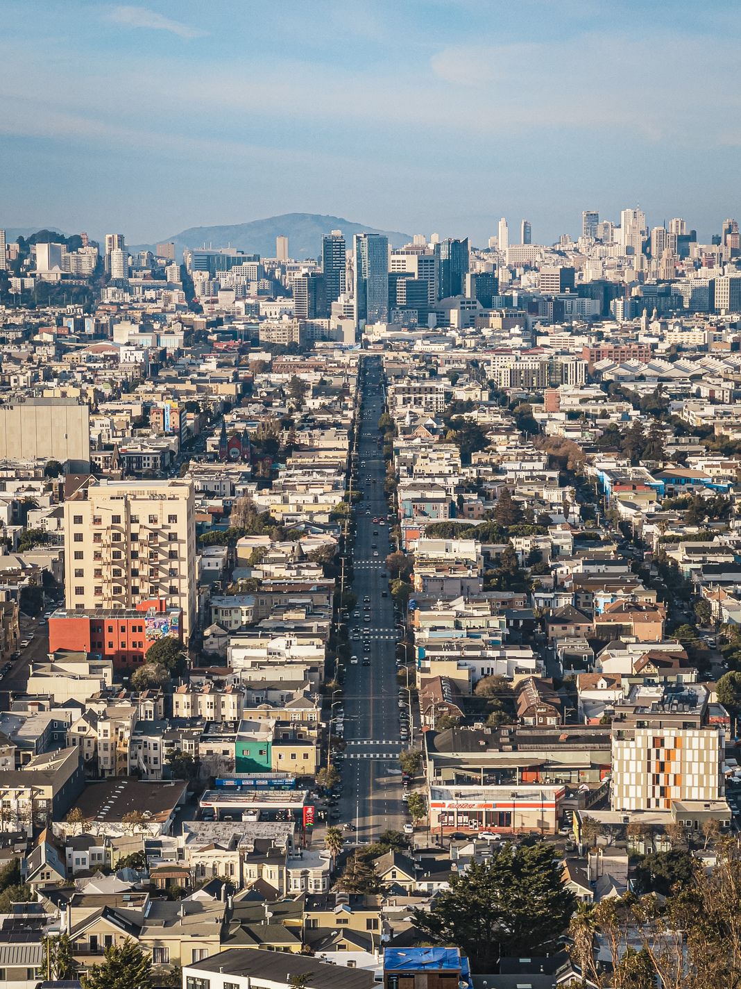
You can take a shot from your point-of-view and even get your legs in it, and it’ll be sharp:

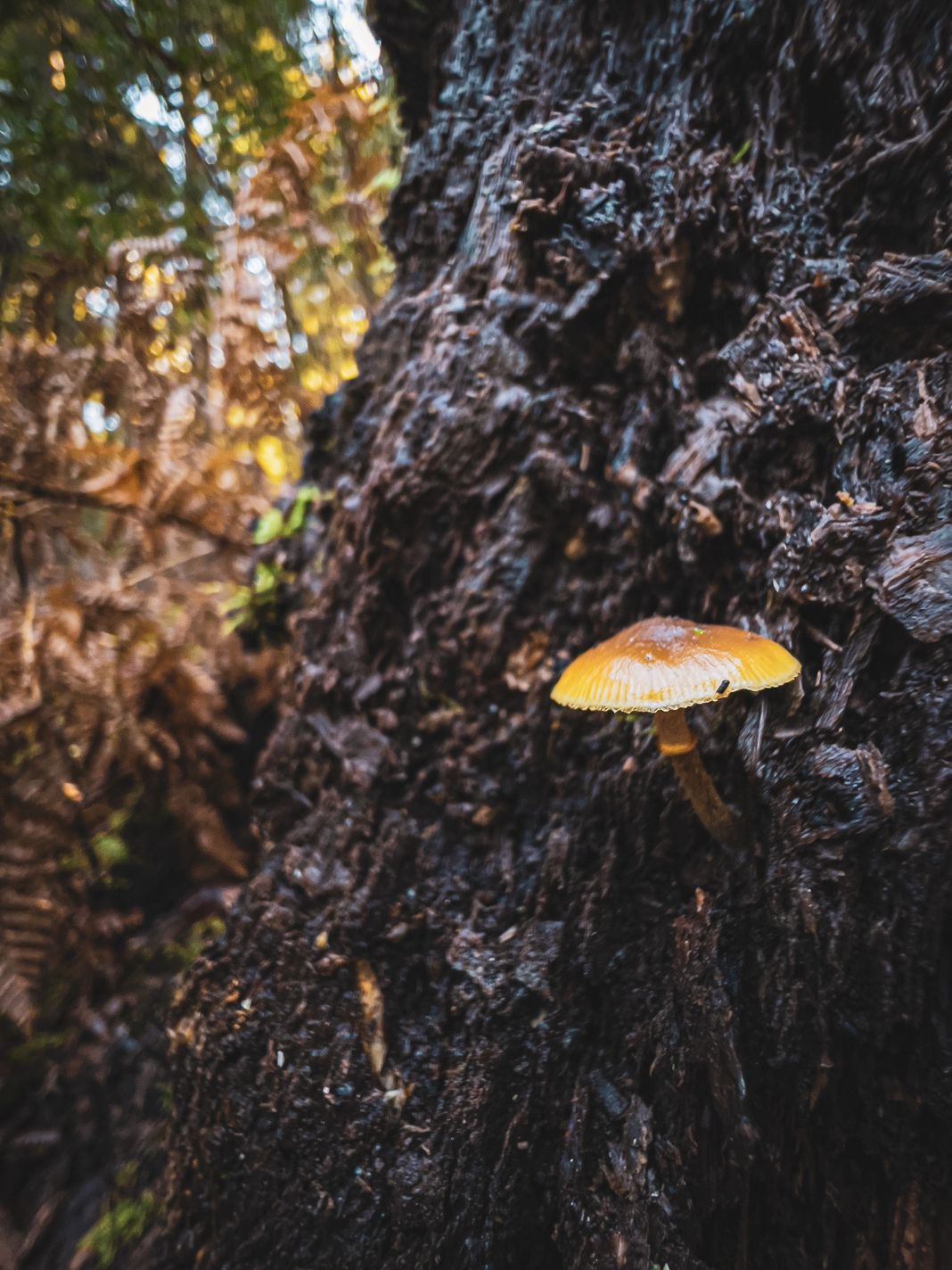
Thanks to having real depth of field, you can now take separate your subject from its background. Its larger sensor and faster aperture gives you real background blur (‘bokeh’) without the need for Portrait mode!
Oh, and that adjustable focus unlocks a new superpower…
Macro
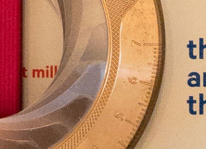
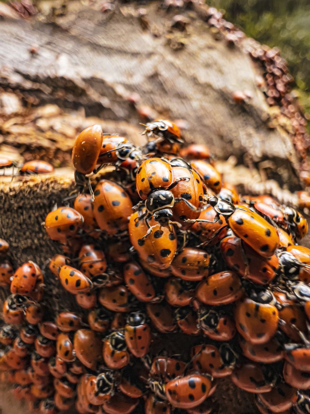
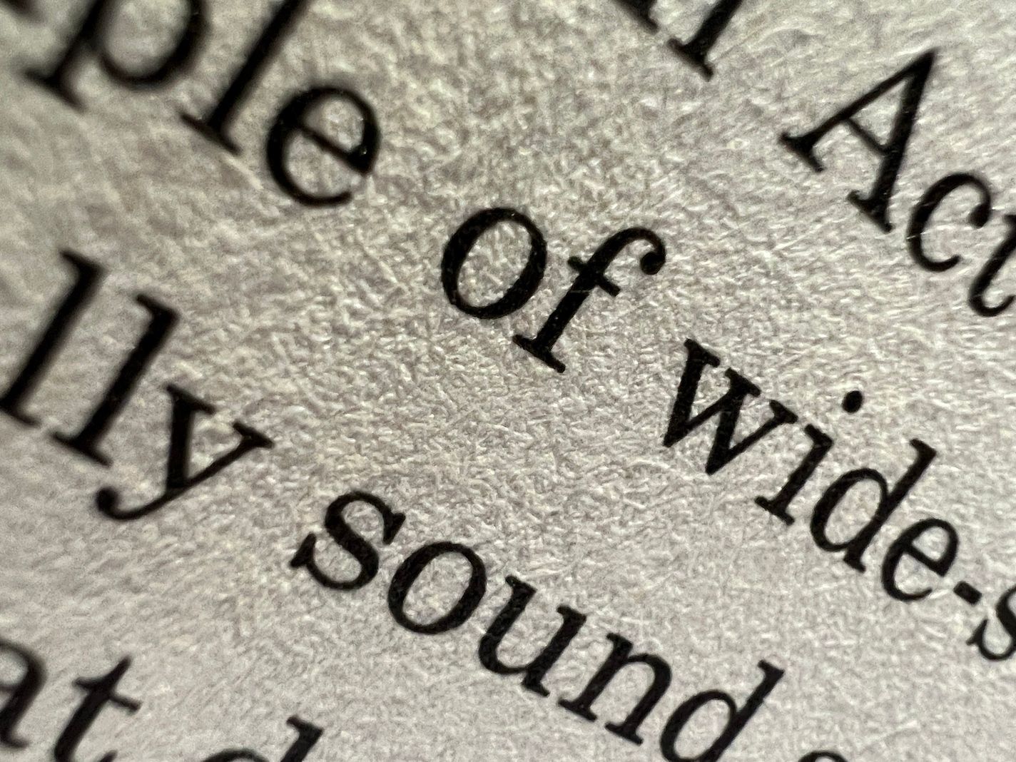
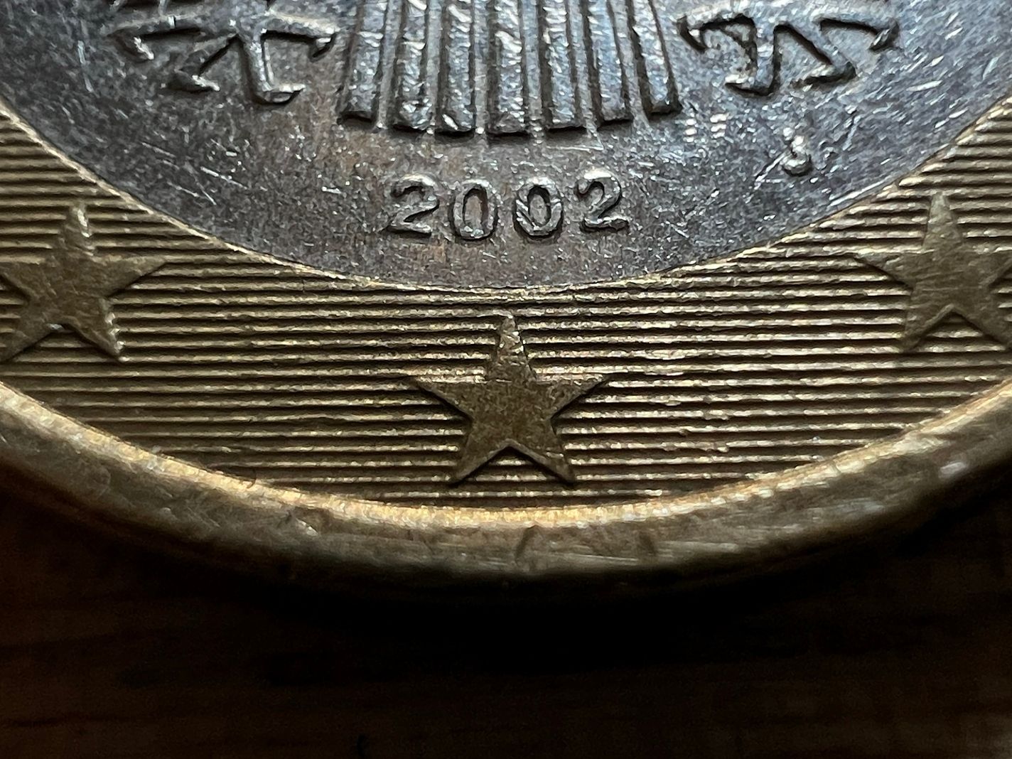
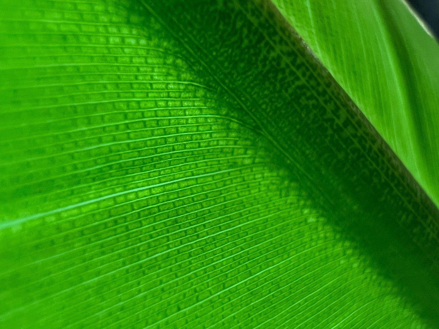
One extra bonus we got thanks to the ability for the camera to alter its focus is a borderline bizarre close-focus distance. This new camera module can come up to about half an inch of a subject and still render it sharp.
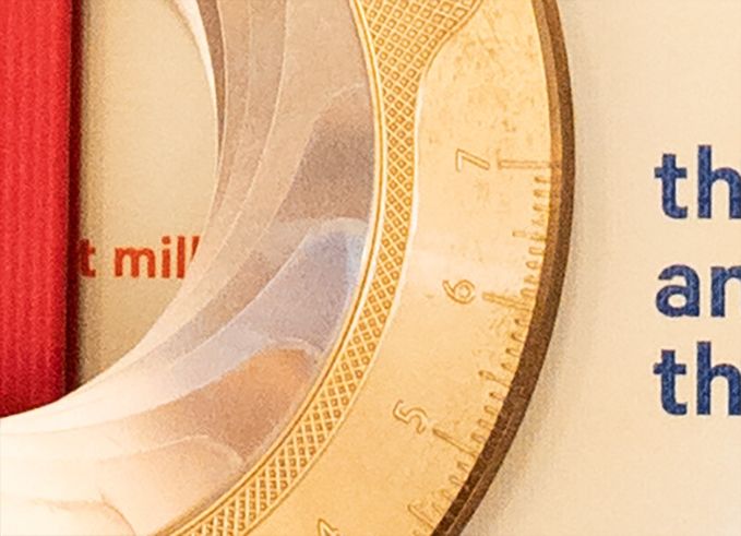
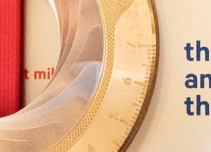
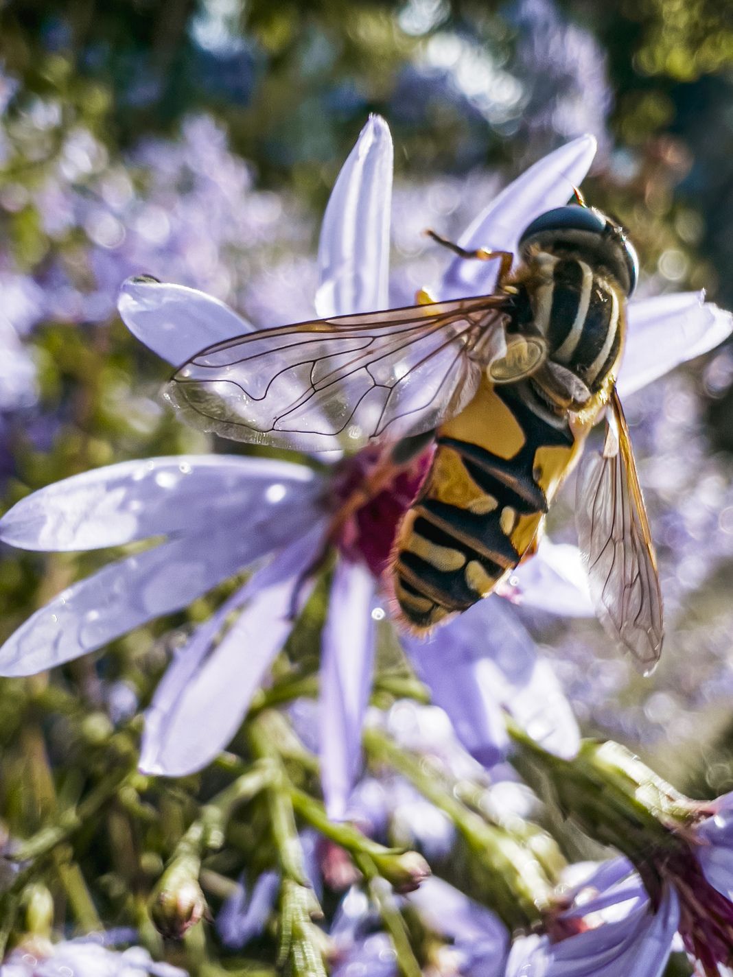
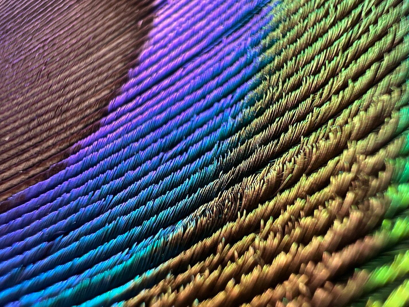
While this allows incredible fresh perspectives at the world, it’s even cooler when applying some magic to it. An existing macro-capable camera is one thing, but as a camera app developer we couldn’t help but push it a bit further. When we released an update to our app with fine-grained focus control and AI upscaling, we found that it can also be applied to this already-Macro-capable camera, creating a sort of microscope:
This new camera package is supremely powerful, and it has incredible potential with smart processing as we show here with a feature like Neural Macro.
This seems like a slam dunk of a camera upgrade, yet most reviewers ran into issues with this camera. And the issue they had was with the camera being ‘smart’.
In The Switch
We can conclude that this iPhone packs a hugely powerful set of cameras in its Wide and Ultrawide cameras, but to your average user, there is only one camera; the one they shoot with. The iPhone’s camera experience is cleverly designed like this: it was carefully crafted to eliminate the complexity from a traditional multi-lens photography setup.
As an experienced photographer, if I pack three lenses for my big camera, I’m going to consciously choose between them. I think about the tradeoffs between each lens, like edge-blurriness vs field-of-view. iPhone’s camera app wants to make that decision for you. You don’t open up your iPhone camera and choose a lens; it just works. The iPhone will choose a lens, even if you don’t. And it can even switch between them, whether you choose to… or not.
When this intelligent switching works, it’s like magic. The camera behaves and works better than a set of separate cameras. You don’t pick between them*; the Camera app has been programmed with incredible intelligent adjustment to ‘seamlessly’ switch between them. This is how you can zoom with this big wheel all the way from a 13mm to a 75mm lens:
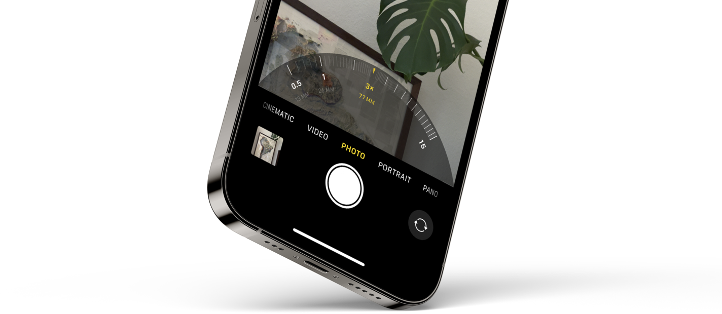
*unless you use Halide or other apps that enforce a more strict choice between cameras
There are two ways this can work: it can work like true magic, where the camera will behave and work better than a set of separate cameras, and there are times where this can confuse with its ‘intelligent’ switching, creating a jarring transition when users have no idea why it is happening.
For example, on previous iPhones with dual camera systems, each camera had limitations in focus. Your wide angle lens (1×) could focus closer than the telephoto one (2×). So if you tried to take a photo of something fairly close, the iPhone always took the photo with the wide angle lens and cropped in, even if you had picked 2× in the app. It’s hard to argue with this decision, as it’s better to have a lower resolution photo than one out of focus.
But it also confused Halide users who wrote in to ask why we can’t focus on objects as close as the first-party camera. If you truly force one lens, you’ll discover that it has limitations. We had to break the news to them, like parents with older kids having a talk about Santa: that ‘close focusing telephoto’ was not real. Cover the telephoto camera with your finger, and you will find that it still somehow worked. What was this dark magic?
It was a made-up camera that Apple created virtually to fool us all.
And that brings us to that little ‘Macro-gate’. Previously, it never really made sense to switch to that ultra wide camera. Now that it can, various people tweeted and many reviewers were flummoxed to see their camera jump erratically when focusing close between points of view:
The cameras on the rear of the phone are closely spaced together, and when they are focusing on something nearby, switching between them creates a ‘jump’ in the image. This can’t be fixed easily with software or cropping; it’s a concept known as parallax. If you look at your nose and close one of your eyes, and then the other, you can see your nose jumping around. The illusion of the ‘one camera’ is broken, and no amount of processing can fix this.
The source of friction here is that users know what they want, but in an ultra-simple interface the ‘smarts’ of image processing and camera selection have to predict it. If the system assumes correctly, great. But the more complex this system becomes, the more you run into times where a seamless transition can start feeling like a choice that is being made on your behalf.
In Halide, we simply have a Macro mode. You toggle it to jump to the closest focusing lens (and we throw in some AI enhancement magic too). Apple avoids this sort of complexity in their camera app, but relented in an iOS 15 update, making it a setting.
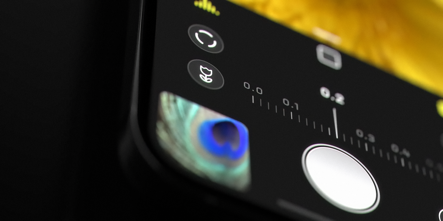
Don’t get us wrong: we still think their goal— magical and transparent switching— is the best for almost all users. But Apple runs into an unenviable challenge — a camera app that works for users of all skill level. We design Halide to serve slightly more experienced photographers, all the way up to seasoned pros. Apple wants to serve the entire population of Earth, from pros to your parents. This requires much more advanced ‘magic’ to bridge these gaps.
Unfortunately, this is a place where the ‘magic’ illusion failed and instead started to get in the user’s way.
The 75mm Telephoto Camera
And that brings us to the final camera and my personal favorite: the telephoto camera. Introduced in the iPhone 7 Plus, the telephoto was always a fantastic way to get a closer shot from a distance, and longer focal lengths are particularly great for portraits and artistic photography.
Apple made a small step to this major leap in the iPhone 13 Pro with last year’s iPhone 12 Pro Max. Instead of its smaller 12 Pro sibling, the Pro Max came with a 2.5x (65mm equivalent) telephoto lens, sacrificing a little bit of light for a little bit of reach. While I liked it, I found it awkward overall. It wasn’t enough reach for me to really enjoy, and I missed having the extra sharpness at 2x. The step was just too small.
No more half measures: iPhone 13 Pro and its larger brother, the iPhone 13 Pro Max, pack 3x (77mm) lenses. Unfortunately, however, Apple did not bless this camera with the upgrade of all the other cameras. Its sensor remains disappointingly the same size. This is a serious problem.
Virtually all telephoto lenses make a serious sacrifice: light. For example, on the iPhone 12 Pro, the wide angle lens had an ƒ/1.6 aperture, its telephoto had a narrower ƒ/2.0, allowing in less light. Less light translates into more noise and/or motion blur, making it hard to get a sharp shot.
This year, this gap is even greater. The iPhone 13 Pro’s wide angle camera has an ƒ/1.5 aperture, while the telephoto has an ƒ/2.8, for even less light.
What this means is that the camera that was lacking a bit in terms of clarity, noise and sharpness in previous iPhones has gotten… a bit worse.
Yes, the tradeoff was clear: we get reach. In bright daylight, you do get some fantastically sharp shots you previously simply could not get.
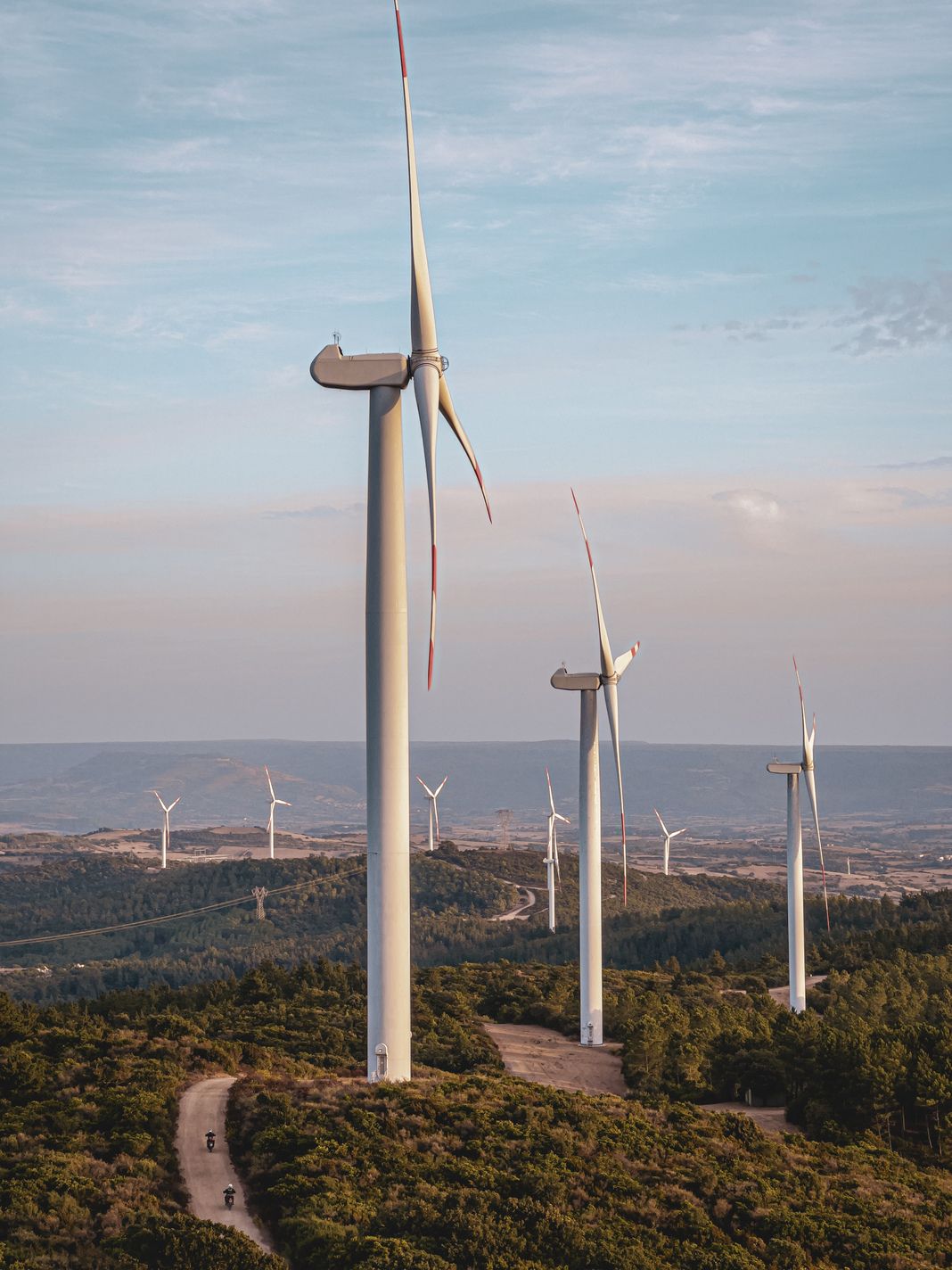
But it’s also clear that there’s more processing than ever happening in these photos:
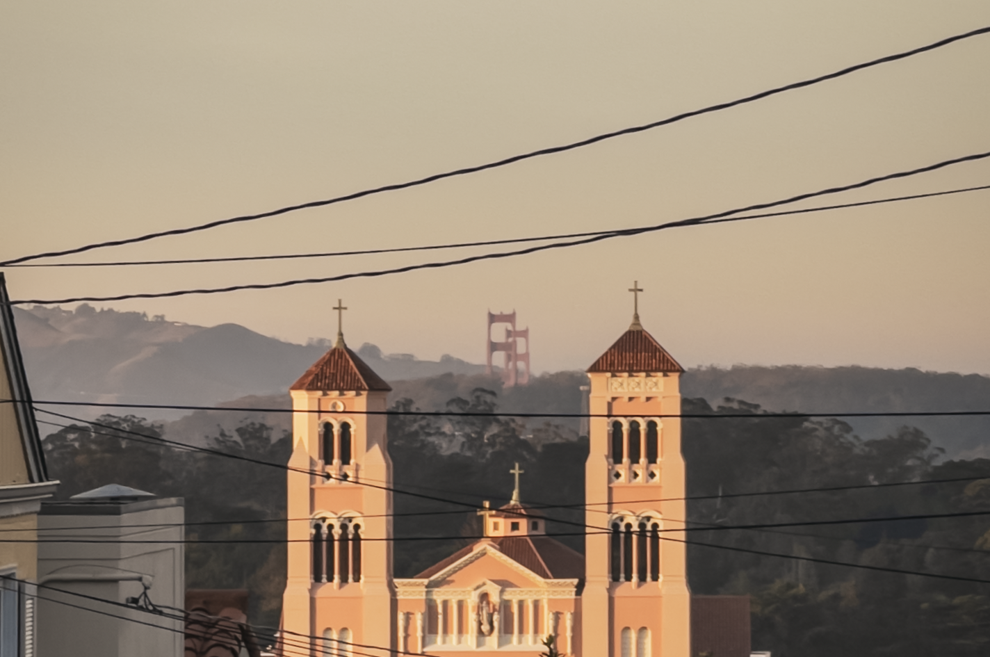
This is the nature of zoom lenses and shutter speeds. When you shoot handheld, the more you zoom, the more susceptible you are to motion blur due to the subtle movements of your arm holding the phone. As a rule of thumb, when shooting handheld you should set your shutter speed to twice the focal length of the lens. The telephoto camera on the iPhone 12 Pro Max had a 65mm focal length, so the math worked out to 1/130th of a second. With the iPhone 13 Pro’s 77m, that works out to 1/144th of second. To keep track, that’s three times more than the ‘regular’ Wide camera.
1/144th of a second is also less time of exposing, or letting in light. Less light makes it challenging to get a great shot.
The iPhone does have one tool to help it get the shot in that short moment. It can make its camera sensor more sensitive. What ends up happening is that your iPhone needs to crank up its ISO level, which translates into more noise. That means the iPhone’s post processing is going to include more noise reduction than ever before, because the shots are so noisy:

In my testing, a lot noisier than the iPhones that came before it.
A regression in noise quality between iPhones isn’t new. There have been iPhone camera generations with heavy, noticeable processing: the iPhone XS notably had some confused reactions at launch from people who thought their skin was being smoothed by the new Smart HDR process, when in reality it was just merging images for a better shot. The reason for the excessive smoothing? The cameras were producing better shots, but with more noise. Increased processing per-shot required more exposures, and the only way to capture extra shots was with more sensitivity.
This phenomenon has returned in the iPhone 13 Pro. This time your camera applies a “beauty filter” to leaves on a tree.
To make matters worse, the transparent switching between cameras rears its head once more here. As the telephoto camera is much less sensitive to light, the Camera app is very conservative in assessing when its image is clear enough to be usable.
That means many shots, even in daylight, actually come from the wide (1×) camera, and then cropped by the camera app.
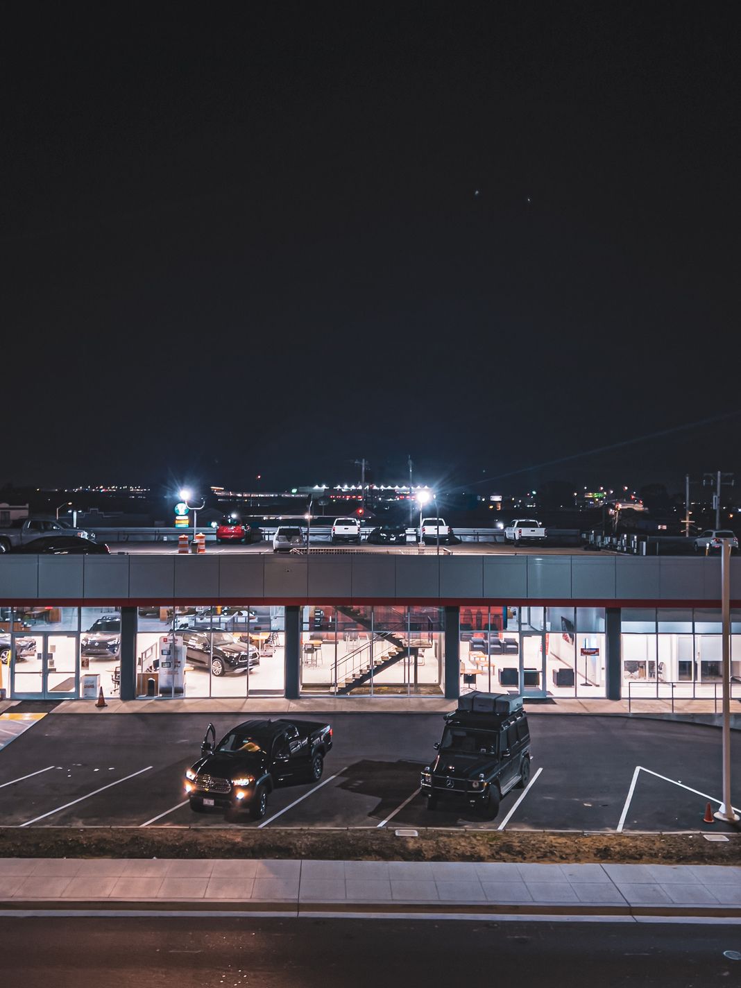
While there is an admirable amount of detail recovered here, the second shot here is not taken by my telephoto lens — it’s just a crop of the regular Wide lens, chosen because the lack of light at night makes the telephoto lens less usable for quick handheld shots.
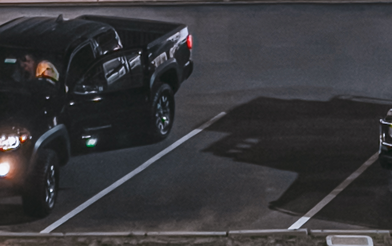
This issue is made worse by the greater difference in focal length between the wide and telephoto cameras. In prior years, it was only going from 1× to 2×. Now, the system crops by a factor of 3×. Now consider that the megapixel count isn’t exactly pushing boundaries, when you crop it by that much, you end up with, well…
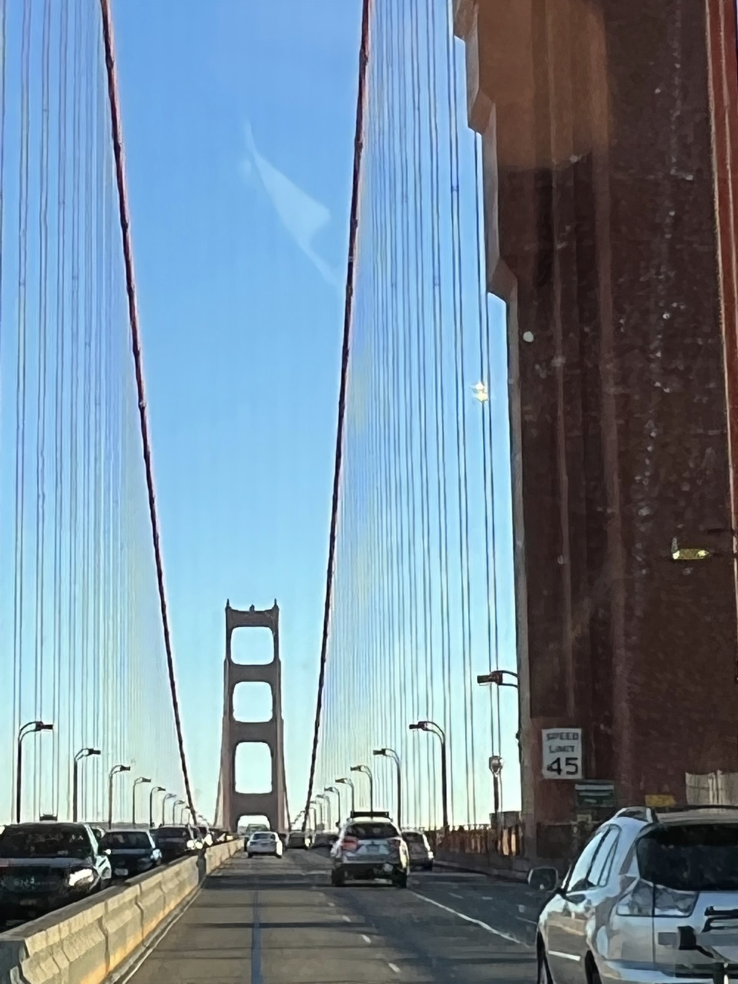
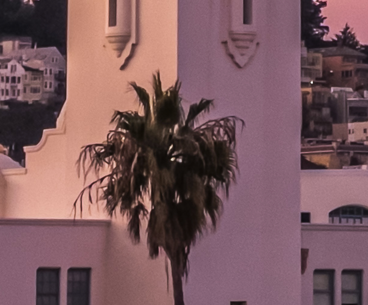
Apple is doing some funny things to avoid pixelation. In the image above, it ‘fills in’ details in the Speed Limit sign’s text fairly well, keeping it legible. Other areas, however, are modified in seemingly bizarre ways, even making the suspension cables of the bridge disappear around lampposts for inexplicable reasons:
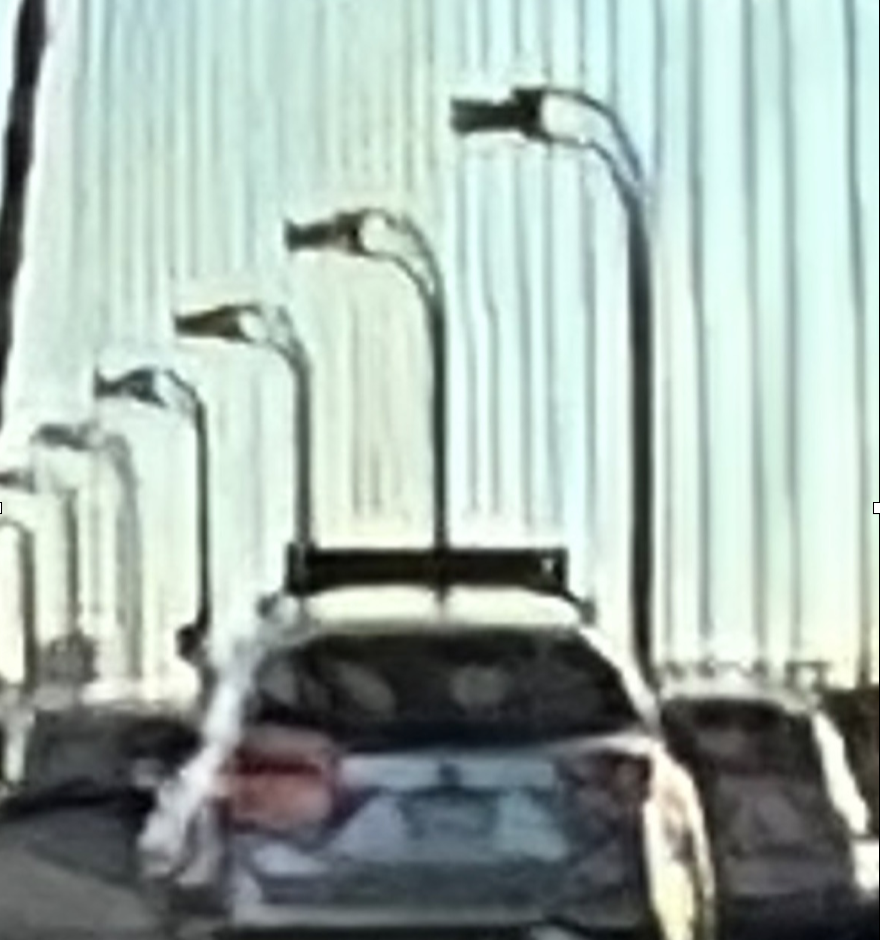
This is where a frequent problem I run into with the 13 Pro. Its complex, interwoven set of ‘smart’ software components don’t fit together quite right. The excellent-but-megapixel-limited Wide camera attempts to ‘hide’ the switch to the telephoto camera, creating a smudgy image. Intelligent software upscaling is stepping in to make the image look less pixel-y, which alters the look off the image significantly — it resembles a painting more than a photograph when blown up.
When switching lenses, I have to hope the camera will switch to the actual telephoto camera, but if the sensor can’t collect enough light, the image suffers from an ‘overprocessed’ look. The image is either an upscaled crop from the Wide camera, or a very heavily noise-reduced frame from the telephoto sensor.
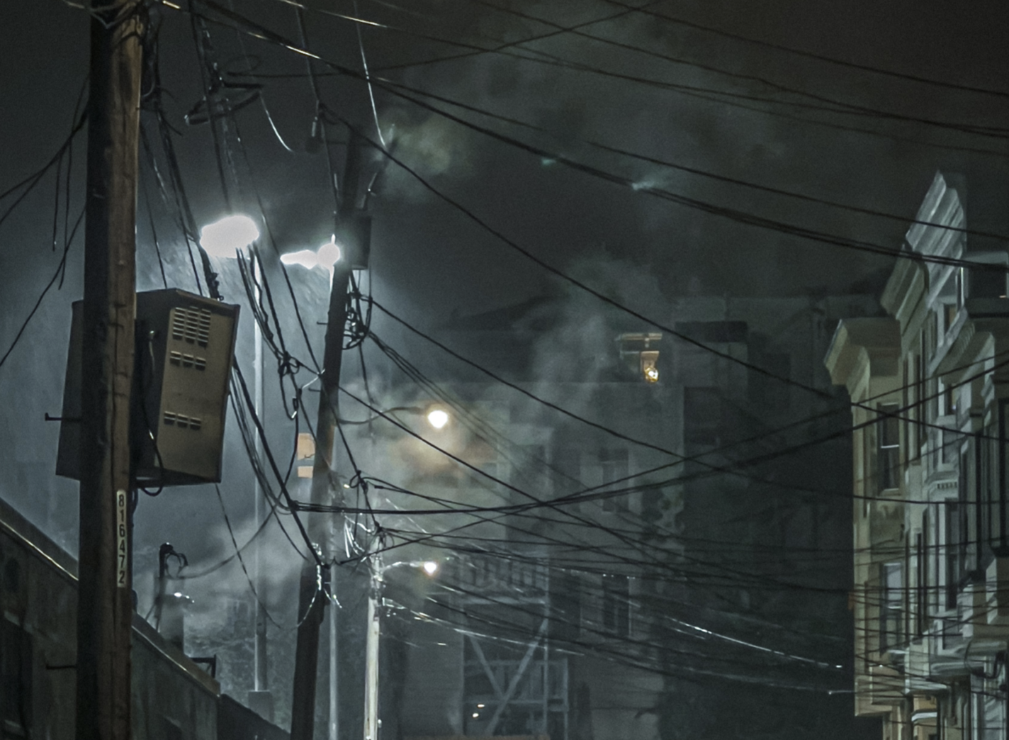
I was a big fan of this shot I took with the telephoto camera:
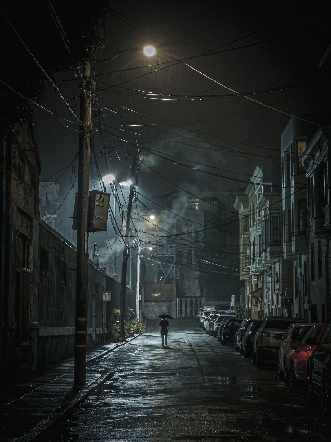
Many people on twitter felt it looked like a ‘painting’, however.
I can see why: in this low-light scene, the image from the telephoto is getting heavily smoothed. I have to give major props to how much detail is both retained and enhanced, but the image does end up looking unnatural. Focusing on details makes the image look a bit too smudged:
Compare this to a pure (not in-camera processed) RAW image from the same telephoto camera, and you can see why Apple made this choice:
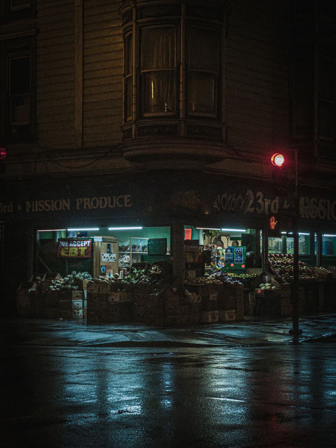
This is where visible noise enters the shot, something Apple’s camera fights hard against. I personally don’t mind it so much. In fact, I think in a dark scene, it adds to the texture, creating a more ‘realistic’ image than the smoothed-over rain shot.
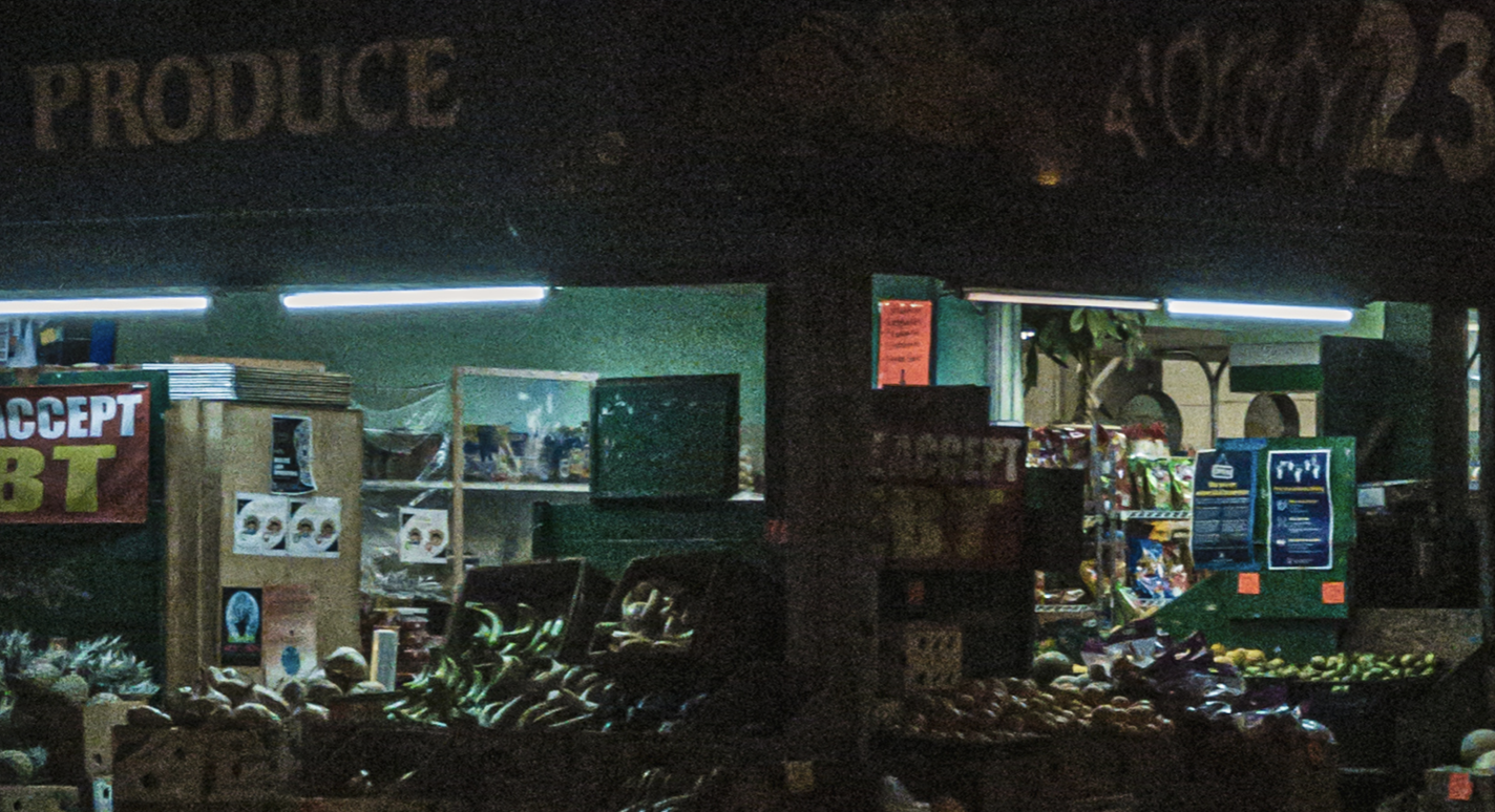
In the end, this is a creative choice. Apple is doing true magic with its processing; it gets very usable, detailed images out of a very small sensor with a lens that just can’t collect the light necessary for great handheld nighttime images. This is without even considering the wild processing that Night Mode enables. If you are a photographer, you should be aware of this processing, however — and make an informed decision if you want to use it or not.
I’ve made up my mind after a few months: For me, the iPhone’s processing on iPhone 13 Pro is simply too heavy-handed at times.
A confusing moment arose when iOS developer Mitch Cohen thought his iPhone camera had replaced a poor woman’s head in a photo with a mess of leaves:
In the end, it turns out this was just a trick of the eye. But the processing on iPhone photos does make the leaves look smudged; the way edges are enhanced and smudging is applied over the shot to reduce noise makes it hard to really makes sense of the image. This is a tell-tale iPhone 13 Pro photo: no noise, but a lot of ‘scrambled’ edges and an almost ‘painterly’ look to the whole thing:

I have taken to going about picking my processing. In the daylight, I will often shoot with our camera app set to native RAW. Shooting in this way will skip most of the aggressive noise reduction and detail enhancement that are omnipresent in iPhone 13 Pro photos. The slight grain is appealing to me, and I enjoy the slightly less ‘processed appearance’. At night, I will opt for the magic that helps me get great shots in the dark: Night mode, ProRAW noise reduction and detail enhancement.
Being conscientious of the magic in computational photography helps me appreciate it so much more.
As I mentioned earlier, the most important creative choice we will have to start making as photographers is to choose the amount of processing on our images by our cameras. If we can make such a choice, at least. Sometimes, the choice is made for you.
A final example of iPhone’s computational processing being hard to avoid:
Since iPhone 12 Pro, Apple has introduced its own RAW format for shots. Previously, taking RAW photos meant you lost out on all of Apple’s magic and powerful image-processing — photos often required lots of editing when shot in RAW vs. JPG. Images were noisy and lacked dynamic range; after all, in regular JPG shots the highlights and shadows were brought out through taking multiple exposures. Enabling ProRAW gives users a way to get this smart processing, with all the flexibility and image quality of a RAW file.
Unfortunately, it doesn’t let you *opt out* of some of this processing. My biggest issue is not being able to opt out of noise reduction, but on iPhone 13 Pro there’s a far bigger issue. Even if you enable ProRAW in the first party camera, switching lenses in Apple’s Camera app does not mean it will actually switch to the proper camera. Several shots I captured in telephoto mode resulted in a cropped ProRAW image coming from the wrong lens:

Yes, I am aware: This isn’t an iPhone-exclusive problem. The Google Pixel, too, opaquely switches between cameras when it deems it necessary, offering as little as a 0.3 megapixel crop of another camera even when shooting in “RAW.”
The only solution — outside of using an app like Halide — is to watch your viewfinder closely after you change your subject, to see if the camera has switched. This can take up to several seconds, unfortunately.
We find this crosses a border that computational photography shouldn’t cross in a professional context. RAW capture should be explicit, not a surprise. In a RAW capture format, the camera should honor user intent and creative choice. If the user picks a lens— even the ‘wrong’ lens— the software should use that lens. If the ‘Camera’ considers that to be a mistake, I don’t want it to stop me from taking the photo. I want to make my own mistakes. As they say: creativity is allowing yourself to make mistakes. Art is knowing which ones to keep.
I understand the first party camera isn’t meant for professionals, and you can still get great photos out of this camera. I still believe that Apple is in a hard place: the Camera app has to work for every single iPhone user, from the novice to the seasoned photographer with decades of experience.
There’s a paradox in the relationship between hardware and software: it’s easy to make smarter software with bad hardware. The decisions are black and white. But as the hardware gets more sophisticated, the decisions involve more shades of grey. How can science quantify an acceptable level of noise or motion blur, when so much of this depends on artistic intent of each photo? As the complexity of computational photography grows, so grows its dominion over our creative decisions, and I am increasingly finding myself at odds with the decisions it makes.
I think that as this trend continues, choosing what level of software processing to allow to your camera’s data is increasingly going to become the most important creative choice in photography.
Closing Thoughts
iPhone 13 Pro is a big shift in iPhone photography. Not only are the cameras all upgraded in significant ways, but Apple’s adaptive, clever computational smarts have never been so powerful. Touching every aspect of the photographic experience, you might be surprised to at times become aware of its power and limitations alike.
If you’re coming from an iPhone 12 and don’t take a lot of photos, you may not see a leap in quality, because so much is now determined by the existing processing which was already fantastic on the previous generation. However, the iPhone 13 Pro makes other leaps forward — with physical upgrades in the ultra-wide camera and 3× telephoto camera. Unfortunately, that magical processing sometimes works against the hardware.
If you’re a serious photographer, the iPhone 13 Pro is a brilliant camera — and you will only begin to scratch the surface of its potential with its built-in software and processing. When using apps like Halide or other third-party applications, the possibilities really begin to present themselves. Apple here has laid the foundation; much like with the LIDAR sensor that was added in the previous iPhone, the camera improvements here lay the groundwork for software to perform magic.
The only thing you need to add is your own creative vision.

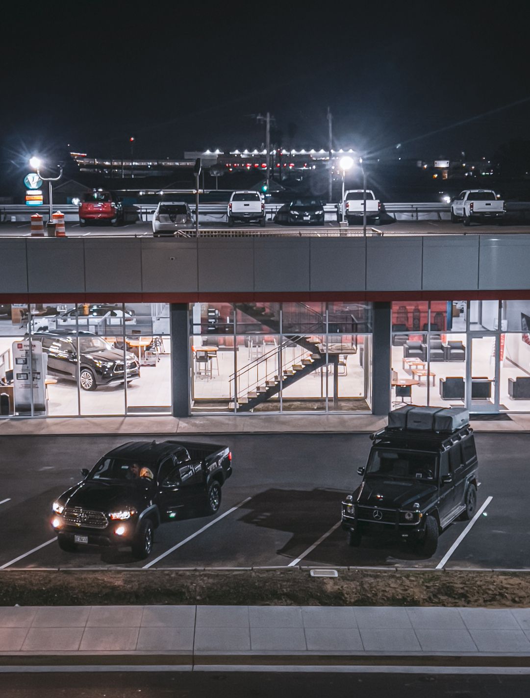
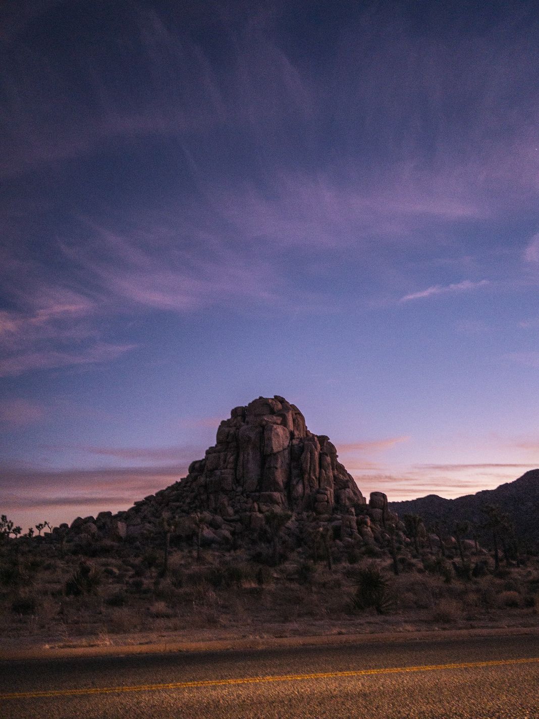
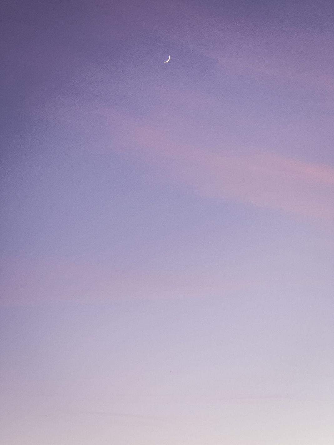
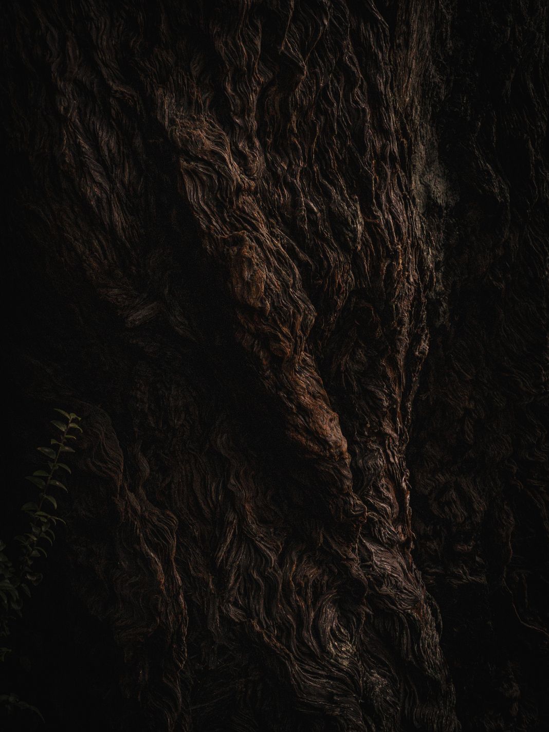
All images in this review were shot on iPhone 13 Pro by Sebastiaan de With.


