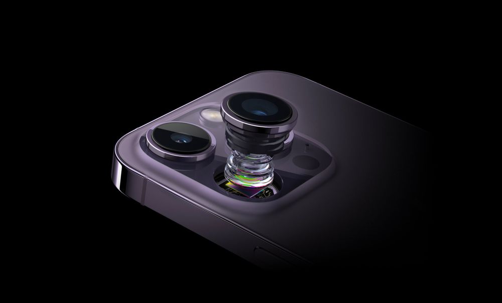
Apple is in the strange position of having to slowly improve a product while also trying to reinvent it.
Some say their success requires them making small, evolutionary steps seem revolutionary. I don't quite agree with that.
As iPhones become better and better over the years, small steps eventually bring tip-over points, when technology starts to enable things that we couldn't imagine years before. These developments enable not mere steps, but leaps forward: the iPhone X's all-screen form factor and Face ID; iPhone 7's Portrait mode; last year's Dynamic Island and 48 megapixel main camera.
So here's iPhone 15 Pro Max. This year brings a leap in materials and silicon, but marks an evolutionary photography step. Or does it?
Intro note: Why should you believe me? I am the design half of Lux, and we make Halide, the most powerful pro camera for iPhone. I'm also a freelance professional photographer.
iPhone 15 Pro Max
I have to get this out of the way: I find physical camera design important. It seems superficial, but camera design has been a playground and muse for artists and designers through the history of photography. There's nothing more magical to design than a box that traps light and converts it to creativity.
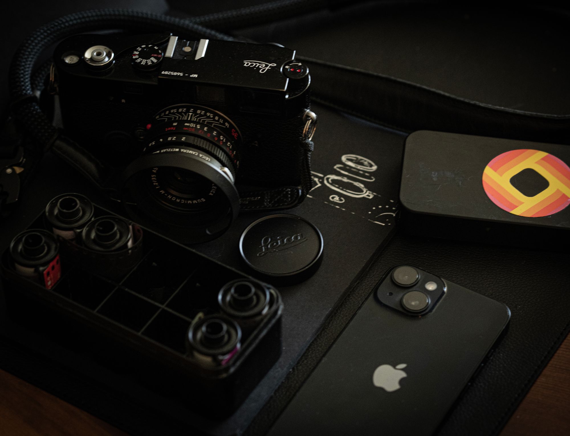
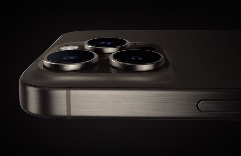
Few companies appreciate this, but Apple certainly did this year. The new Pro line depart from jewel-like appearance of last year. Gone are the reflective, shiny polished stainless steel rails, replaced with an almost imperceptible brushed finish titanium frame that feels fantastic and grippy thanks to its soft finish. The rounded edges make it comfortable in the hand and contoured to your fingers. It might be an illusion, but even the clearance and contour of the buttons make the entire thing feel more tactile.
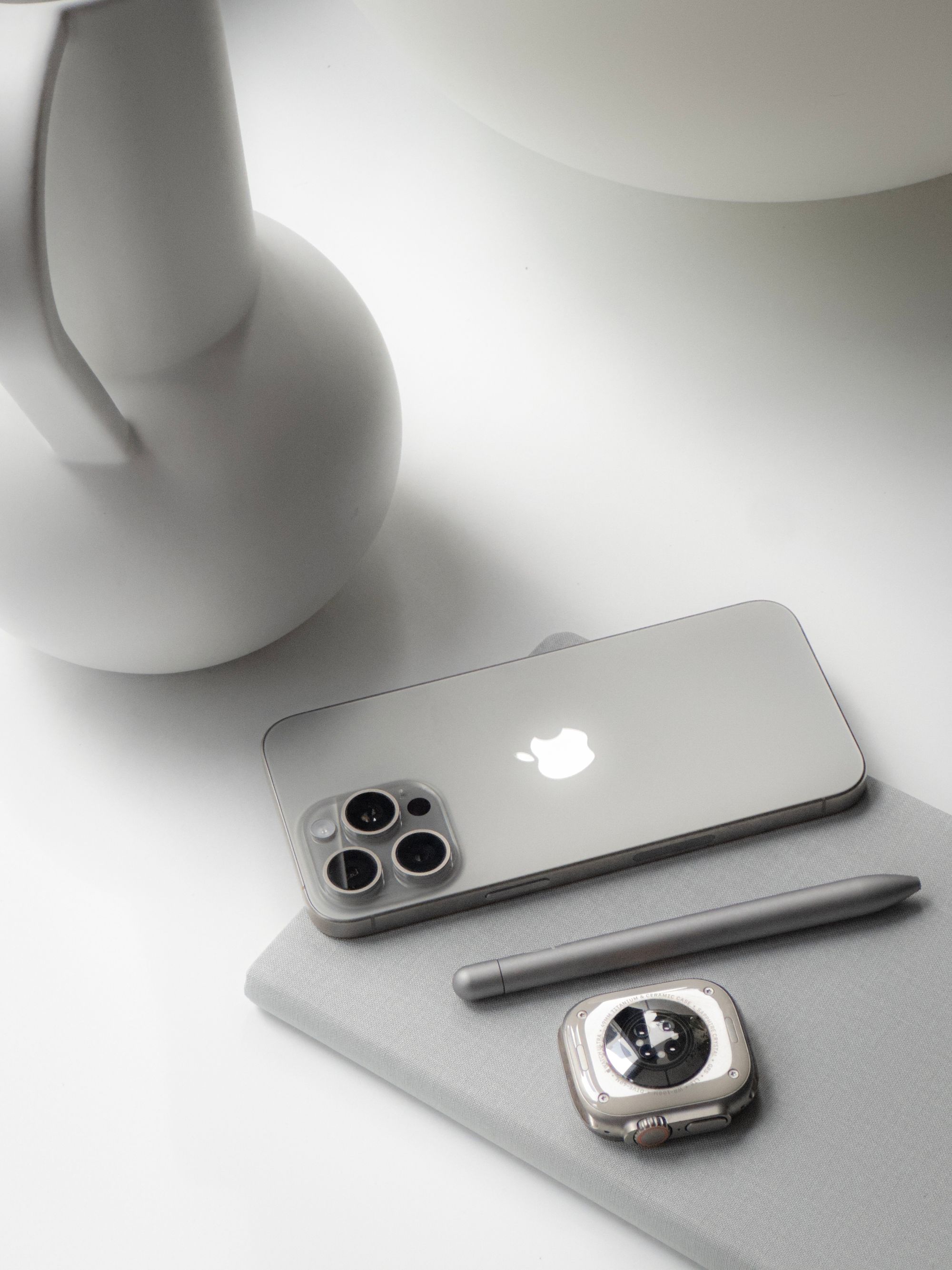
The 15 Pro deserves a place next to the inimitable iPhone 4 which Steve Jobs himself described as related to a 'beautiful old Leica camera'. This iPhone feels like a camera.
I chose the iPhone 15 Pro Max this year, as its optical zoom lens extends to 5× the default camera, or a 120mm focal length equivalent . Its smaller, non-Max sibling maintains its excellent 3× lens.
My previous Large iPhone Experiences— especially iPhone 12 Pro Max— were enough to make me prefer the smaller screen sizes for every subsequent release. Even my standard-sized iPhone 14 Pro felt borderline too large and heavy.
I went into the 15 Pro Max expecting a little discomfort with a giant slab of glass and metal in my hand, but to my surprise, it felt manageable. That titanium frame and rounder edges really make a difference. If next year's standard size models offer same telephoto lens, I'm not sure if I'll downsize. It's that comfortable.
Tactile feedback improves camera usability, and there's a reason that dedicated cameras still have physical buttons: it's hard to make tapping glass feel satisfying. This year we gained a button, which we'll dive into later.
Ultra Wide
We'll kick off this review looking at the lens that has come standard on every iPhone for the last four years: the ultra wide. Its sensor and lens are unchanged, according to Apple — with the notable exception of the coatings on the lenses, which means fewer flares and reflections when shooting into light sources. Additionally, the ultra wide camera benefits from better processing.
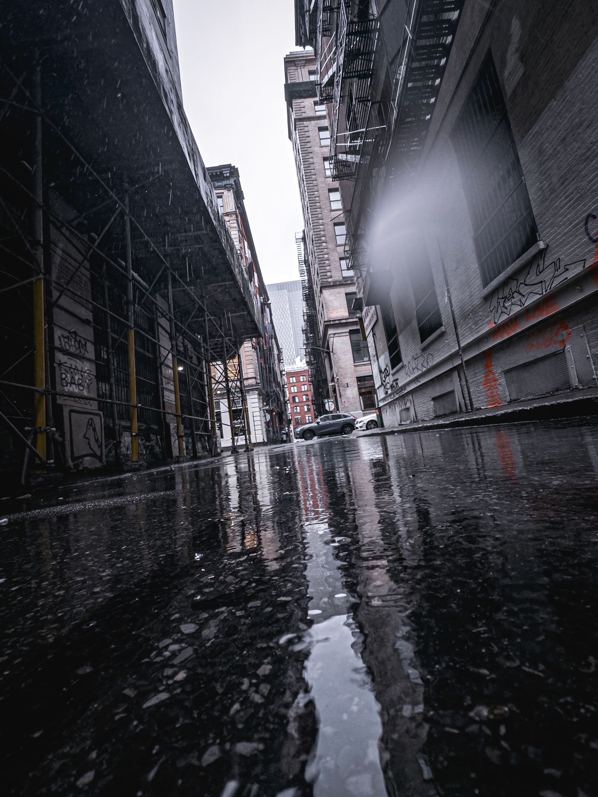
Its field of view remains so incredibly wide that if you don't watch yourself, your body can accidentally end up in your frame. This is a solid, sharp lens that's always fun, because there's almost no framing involved.

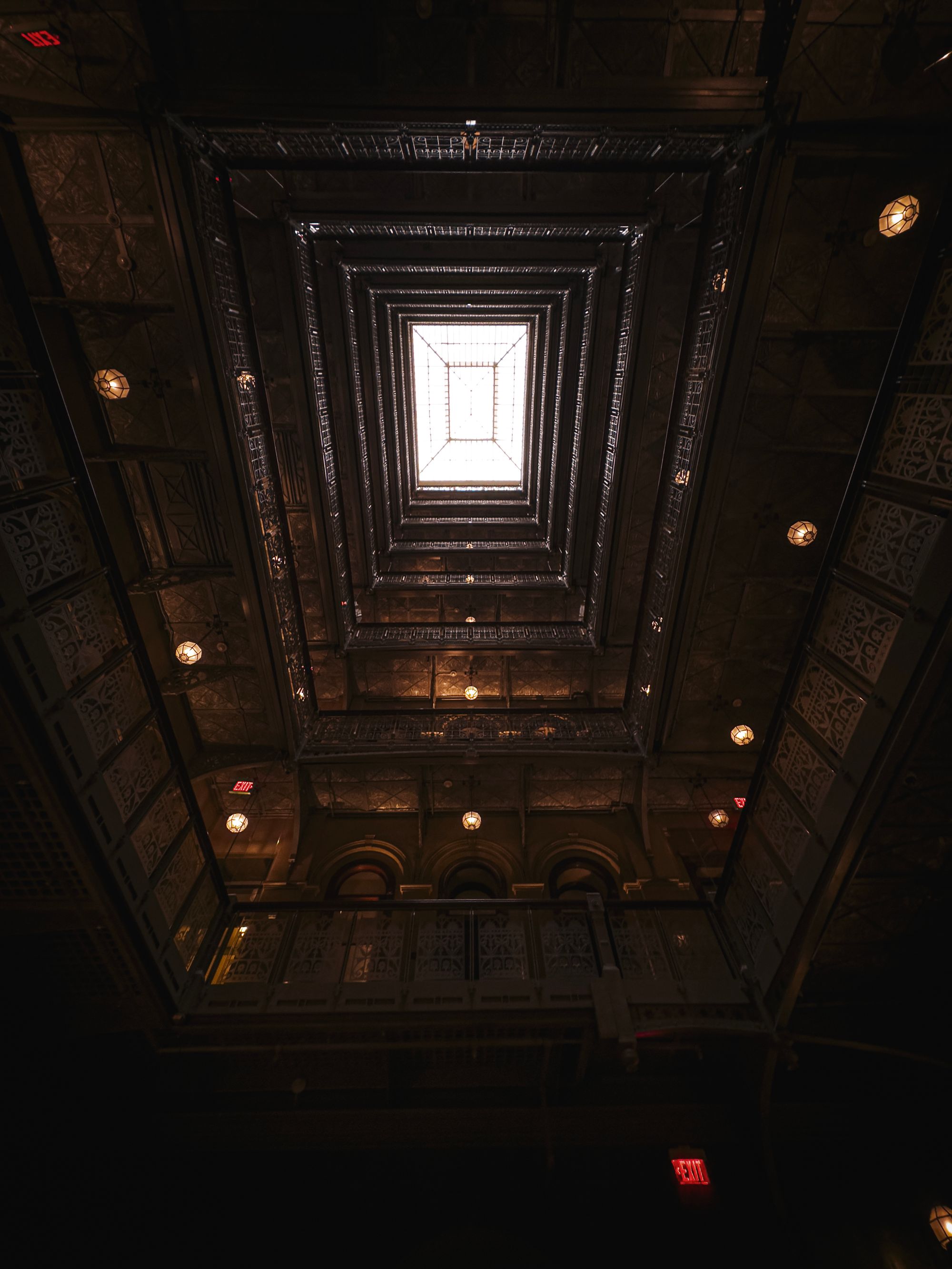


I noted very clear improvements in its handling of very bright light: while the occasional ghost can glint around the viewfinder, it happens a lot less often. In the dark it does fine, but in daylight, it does great. Shots are incredibly detailed and sharp, and the macro mode is astonishingly close focusing.
One thing that I'd love in a future iPhone: an extra 'lens' in between this hyper-ultra wide and the regular camera, offering me a 16/18mm equivalent field of view. It would help keep subjects framed with a bit less distortion near the edges and fewer accidental finger photos. Hopefully this can be achieved similar to 2× mode, using a higher-resolution sensor that creates a virtual lens.
Main
Last year, I waxed poetic about the main (or 'wide') camera on iPhone 14 Pro — taking it through Bhutan by motorcycle and Tokyo by foot. Without hyperbole, it was easily the most dramatic shift for my personal photographic process. Not only did the iPhone suddenly take 48 megapixel photos — the camera itself began to render in a way that I could only ineffectively describe as 'real-camera-like': I really got shots that were great. Not 'great for a phone' — genuinely great photos.
This year's main sensor and lens combo feels just like one on the iPhone 14 Pro. Zero complaints. It's a great camera.

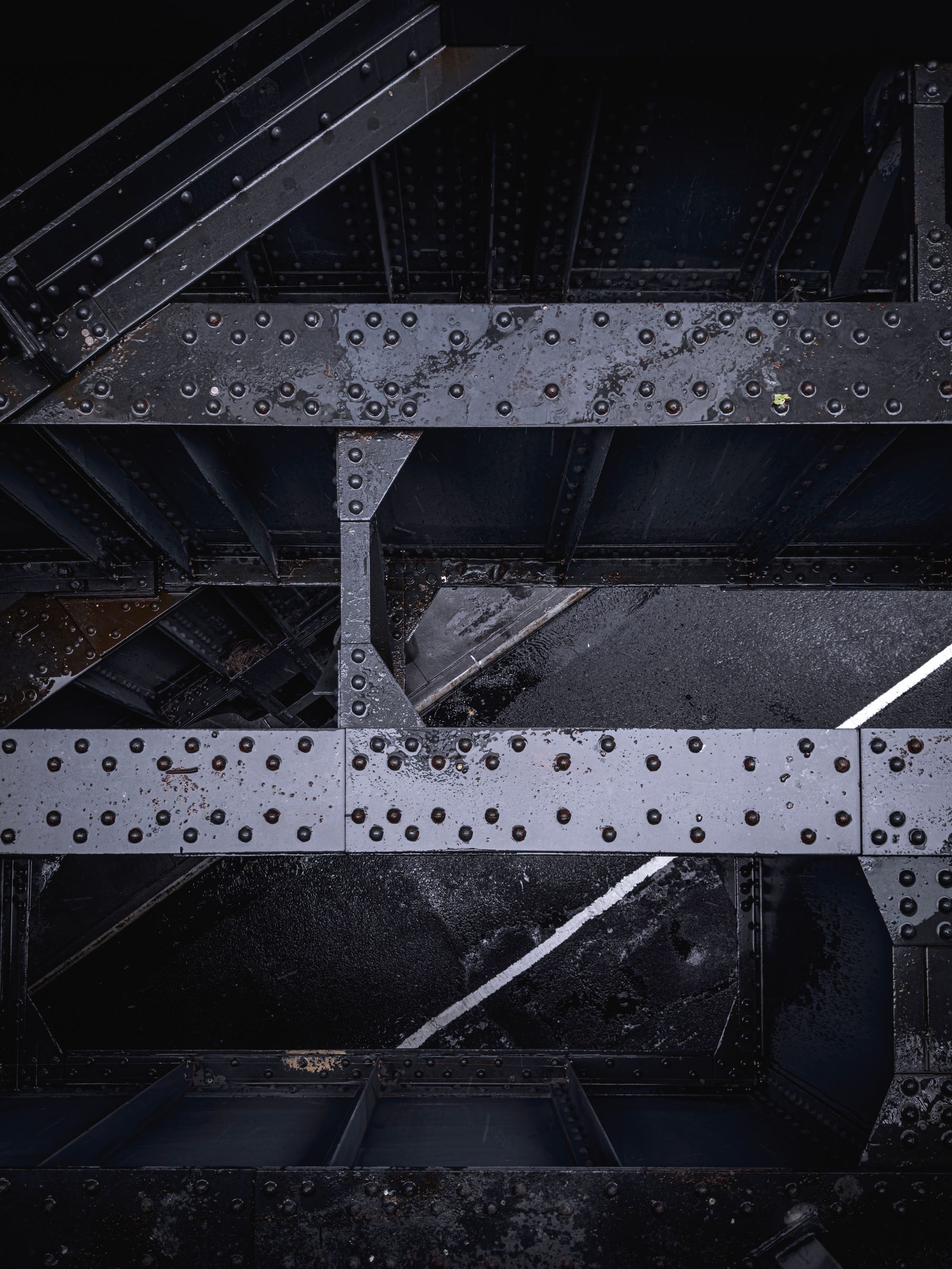
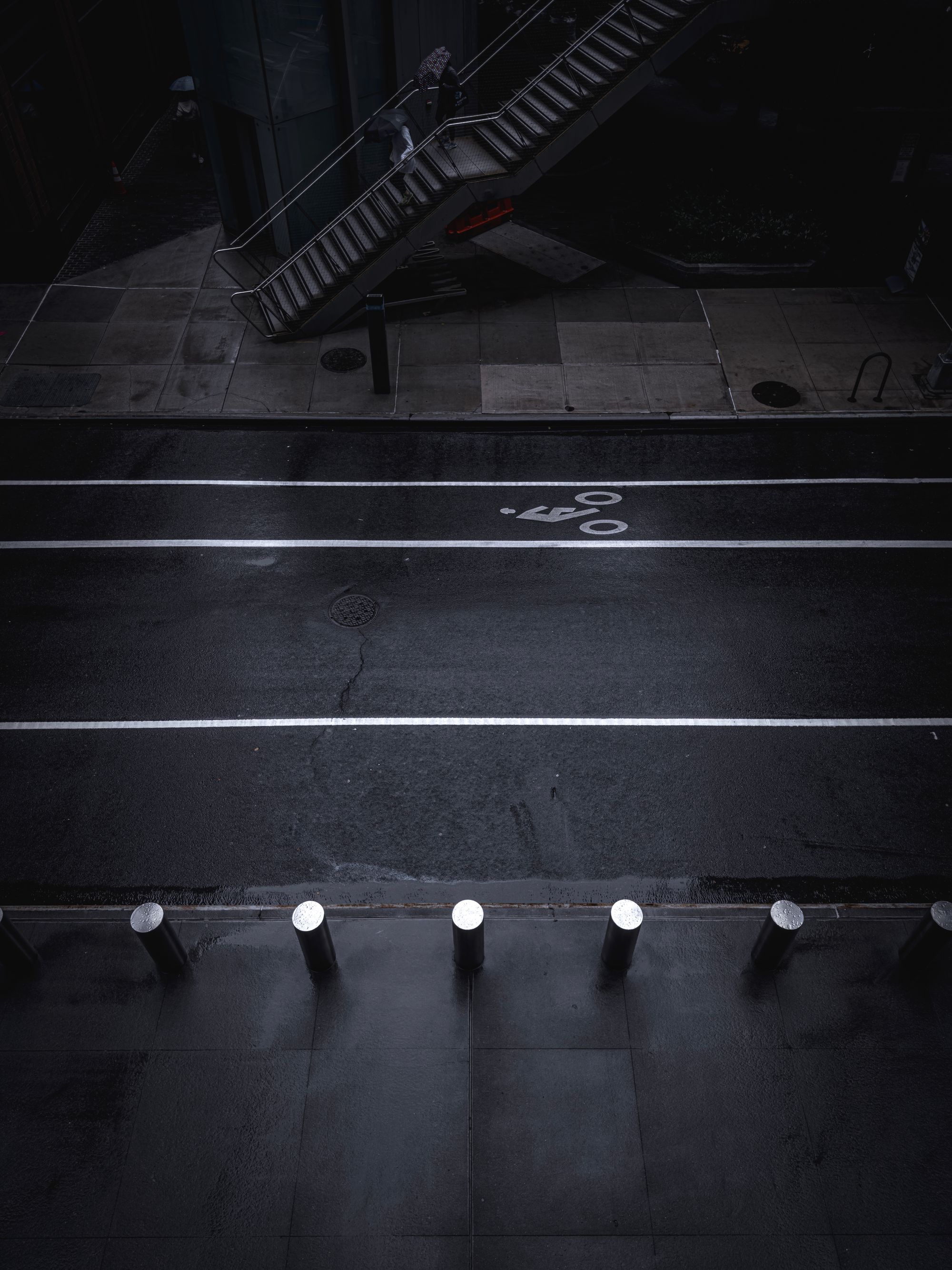
Apple's touting some serious improvements on this camera as a result of an improved imaging pipeline. While not mentioned explicitly during the event, the iPhone camera now combines a 48 megapixel high-resolution frame with a 12 megapixel frame to create a highly detailed, high-resolution-but-manageable 24 MP shot by default.
This is going to be a huge jump for most users, which have previously shot 12 MP shots (even on iPhone 14 Pro, which always shot 12 MP images unless set to ProRAW 48) and it makes absolutely perfect sense.
48 megapixels are far too much for most images, take up a ton of space and are slower to capture. I think I can state without exaggeration that it'll be a huge upgrade—potentially one of the biggest ever— for the average iPhone user, on par with the introduction of Night mode.
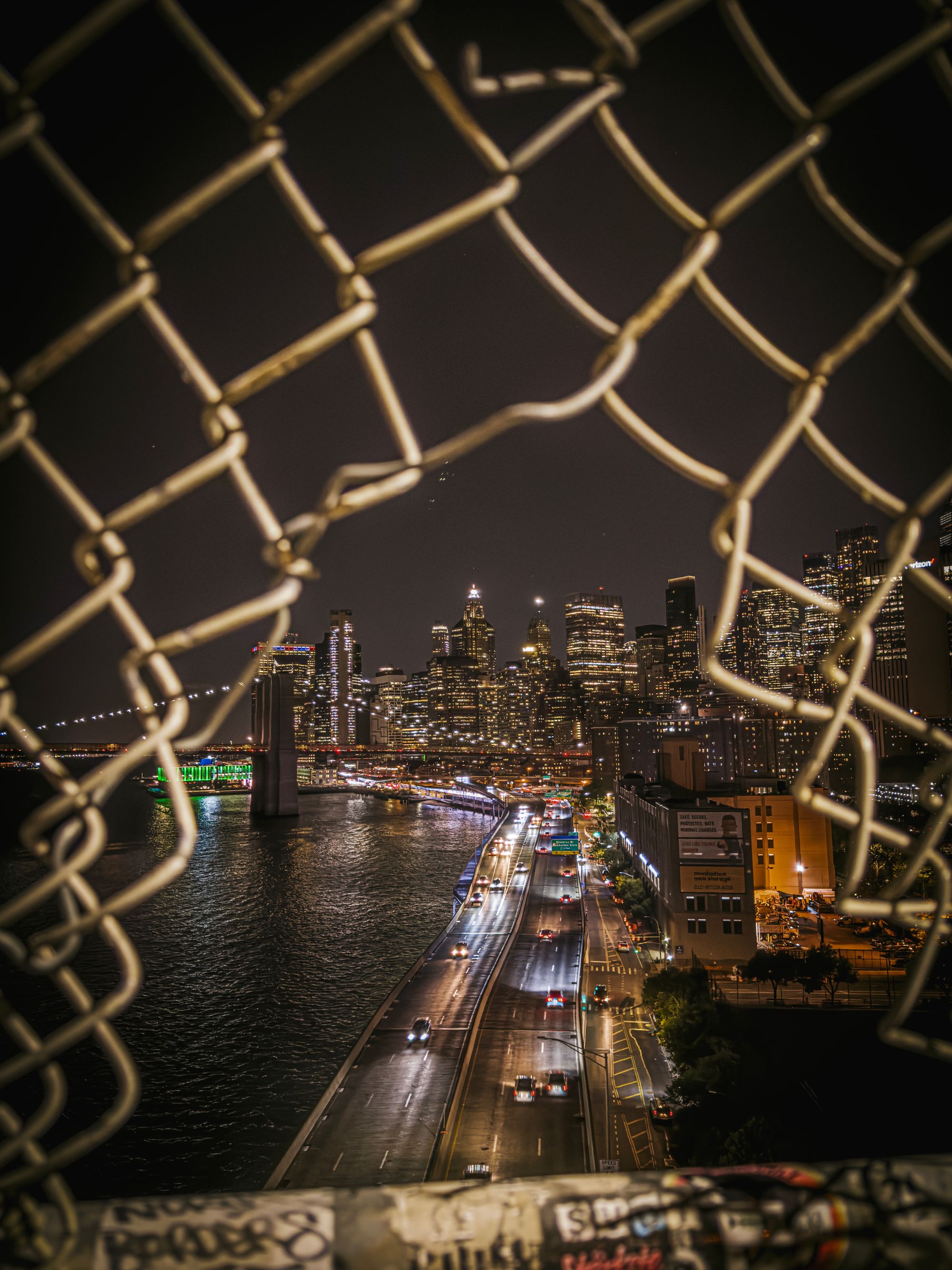
Speaking of Night mode: in some modes, the camera app will output lower resolution images where needed. Night mode, for instance, combines pixels for higher light sensitivity on-sensor and only gets you 12 MP, no matter the capture format. I found it a solid tradeoff in my usage.
Unfortunately, I can't personally shoot in 24MP, because it isn't available when shooting ProRAW. Your choices are only 12MP or 48MP. It's a real bummer because 48MP ProRAW files get absolutely massive.
Even if you're fine shooting HEICs, native 24MP capture is sadly not available to third-party apps like Halide. Some apps now take 48MP photos and then downscale to 24MP, for the slowest possible experience with none of the processing benefits. We're here just hoping Apple will roll out genuine 24MP support in an update.

As for the files as they are today, I noticed colors are ever so slightly more pleasant. Maybe it's software—we'll dig into that later—but it's always possible this is due to lens coating changes this year.


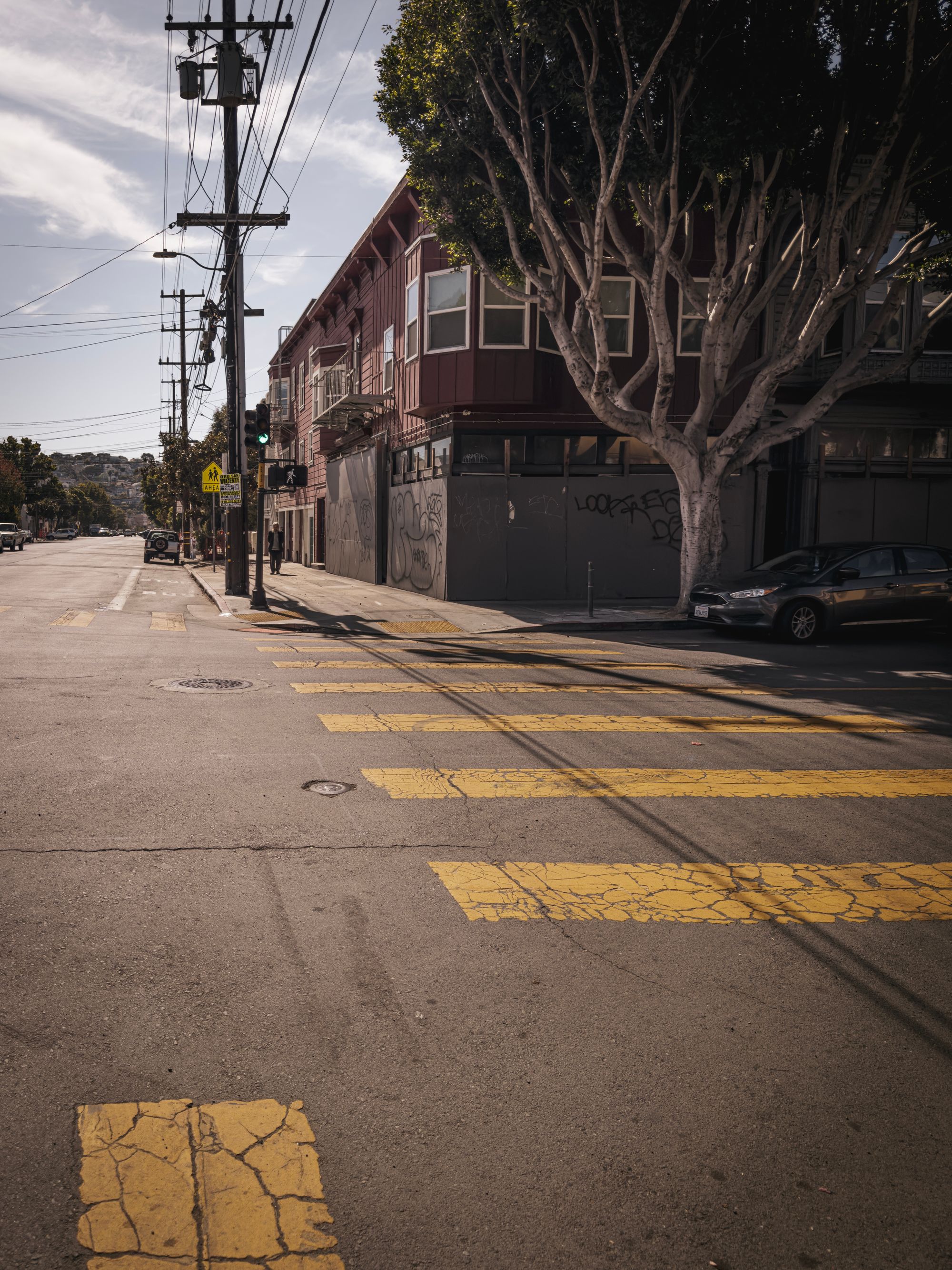
Last year's iPhone pro added an 'optical' 50mm (2×) lens, and this year adds 28mm and 35mm equivalents. You can disable or enable any of these, even making, say, the 35mm (1.5×) 'lens' your only main camera, comfortably sitting between the extremes of 12 (0.5×) and 120mm (5×).
Last year's virtual lens was, more or less, a straightforward crop of the higher resolution sensor. Apple says that these new modes use a special capture pipeline to get more detail out of the sensor.


I have to say, I love this approach. It's a great way to add depth and control to the camera. For most users, it's not more than a stop along their zoom wheel, but for those that care it is a discrete lens. I can't help but escape the feeling that it's still kind of a digital zoom. The quality is certainly there, but there's more freedom in shooting at 24mm and cropping afterwards.
Maybe they were on to something with this being the field of view of the main camera after all.
Revisiting the Virtual Telephoto
I suppose I should really be reviewing both the main camera's 'optical' 2× lens here, and the new telephoto.
For everyday use, the 2× shines, but there are times where you'll find that it is indeed an extra-crispy, zoomed version of the main camera. Sometimes the depth of field isn't quite as sharp as you'd expect from a dedicated lens. But as a device with only 3 real lenses, the virtual 2× 'lens' holds up surprisingly well:

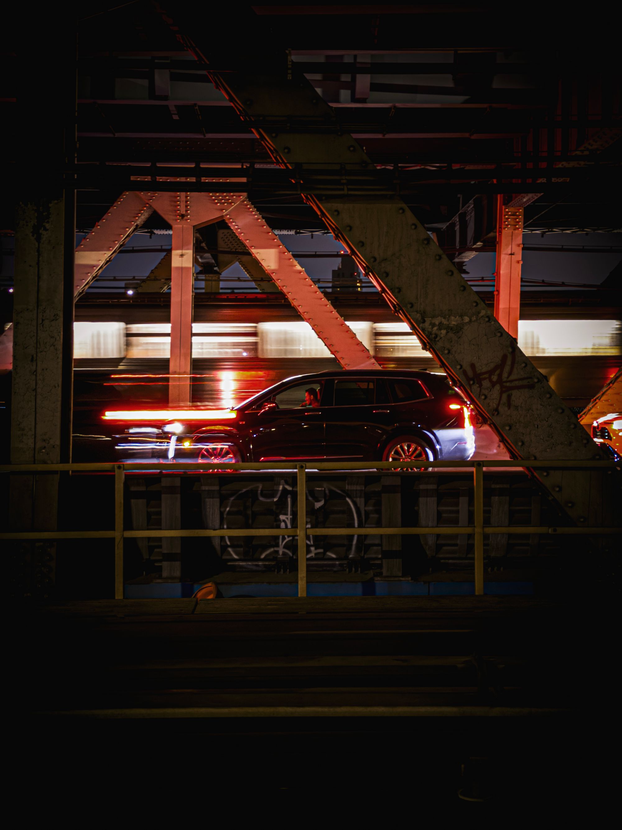
I am not sure if the 15 Pro is any better, but one year later, it's clear that the 48 megapixel sensor has enough resolution headroom to make these kind of virtual lenses work quite well. I was a skeptic in last year's review, and this year I'm a cautious believer.
And now for the main attraction…
The 5× Telephoto
I will not quit until I have shown you an inordinate amount of comparisons between the main camera and its new, long 5× telephoto counterpart. Not because it's just fun to see how much it zooms, but also to show you how differently you have to look at the world around you.
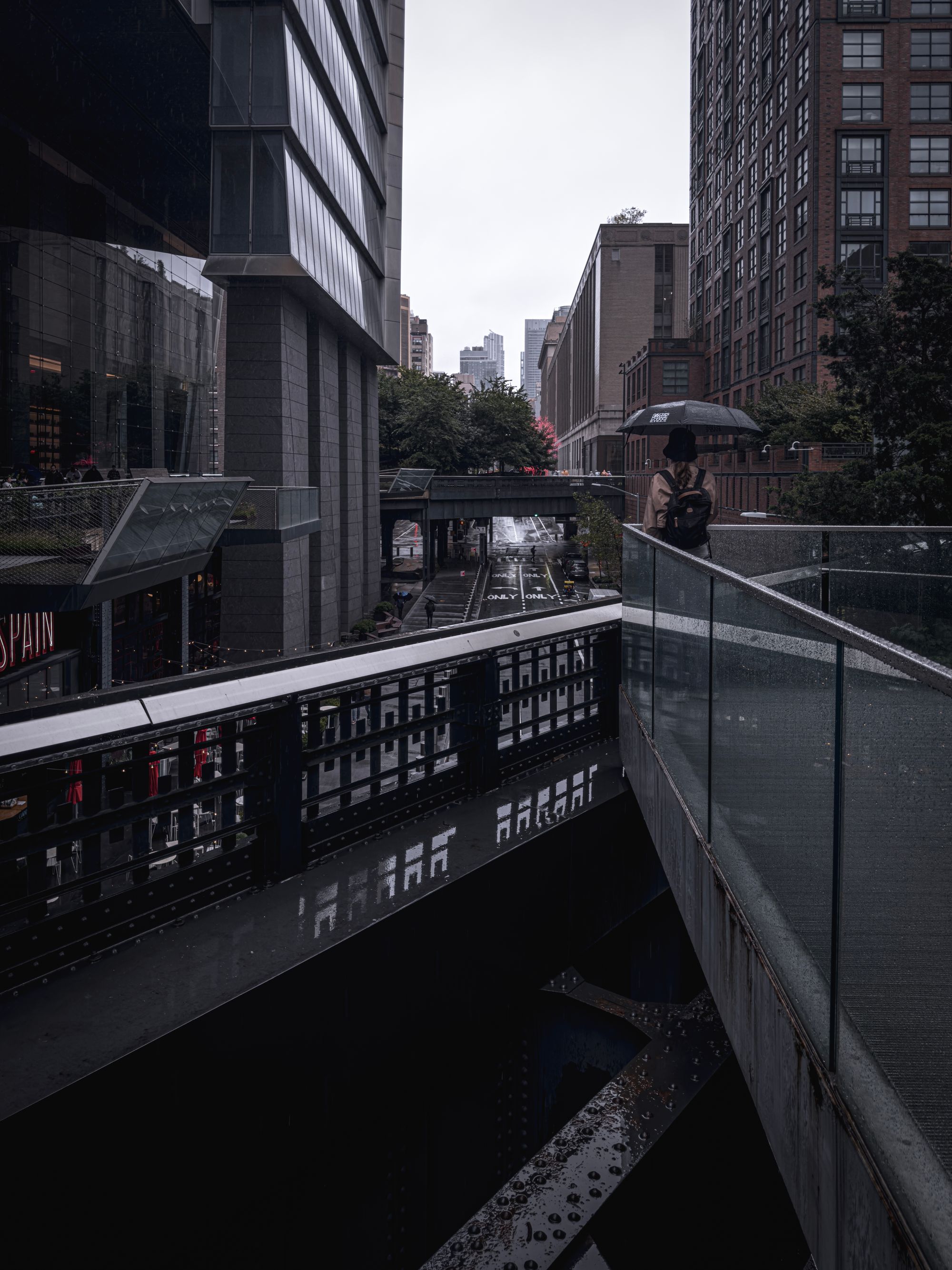
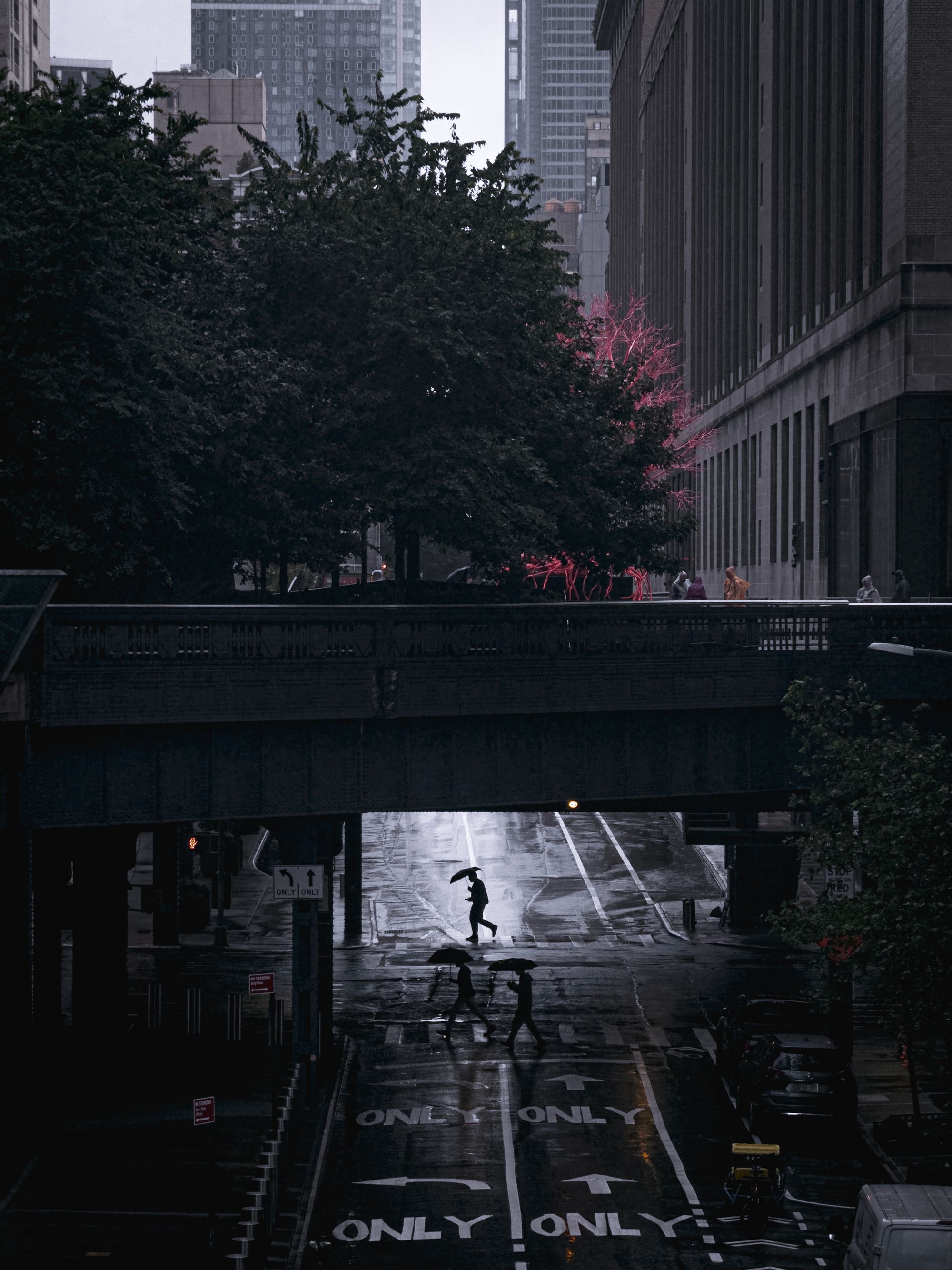
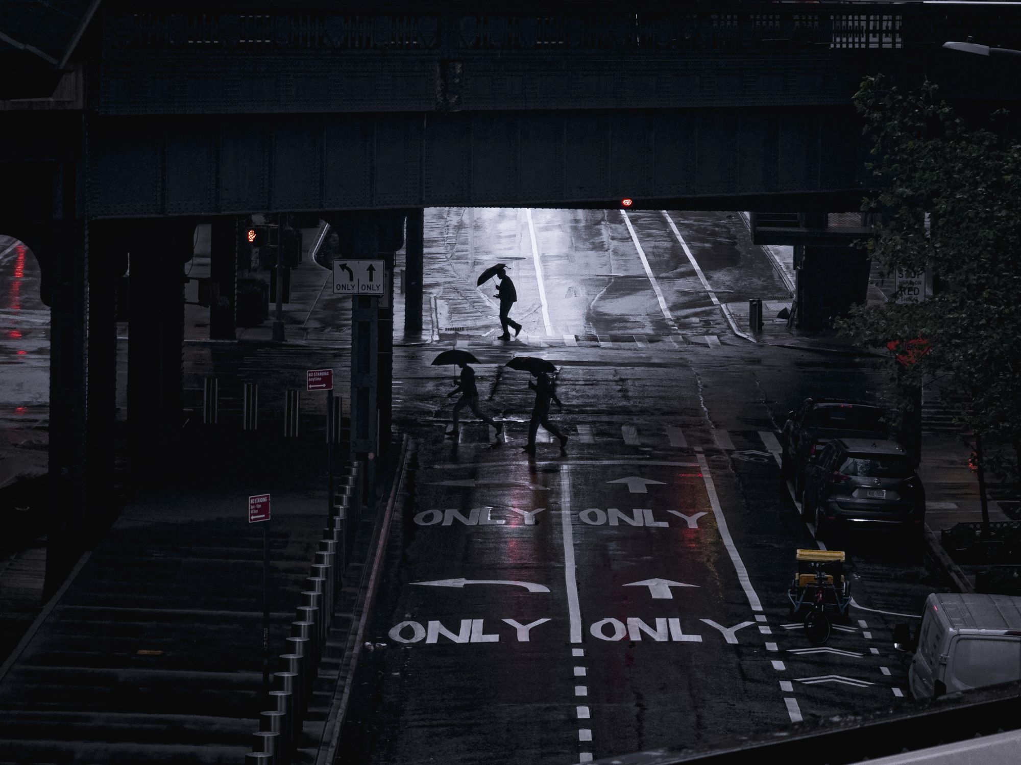
Previously, you could see a shot that you wanted to capture because it was part of what you were seeing. Now, you have to look for a detail and then capture it. It's a very different way of composing shots, and kind of tricky.

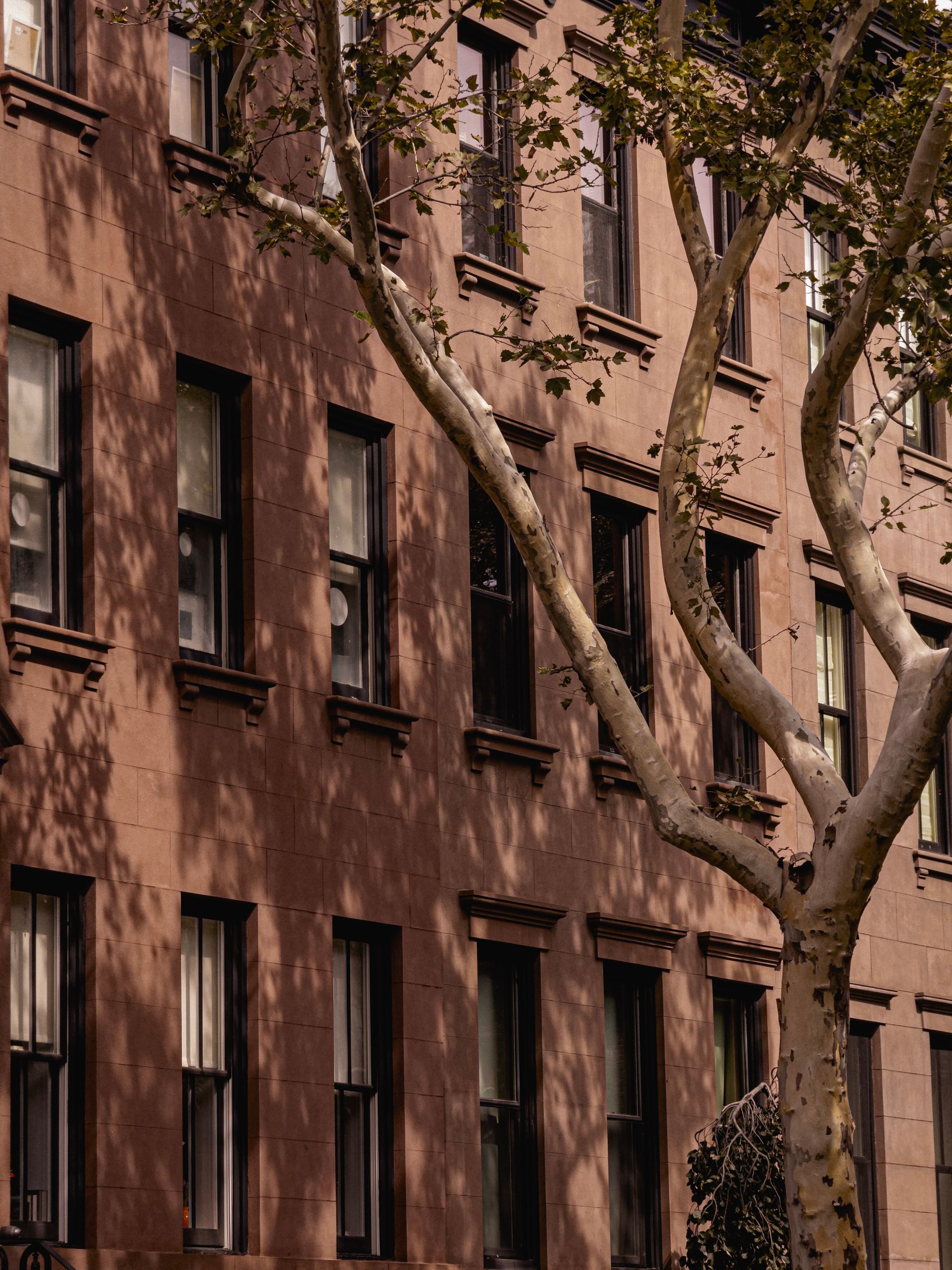
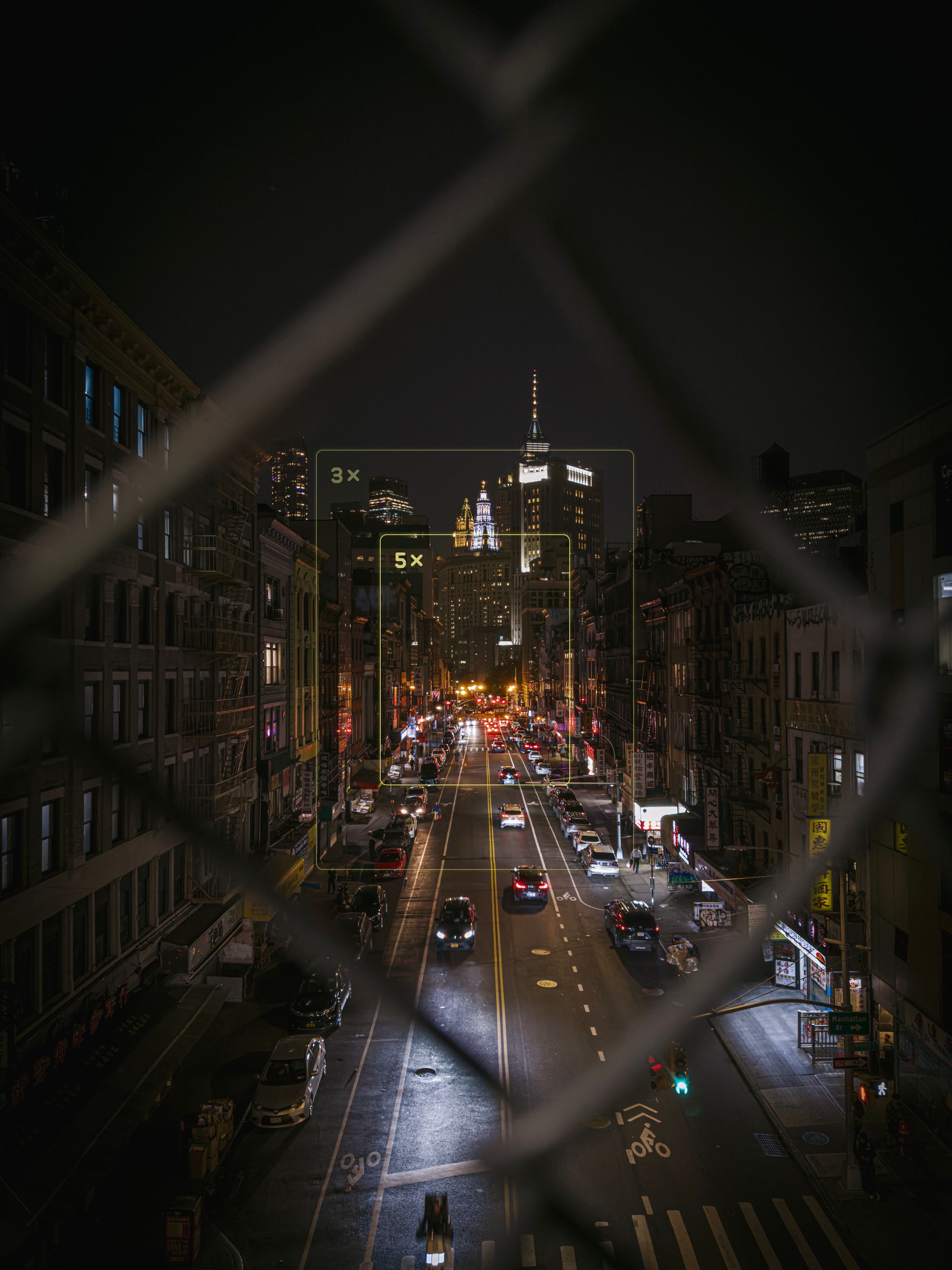
If it helps, I have overlaid our 'director's viewfinder' framelines on a regular image here so you can see just how much tighter of a shot you are lining up.
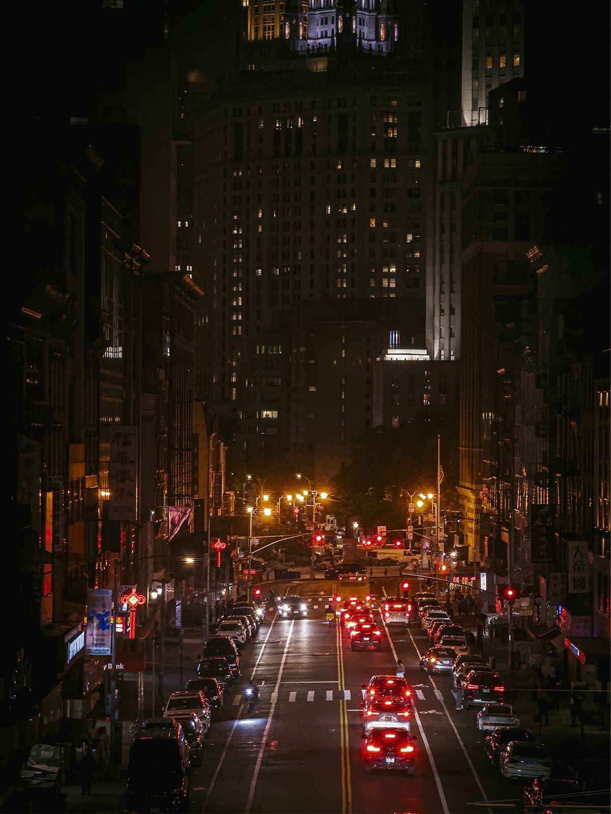
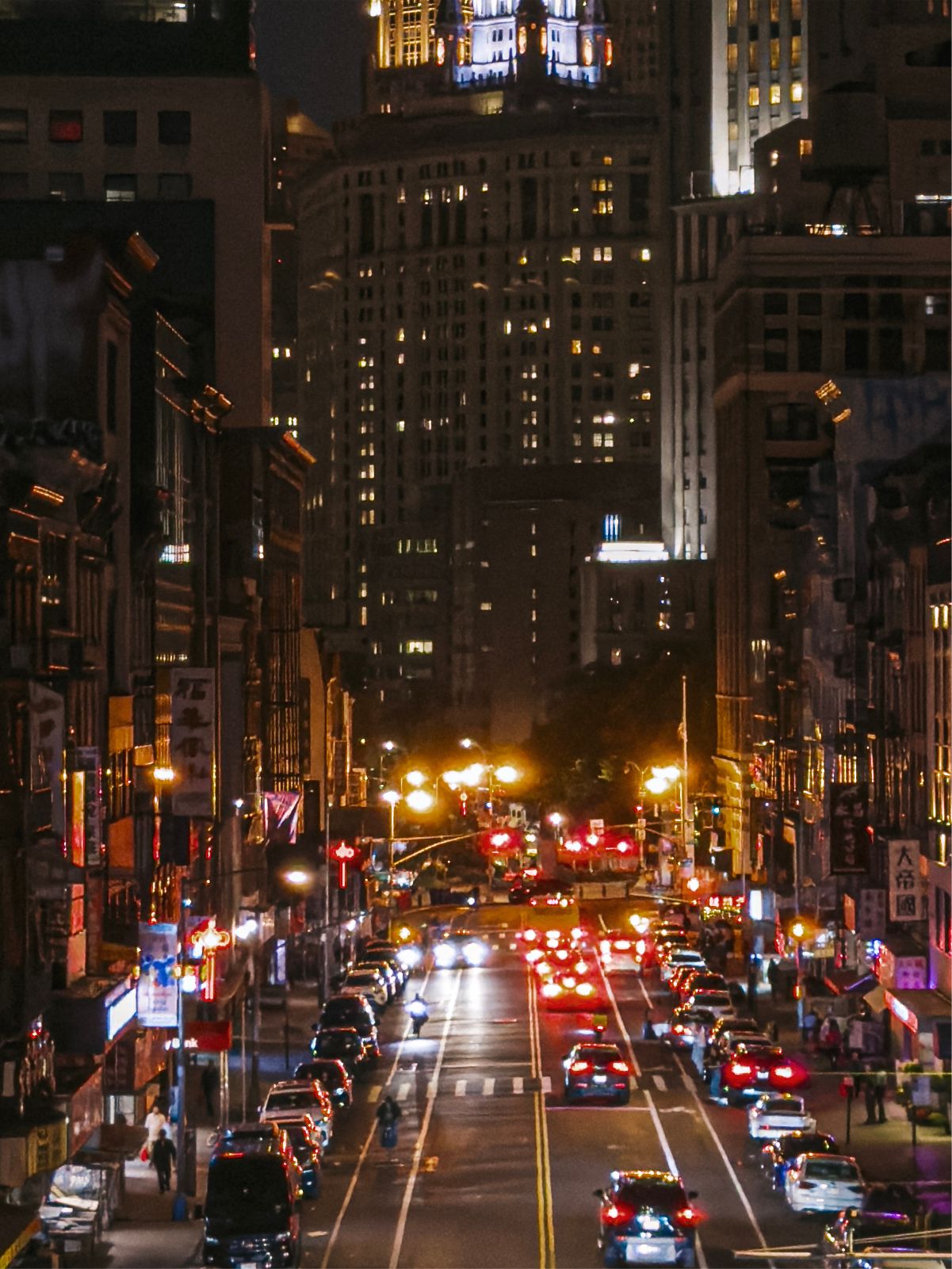
... but the sharpness is easy to warm up to. A purely 'digital' zoom on the right is still retaining impressive detail at 48MP in the dark, but the sharpness of the shot left showcases just how much more reach this lens brings to iPhone.
This has a funny psychological effect: once I shoot at 5× for a while, the Main lens feels... wider somehow. I've had to double-check a few times if I am not accidentally shooting at 0.5×. I suspect that this is what led to Apple adding the 28- and 35mm 'lenses' to the camera — once you are going between such extreme ranges, the change is just a bit jarring.
Is it a great lens?
It is, hands down, the sharpest telephoto lens Apple has ever shipped. "Of course!", you could argue. "Why wouldn't it be? It's 2023 and technology gets better. Why wouldn't it be sharper than the last one?"
Well, it's a long lens. It is truly remarkable how nicely this new lens captures detail despite that length.
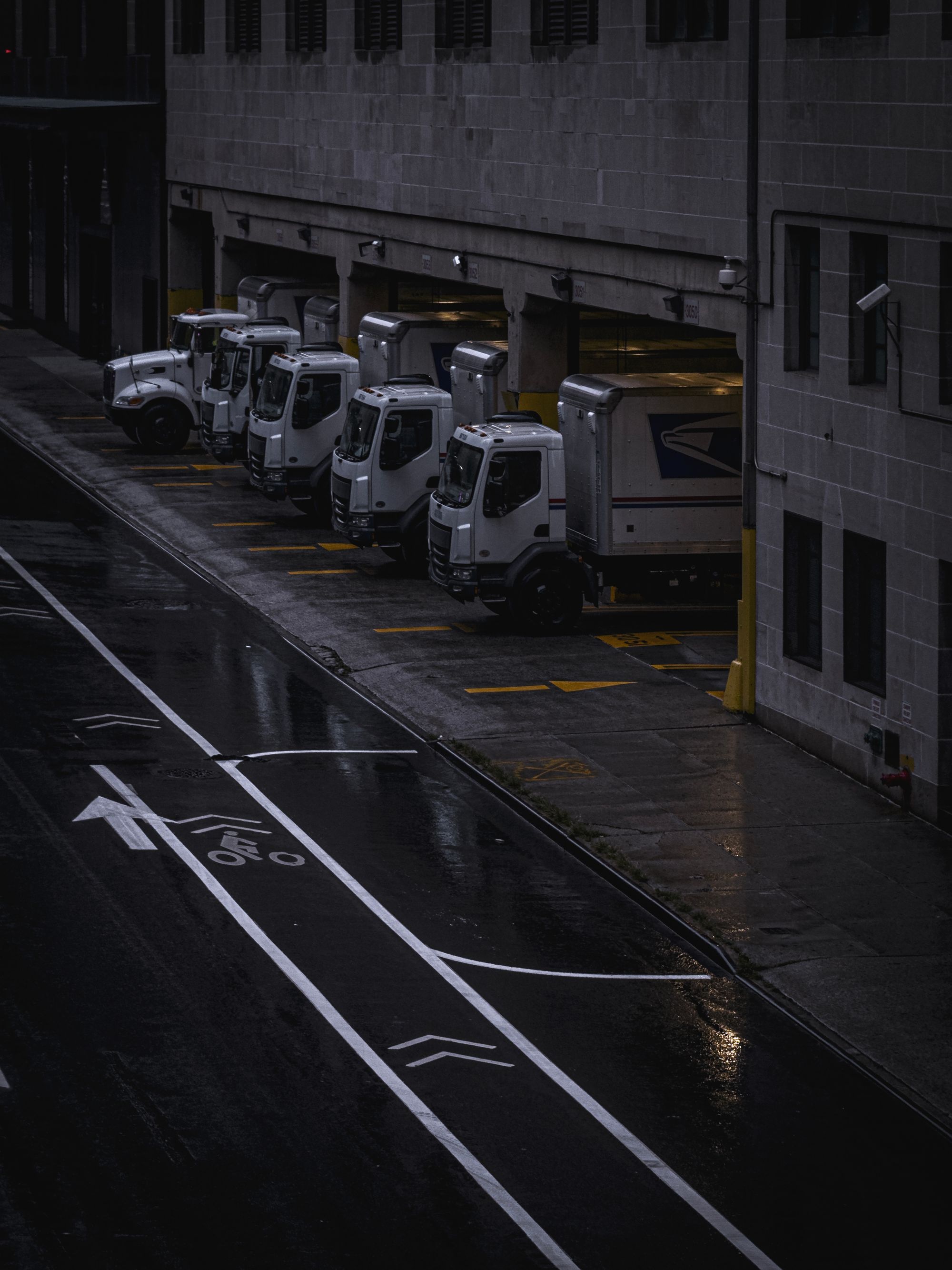
The challenge here is serious: the longer the lens, the harder it is to keep it steady from your shaky, pathetically unstable human hands. Most people do not take photos the way a tripod does — which means the iPhone camera has to do several things:
- Take a stream of photos from the telephoto lens and stabilize them in space to offer a less shaky viewfinder;
- Take said stream of photos and manage to capture enough photos from them for their multi-frame Smart HDR process despite the large amount of shake potentially misaligning them;
- Take photos preferably with a higher shutter speed than 1/focal length, which is 1/120th of a second without too much noise despite using a significantly smaller sensor than the main camera.
It does all that splendidly.
It's very fun to play with the first point. Simply open the camera app and move around at telephoto zoom range to see how there is some 'inertia' to the movement. The heavier, slower movement of the viewfinder is a result of keeping that image somewhat stable instead of a trembling mess that is your minuscule (or large) amount of hand shake magnified by ten.
The more fun experiment, however, is taking a photo. For someone who has always loved taking photos at night, it was kind of mind blowing:


Getting a handheld shot, at night, without a tripod, or really too much effort on my part on a 120mm-equivalent lens is magic. There's no other word for that, because there's such complicated technology involved on a hardware and software level that it makes my head spin.


This is a cool thing, because whether or not you're a photography nerd or an absolutely average iPhone user, the lens will impress. It's just really neat.
That random shot out of an airplane window? You can count trees on a mountain now.
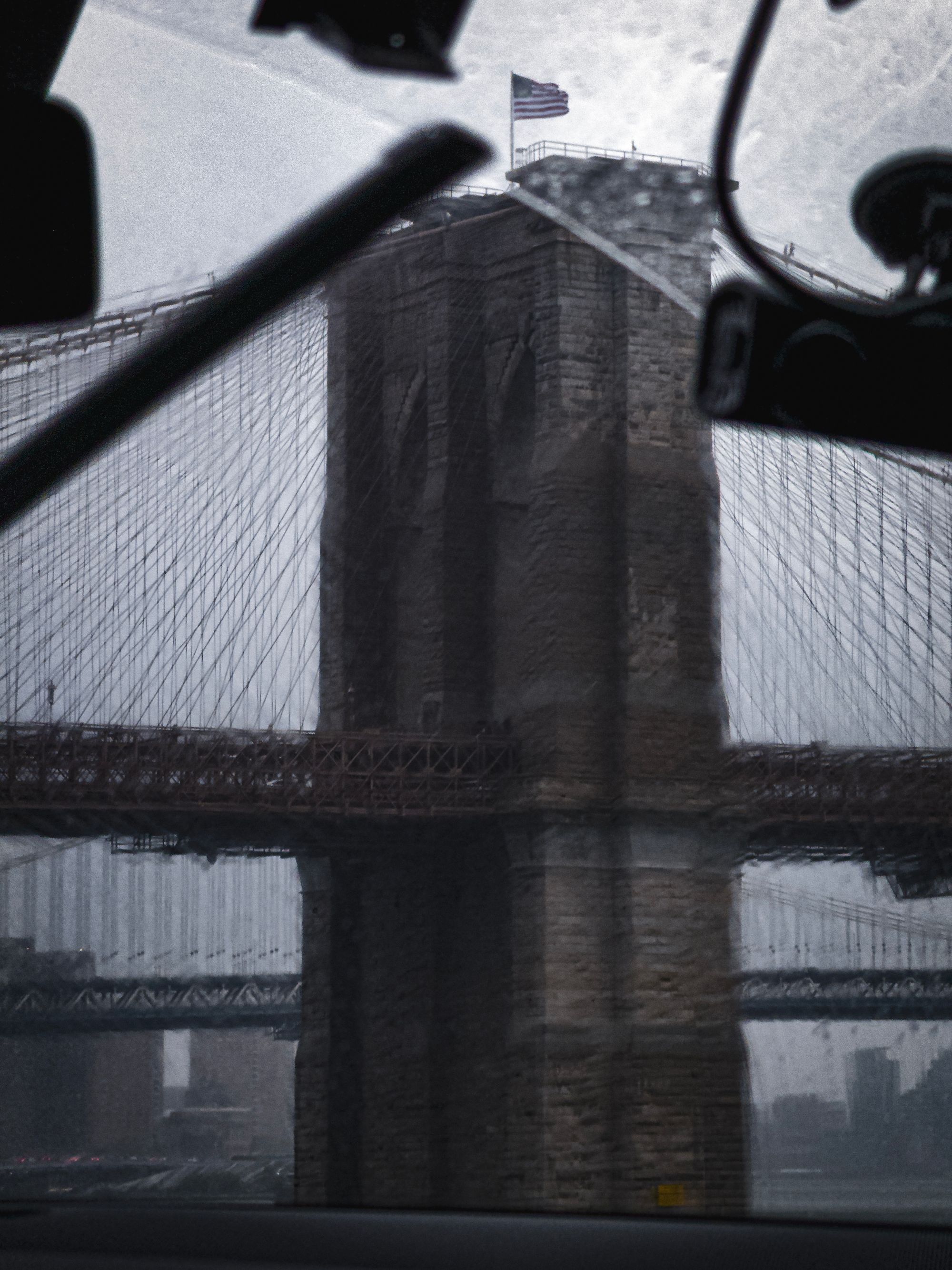
Out near a popular bridge? Take a closer look and count the rivets.


All in, it leaves one difficult photography problem that you have to solve that the stack of machine learning and three-axis optical image stabilizer cannot: framing.
Whether it's an iPhone or DSLR, it's tricky to take great photos at this focal length. You're left with details, closeups and portraits — even the latter perhaps a bit too long. It's worth returning to iPhone portraiture in another post, but suffice to say, this is a challenging focal length to get fantastic shots, despite its excellent execution.

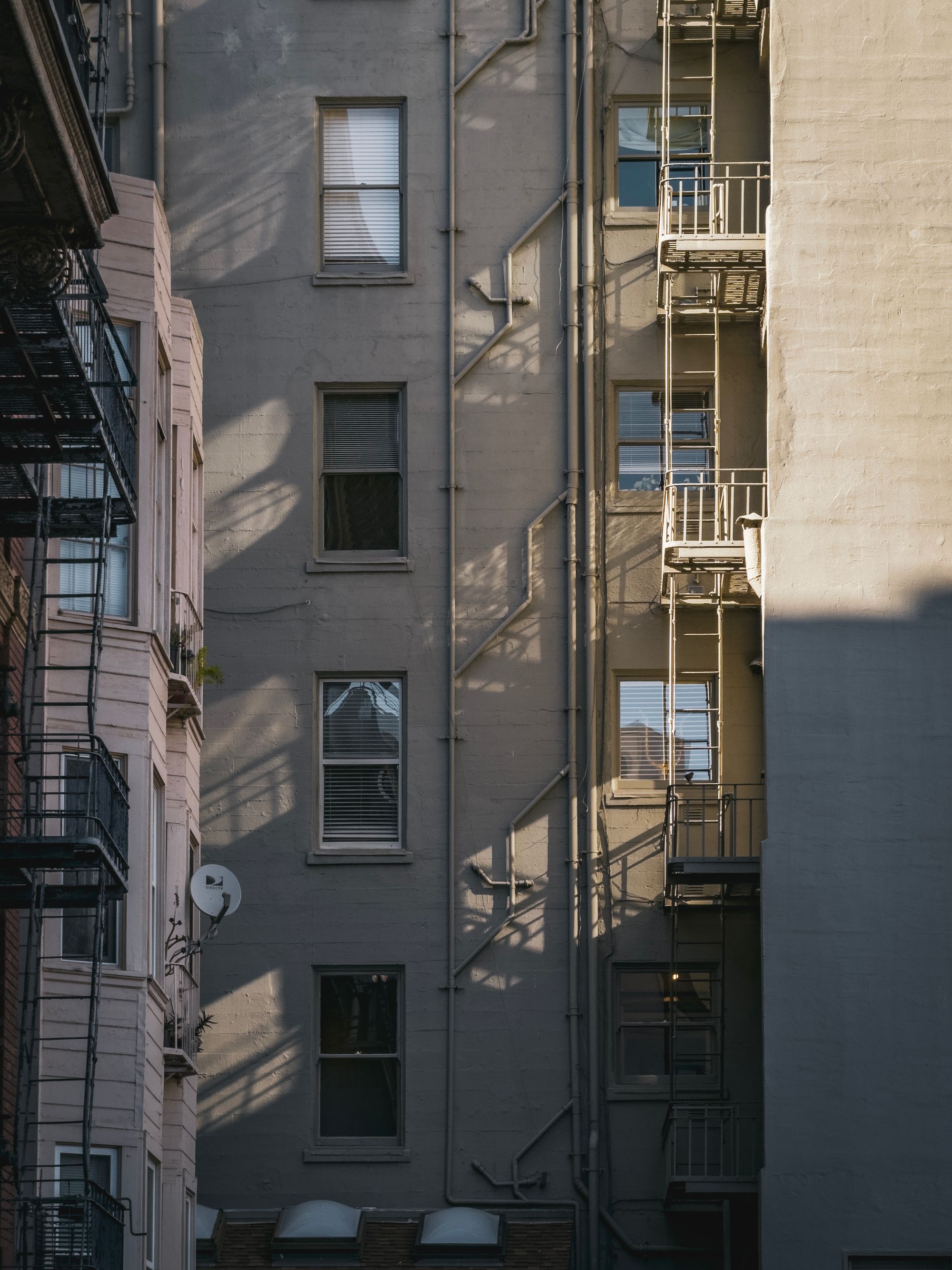

This is perhaps personal, but I'll go back to what I said about the ultra wide camera: you essentially don't have to think about framing with a field of view that wide. With the old, shorter telephoto lenses on iPhone, I enjoyed the creative challenge. I had to think a lot more: one has to be very intentional with what you frame, and how you capture it.
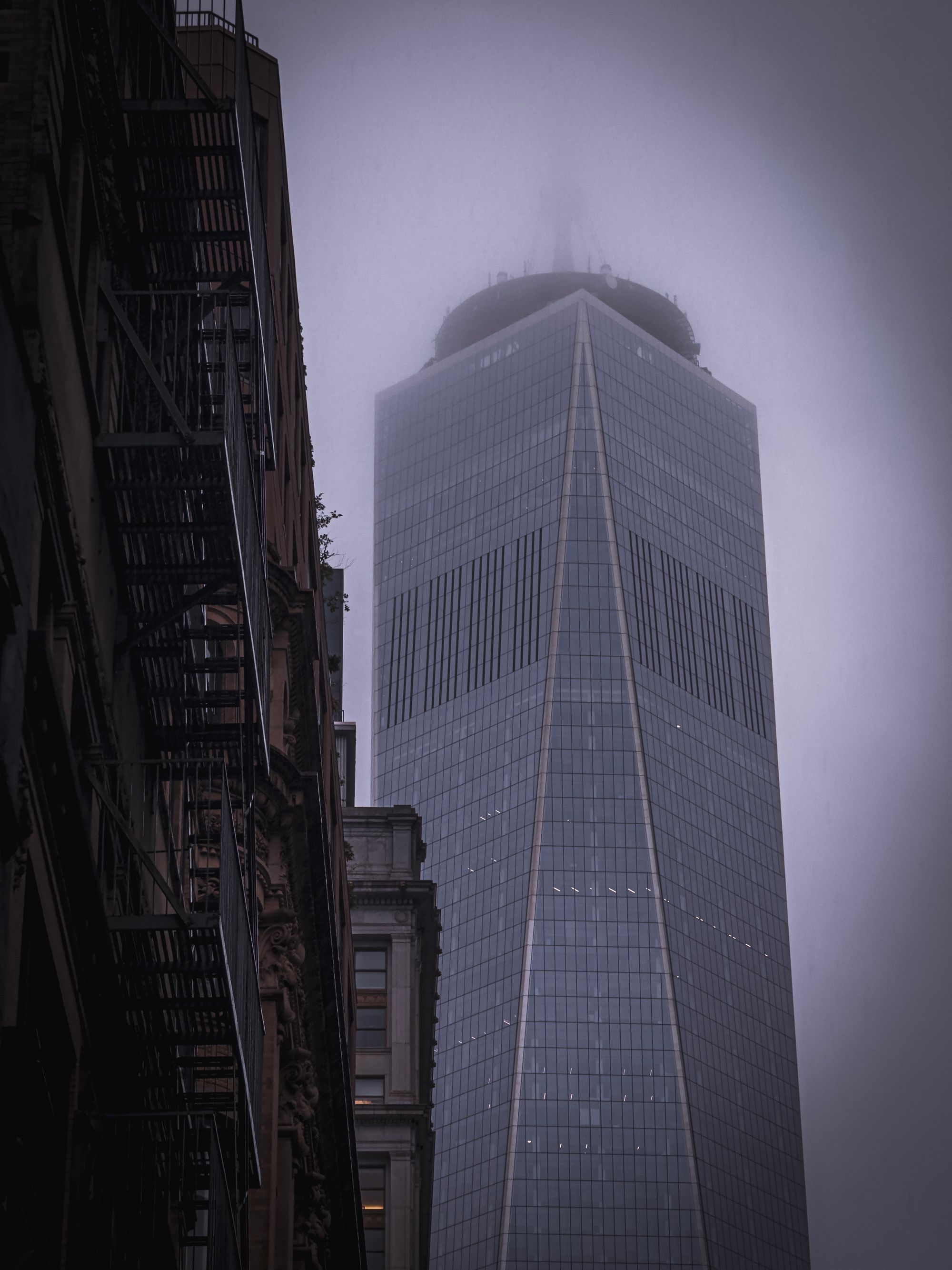

A 5× lens requires a lot more planning and thought. It feels at least twice as challenging.



While uncomfortable at first, it isn't bad. If you stick through it, you can get much more original and interesting perspectives— ones we've never seen taken on iPhones.
Does It Really Have 7 Lenses?
It seems that a lot of people in the photography world are a bit hung up on the idea of claiming that this phone packs 7 lenses. For what it's worth, if you rewatch the Apple Event, it seems nobody says that exactly. It's phrased as being like having seven lenses.
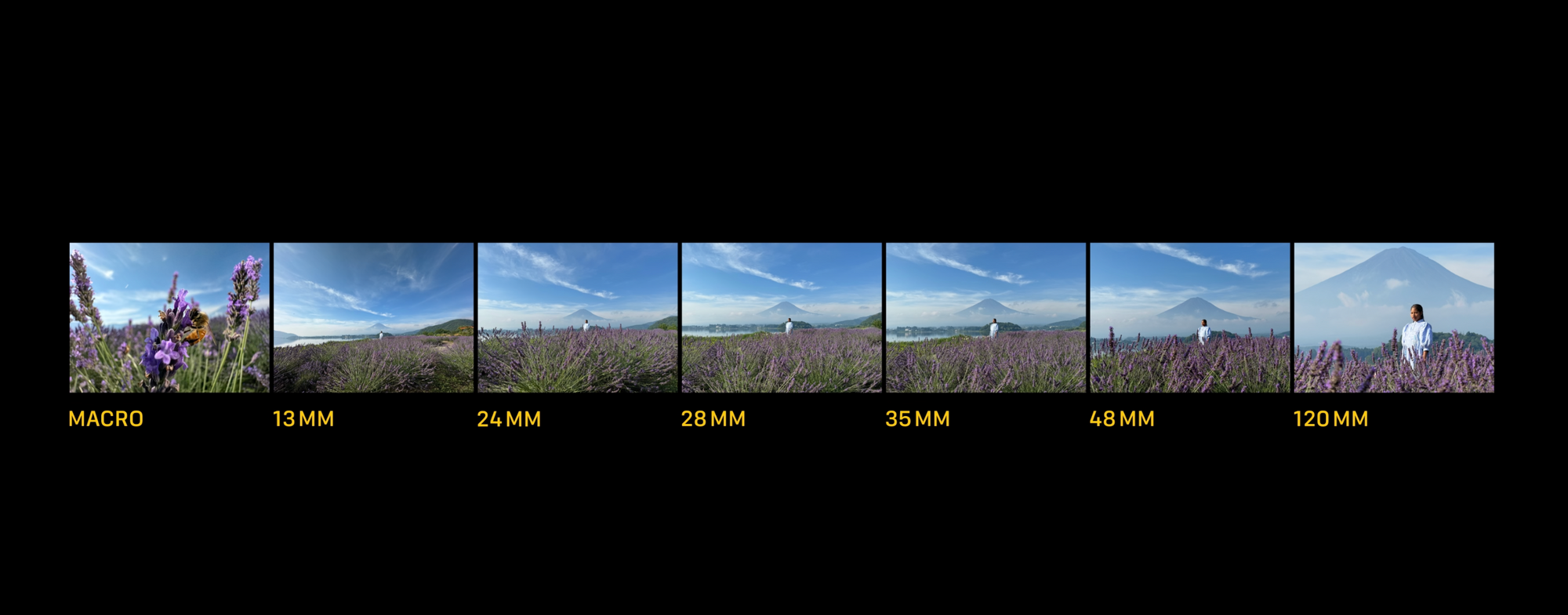
Is it like having seven lenses? For me, I wouldn't say so. I would not mind seven actual lenses, but I suspect most people would find that cumbersome and borderline insane. For most people, the iPhone 15 Pro feels like it has a bunch of extra lenses. It even managed to make me a pretty happy user of a virtual 2× lens.
For most intents and purposes, what Apple really succeeds in with this major camera update is to bring much-needed depth to the photographic experience for average users — not just pros.
I found it pleasantly surprising that Apple chose to maintain real photographic verbiage and iconography throughout all this, too. Field of view is expressed as a focal length — 24mm, 28mm, 35mm and so on. F-stops are used for Portrait mode’s depth of field, even down to the icon of an ƒ.
This matters, because it helps expose and teach average users to photography’s essentials. It'd be easy to toss in a slider that goes from 1 to 100 for portrait blur.
Anyone can design an interface that just dumbs things down. Great interface design, on the other hand is easy to use — while helping you learn. Great interfaces make users smarter.
Becca Farsace of the Verge has an excellent video review of the iPhone camera in which she said it best when talking about the new virtual lenses: it's accessible.
Where Are You Coming From?
Just a quick check here: not many people should really be upgrading their phone every year. iPhones get excellent, long term software update support and can easily last you a few years. I tested the iPhone 15 Pro against my iPhone 11 Pro, iPhone 12 mini and iPhone 14 Pro, and for each you've got a pretty nice set of upgrades:
Coming from iPhone 11 Pro:
- Higher Resolution: The iPhone 15 Pro Max packs a 48-megapixel main camera which is a significant upgrade in resolution compared to the iPhone 11 Pro's 12-megapixels.
- Sensor-Shift Image Stabilization on the Telephoto lens: This feature, which stabilizes the sensor instead of the lens, helps in capturing sharper images and smoother videos, especially in low-light conditions.
- Enhanced Zoom Capabilities: 3× or 5× optical zoom options vs 2×.
- Photography Modes: Features such as Action mode, Macro mode, Cinematic mode, ProRAW photos, ProRes video, Night mode portraits, Photographic Styles and a whole lot more has been added.
- Upgraded Front Camera with Autofocus: Improves the clarity and focus of selfies and video calls — a big one.
- Much better Low-light performance: Night mode and sensor-shift stabilization are one thing, but with larger sensors and faster lenses the iPhone 15 Pro Max performs better in low-light conditions on all of its cameras.
- Ultra Wide Upgrades: Very significant upgrades to the ultra wide camera in recent years enable it to shoot much sharper shots.
- Next Generation Portrait Mode: Portrait mode is now automatic and does not require switching into a discrete mode anymore, with the Camera app capturing depth data when it detects a person, cat, or dog.
Coming from iPhone 12 mini:
- Higher Resolution: The iPhone 15 Pro Max packs a 48-megapixel main camera which is a significant upgrade in resolution compared to the iPhone 12's 12-megapixels.
- Telephoto: Having a telephoto lens is one thing, but you'll be upgrading to a 3× or 5× optical zoom. That's a lot of reach.
- Advanced Photography Modes: Including Action mode, Macro mode, Cinematic mode for video, ProRAW for photos, and ProRes video, among others.
- Upgraded Front Camera with Autofocus: Improves the clarity and focus of selfies and video calls — a big one.
- Much better Low-light performance: With larger sensors and better processing, plus faster lenses the iPhone 15 Pro Max performs better in low-light conditions on all of its cameras than the mini.
- Next Generation Portrait Mode: Portrait mode is now automatic and does not require switching into a discrete mode anymore, with the Camera app capturing depth data when it detects a person, cat, or dog.
Coming from iPhone 14 Pro:
- 120mm 5x Telephoto Lens: The iPhone 15 Pro Max features a 5x 120mm telephoto lens, providing more reach and creative photography options.
- Improved Night Mode: The Night mode feature has been enhanced for better low-light photography.
- Next Generation Portrait Mode: Portrait mode is now automatic and does not require switching into a discrete mode anymore, with the Camera app capturing depth data when it detects a person, cat, or dog.
- Lens Coatings: Updated lens coatings result in fewer lens flares when shooting into light sources.
- Pro Video: Recording to external media and ProRes Log capture.
Action Button
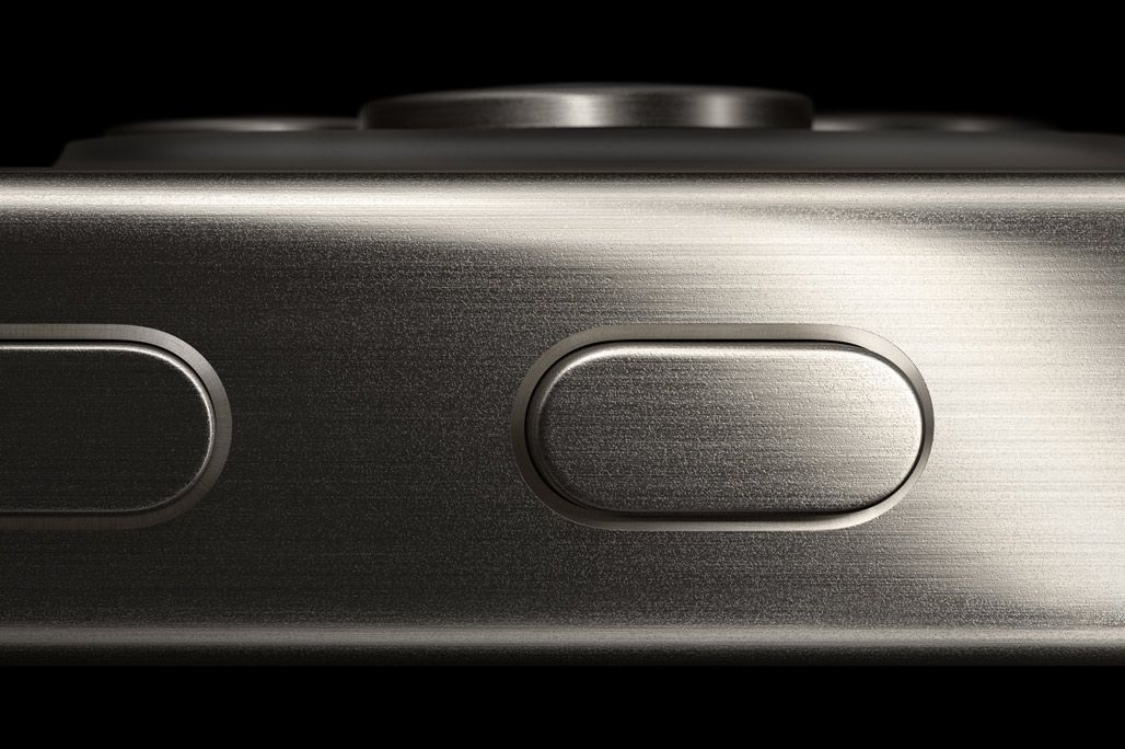
You can't write about iPhone 15 Pro hardware without diving into its other signature feature — and I am not talking about a new element on the periodic table.
The Action button is an interesting addition with some clear photography applications. Apple showcases opening the Camera app to snap a photo in its keynote, and I was excited about a potential new physical control for the camera. This could have a huge impact on the usability of the iPhone as a proper photo-taking device.
In practical use, the devil's in the details. I didn't find using the button to open the Camera — or Halide — particularly useful. Yes, it's quick, but the button on the iPhone 15 Pro Max sits quite high up, making it less ergonomically feasible to quickly hold.
In the Camera app, the Action button also takes a photo. This is great, as a dedicated shutter button is wonderful to have, but it doesn't do more than the volume buttons. There's no half-press for focus before the shot and you cannot hold the button down for a burst of shots.
I ended up really missing the regular old ringer switch behavior (this was not helped with iOS 17 having wonderful, non-disruptive new ringtones and sounds). As a result, I kept it on the default 'Silent Mode' setting for a while, until I discovered thanks to Steven Robles that the button can also show a list of options through the use of a Shortcut.
I grabbed his version and put together a personal Shortcut that shows a list when triggered:
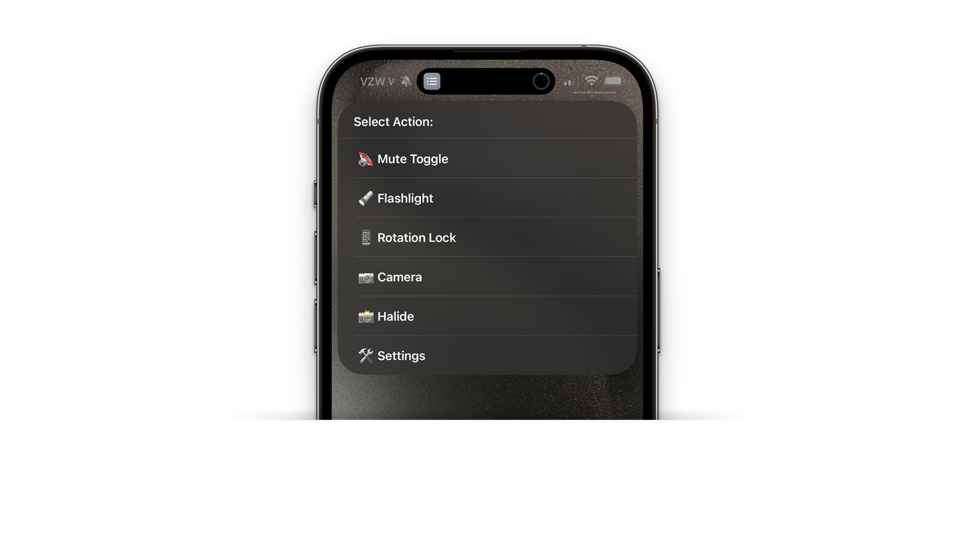
This was getting somewhere. This small, personal Control Center let me toggle the most useful things very quickly.
I still think there's a lot more potential for a dedicated button on an iPhone. Shortcuts unlock a lot of potential: some people have orientation-sensitive triggers, so your Action button can do different things depending on which way you hold your phone. There's some limited ways you can add a single- and double-click functionality.
In Halide, we decided to really try to push it to its limit: with the use of Shortcuts, we can actually use the button for in-app triggers. Our latest update, which is out today, has an entire Action button menu:

From there, we guide users to either set up our special 'In App Trigger' shortcut, which opens Halide and enables you to use the Action button while in the app to switch lenses, modes or more, or to set up the Action button the old fashioned way: with a single action or a custom menu as shown above.
This particular bit of clever engineering made me excited about the future of having a dedicated Action button on iPhone. Cameras are all about phyiscal controls. Delightfully tactile buttons and dials that live in fixed places, allowing you control in a way that can become reflexive — so the camera can become an extension of your own body.
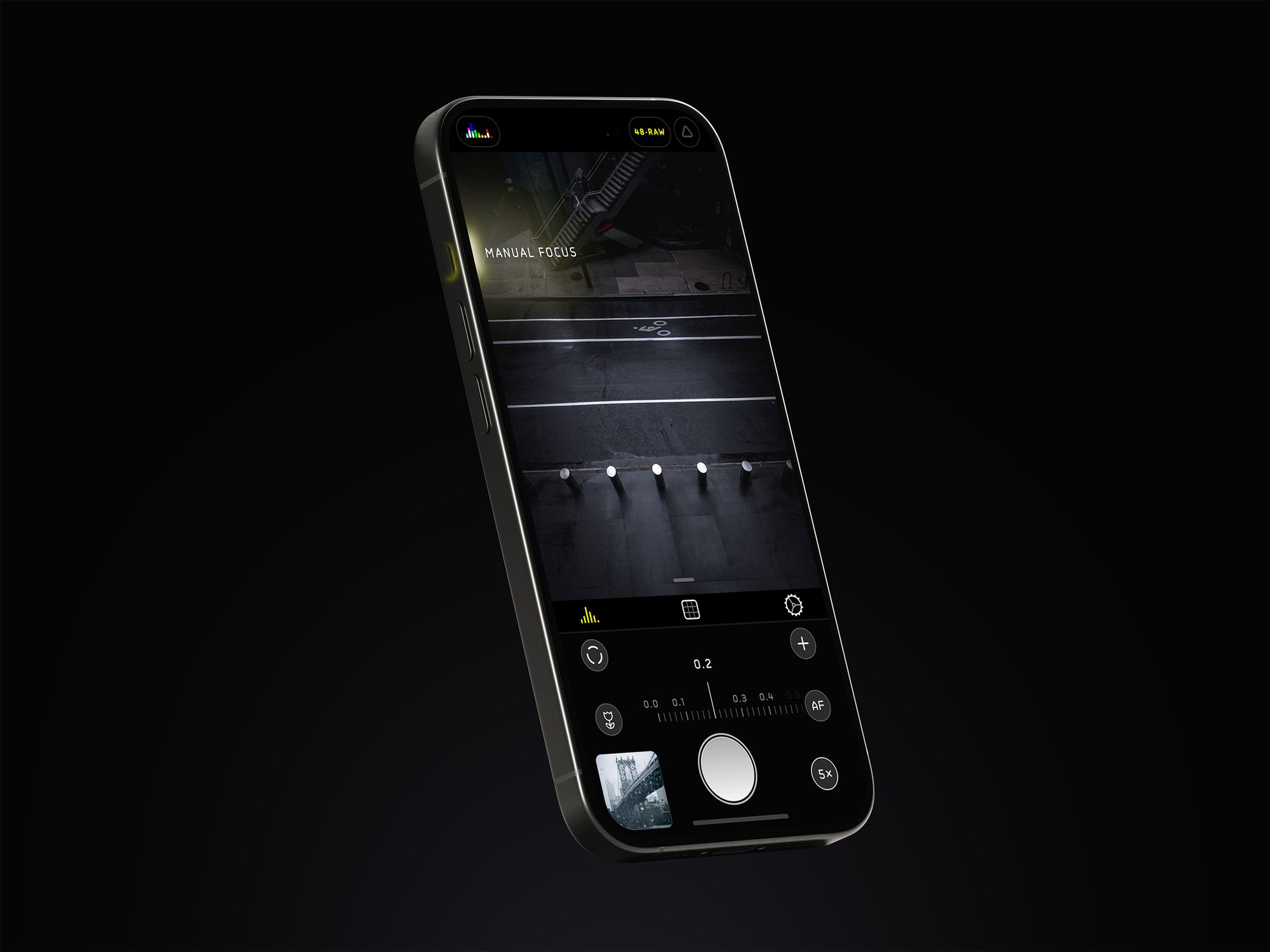
We hope this update and further iterations on the Action button from Apple will start to bring that kind of flexibility and power to this newest tiny hardware addition. I'm excited that it's only going to get better from here.
Processing and Process
One of the best things I have done to educate myself as a photography instructor and camera app developer is joining a Facebook group of novice iPhone photographers. In the last few years, I've watch many novices run into the same issue: distracting processing on the latest and greatest iPhones.
People in photos are blown out and seemingly over-processed, and telephoto shots reduced to a sloppy, smudgy mush. Some argue that Apple has gone too far in processing, to the extent that it makes images unrecognizable. Many Halide users reduce processing in Capture Settings, or just shoot native RAW to circumvent processing altogether.
But what's really happening is that the iPhone has gotten better as rescuing photos. Back in the days of the iPhone 7, if I shot my subject backlit by the sun, the result would be unusable. At best, you'd see a silhouette. The iPhone can now take those once-unsalvageable and make them passable. Sometimes even good.

The tradeoff is that today's novice photographers have lost the feedback loop we had back when we learned photography on big, dumb cameras. When a camera never fails, you can be fooled into thinking you've mastered photography.
Apple is in the position where they design a camera for everyone. I don't mean all of us reading camera reviews on this blog. I don't even mean all of us in this hemisphere, or country, or culture. I mean every person, of every age, on the planet. And if they get an unusable photo where other cameras give an overprocessed shot of a loved one, they will pick the camera that gives them something over nothing at all.
We're photographers who make camera apps for other photographers. We want the freedom to take bad photos.


Regardless, this is the iPhone 15 Pro. Does the Pro in the name give us a bit more feedback? Will it let us make mistakes? Surprisingly, yes.
iPhone 15 Pro Max has significantly more feedback in its processing, in a form that I missed in the last iterations of Apple's image processing pipeline. As I edited my photos, I was delighted to see... noise.

When it isn't stylistic choice, noise indicates your camera lacked light. When noise gets stronger in an image, we understand that we were taking a literal shot in the dark.

On iPhone 15 Pro, ProRAW files contain a bit more noise. This is most pronounced on the telephoto lens, which tells you in no uncertain terms that it's punching above its weight when light levels dip too low.³
This is a welcome change, as previously iPhone generations tried to hide this behind heavy noise reduction, resulting in that smudged, 'watercolor' effect. It seems odd to cheer on noise, but this is genuinely a huge improvement as fewer details are lost, and it might even help people take better photos.
3 — I will have to admit that this is, at times, a difficult task to test. The new telephoto lens is engineered to collect a lot of light, and the larger sensor and optical image stabilization took sharp, handheld shots in conditions that seemed almost unbelievable to me. This takes a lot of work — from the image being stabilized for users in the camera to capturing a sharp image — and it was hardly mentioned in the event. Well done to the team that worked on that.
The Camera
Apple expends monumental efforts to make the iPhone camera feel natural. The vision is clear: "You should never know there are separate lenses, sensors and processing pipelines." They strive for an uninterrupted whole, a utopian vision of a technology-enabled camera that just works.
Most of their work is invisible. At manufacturing, components are matched with microscopic measurements so their tolerances are aligned for better optical and color performance, ensuring fewer visual hiccups as the camera switches lenses transitioning through the zoom range. Once impossible feats are made possible with custom silicon and highly optimized pipelines that few companies could dream of matching. Only Apple can achieve this thanks to their integration of hardware and software.⁴

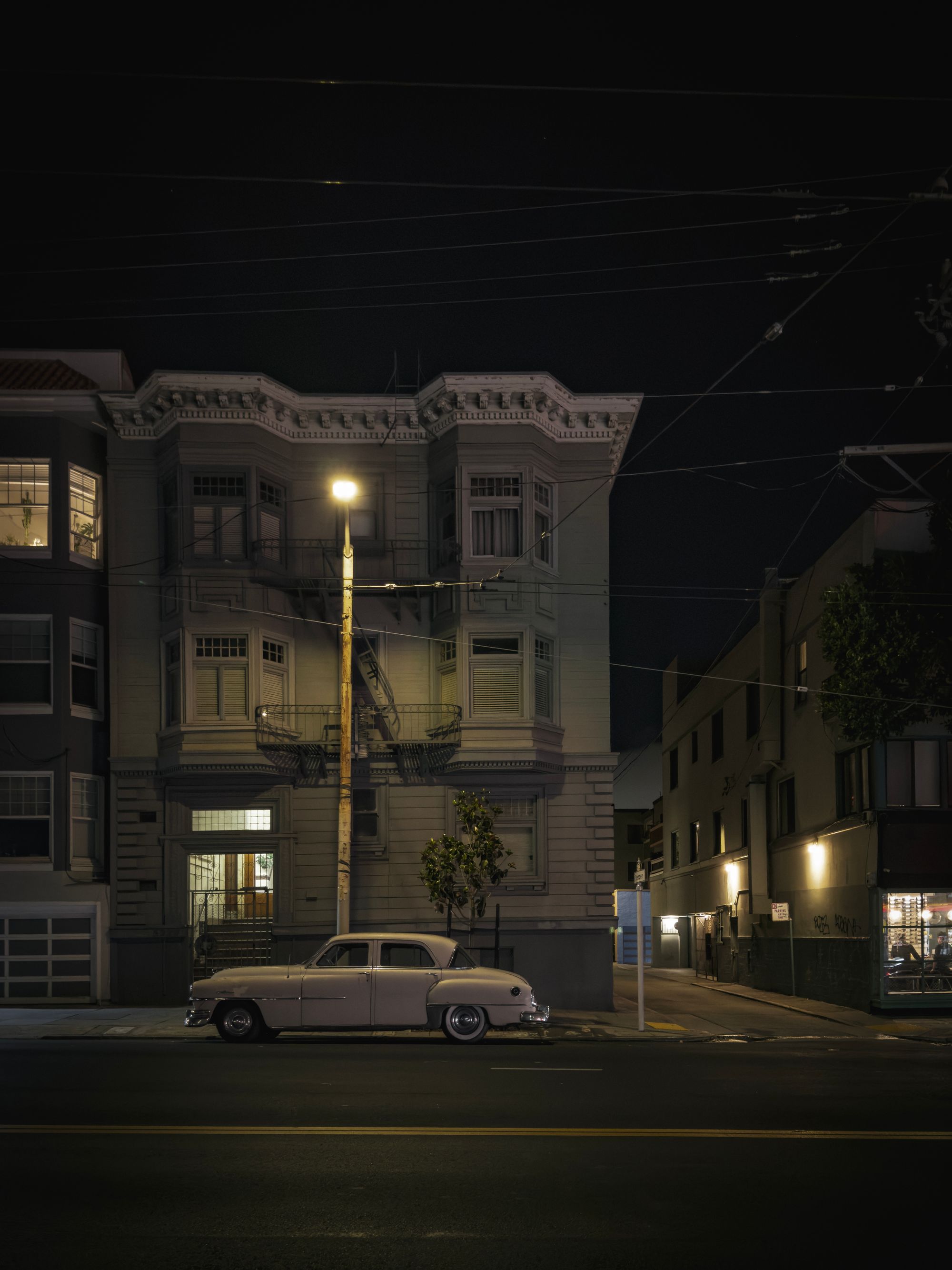
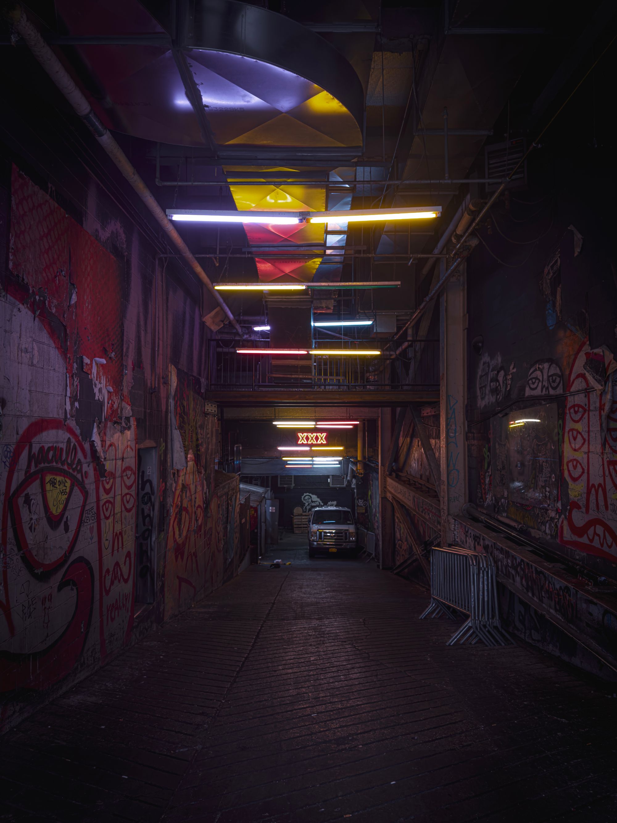
(It surprises me every year that Apple uses a design that reveals individual camera, when a big self-contained camera module could blend them all together, visually reflecting their philosophy so much more.)
But every approach requires tradeoffs. It means the camera software has to swap out lenses — even in ProRAW mode. It will lead you to think that you're using one lens when it is substituting another,⁵ because it thinks it's for your own good.
I am not envious of the team designing Apple's Camera app. It has to be one app that does everything, and with every new iPhone that adds even more capabilities, that camera app runs the risk of getting heavier and more complex. However, this year they managed to integrate the new 28mm and 35mm quite well.
With the portrait mode turning on automatically when it detects humans and pets, I could see the discreet 'Portrait' mode disappearing altogether. With spatial Photos and Videos just around the corner, it could make sense to just capture depth data all the time, regardless of subject.
4 — An example of this has been real-time Portrait mode. Long before Cinematic Mode, Apple managed to do a real-time preview of the Portrait effect blur in iPhone Camera's viewfinder. Google's computational photography powerhouse, the Pixel, only managed to apply the blurred background post-capture, after a few seconds of processing. Apple first applied this blur in realtime using a highly optimized process of computing depth with the parallax of two camera in iPhone 7 Plus, but has started using a real-time machine learning network that segments subjects and generates depth from a single image along with focus pixel data that works even on single camera iPhones since iPhone XR. This is insanely impressive stuff, and solidly in the realm of things only Apple can do thanks to its super-tight integration between software and hardware.
5 — fun test: cover the telephoto lens on your iPhone, then point the camera at stuff close to you. You'll notice that once the minimum focus distance of the telephoto camera is exceeded, Apple Camera simply swaps in a cropped portion of the main camera, instead. I think this is clever, and reasonable, but perhaps not in a ProRAW capture mode where you want the camera to, well, let you get raw camera output.
Conclusion
The annual iPhone announcement feels like the Superbowl of tech — a huge event that everyone tends to have an opinion about. It's exciting to have a quick hot take, and in the interest of a quick response, it's easy to look at specifications and fact sheets and jump to conclusions. That would lead you to believe the iPhone 15 Pro Max offers little beyond its 120mm equivalent lens, but this is impossibly far from the truth.

For the every day user, iPhone 15 and 15 Pro probably offer one of the biggest camera upgrades in the history of the iPhone. Yet, people seemed to have missed this. How did that happen?
It is the details that tie all of Apple's camera hardware and software improvements together. Most iPhone users took 12 megapixel photos, had a small-ish zoom range, and had to switch to a separate mode for portrait Photos.
With iPhone 15 Pro Max's default 24 megapixel resolution, added 'lenses' under the main camera lens, automatic depth capture for portraits, and that 5× lens, this release might not blow away on a spec sheet, but is massive for everyone who uses an iPhone to take photos.
Meanwhile, the pros get the Action button, a big step towards the phone itself becoming a dedicated camera. While I did not touch on it in this photography article, ProRes Log capture and external video recording is a big deal.
For photography, this was the year of reach and depth — and that'll be up to us 'pros' to pour our own creativity into to appreciate.


